This box will ask the user to select a sensor during configuration.
Then, with one click, it can display a view:
- last 24 hours
- last week
- last month
The GitHub issue:
This box will ask the user to select a sensor during configuration.
Then, with one click, it can display a view:
The GitHub issue:
Wouldn’t it be more judicious / intuitive to simply click on a sensor on the dashboard to see details appear (such as the history in our case)
Because if we have a box that has been configured to display only the last 24 hours, we will need to add another box for the last month… etc.. A lot of boxes all that.
So unless I misunderstood, would it be more relevant to have a box on the dashboard on which we change at our discretion (click, radio button, select or other) a view of the 24h / 1 week / 1 month / 3 months?
Very good remark, I agree with you! I’ll change it in the post.
We already have a ticket for that ![]()
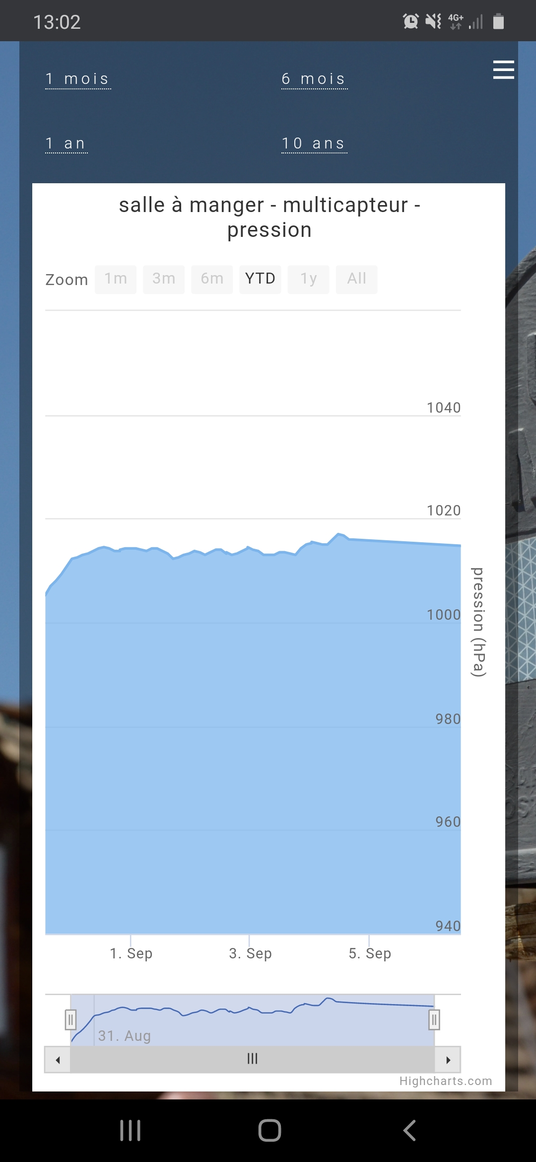
Is it allowed to use Highcharts? Normally possible if the purpose is not commercial.
With this service it’s quite simple to integrate (at least in PHP).
Today we are already integrating a chart library:
Hello,
I was going to try to work on this ticket, @AlexTrovato indicated that visjs was already used in Gladys (as far as I understand for the network page of the zwave (vis-network))
So I was going with the same library (vis-timeline, 2D graph display) but @pierre-gilles seems to indicate that the choice of the library is not made/final.
Should I go with visjs or should I do a comparison of existing libraries or specific wishes for a particular library?
@euguuu I replied on GitHub. Honestly, not a fan of visjs at all, let’s continue the discussion there ![]()
Since the PR is in progress, can we close the topic? (to free up the tokens)