Let's talk about Gladys V4

Yes, I recognize :smiley:
Your idea of grouping actions done at the same time would address these problems yes!
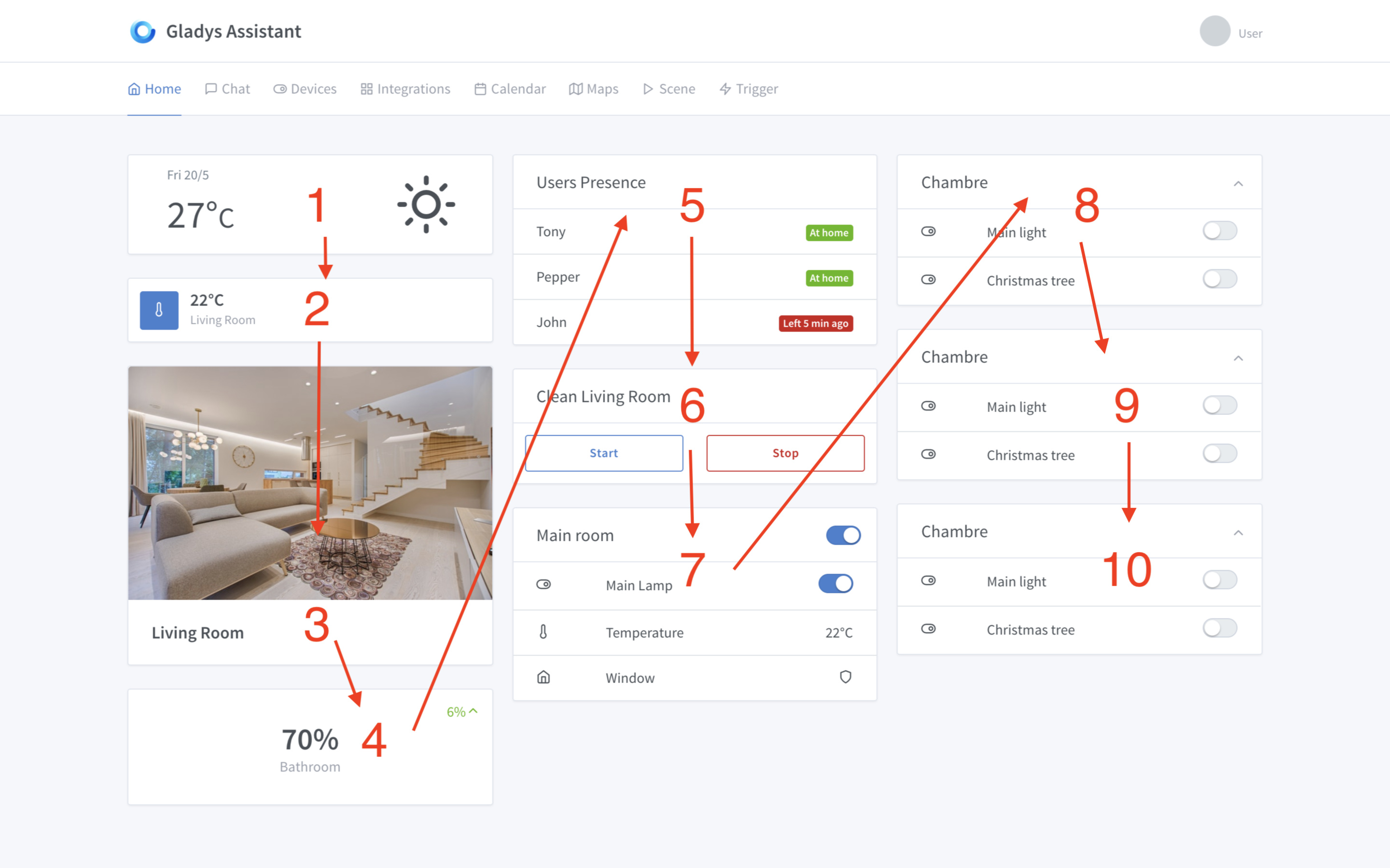
Let’s see what it gives :slight_smile:

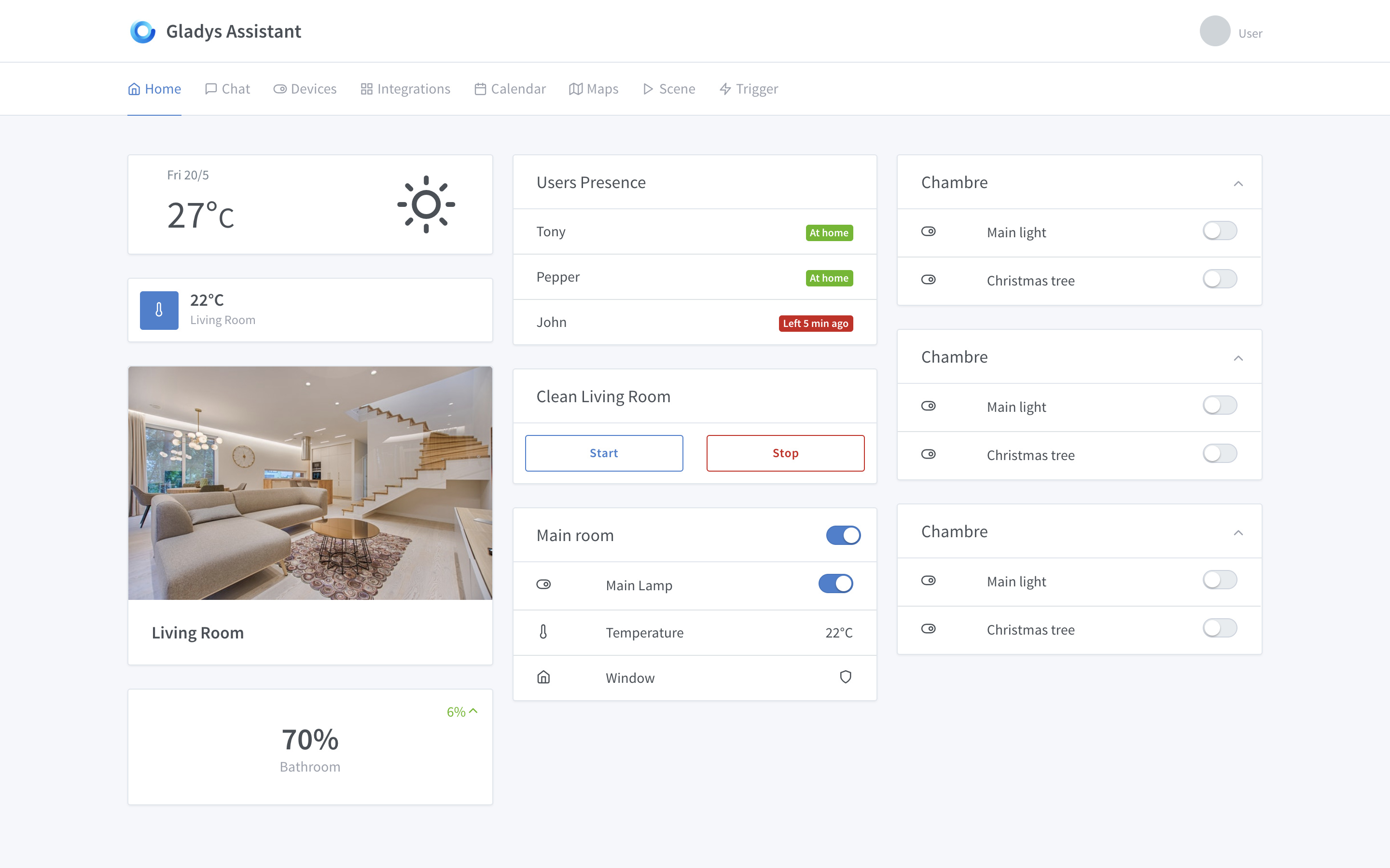
From a UX perspective, it’s great, it’s simple and focuses on the essentials. I would like to see « smart » fields that verify their content in real time (like the user’s email address or password match, and turn from red to green when it’s good)

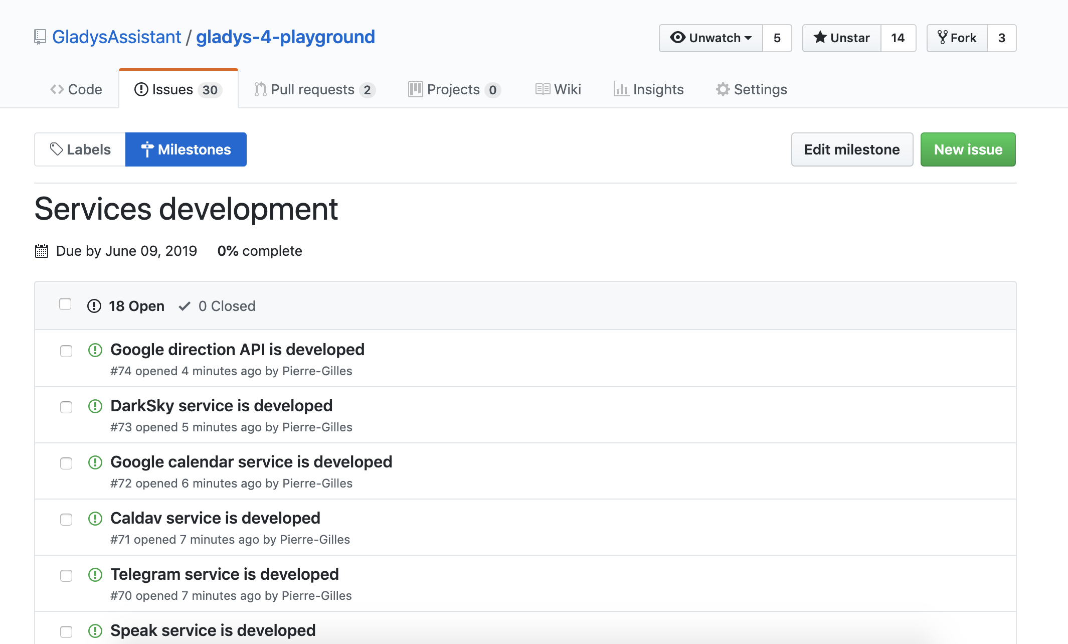
Regarding the services, if I understood correctly, they will all be installed by default, but can be activated according to the user’s needs. Top!

So, on the UI side, I would also like to see a visual element in the service tile (integrations page) such as a bar of a certain color at the bottom of the tile with the status marked:

  • Activated: Green bar
  • Activated, configuration required: Yellow bar
  • Activated, Warning: Orange bar (if there is interest in this feature)
  • Activated, Error: Red bar (if there is interest in this feature)
  • Deactivated: Gray bar

Then, I would like to see a visual separation between active services and available services, which would make two categories, the first above the second.

Regarding the technologies used, how will the integration of the different objects of the different brands/personal creations be organized?

I take the example of Bluetooth: Will there be a master Bluetooth service that handles connections, and dependent services that will manage each product or feature/brand such as user presence verification via Nuts or other, Awox bulbs, and « home » Bluetooth objects? Or will it just be a separation at the UI level?

Oh yes yes yes! Snips :smiley: (I wouldn’t say no to XMPP or Matrix/Riot either :stuck_out_tongue: )

And I will be available to test the alpha when it is released :wink:

Done, I just created the 18 issues, one per service, to be developed for this first alpha.

The milestone is available here →

https://github.com/GladysAssistant/gladys-4-playground/milestone/4

If you want to lend a hand and have availability in the coming days/weeks, feel free to leave a comment in the issue that interests you to indicate that you are taking the lead on developing that service :slight_smile: This will prevent multiple people from working on the same topic. And as soon as you start, I invite you to create a PR (which you mark as « in progress »).

I will take care of the remaining services, but the more help you give me, the faster Gladys 4 will be released :smiley:

We will handle each service on a case-by-case basis. A priori, the Bluetooth service will be like the Z-Wave service, everything will be in the « bluetooth » folder code. There will be a separation in the UI for clarity, but behind it will be a single service.

Let’s start with the essentials. Above all, this is an alpha, and everyone’s development time is limited. But if you want to develop these integrations, they will be integrated with pleasure :wink:

Hello @pierre-gilles,

In Gladys 4, you store the scene actions in the database directly in JSON format.
This seems very practical to parse and develop.
However, if we delete a device for reason x or y.
How do you handle this case in your scene?

Good question!

We could implement a device removal check across all scenes to see if the device is in use, and if so, prevent the removal.

Won’t that be really heavy?

I think someone in the community has a campsite.

How does it work if he has a multitude of scenes, each with a multitude of actions?

The scenes are in RAM. Even traversing 1 million elements in pure JS, I think we’re talking in milliseconds :slight_smile:

After this benchmark, it shouldn’t be heavy.

The other solution would be to assume that the case may occur, and to handle the case intelligently if a scene runs and the device does not exist.

In my opinion, we should do both.

Or perhaps insert the information into the device?

device = {
  ...,
  scenes: [ 1, 5, 8 ]
}

In short, create a two-way link.

I don’t think duplicating the data is the best solution. This means we have to maintain this list in addition to having it in the scenes. We have even more risk of data corruption.

I was just going to suggest that:

  • Browse the scenes and warn (or block) when a user wants to delete equipment in use
  • Consider the case where equipment does not exist in a scene (as if it ultimately did not work), to still allow its execution with a warning.
    Because if the scene is complex and accesses multiple pieces of equipment, even if one is missing, it is often still possible to execute it.

Absolutely :wink:

We can imagine « necessary » and « optional » devices for the execution of a scene: in the first case, the scene stops and goes into error, in the second case, it runs anyway (and returns a warning?)

I don’t see the idea ^^

Let’s keep things simple :slight_smile: Here we’re talking about an edge case that needs to be handled; the user doesn’t need to worry about all that.

Hello everyone!

Today I worked on the UI, particularly on how the dashboard(s) will be organized and how the user will be able to edit them.

And, I have a little dilemma.

Important Note

In Gladys 4, I plan to make it possible to create two types of dashboards:

  • The dashboard we all know, the home dashboard. It is designed for fairly large boxes and features 3 columns. It will probably be possible to create multiple home dashboards, but not millions either so that it remains organized. In short, it’s like this:

  • A « full screen » dashboard, practical for tablets or Gladys wall screens, with smaller and tighter boxes. Practical for condensing information on a wall, and having quick controls. In short, something like this (image taken from Google Images, it won’t be exactly this):

Here, I will talk about the home dashboard.

The Question

The debate is at the level of the grid used, for this there are two ways to do it.

  • System n°1: Either we have 3 columns, and on each column the user distributes and fixes where each box will go.

That is to say:

Each box therefore has 2 coordinates, X and Y. Nothing complicated.

  • System n°2: Either we have 3 columns, and the user simply chooses the order of the boxes, and then the browser intelligently places the boxes based on the screen and the dynamic size of each box.

The box now has only one coordinate, X.

Placement is done using Bootstrap’s « column-card ». It’s very smart and tries to put as much data on the screen as possible by condensing everything.

This is what I use for Gladys Gateway, for example.

Question: What do you think?

Edit Mode

To edit the boxes, unlike Gladys 3, it will no longer be necessary to go into the settings, it will be directly in the interface.

I am thinking of an « Edit » button:

Which, when clicked, puts all the boxes in edit mode:

(user presence box here, just an example)

So far, I haven’t been able to make a clean drag and drop unfortunately, if someone is an expert I’m interested ^^ In the meantime, I’ve put a system of « Up » and « Down » arrows to move the box.

I would like your opinion on all this :slight_smile:

I am in favor of « drag-and-drop » on 3 columns. I find that from a user perspective and in use, it’s much more intuitive.
When I choose to place a box « there », it will almost always stay « there ». Unless the screen suddenly becomes smaller or larger, of course.

In fact, I like being able to customize my dashboard and find it always in the same state.

Hello, Personally, I prefer solution X and Y. It looks quite like Gladys 3 and above all, as mentioned earlier, I like that things stay where I put them ^^.

As for editing, drag and drop is great, but the arrows don’t bother me :slight_smile:

I like the second solution, less work in config, Gladys makes a first draft and if it doesn’t work, you just rearrange later with drag’n drop.
If I understand correctly, once you move them, they stay fixed?

A priori I’m going to go with solution X, Y.

Actually, no! Depending on the content size and the screen size, the boxes are arranged differently.

In the example I gave, for example, let’s say if box 5 was much larger, the CSS would rearrange it and put, for example, box 7 above box 8 so that the screen is evenly covered.

I think this might not be clear. The « X, Y » solution is clearer and the dashboard won’t move. (except on mobile but that’s another thing)

Drag and drop, I put myself in the user’s shoes, who I think in 2019 expects this rather than a coordinate system. (I know it’s not simple)

Unless there is a reason, I am ready to take on the Drag & Drop topic, with preact, we should be able to easily find examples, but I think that will be in a second step, a GitHub issue will do the trick :wink:

I didn’t say it will be a coordinate system :slight_smile:

For now, the editing interface looks like this:

You have the small arrows (up/down) that allow you to move the boxes.

I started playing with drag and drop, I didn’t find a nice library but I think we should be able to manage it natively. After that, I might need help if we want nice animations, it’s not my specialty :slight_smile:

@AlexTrovato It’s nice, after that I need you more for the Bluetooth for now :smiley:

Short video demo of the current editing mode:

https://gifyu.com/image/9iEa

Warning: the GIF is 22 MB, so I didn’t include it here :slight_smile: