If we can avoid text, that’s better: fewer translations ![]()
Something like that ![]()
Awesome indeed! It’s great and pretty! We’re waiting for the PR ahah ![]()
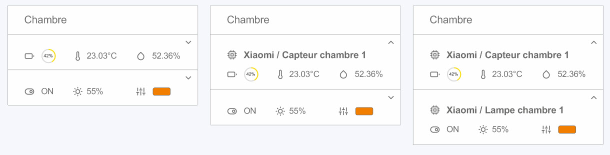
This is just a drawing, nothing coded ![]()
I do think I say that to joke! We keep this view in mind to modify maybe later we see if others have suggestions.
By chance did you do the drawing on what?
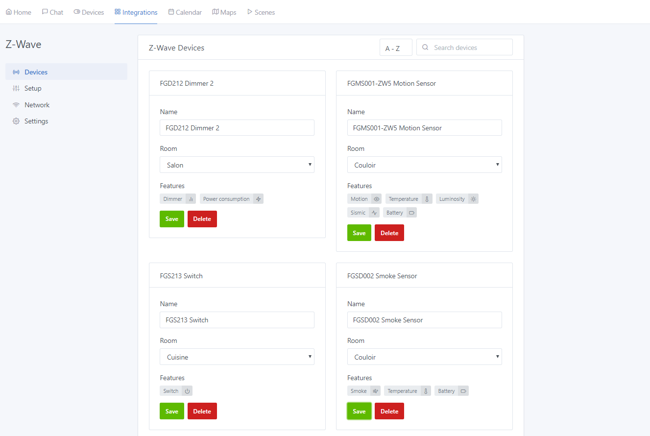
CorelDraw using the Feather icons
It’s perfect @luke !
It seems to please you ![]()
To be seen with @pierre-gilles!
Awesome!! Can’t wait to see the result! You have to do a presentation of your whole setup haha
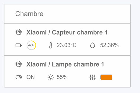
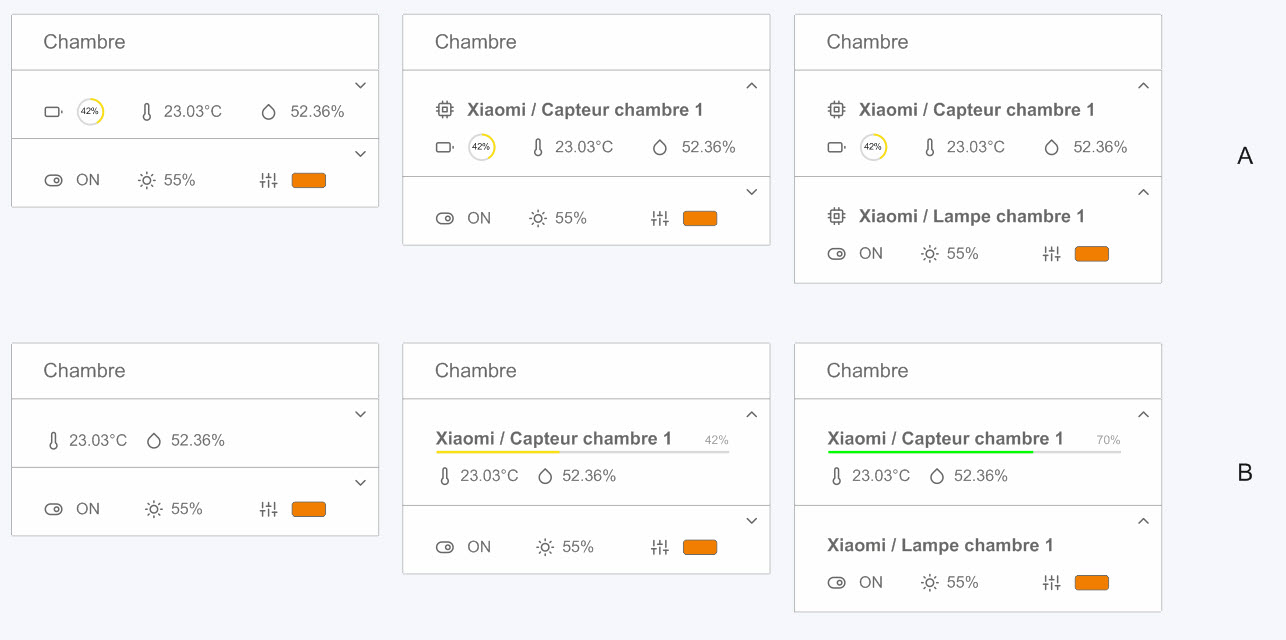
On my side, the battery information seems excessive or just to be displayed when it is low.
Otherwise, nice design!
I also really like it.
It’s simple and effective, nice drawing.
I really like what Luke is proposing.
Battery life is important to me, but it will depend on each individual.
I think that if we don’t include it now, another user will request it later.
For the battery, you can simply add it to the right of the sensor name with just the small circle. No need for the icon ![]()
Oh yes, this one is great as a view.
Cool! We’re going to hire you as a UX ![]()
I am a graphic designer ![]() well, among other things…
well, among other things…
No worries if you don’t code, you can definitely help us with this… ![]()
I admit that I prefer the « health » bar under the name rather than the circle that I find less visible.