Hello to all v4 developers ![]()
![]()
First of all, a big thank you for your involvement in v4. It’s so cool to see so many developers interested in this version, and we’re making huge progress thanks to you, bravo ![]()
I wanted to create a topic to discuss developments in general about v4. Think of this as a « general » channel for devs!
I’m starting with a first post to talk about the development process, but you can talk about anything and everything on this channel, that’s what it’s for.
@AlexTrovato @joeypic @link39 @Pti_Nico @billona @VonOx @Reno @bertrandda
Let’s talk about the development process
I’ve reviewed a lot of PRs recently, and I wanted to make a post to talk about the little things I’ve seen that keep coming up, so that we’re all on the same page ![]()
I warn you: I will mainly talk about the frontend, and I know, you are more like developers in love with technology, backend (like me!). For us, often the backend is the most important: I want to change that ![]()
For the user, Gladys is the frontend, the backend is a detail. Yes, it’s hard to make a good backend, but making a good frontend is even harder!
Note: In my developments for Gladys 4, some pieces of code that I wrote do not respect what I say here, because my thinking has evolved between the beginning of development more than a year ago, and now. I am trying to continuously improve the code to respect all this ![]()
1. The development process
For me, in v4, the UI/UX of services must be the most important part of your development. Generally, when I develop in v4 now, I start first with the front end to start from what I want visually, and then I go to the technology, the backend.
The backend must be developed to meet the needs of the UI, and not the other way around!
Think about the user flow!
2. Empty states
When a user arrives on an integration, they must immediately understand what to do. They must understand why the integration is in this state, and what to do to remedy it.
Example, on the home page, by default the user can see:
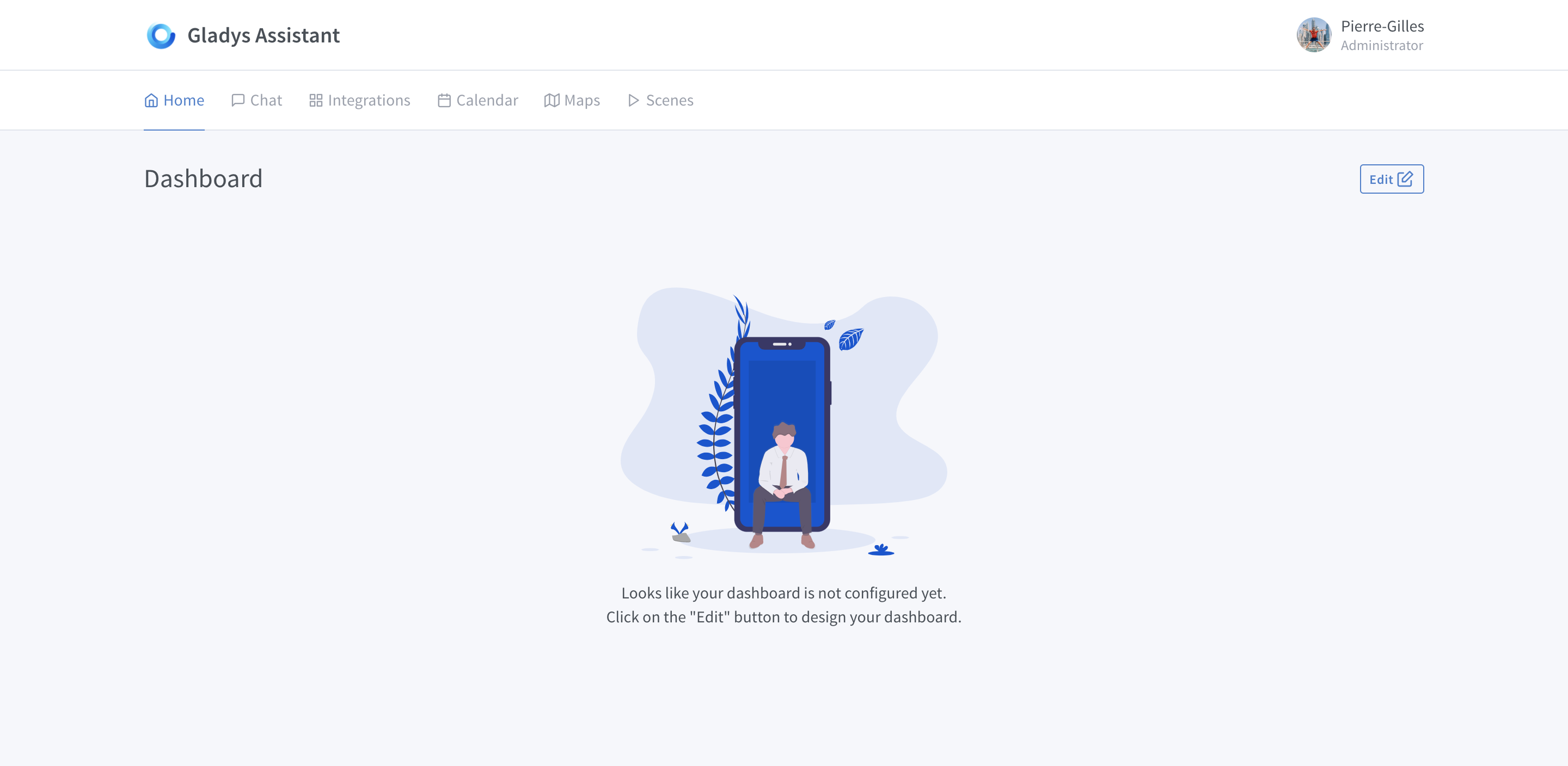
- A nice icon prevents the screen from being « empty »
- The first sentence tells him why this screen is empty: his dashboard is not configured.
- The second sentence tells him what to do: he must click on the « edit » button to configure his integration
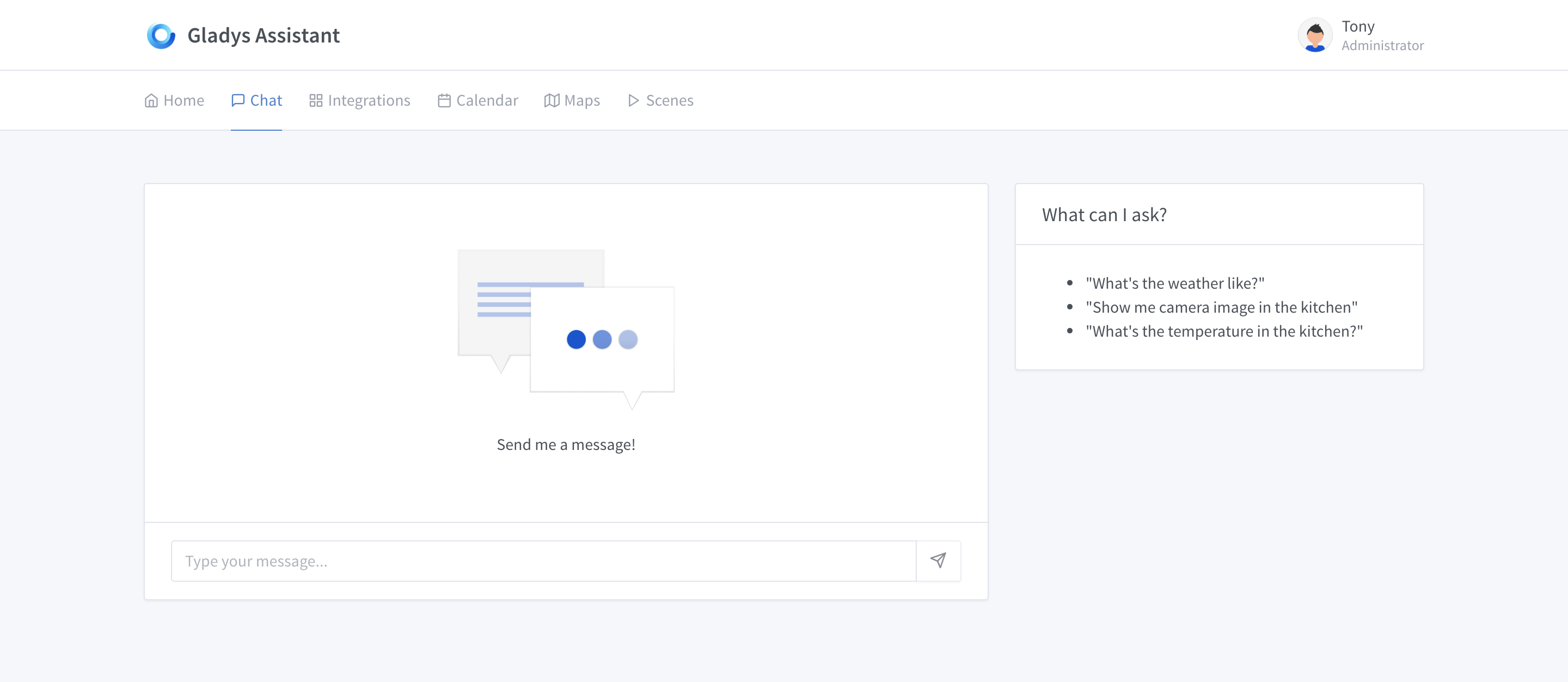
Another example, the « message » page, the default state displays a nice icon to fill in + a message indicating how to start:
All integrations must be like this, the user must arrive on the page and know:
- The state of the integration: Is it configured? Why is it empty?
- What to do to move forward: Does he have to press 3 seconds on the back of his device? Does he need to configure an API key? Or does he need to find it?
The UI of the integration must be self-sufficient, the user must be able to configure the integration without going on the internet or on the forum.
For additional information, it is possible to put a link to the documentation: but only to have additional information, this should not replace the basics of the empty state + what to do.
3. « Loading » states
If you perform actions and the UI is waiting for something, the user must know that something is going on.
Sending a message in progress…

Loading the image of a camera..
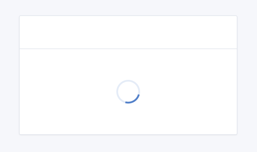
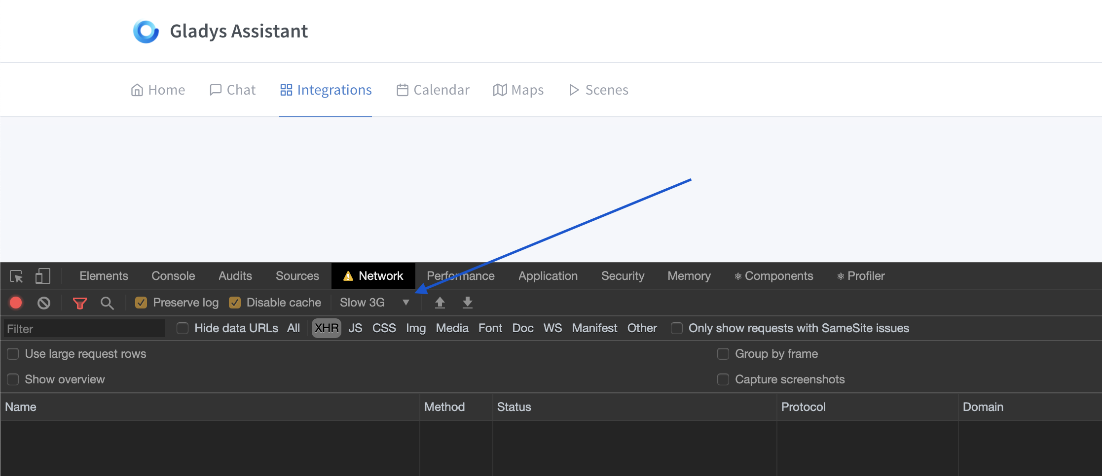
To test all this, I advise you to put your browser in « Slow 3G » to test the application with a lot of loading states:
4. Error handling
When the user performs an action in the UI, they go through different states:
- The request goes to the backend
- The front end waits (loading state), then:
- The front end receives a positive response: everything went well
- The front end receives an error code + an error message
The front end must handle all the errors that the backend sends, and each error from the backend must have a translation in the UI.
Errors must follow the same rules as « empty states »: an explanation of what is happening + a clear action on how to solve the problem.
Example on the weather box:
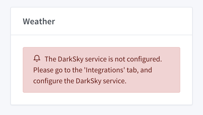
The error specifies 1) what is happening, « the darksky service is not configured » 2) the steps to follow to configure it, « he must go to the integrations tab, etc… »
Conclusion
It’s hard to make a good frontend! ![]() But what a reward, to see that users then get by without having to read 10 posts on the forum, and browse 10 docs…
But what a reward, to see that users then get by without having to read 10 posts on the forum, and browse 10 docs…
I make calls with community members every day right now, and they are all excited about the simplicity of v4 compared to v3 where some spent entire weekends just to find a piece of information that could have been on the service configuration page… ^^
Thank you all for your work ![]()