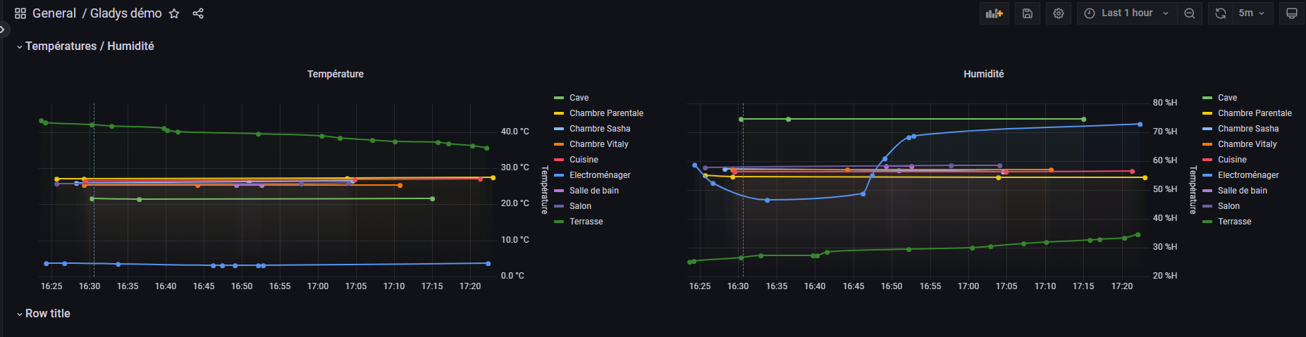
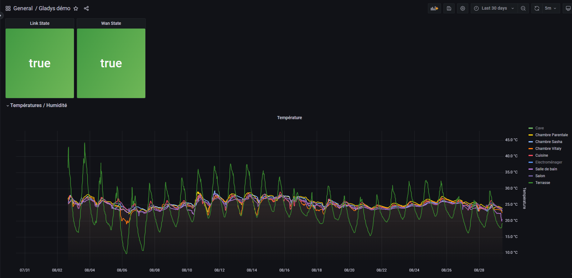
I would really appreciate being able to create charts in InfluxDB if needed, over several months and multiple sensors. In Gladys, aggregated data alone is sufficient for my dashboards (if necessary)
I’m referring to the improvements we discussed with @pierre-gilles.
I suggested the following to reduce database size, and therefore storage needs and improve speed:
keep 24 hours of raw data
only keep aggregated values for the last 7 days (roughly 100 values/day)
only keep aggregated values for the last month
keep aggregated values for the last year.
That way, Gladys ends up storing relatively little data and the dashboard graphs remain functional.
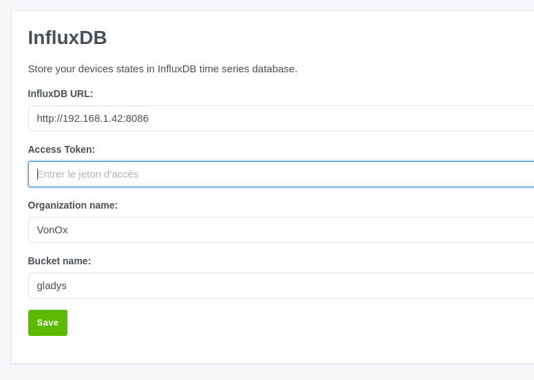
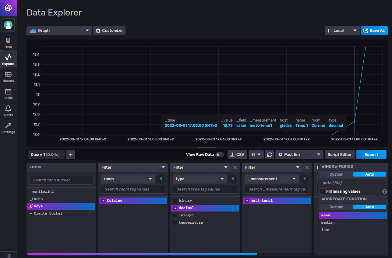
And finally, for visualizing and storing all raw data, we could offer the InfluxDB integration you’re working on.
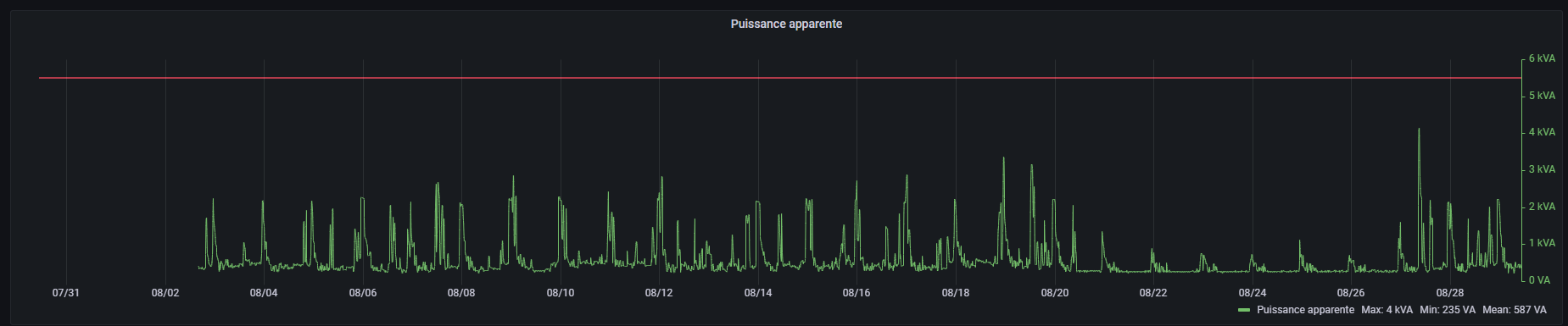
What are you pushing into your InfluxDB that makes it only 300 MB?
Otherwise it’s exactly what I was hoping for: viewing sensor data independently of Gladys when it comes to removing devices. It’s more complicated if you really want to delete all of a sensor’s data, but it allows addressing different needs and situations.