Hi @GBoulvin, yeah, you’re being unpleasant there!!
Are we talking about the device names in the legends?
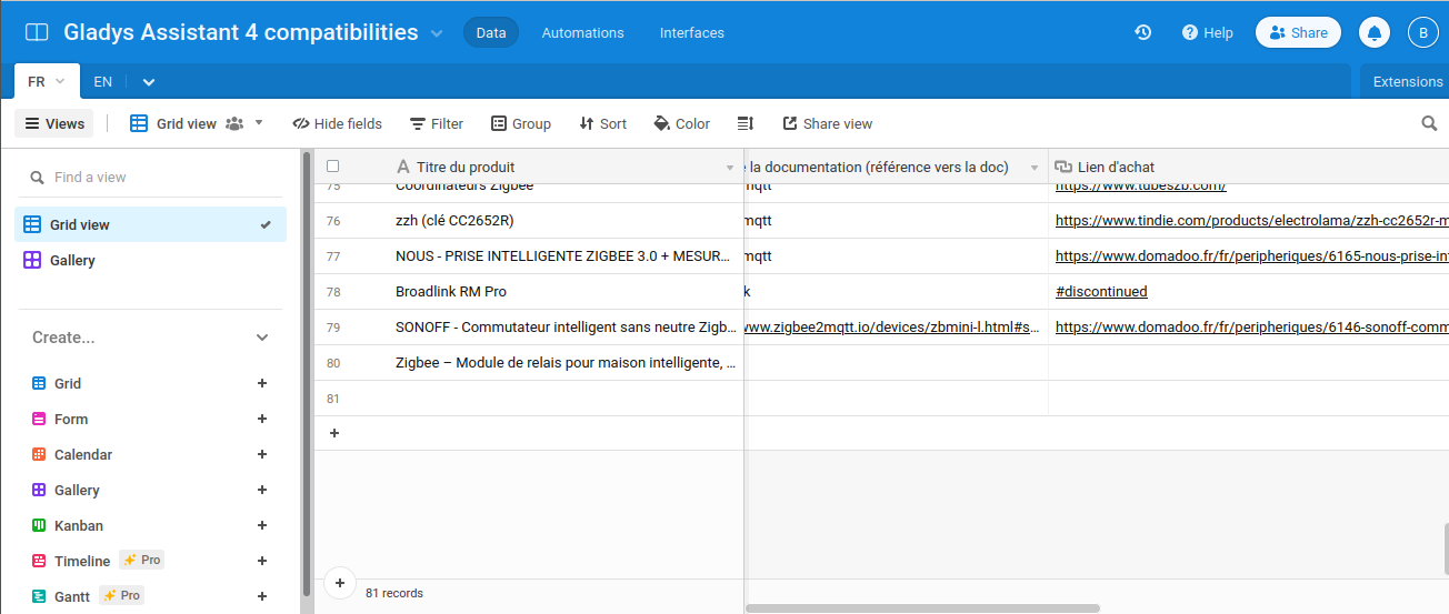
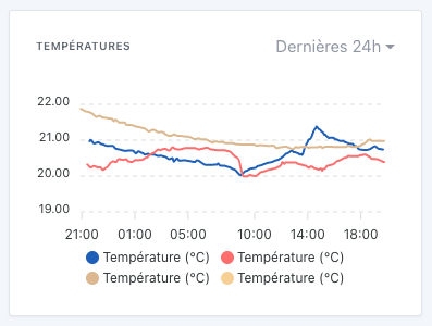
In the graphs, we chose to display only the feature name, and not the device.
In your case, that’s rather annoying… indeed…
Is this display from your local Gladys or from Gladys Plus?
@pierre-gilles on the website the page Intégrations | Gladys Assistant shows 61 articles while on Airtable there are 80, so maybe this page should be updated. Also, I don’t understand — on Airtable, if you switch the view to Grid, far fewer articles are displayed.
Both
So, a new situation…
I had put all the curves into a single graph to avoid multiplying them unnecessarily, in my view (they use the same scales). Same for the devices’ power graphs.
I suppose I just need to rename the devices
It’s a shame to have to rename it with the room name given that the device is attached to a room in Gladys.
Isn’t there a way to add the room in parentheses when a graph contains devices from multiple rooms?
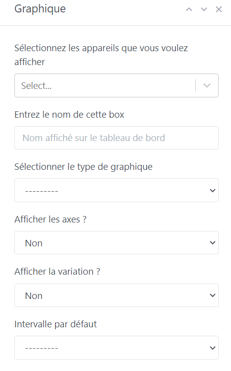
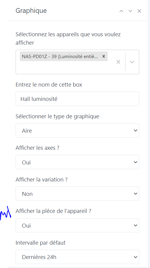
Where should we put an option in the chart? If it’s checked we add the room… With a feature, we should also put the room in the box title to determine which chart it is (so we could use this option to add the room to the title).
I think @pierre-gilles isn’t very keen on options in the boxes
[quote=« pierre-gilles, post:15, topic:7490 »]
For the option, I’m not a fan of options at all, especially for this kind of detail, we’re not Microsoft ^^ We can just add the decimal, that will
A note about the charts :
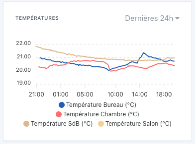
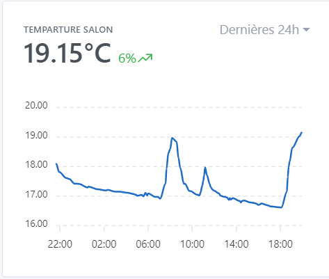
Quand je clique sur le format d’affichagedes dernières 24h j’ai les températures arrêtées à 11h50 (il est 13h37) et quand je change le format pour avoir la dernière heure, la dernière valeur est celle de 13h36… Pour les
Hello @gaetanb76 ,
je plussoie a ta remarque : I agree with your remark: I have graphs of outdoor temperature and rainfall (external weather station is retrieved via MQTT every 10 minutes); when my graphs are set to the last 24 hours, I notice that the last displayed data point does not correspond to the time when I check (here 13:53 and I see on the graph the data from 12:50, whereas in parallel on my data table I can clearly see the one from 13:50!).
furthermore sur les données 7 j , 1mois etc I notice that where we should have the day’s max data we display a smoothed (or averaged) value (e.g.: 8/11 I had more than 20 mm of rain, and the graph on that date shows 12.96 mm! not the expected!)
Salut @gaetanb76, effectivement c’est le fonctionnement prévu, en fait on utilise des données « agrégées » pour que l’affichage soit très rapide.
C’est de l’échantillonnage pour réduire la quantité de donnée à charger.
Exemple: si tu as un capteur qui envoie une donnée par 5 secondes, ça fait 30 données par minute, ça fait 30 * 60 = 1800 données par heure, ça fait 43 200 données par jour, et ça fait 1.2 millions par mois.
Si tu veux afficher le dernier mois de donnée, faire l’affichage de 1.2 millions de points n’est pas réaliste et serait super lent.
Du coup on a une tâche qui passe régulièrement pour échantillonner chaque capteur avec différents niveau de granularité:
Pour l’affichage en heure par heure, on calcule toutes les heures l’agrégation de l’heure précédente
Pour l’affichage jour par jour, on calcule tous les jours l’agrégation du jour précédent
Pour l’affichage mois par mois, on calcule une fois par mois l’agrégation du mois précédent.
Mais effectivement, la conséquence de ça c’est que sur l’affichage tu ne vois que les données de la période précédente.
Une solution que j’avais envisagé mais qui n’est pas concluante pour l’instant, c’était de faire un « mix » de la donnée agrégée et de la donnée « live » pour avoir la totalité du dataset.
Malheureusement, ça faisait assez sale parce que du coup la donnée live était très détaillée par rapport à la donnée agrégée qui est un échantillonnage.
Si jamais c’est un retour récurrent, je peux investir du temps pour trouver une solution, mais c’est un peu de boulot
Ca c’est autre chose, effectivement le graphique affiche des valeurs lissées actuellement!
Pour les types d’appareils comme ça, il faudrait afficher la « somme » et pas la moyenne. ça peut être une demande de fonctionnalité ça