I’m asking the question here, I may have missed something but I know there has been work on aggregation over 24h / 7d / …
The problem I notice is that it’s absolutely unusable when you set 7 days for a temperature sensor.
I want to compare the different temperature drops in the house at night and compare them with the daytime. If I set 24h it’s very good — I can broadly see the temperature changes. But over 7 days, it’s completely flat.
Of course, over 7 days, one point per day I don’t see the usefulness of being able to exploit that information.
It would be better, in my opinion, to have one point per hour, especially for 7 days?
I also find that part of the graphs quite impractical (or maybe it is in other cases). But indeed I also use the graphs for temperatures, and as soon as you go beyond 24 hours it’s not really usable.
In fact, one data point per day can be useful if, for example, you actually use the data — that is, compute an average, a max, a min. So produce several pieces of information per day. And in that case we could make slightly better use of the graphs.
These intervals can be modified, but keep in mind that the more data we request/display, the slower it is to render, so we need to find the right balance between too much data and not enough!
For this, I agree, we can « blow up » the DB (database) if we keep too much data. But conversely, if the data isn’t exploitable, we might as well delete it
In my view it needs to be exploitable:
over a week, one point per hour
over a month, 4 points per day? (00:00 / 06:00 / 12:00 / 18:00) This is actually for temperature sensors quite representative of reality given working during the day, turning off the heating, etc.
above that, currently given the graph (impossible to zoom / go back to a particular day), we could maybe leave it as is except > 6 months => 2 / 4 points per month, it doesn’t cost too much
What do you think?
We can always do two operating modes with a configuration on the dashboard that explains how aggregation works? A « disk-saving » mode and a « high-usage » mode.
I’m not necessarily sure if that’s really useful then? We have the data but we don’t use it.
With Thanos for example (backend for querying all kinds of system/application metrics) it’s possible to do aggregation on data older than x days / months.
So instead of keeping the raw data indefinitely, we can say after 1 month, produce only 1 point every 10 minutes instead of every minute for example, and then after 3 months, 1 point every hour.
hello,
not wanting to be unpleasant, this questioning ties in with my feature request regarding the calculation mode of the graphs!
namely that beyond 24 h the graph returns « averaged » values, which in many cases makes little sense for monitoring (weather measurement, room temperature, greenhouse, aquarium, etc).
for example over the
Depending on how it’s used — for weather data or tracking the temperature of a greenhouse or an aquarium — the average means nothing: Wednesday with an absolute 38 mm of rain makes sense, whereas 29 mm on average in the 7-day graph no longer means anything. It all depends on how the graphs are used. For me, the fact that it’s not in Gladys forced me to have a third‑party app for the weather and another for my greenhouse, so you lose a bit of the point of Gladys as a home‑automation app if you have to multiply apps, and at the same time we develop other integrations (which is good in itself but…).
Gladys is still used by everyone with different needs, so you have to think broadly. That’s why I’m talking about min + max + average, which helps cover as many possibilities as possible, even if the average isn’t useful in your case — in other cases it is.
And of course you also have to make a decision that’s easy to implement without taking too much development time.
Yes I’m 100% with you — as it stands the « long-duration » graphs are not usable for rain sensors. After that, it doesn’t seem to me that your request got that much popularity?
I’m not sure everyone understands its purpose (too focused on alarm-monitoring and motorization… on short timeframes, but not on long-term follow-up) and that’s a real pity because to extend the scope of this tool that would be very useful.
And alongside that, I’m not sure that all the development that’s done is systematically the subject of a request (ad-hoc development) or of significant voting.
I’m not questioning these developments but we shouldn’t systematically
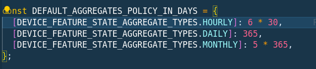
Quand on affiche la vue graphique, tu as le choix entre piocher dans 4 jeux de données: le live, les données heure par heure, jour par jour ou mois par mois.
La l’idée de ton retour, c’était de modifier la requête qui lors de l’affichage, va chercher et grouper les données. La partie calcul des données agrégées ne change pas
Ok I saw some things to change, I’ll make the appropriate changes. I thought we wanted to be more precise about the number of points per graph display duration.
But no worries I had spotted this file