Gladys Assistant v4.26.1: Mosquitto pinned to v2.0.15, Google Home, improved graphs

Hi everyone!

I hope you had (or are having) a good summer holiday :sun_with_face:

As for me, I got back to working on Gladys last Friday and I just published an update today with a few fixes.

Mosquitto (MQTT) version pinned to 2.0.15

Mosquitto released a new version of its MQTT broker, and this version suffers from some bugs that, for some of you, prevent the use of the MQTT integration and Zigbee2mqtt.

In Gladys, I decided to pin the version to 2.0.15 for now while the issues persist.

If you are affected by the problems, after the update you may need to go back into the interface and re-register the password on the MQTT integration side, or restart the Zigbee2mqtt integration to properly overwrite your Mosquitto configuration file.

Managing the color temperature of a Zigbee lamp in Google Home

IKEA Tradfri bulbs sometimes come as white bulbs where the white temperature is adjustable (cool or warm).

Google Home handles this temperature in Kelvin, whereas Zigbee handles these temperatures in Mired.

This conversion step didn’t exist in Gladys, so I added it to allow control of these IKEA Tradfri bulbs.

For info, IKEA TRÅDFRI connected LED bulbs are available from €9.99 per bulb at Ikea, (without temperature control), or €12.99 with temperature control — so it’s a great deal; the prices are close to those of standard LED bulbs for very high-quality bulbs.

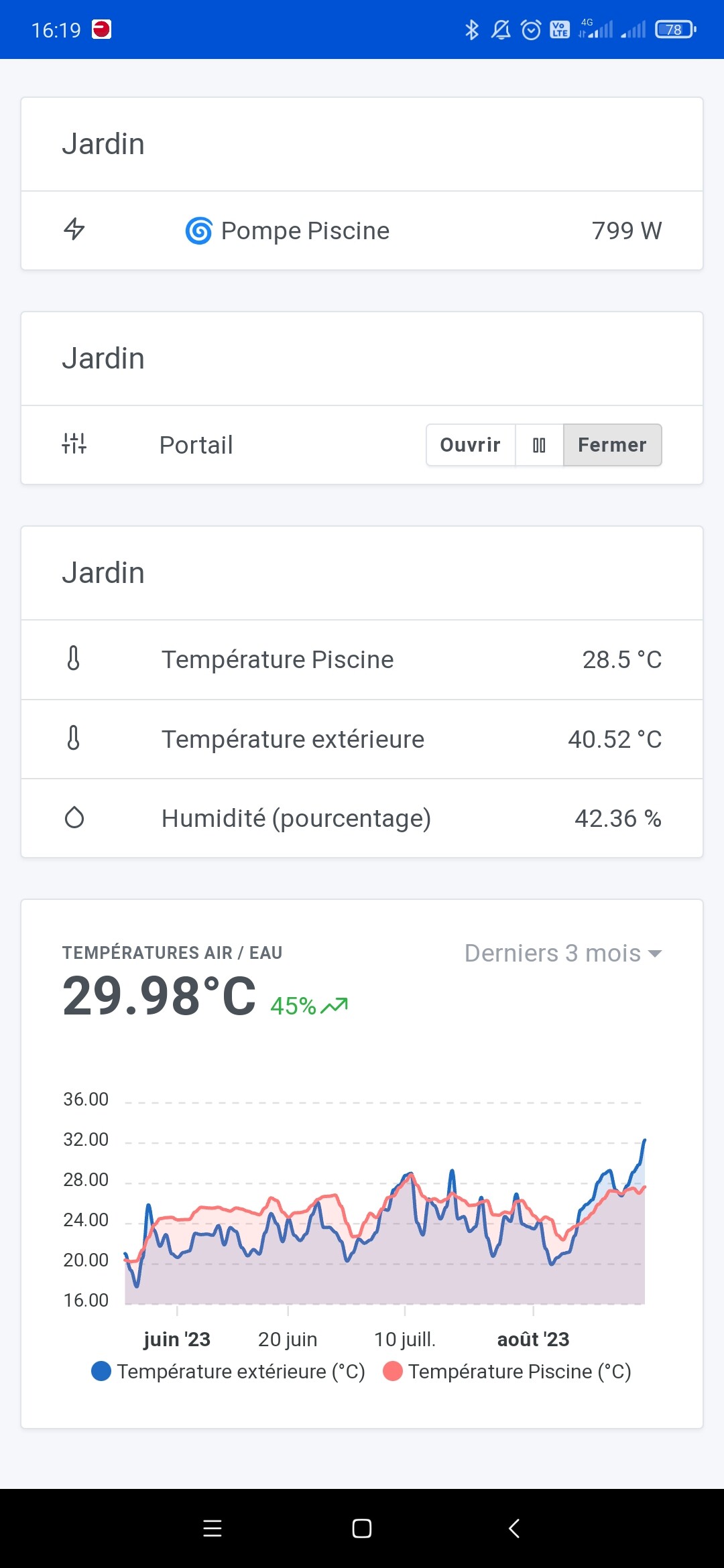
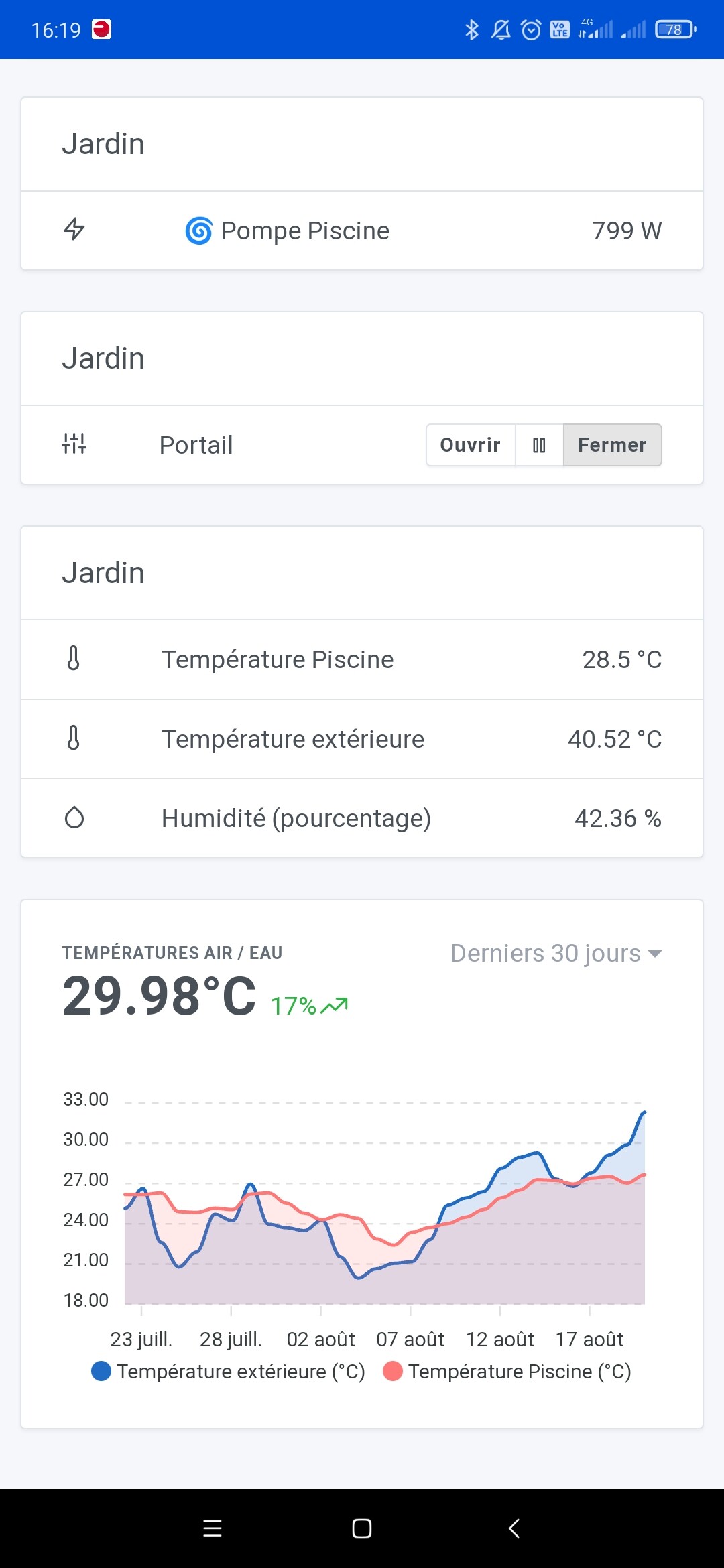
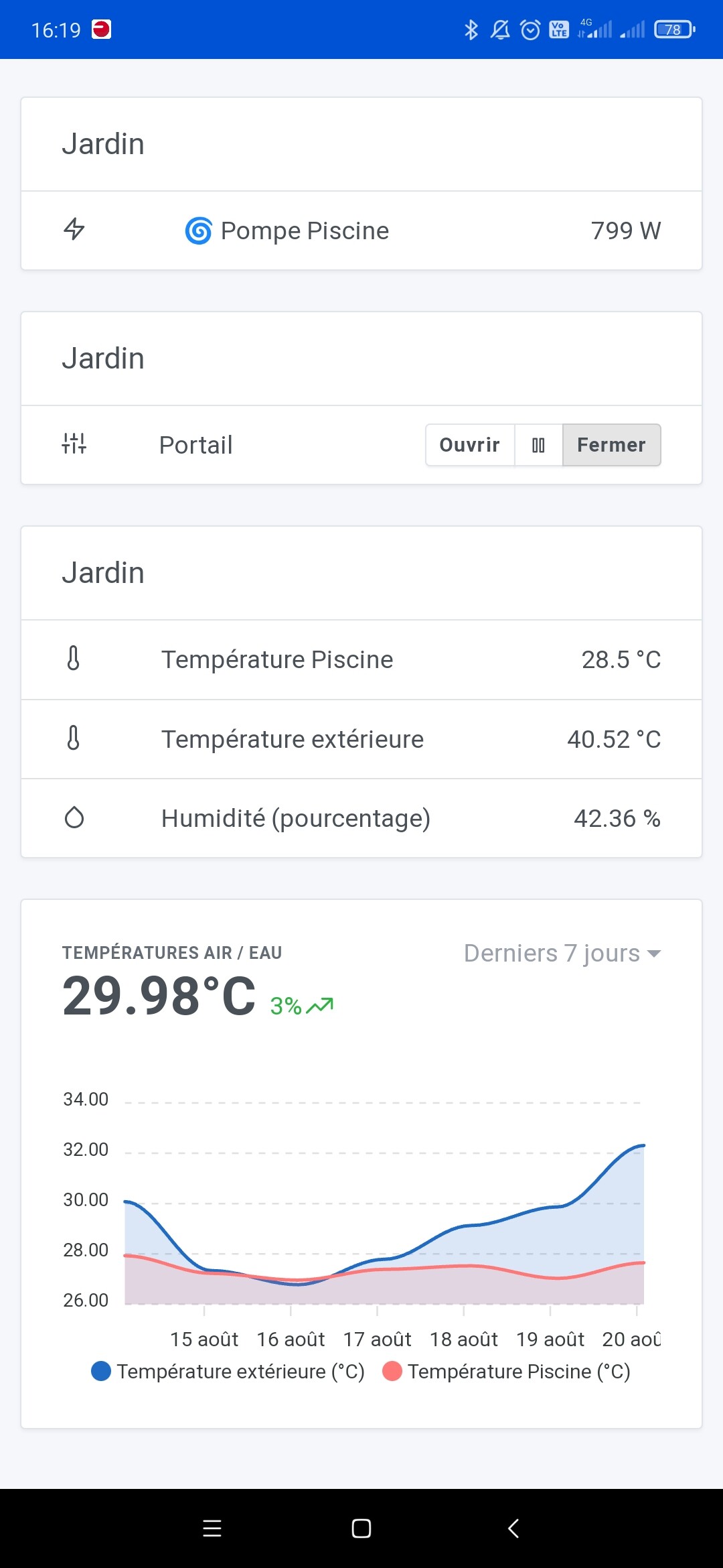
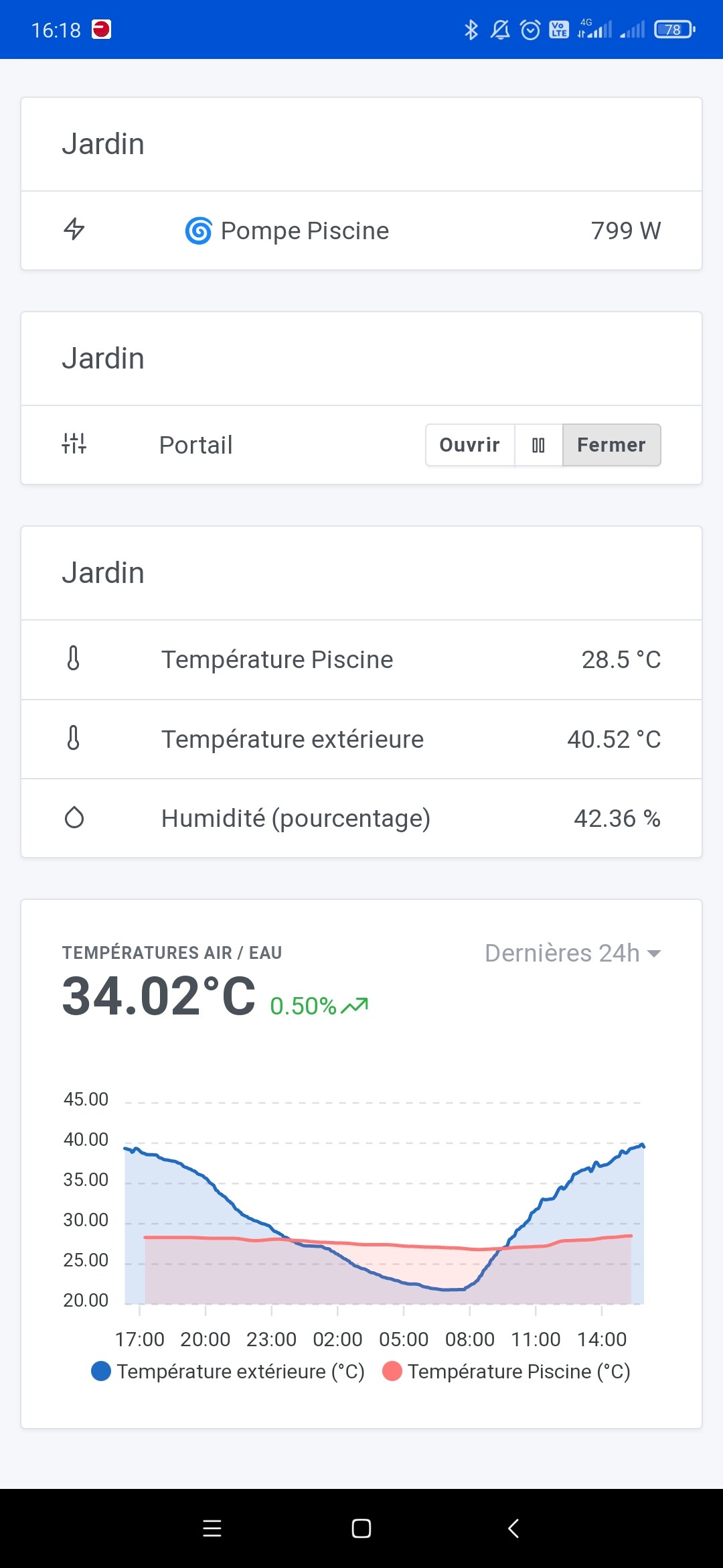
Charting library update

We use ApexCharts in Gladys, a library that generates charts to display curves on the dashboard:

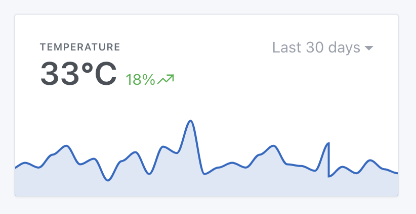
Several users reported bugs related to this library, and a recent version of this lib has been released that fixes certain bugs. So I updated it!

Some other fixes:

  • The chat height is now dynamic and expands according to your screen size. Thanks @cicoub13 for the fix!
  • Spelling fixes in the LAN-Manager integration. Thanks @qleg for the PR!
  • Stability fix in the NextCloud Talk integration. Thanks @bertrandda for the PR!

The full changelog is available here .

How to update?

If you installed Gladys with the official Raspberry Pi OS image, your instances will update automatically in the coming hours. This can take up to 24 hours, don’t panic.

If you installed Gladys with Docker, check that you are using Watchtower ( See the documentation )

6 Likes

Great update! :+1: Well done everyone.

I have a question, maybe I’m not the only one…
I’m having trouble understanding the meaning of the data in a graph. Here’s my dashboard with, on the same graph, the temperature of my pool water and the outside temperature.
Depending on the data range, I have no idea what the numbers are supposed to mean… :thinking:

Here are a few screenshots:


What’s more, it’s strange that for the 7-day, 30-day and 3-month time ranges, the value in degrees is the same.

Anyway it’s not super clear to me :sweat_smile: if anyone has any insight to share!

I don’t really get what you don’t understand? ^^

The data for « 7 days »/« 1 month »/« 3 months » are aggregated, so it’s an average :slight_smile: We only show precision on the « 1h » and « 24h » views, so it’s normal if it’s smoother on long-term views.

Great update, however I have a question regarding the IKEA TRÅDFRI modules: I have an E1743 on/off switch — is there any plan to support that one? For now it doesn’t work, which is a shame because the prices are attractive.

Thanks for the work you do

Ah, strange that it doesn’t work, you do mean this one:

?

Look in the Zigbee2mqtt documentation, they talk about 2 modes, legacy and new, maybe you need to enable something on the Zigbee2mqtt side for it to work on the Gladys side?

Yes, that’s the one, Zigbee2MQTT sees it and it responds, Gladys recognized it too, but how can I turn something on or off with it??? In features it says « button click »

Try to spot the action associated with each click, and then create one scene per click/action :slight_smile:

Exemple:

Don’t hesitate to create a dedicated thread if you need help :slight_smile:

OK thanks, I’ve already done it

Could you create a specific thread on the forum so we can discuss it in more detail? :slight_smile: There’s no reason it shouldn’t work.

Beyond 24 hours, aggregation in the form of « average » causes problems, especially for graphs of temperature and rainfall. An approach with two options, min or max, would be more realistic for better monitoring.

Indeed, there are 2 feature requests (quite redundant) that go in that direction:

Very few votes on these so far

Good evening,

Thank you for the updates.

2 Likes

Thanks for your reply :slight_smile: I may not have been very clear about my question.
I understand aggregation, but in these cases I don’t really see why the 7d / 30d / 3mo view display the same value at the top: 29.98°C :thinking: even if it were an average it’s unlikely to be identical for each time range.

Also, my chart showing 2 temperature values — what does the single displayed value correspond to? An average of the two temperatures? Which in itself doesn’t make much sense for my use.
On my 24h screenshot, we see that the outside temperature is 40.52°, the pool is 28.5° and the displayed value is 34.02°.

In short, it’s a bit unclear to me at that level. But I have the impression that lots of people use charts for many different things: temperatures, the level of a tank, electricity consumption… which means the value calculations aren’t supposed to be the same. Is it possible to « customize » these charts depending on the type of data you want to display?

2 Likes

The value at the top corresponds to the last value of the graph, and if there are multiple curves:

  • If the units of the two curves are the same, an average is calculated
  • If the unit is different, then only the first curve is taken into account

It’s true that it doesn’t necessarily make sense for everything, you can disable the display of this value if you wish :slight_smile:

2 Likes