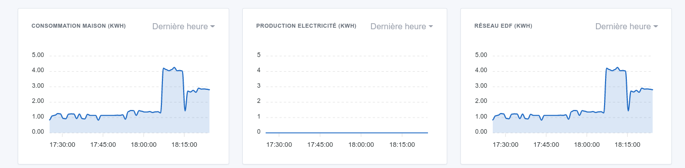
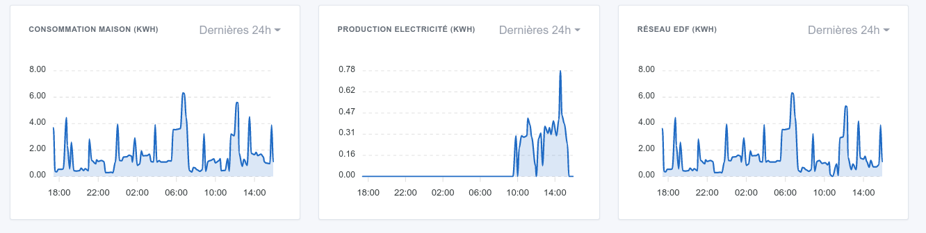
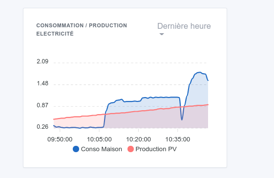
The issue in my case is that the graph of electricity production is on a scale VERY different from the other two, which makes the visualization not very interesting, as it is good to have the same scale on these 3 graphs, regardless of the interval displayed.
Would it be possible to find a solution to this? An option in the graph that would say: Adjust the graph scale to the received values: yes / no?
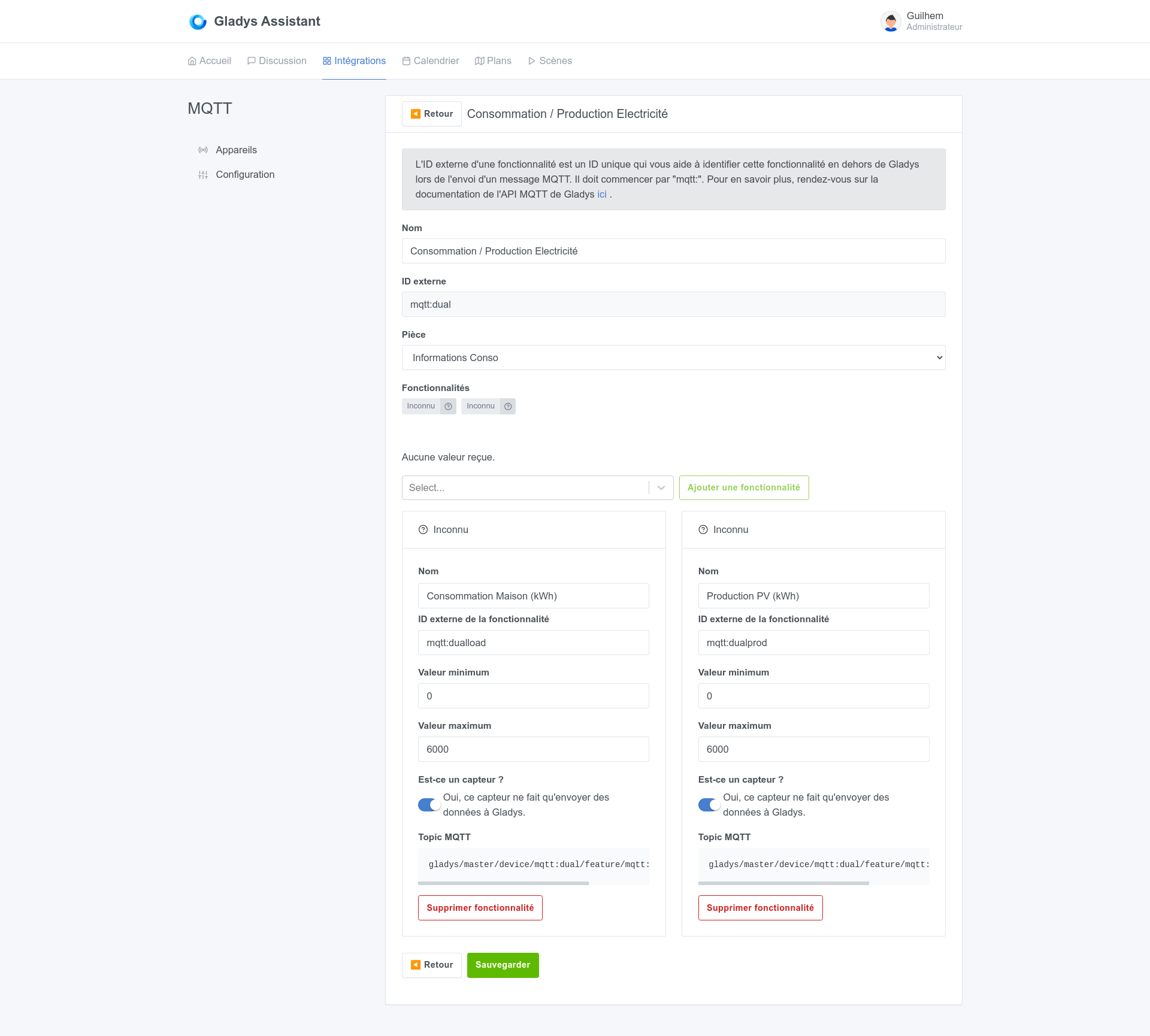
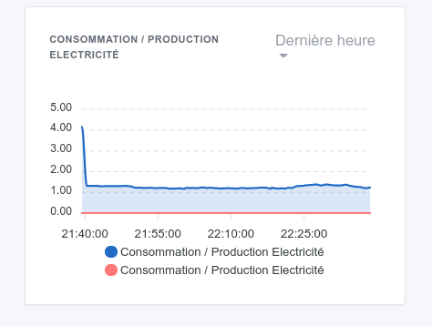
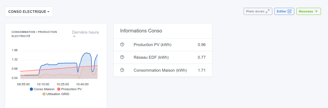
Moreover, is it possible / planned to be able to display multiple values in the same graph? In my case, this would allow me to « merge » my 3 graphs into one, a bit like in my Solaredge app:
This is the name of the device being used. You need to create another device! In Gladys, a device is not really designed to have multiple functionalities of the same type.
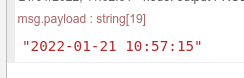
However, is it possible to display a time value in the dashboard?
I want to display the date/time of the last data update received, and I can’t figure out how to do it:
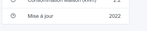
This is not possible! In fact, Gladys already has the date of the last received value, it’s just not displayed. I think there were proposals to display it when you hover over the value.