Well, in any case on my side, I really like the result. And combined with the other adjustment to rounding, it’s going to be great!
I’ll prepare that for you…
@pierre-gilles, I think you should replace the end of your code with this:
    // Optional: Constrain the step size
    const nbTheoreticalStep = (maxY - minY) / f;
    let stepSize = f; // Default step size

    // Adjust number of steps for better visuals
    if (nbTheoreticalStep > 5) {
      stepSize = f * 2;  // if too much steps, increase step size
    } else if (nbTheoreticalStep < 3) {
      stepSize = f / 2; // if too few steps, reduce step size
    }

    return { minY, maxY, stepSize };
@StephaneB It’s been updated!
Still at the same URL:
https://fix-chart-min-max.gladys-plus.pages.dev
Open to new feedback then ![]()
It’s good on almost all my graphs. Except two, actually.
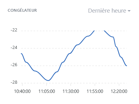
On this one, the graph is cut off at the top. But I know where it comes from: it’s a case where the theoretical number of steps is 7 and the adjustment makes it go to 3.5, and that causes an issue… I’m looking into it to suggest a code fix
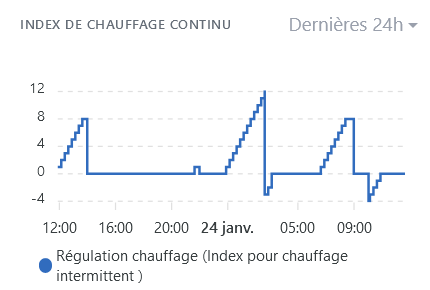
On that one, however, I don’t understand how the calculation results in a scale -4;0;4;8;12. It’s neat, but with the code I expected -10;0;10;20. I’ll try to understand, and I’ll get back to you…
@pierre-gilles For the first chart, the code below should be better. Basically, when the amplitude of the x-axis is not an exact multiple of the step, we ‹ shift › the x-axis range up or down.
    // Optional: Constrain the step size
    const nbTheoreticalStep = (maxY - minY) / f;
    let stepSize = f; // Default step size

    // Adjust number of steps for better visuals
    if (nbTheoreticalStep > 5) {
      stepSize = f * 2;  // if too much steps, increase step size
	  if !(isInteger((maxY - minY) / stepSize) {
		// If the range is not a multiple of step size, minY or maxY must be adjusted.
		// Adjustement is choosen for a good centering of the graph
	    if ((maxY - maxVal) < (minVal - minY)) {
		  maxY = maxY + stepSize / 2;
		} else {
		  minY = minY - stepSize / 2;
		}
	  }
    } else if (nbTheoreticalStep < 3) {
      stepSize = f / 2; // if too few steps, reduce step size
    }

    return { minY, maxY, stepSize };
@pierre-gilles, I just went through the ApexCharts options. Wouldn’t what we’re coding here actually have been handled directly by the ‹ forceNiceScale › option?
Another detail: if the graph’s values are negative and positive (I’ll take -28 to +26 as an example), we’ll have the following values on the axis: -30 -10 10 30. And I think it’s a shame not to see zero.
My favorite AI tool tells me we can do this with annotations (to have a light dashed line at y=0):
var options = {
  // ... other chart options ...
  annotations: {
    yaxis: [{
      y: 0,
      borderColor: '#00E396',
      strokeDashArray: 5, // Creates a dashed line
      borderWidth: 1,     // Line thickness
      opacity: 0.7,       // Line opacity (optional)
      label: {
        show: false       // Hides the label
      }
    }]
  }
};
What do you think?
The idea would be to add it only if minY is negative and maxY is positive, because it’s not useful if everything is ‹ far › from zero…
I just tested forceNiceScale, I don’t see any difference with the option currently in prod!
Your code isn’t valid, for your information here is the code currently on the PR:
calculateYAxisRange = () =\u003e {
    const { series } = this.props;
    // Extract all values from all series
    const allValues = series.flatMap(serie =\u003e serie.data.map(([, value]) =\u003e value));

    const minVal = Math.min(...allValues);
    const maxVal = Math.max(...allValues);

    const range = maxVal - minVal;
    const f = Math.pow(10, Math.floor(Math.log10(Math.abs(range)))); // Scaling factor

    const minY = Math.floor(minVal / f) * f;
    const maxY = Math.ceil(maxVal / f) * f;

    // Optional: Constrain the step size
    const nbTheoreticalStep = (maxY - minY) / f;
    let step = f; // Default step size

    // Adjust number of steps for better visuals
    if (nbTheoreticalStep \u003e 5) {
      step = f * 2; // if too much steps, increase step size
    } else if (nbTheoreticalStep \u003c 3) {
      step = f / 2; // if too few steps, reduce step size
    }

    return { minY, maxY, step };
  };
I’d like you to modify this piece of code and then send it to me ![]()
PS: too bad you can’t test directly ^^ I don’t know if you have a Github account, but you can launch a Gladys environment with a single click from Github, that would avoid the back-and-forth ![]()
This time, it should work. I tested in Codepen, and spotted my 3 mistakes ![]()
calculateYAxisRange = () => {
    const { series } = this.props;
    // Extract all values from all series
    const allValues = series.flatMap(serie => serie.data.map(([, value]) => value));

    const minVal = Math.min(...allValues);
    const maxVal = Math.max(...allValues);

    const range = maxVal - minVal;
    const f = Math.pow(10, Math.floor(Math.log10(Math.abs(range)))); // Scaling factor

    let minY = Math.floor(minVal / f) * f;
    let maxY = Math.ceil(maxVal / f) * f;

    // Optional: Constrain the step size
    const nbTheoreticalStep = (maxY - minY) / f;
    let step = f; // Default step size

    // Adjust number of steps for better visuals
    if (nbTheoreticalStep > 5) {
      step = f * 2;  // if too much steps, increase step size
      if (! Number.isInteger((maxY - minY) / step)) {
        // If the range is not a multiple of step size, minY or maxY must be adjusted.
        // Adjustement is choosen for a good centering of the graph
        if ((maxY - maxVal) < (minVal - minY)) {
          maxY = maxY + step / 2;
        } else {
          minY = minY - step / 2;
        }
      }
    } else if (nbTheoreticalStep < 3) {
      step = f / 2; // if too few steps, reduce step size
    }

    return { minY, maxY, step };
};
I have a GitHub account, created when you asked me to open an issue ![]() but I haven’t done anything else with it.
but I haven’t done anything else with it.
When you say ‹ launch a Gladys environment in one click ›, is that to get a dev environment to run on my Windows computer, or is it a full online ‹ sandbox ›?
Actually, the computer isn’t mine but my company’s, I can’t install quite whatever I want on it ![]()
Tinkering with little things online (like here for example this bit of code, by testing it in codepen.io, I can do that…)
Thanks! I just updated the PR, this is how it looks with the data you gave me:
Still available at the same URL: https://fix-chart-min-max.gladys-plus.pages.dev
It’s a development environment entirely in the browser, like CodePen. It’s called « GitHub Codespaces », there is a free plan with 120 core-hours free per month ![]()
The Gladys repo is well configured to support this tool; it launches in one click here:

Then you’ll end up in a VS Code in your browser, and it’s a ready-to-go environment that lets you do the same as locally (all dependencies are already there)
Everything is explained in the Gladys documentation:
Otherwise, I recommend the live coding sessions I did on YouTube, where I explain on video everything I do ![]()
[quote=« pierre-gilles, post:32, topic:9297 »]
It’s a dev environment entirely in the browser, like CodePen. It’s called « GitHub Codespaces », there’s a free plan with 120 core-hours free
Tested with your URL (very handy, by the way!), and it renders all those charts really well with readable scales!! In my opinion, it’s ready to be merged ![]()
It’s good for me (electricity, temperature, air quality) over several time intervals ![]()

Indeed, previously this was handled by ApexChart but now we have to re-code that whole behavior since we’re manually managing the min/max. There is a legendClick event that allows doing that.
I’m willing to take care of redoing everything, but I’m starting to ask myself: is what we’re doing really useful? ![]()
I feel like we’re re-coding externally everything ApexChart already does, and for now I admit I’m just copy-pasting what @StephaneB gives me without questioning it, but at the moment I see almost no difference with what’s in prod ^^
@StephaneB does what you propose really seem better to you?
I still haven’t understood what the problem actually was.
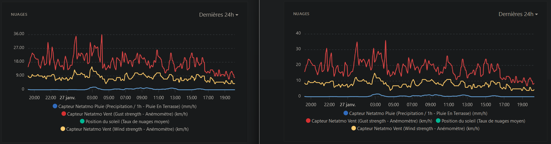
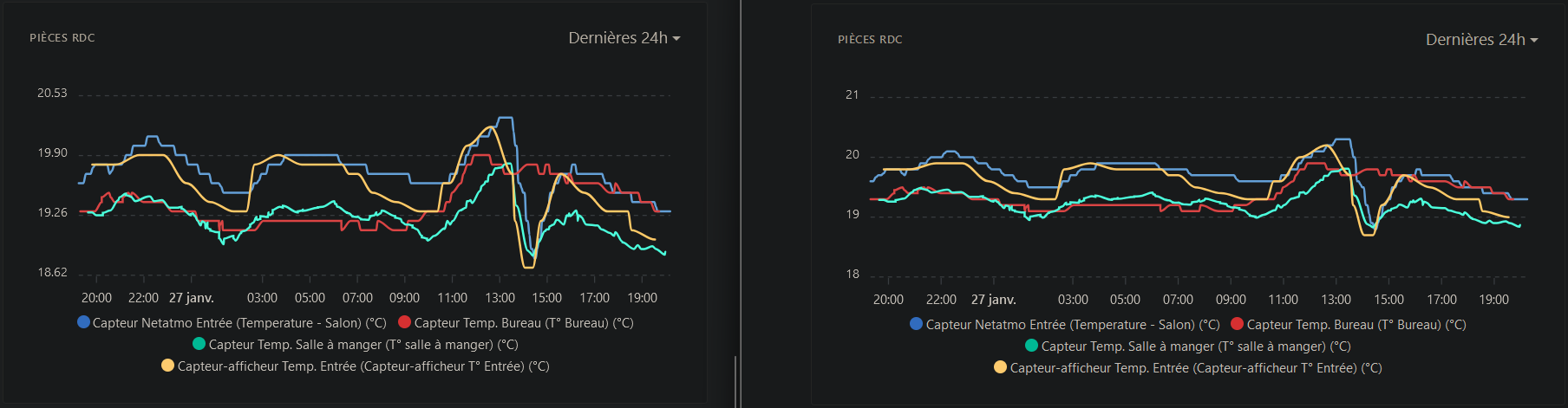
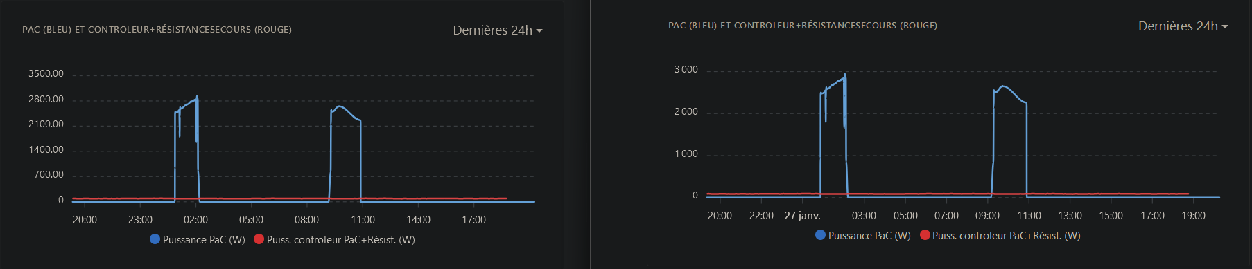
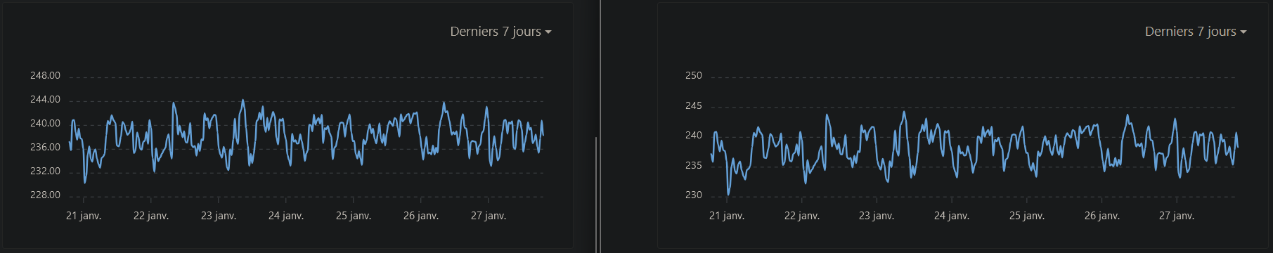
Some examples of charts that I find are really more readable, because the y-axis has become ‹ logical › :
I hardly ever remove curves. When I have a case like the one @GBoulvin shows, with devices that aren’t at all on the same scale of values, I prefer to make two graphs so they remain readable.
But I of course understand the concern…
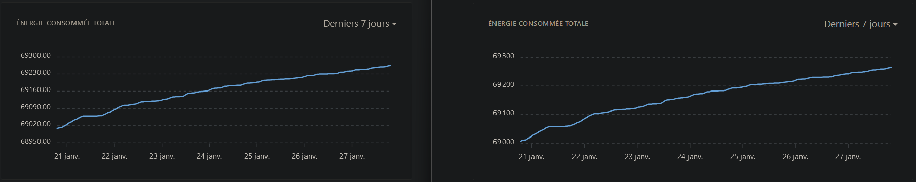
If on the left it’s prod, you’re comparing two different things there so it’s hard to compare. I’ve made