I’m coming like a fly in the ointment (since I haven’t even installed anything at my place yet) to suggest something. Maybe it has already been done but I didn’t see it in that case.
Is it possible in one way or another to have a dashboard in the form of a house plan?
Something like this: http://jsfiddle.net/syzner09/1/
I just spent 1000 years making this jsfiddle… so don’t destroy my dream right away!! hahaha
With a display of commands:
Global: turn off the light in the whole house / close all the shutters
Per rooms / zones
Hi @guim31,
I had the same idea too (easy to say, probably less easy to implement).
I think it would really be interesting if real added value could be brought by this module, other than seeing your own house in digital.
On my side, this won’t be my priority in development, but if the community considers this module indispensable, I might change my priorities
In fact, I suggest this because I am like everyone else: attracted to ergonomic and easy-to-use things.
If I can afford to struggle a bit, it’s not the case for the other inhabitants of my house ^^
The added value seems simple to me: you don’t read, you click on images/symbols > it’s much faster and resembles more what we already do with our switches.
To give an example, I’ll try a comparison:
The current version of the Dashboard would be like if, in my house, I had put all the switches / all the buttons of the house in one and the same place. Except that there are many and I therefore have to put labels to know what they operate.
The bottom line is that it’s a bit tedious and I can’t remember everything.
On the other hand, if I contextualize the buttons a bit, I can understand them without reading:
I click on the floor / room / area with which I want to interact and access the different modules.
It’s just what we do instinctively, we get closer to the place and then use the buttons that are there.
Note that I may be the only one to see it this way ^^
I would love to have the skills to do this, unfortunately that’s not the case at the moment.
Ok, you’ve found some good arguments: the others
If you have some graphic and ergonomic knowledge, you can already provide an acceptable rendering and a way to use it.
On the technical skills side, we’ll surely find someone
If we continue further on the subject, it might be preferable to open a dedicated topic.
Oh boy, the most controversial topic in home automation: the floor plan view
I’ll give my opinion ^^
I find that it’s often very appealing as an idea on paper (and in designs), but in practice it’s often very impractical to use and the result is messy. I’ve never seen a home automation interface that does it and where it’s clean…
Don’t forget that the interface is responsive and works just as well on browser, tablet, and mobile. That’s often where these interfaces fail: it’s cool on a large screen, but much less on mobile (where mobile is the main use in home automation).
After that, I would be happy if you could prove me wrong I’m not closed-minded, but from my side I have the impression that it’s a bit of a classic dream in home automation where no correct solution has been found yet…
Do you think it’s possible to use a Squeezebox interface on Gladys?
Because I only use that for my music depending on the room I’m in, but if there was a way to control it with Gladys, that would be great! Plus, it would avoid conflicts.
Hello @pierre-gilles! I’m glad you’re joining in, I was wondering what your opinion on the matter would be.
I completely agree with you, but my perspective is different: it’s important to have responsive design (it’s the basics), but if I have a large control screen, why not a « dedicated » dashboard that can be used at will?
In short: those who can do more can do less. Knowing that the idea is precisely to avoid the pitfall of overloaded/poorly ergonomic plans
Another solution, in Philips Hue there is a great selection of scenes (Savannah Sunset, etc.), we could also create a dashboard box that would allow you to put a scene in a room, which would allow you to create color effects in the Hue app that is very well done, and then just call these scenes in Gladys: we would then fully take advantage of the hues!
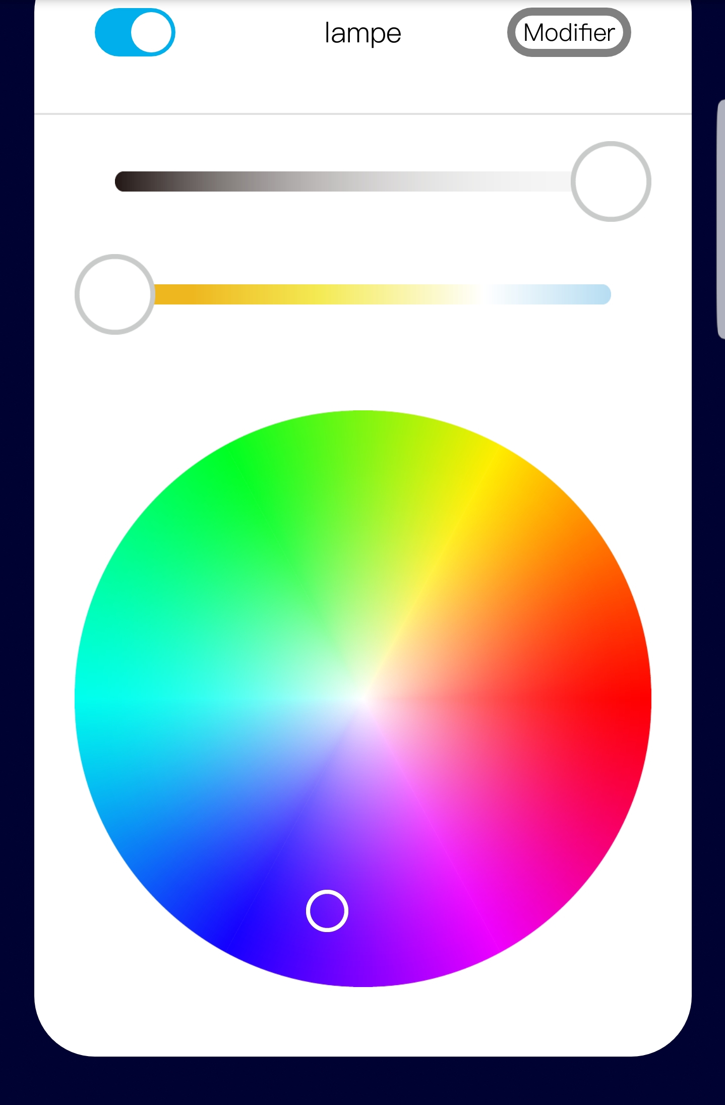
After having tested many interfaces to manage colors (Color picker in particular), I went back to something simple like you propose with color squares. It’s much more effective.
Hmm honestly, I’m not a fan of hex codes, we’re talking about the homepage, the Gladys dashboard, right! Who’s going to type a hex code on your phone? ^^ Nobody knows what a hex code is…
I see more of a color selection for the homepage… Or simply a selection of Philips Hue scenes as I mentioned earlier, it’s more user-friendly.
I am not a user of hue, but of other bulbs: xiaomi and mi-light. All the bulbs allow more or less the same things. Wouldn’t a generic box be possible? As far as I remember, we had discussed the subject higher up in the topic a few months ago. I even think someone had proposed boxes and it would look really good.
The notion of a scene, on the other hand, is specific to each brand, so it’s not easy to do something generic in this case.
For my part, I find that the datapicker is pretty and classy, but when you need to find a color you liked, it becomes complicated. So I lean towards the same solution as you, something simple, twiter or circle.
I agree with @link39.
I have RGB outdoor spots that I flashed with Tasmota, as well as RGB indoor spots controlled by IR. It would be great to control them all from the same location.
Regarding color selection, I find Circle nice (it’s a bit different from the classic). However, it would be great to have the option to use a color picker: I have an artist at home and the choice of « The » color must be precise…
Couldn’t we have one of the circles or boxes (multicolored?) that would allow us to switch to color picker mode?
Hello everyone,
I see that Gladys v4 is progressing well. I know we are fully focused on migrating services, but in recent weeks I have heard that Preact 10 has been released, is there a plan to upgrade to this new version, @Pierre-Gilles? This is purely an informative question, Gladys will inevitably switch to it at some point and wouldn’t it be interesting to migrate to it quite quickly to have all future developments directly compatible with this version and to avoid having to go back over all the code in a few months.
Of course we will switch to it at some point or another, after honestly I am not in the race for the version (except for critical security updates).
My main priority is simple: the user experience. Will upgrading to Preact 10 change anything about the user experience? In my opinion, no.
So we will switch to it, but it’s not my top priority. My time is limited, and there are so many things to do, I prioritize After if you want to propose a PR for the migration, it will be with pleasure.
There is a new smart home connected objects store that has opened in Toulouse.
It’s Dom Store.
They have products from Netatmo, Sonos, Somfy, Aurora, …
He didn’t know Gladys but he told me he would take a closer look. Because for the moment he is going to offer the Jeedom box.
All that to say that I won a Bluetooth connected bulb from Aurora.
It works with a quite nice and well-designed app.
The color selector type is really good.
Okay, I understand completely, and I agree with you. Today the most important thing is the features.
After a few tests, it doesn’t seem like many changes are needed for the migration, so indeed I will probably propose a PR and in parallel this has allowed me to unblock a problem I had with the calendar events.