I am making the following changes based on your feedback, does this seem clearer to you? 
I find that the « Add new action + » button is a bit confusing.
We don’t know if, when we click on it, it will simply add another tile to the right (e.g. « Turn TV ON ») or if it will take us to the block below to configure a THEN.
For my part, I would have left it on the right or in the title bar, next to the 1.
For parallelism, one of these solutions might work:
Top! 
However, if we want to set a specific setting (color, intensity), it would be simpler if the search list results appeared below the bar with adjustment options (gear wheel, adjustment box with colors).
Much better!
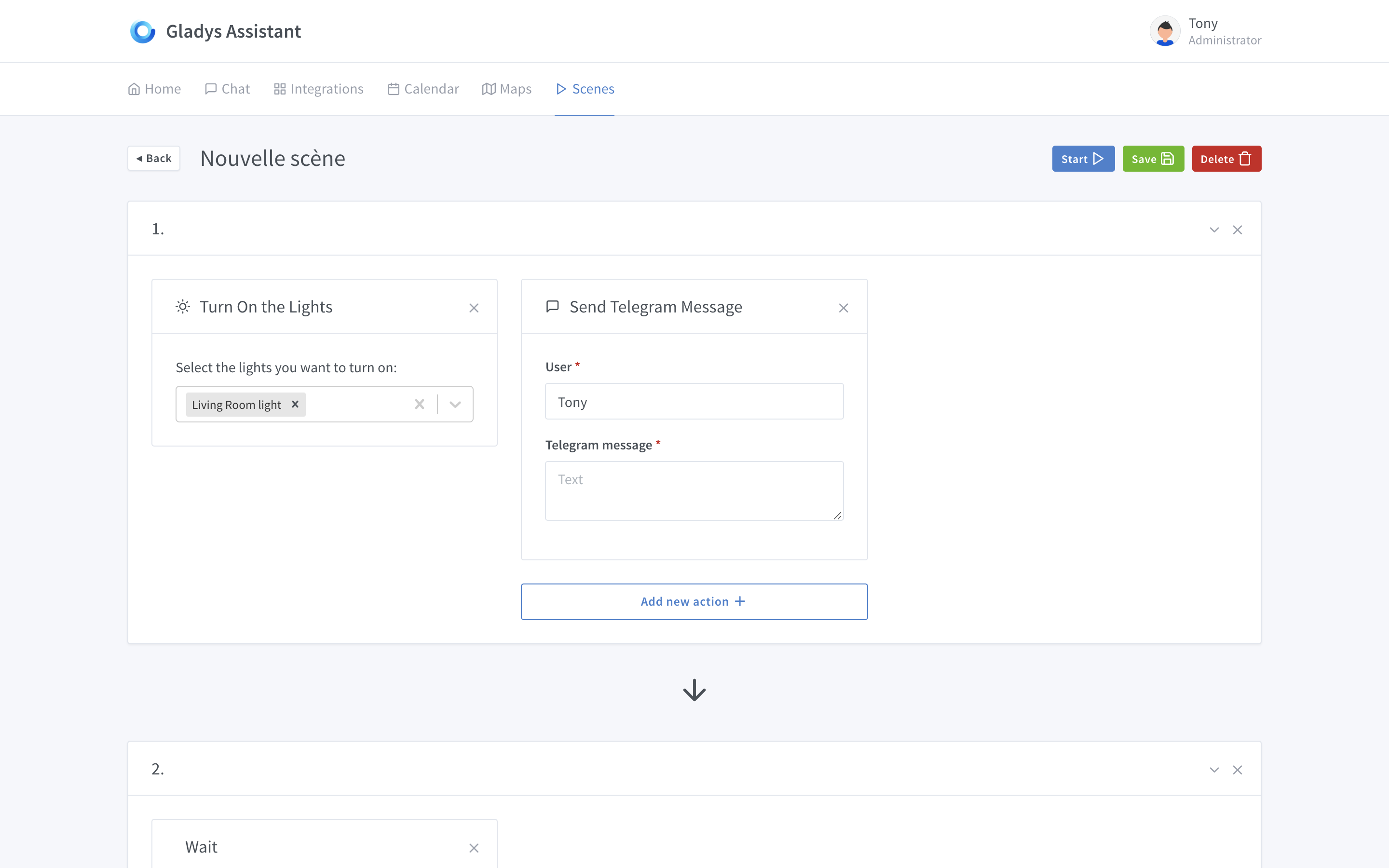
I don’t know if you’ve made fixed style guidelines for Gladys 4, but you could put in the Telegram box "To: " [destination user’s case, e.g., Tony].
This would save some space and make the following boxes at the bottom more visible, which, in my opinion, are a bit too hidden.
I agree. Or, the « + » could be in the background of a box to be added, keeping the header with the « … ». Am I clear? 
How to include sensor results (temperature, for example) in messages? With a bracketed variable? Something like {living_room.sensor_name.value} or is that too technical?
I think we’re confusing scenes and script.
A script will activate a scene (a set of actions) or a specific action.
Exactly!
For you, a scene is a set of parallel or sequential actions. Without any notion of a trigger. And the scenario, a set of scenes with triggers. Is that correct?
I think it’s important to define what the scene creator should do before imagining its UI/UX and level of complexity. By the way, there could be 2 modes: the first, simple, which allows chaining actions quickly, and the second, more complex (conditions, variables) to satisfy advanced scenarios.
Exactly that. At least that’s how I differentiate the two.
Actually, I’m a bit torn by the all-white on your page.
I expected more visual information to catch the user’s eye.
Here we arrive with a gray frame with a white background containing a select and an input.
I find the select very outdated, I expected cards in the style of IFTTT:
Like services, we have actions in the form of icons (a bit of color for more pep, you know).
This is just an opinion, after all, tastes and colors
After that, I find the idea of @peb quite interesting and I can’t wait to see the evolution of your discussion.
I agree with you on this, the Gladys theme is clean and simple, but austere. A bit of roundness and contrast could be quite nice.
Hello!
After re-enabling notifications for some time, I’ve received quite a few today ^^
So I just went through the conversation and, to be honest, I’m a bit disappointed @pierre-gilles
I see that you’ve abandoned the reflection we had some time ago, namely the horizontality of the view and the overall design :stuck_out_tongle:
Just to remind you, at the time I made some drafts:
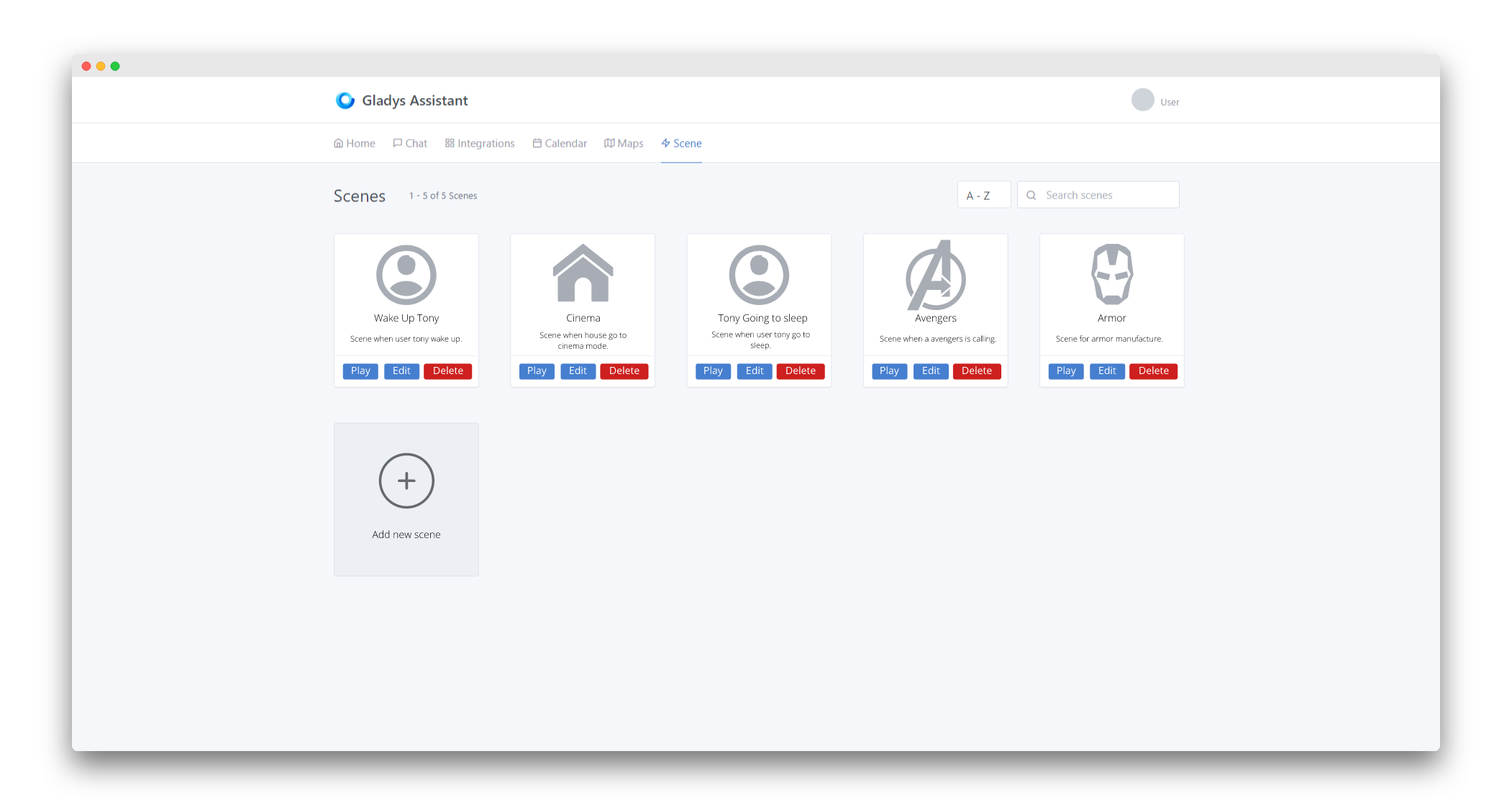
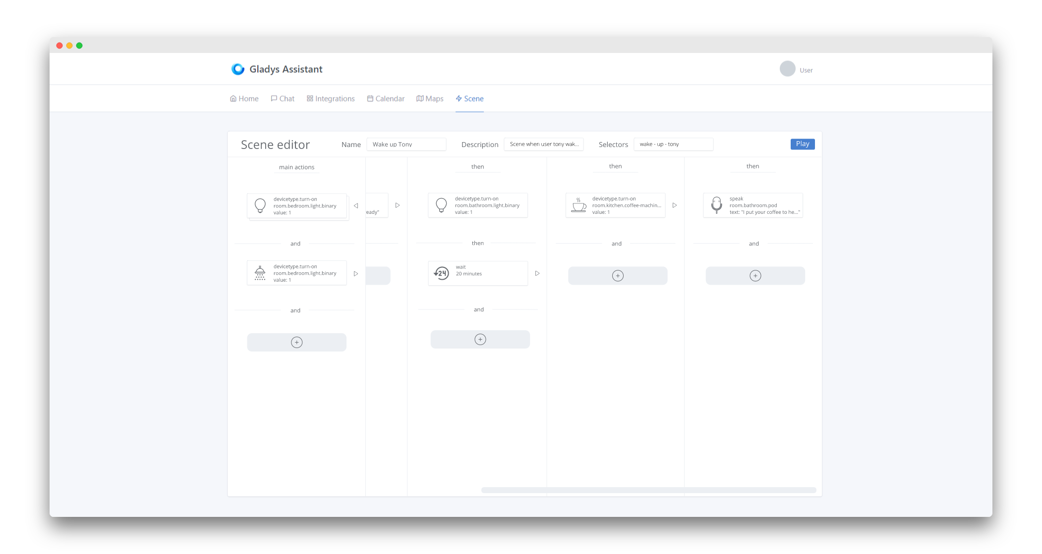
Main screen of the scenes
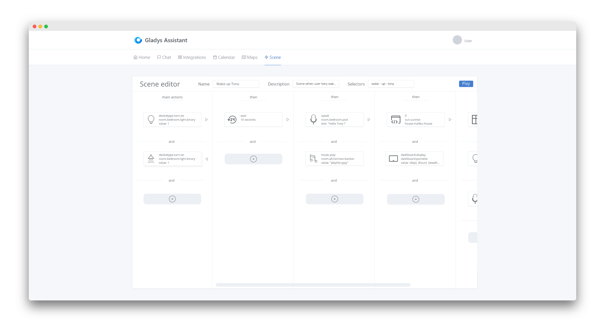
Editing the scene « Wake up Tony » mentioned above
Part 1
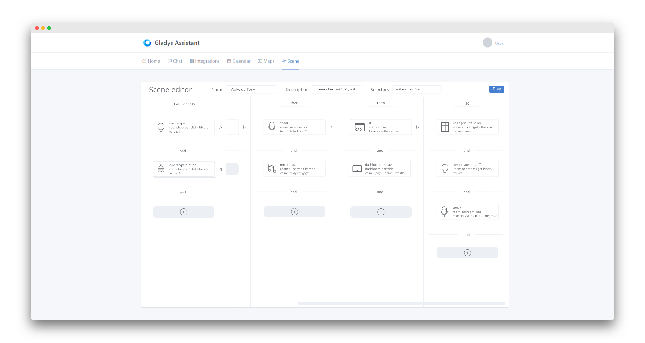
Part 2
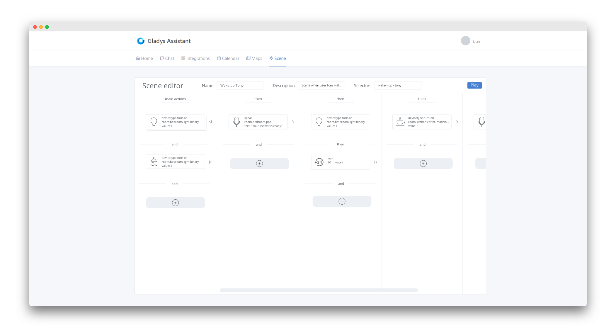
Part 3
Part 4
I started from the reflection of the Homey solution:
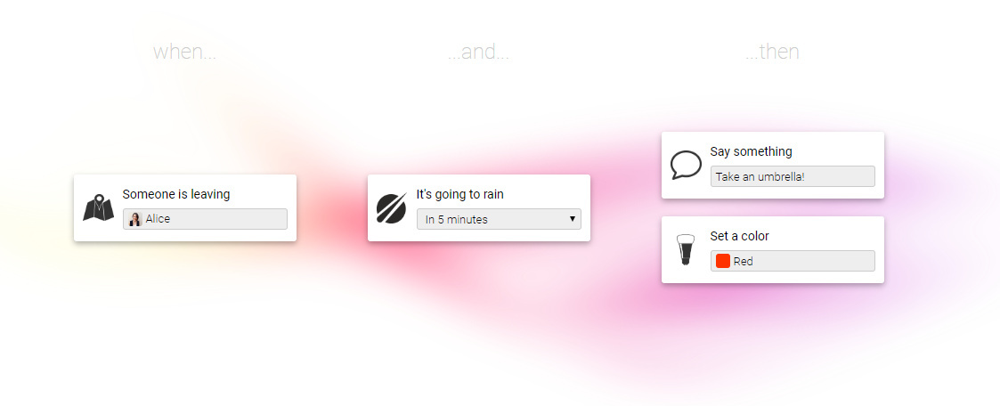
By the way, you found this screen at the time:
Which is really clean.
So, to get back to your test today:
- Honestly, I find that in its current state, the flow of the scene is not clear at all and it’s not very intuitive

- As @spenceur said, it’s a bit sad, even « fade » (without being too violent), it lacks color.
- You also raised a problem yourself with this type of configuration:
The vertical configuration will be relatively complicated to implement on a small screen while remaining clear.
I think that before continuing, we should take the time to write some guidelines to have a real idea of what we want, especially since it is a relatively complex part in terms of UI/UX.
For me:
- For the readability and understanding of each scene, the lines between each action seem to me a good idea, like the screen you posted at the time.
- For me, the verticality of the screen is much less suitable than a horizontal configuration. A horizontal configuration that will be much simpler to implement on a small screen and will only be beneficial for large screens.
- Colors can be very useful (even indispensable) in such a complex view. On the one hand, they will add a bit of cheerfulness
 but they can also serve as a very distinct indicator to differentiate certain more specific actions, or even misconfigured actions. (these are just two examples among others obviously)
 - The size of the cards is a bit large I think. The action card to turn on lights displays clearly unnecessary information (even if you reviewed it a bit further in the conversation) and can therefore be compacted just like the one for sending a message.
- The way to add actions to the scene would gain in intuitiveness and clarity if it were done in a modal (for example)
That was my hot take. Of course, this is just personal and it’s just to move things forward. 
I’m not a fan of horizontal scrolling, on mobile it quickly becomes annoying… and even more so on desktop (much less intuitive, where you place your finger to move left and right on mobile)
True, it’s a bit bland but the goal is also to be sober and not end up with color plates like Windows… but I’m not against a little more color either.
I quote Mathieu because in fact it’s probably the only part I agree with ^^ haha
Just like Hamtaro, I find the horizontal scroll completely counterintuitive, no matter the platform used.
For the colors, I say yes but very few: blue / green / red, which already exists in fact because with logos etc… it quickly becomes messy and not homogeneous.
Here’s my 2 cents 
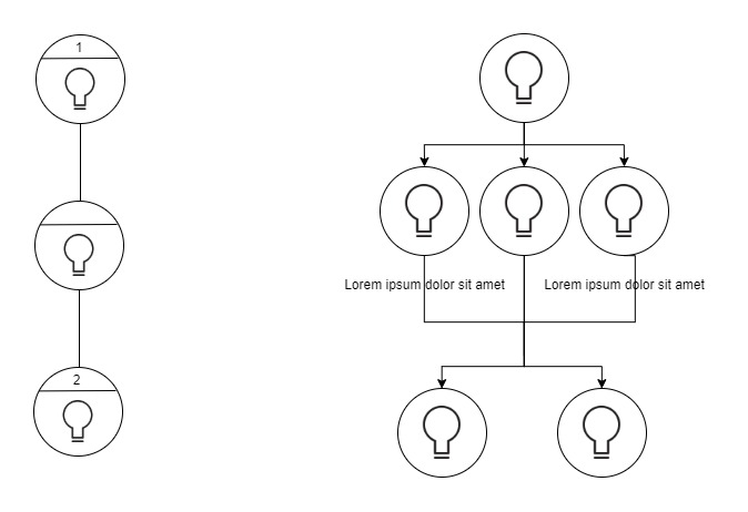
We therefore agree that being able to parallelize actions is important, just as serializing actions is.
Otherwise, for the other aspects discussed further in this thread, I think there will be, in any case, as many opinions as people since we are addressing ergonomics, design, tastes, and colors
A small survey would almost make things clearer ^^. For my part:
- I am more of the team verticality, like the current presentation of the scenes.
- I prefer the uniform, sober side but with colors that highlight information. No icons representing technologies/devices/brand because it quickly becomes heterogeneous, it gives a messy look.
- I join everyone on the current « + » button: it is not very explicit. The « + » Radaar button is nice. It could allow adding an action to a step. At the end of the steps, there could be a button « Add a step ».
- I really like the home page of the scenes presented by Matthieu.
I would like someone to clarify the difference between scenes and scenarios. I am not sure I understand the difference.
In any case, beyond the design, I am eager to be able to test!!!
Here is the conversation a bit higher up to differentiate scenes and scripts.
You’re going a bit to the extremes 
First, I don’t think this view is meant to be used on mobile, whatever the chosen configuration, it will be horrible to use on such a small screen and especially it will be a nightmare to adapt correctly. At best, tablets could work…
And for horizontal scrolling, we shouldn’t confuse habit and intuitiveness. Just because everyone does it that way doesn’t mean it’s necessarily the best way to do it (just as it’s not because we do it differently that it’s necessarily better). I mean, we’re not on Google Images browsing an infinite list of images, so it’s not because vertical scrolling is used everywhere in general and that we’re therefore used to using it that it’s the most suitable in this specific case.
In my opinion, the actions should be represented horizontally because it’s more « human » to see them executed in this way. For the metaphor, it’s like a movie, the bar that scrolls at the bottom and represents the total time of the movie scrolls horizontally. It represents each scene (or even each image) over time… Time is always represented horizontally because it’s human. Here it’s the same, each card represents an action over time, which is why it’s more human, and therefore, intuitive to represent them horizontally.
Sorry, maybe it’s a bit boring 
As I said, we shouldn’t go to the extremes either. A small colored bar above the card or on the side would be more than enough. Obviously, we’re not going to put big icons in red or even the background of the cards in green
The graphic charter of the template wouldn’t be respected. But on the other hand, we can find this in the template =>
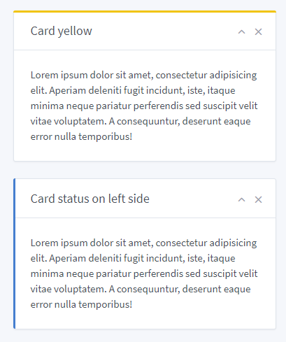
It’s sober, elegant, and it allows a bit of eye-catching to attract attention. Clearly, it’s perfect
Thanks, but these drafts would clearly need to be reworked
I admit I’m having trouble imagining what this might look like in a real UI. I think it’s going to be quite messy and not as clean in the end ^^ Of course, a diagram is beautiful, but we’re very far from the reality of a UI. If you see something more specific, don’t hesitate to make a UI draft, I’m struggling with it right now
I use the Tabler theme and follow these design guidelines!
I would like to achieve something like on this forum when you tag someone, you have the username highlighted in blue. Here it could be the same, you see the list of available variables and when you add one it is in the text but « injected in blue ». I don’t know if it’s clear ^^
Ok I see! After all, sobriety is nice, but I agree with you for now it’s a bit empty. I think that as development progresses, I will add some UX « tricks » to indicate this or that, and it’s these details that will « enhance » the UI and give it more visual richness. Yes, this UI is an empty shell, but it’s an empty mockup ^^
Hello Mathieu!
I remember very well the drafts you made, by the way the design of the main screen of the scenes is you who coded it, I integrated it as is to Gladys (For the record here!)
For the part of the horizontal design of the scenes, I started with that in the beginning, and I had completely developed the scene view in horizontal in April 2019 (that dates!), and I left it like that from April to October in the v4.
After several months, even if it was very attractive on paper (it’s always beautiful the mockups^^), I found that the horizontal scroll was really awful in use. Most apps/browsers do vertical scrolling to move forward (just this conversation on Discourse, we scroll from top to bottom to move forward in time), and horizontal scrolling is generally dedicated to going back/forward, it’s even a shortcut on many browsers/OS (swipe from left to right = back button). On mobile, it’s the same, for example on iOS when you swipe to the left, it goes back in your app.
I found it messy, impractical, and not suitable for complex scenarios.
I completely disagree!
I like the idea that a scene can be configured without having to go through pages and pages. Don’t forget that we are not here to make a « visualization » view but an « editing » one. I see a lot of schematics/drawings in this topic quite simplistic, but not at all functional! Of course, simple schematics are beautiful, but in reality it’s quite different.
I do everything I can so that even in editing mode it is compact, I have even reduced the « turn on the lights » card to make something lighter.
I see the idea, I think that will be the case for some rare cards that would be long to edit, but I don’t want that to be the norm.
By the way: no modal in Gladys 4.
I agree! I’m improving that.
It’s yet the same view that he coded both The difference is that on Mathieu’s screen there are more examples with more varied and rich text, and therefore it looks more « filled ». I will work on my screenshots in the future to put more data and make it look richer ^^
You can’t see it in this example but when the scene is executed, as soon as an action is being executed, its top bar is colored in blue.
I made a video in April 2019 on Twitter (scenes horizontal at the time):
https://twitter.com/pierregillesl/status/1116654124672507904
Small conclusion
Thank you all for your feedback!
A rich and interesting debate, and opinions in all directions, it’s cool to see enthusiasm around development I always try to take a step back on these hot feedback, and here I mainly have the impression of one thing: the visual feedback you give me is not on the scene view itself but on the content of the scenes. My screenshots look « poor » because indeed the scenes I present to you are empty. It’s like presenting an empty dashboard, it looks white and austere. I will enrich this view with more examples and make beautiful screenshots to hopefully convince you more I think you are waiting for small UI details that add pep and colors (for example the user select-box in the Telegram box could display the user’s profile picture, a Telegram logo in the corner of the box maybe, etc..), UI details that are not yet present because I am still at the very beginning of this development cycle (started yesterday).
As for the horizontal/vertical debate, there is no right answer: it’s a matter of taste and color. I am more on the vertical side, and I will continue development in this direction.
If someone disagrees with me, as always in open-source: prove me wrong by doing better than me 
Hello everyone!
To continue the debate on scenes, I would like to talk to you about another topic: triggers.
The scenes I have presented to you so far are just a set of actions that can be triggered at will (for example, by clicking on the dashboard on a hypothetical « launch cinema mode » button, for example).
But what is more interesting is to trigger these scenes automatically based on one or more triggers.
Example:
IF it’s less than 10°C outside THEN notify me via Telegram that it’s cold outside.
The « then » part is a scene, the « if » part is a trigger.
I am wondering about the UI: how to present this?
- Is it a step before/after creating a scene?
- Is it a separate view?
For now, I haven’t started anything on this, but if any of you have ideas, I’m open to any suggestions
For me it’s separate, the whole thing is a scenario.
It’s a short opinion but I had already explained when we debated the scenes
I think we should separate them. This way, a scene could be triggered by several triggers. For example, the scene « set the temperature to 21 degrees » could be triggered when I come home or when I tell Gladys to reset the temperature to normal (because madam has discreetly increased it ).
If it’s all in one piece, you would also have to play with « OR » operators to achieve this result and it can quickly complicate reading.
I also agree that we need to separate… BUT with one condition: a super easy understanding at the UI level.
I take the example of the Tasker app on my phone. It’s super powerful, super effective, but super difficult to get started with at first, and that’s a big obstacle. I took a very long time to integrate the app’s vocabulary (Profiles / Tasks / Scenes / Variables) and the order in which I had to configure everything. I think Gladys must absolutely avoid this pitfall.
If triggers and scenarios are done separately, the user must be guided chronologically, like a mini-guide with a few lines:
- 1 you create your scenario: the set of actions you want to execute
- 2 you decide what will trigger a scenario: the state of a sensor / a time / etc.
I’m not very clear, I think, but you will probably have understood the example.