about 4 minutes to perform the 3 aggregations (3 months, about a dozen devices)
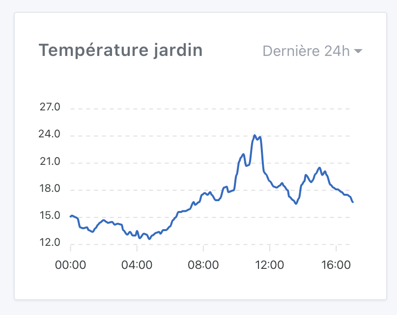
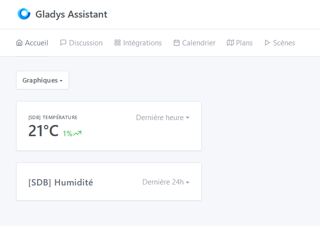
the widget on the dashboard is very easy to understand and use , it is also very responsive, regardless of the interval chosen
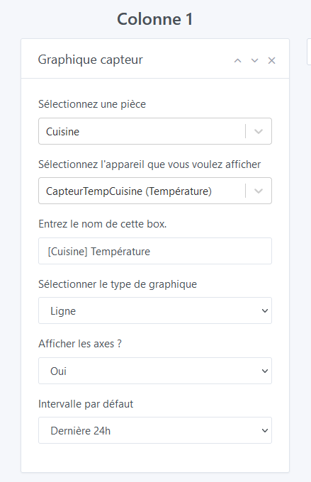
same comment from @VonOx about the title. If it’s a field with autofill, it should be placed after the device selection. Otherwise, it’s frustrating to enter something and have it automatically replaced
when there are no values, « interval » is written as « intervalle » in French
same comment from @VonOx about the time display for « Last 24h » (there’s a missing S, by the way)
In my opinion, it’s the SSD disk part of the MacBook Pro that is fast, because it’s almost all disk in the end (reading/sampling but it’s quite fast/writing). So if you have a good SSD on your Pi, it should also be good in terms of performance in my opinion
I have the answer to this riddle, it’s quite simple: -1 is supposed to represent the « unlimited » value, that’s what is defined in the signup code when you click on the « unlimited » radio button.
The issue is that there was a double bug in the code and in the tests that made this -1 value never work…
Here’s what happened:
« -1 » behaved as if you wanted to keep only the states older than « 1 day in the future » (NOW - (-1) = TOMORROW) There was no if(-1) to block the state purge, I think I must have forgotten when coding it. As we weren’t using sensor values from the past yet, it wasn’t noticed. What surprises me is that I think @Terdious has an unlimited history on his instance. Do you confirm @Terdious? I think you must have deliberately removed this variable from the DB, right?
In the tests, a fairly silly mistake, I used fake.resolves() to mock the call to variable.getValue(), except that I misused fake.resolves() and so when I had to do my tests at the time, the -1 behaved as expected, because in short I ended up with a returned function instead of -1, and thus it prevented the purge, in short a very silly thing (it was at the very beginning of v4 about a year and a half ago I think :D)
I fixed the bug and added more robust tests to ensure it doesn’t break again.
In the UI, there is now the possibility to modify the value in the settings:
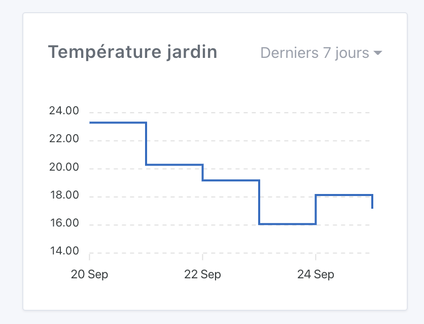
@cicoub13@VonOx To resolve the issue with displaying the date on the « last hour » or « last 24h » view, I changed the default view. Now I format the time display in relative terms:
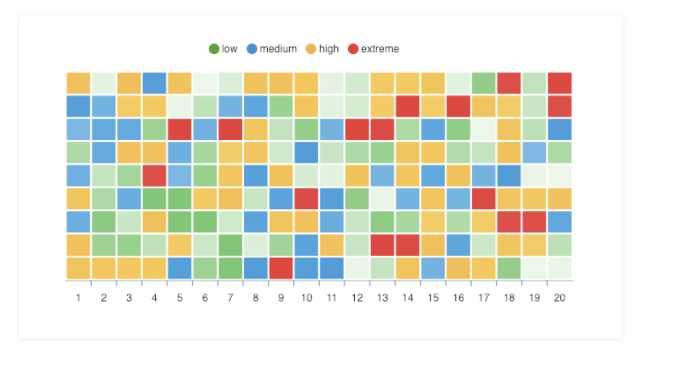
This type of sensor can also be very useful for boolean sensors (presence sensors, opening sensors, etc.).
By the way, in the case of a presence sensor, how are the data displayed? « Presence detected between 2 PM and 3 PM » with a display of « 1 » on the curve and then « 0 » afterwards?
It depends on your presence sensor, whether it sends « 0 » values or not. If it only sends « 1 » values, it won’t move (even if you see the points, it won’t be very visual).
For presence sensors, I think a « heat map » display with presence/absence times would be better, like this: (so with only 2 colors)
This is not included in this development, as it is quite different and specific to presence. We will need to discuss many points before starting this development as I think it is not as simple
Not yet, I was planning to build it at the end of the day after all my developments of the day, I will post a message here when the build is ready
In the meantime, everything is already in the PR on GitHub, but you need a development environment.
That’s a good idea!
However, we should plan to leave the choice of the graph style, because sometimes I would like to know at what time I opened my door yesterday (for example), which this solution does not allow.
What are the current limitations?
I thought I could display all types of values for the moment (even if the chart is not made for it), which is not the case (e.g., presence sensor, opening sensor).
Edit:
I just created two tests, which do not seem to work.

 , it is also very responsive, regardless of the interval chosen