Hello,
I just started working on this topic and wanted to know if there are still people interested.
I am ^^ I just installed an electric car charging outlet for my little brother who lives at home and he insists on paying his share ^^
The goal is to be able to view consumption over desired periods.
I started very simply :
I created a new view next to Scenes: « History and charts » => Name to be determined + see if it’s a good idea to have a new view
I copied exactly the Dashboard system which I stripped of 2 columns to leave only one, the goal being to have a wide visual.
I use the same ‹ t_dashboard › table which I sort thanks to a new type.
I reused the ‹ new › and ‹ edit › views.
I removed the box type choice to go directly to Graph
For the moment I am working with the same ‹ Apex › library.
In this view I work directly with ‹ states › and no longer with ‹ aggregateStates ›. Over 3 months with 5 curves on the same graph it’s quite responsive.
I can zoom into a period while keeping the original granularity. The curves are informative.
The next goals are to be able to:
select by date range.
have editing work ^^
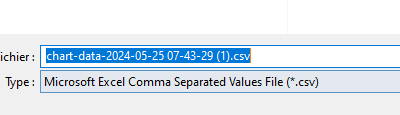
export the viewed data as *.csv
manage the display of min/max for a feature on single curves.
A small GIF tomorrow because pictures are worth a thousand words ^^
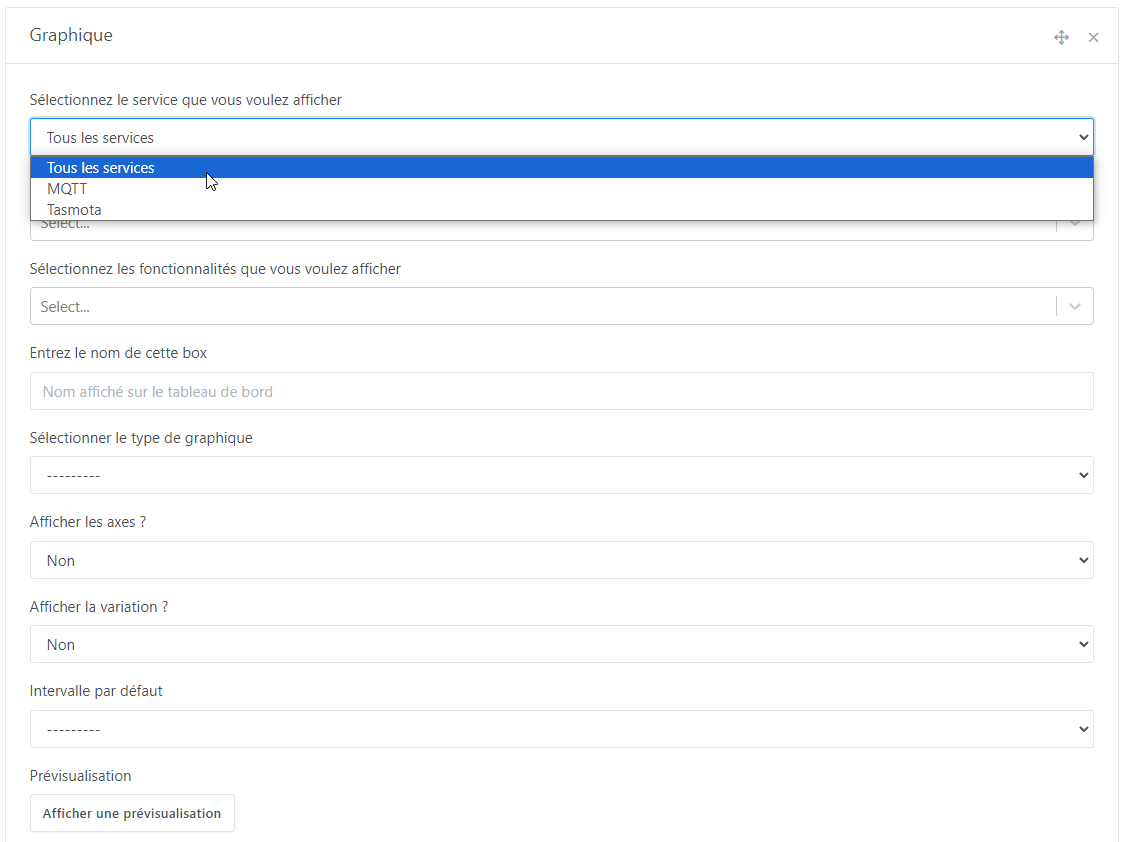
Selection by service (if ‹ All services › then we have all devices and all features as in the current boxes; if one service is selected we have only the affiliated devices). You can select it as a first filter and insert devices, then change it to include other devices — the others remain selected:
Selection by devices (not mandatory, and you can select several to then filter the desired features; this eliminates a long list when you have features with similar names):
Here I select an MQTT device, then I choose the Tasmota service to insert a device from another service.
Selection by feature: if nothing has been changed in the previous two fields we have the full set of possible Gladys features; if one service is selected but no devices, we only have the features of that service, otherwise we have those of the selected devices (WARNING: for the moment, if you have selected devices from different services, you must switch back to ‹ All services › to see the full set of features for all selected devices.)
Yes, it’s catastrophic when you’re looking for a feature like « power » for example and you don’t have the exact name in mind.
If @pierre-gilles likes it, I’d also implement it in the dashboard boxes. Also in the current Devices box, the removal of the list of already-added devices is missing ^^
Can this feature request address:
Retrieving charts and their values over 24 hours from previous periods?
If so, I can cancel it and recover the votes. This would allow counting 13 votes:
Yes, that’s exactly the developer’s intention. I posted here because it seemed the most representative topic. But maybe it’s better to wait for @pierre-gilles’s opinion.
I confirm that for me these features are a very, very nice improvement.
Do you think it’s possible to integrate a system where: if I select a view of the last 24 hours, then I can use the buttons \u003c and \u003e to move to the previous or next 24 hours? This avoids having to enter the date manually for each day we want to view.
From the tests I’m running, yes, we can implement pretty much whatever we want for dates. That could even allow placing two identical charts one below the other and setting two different days, months or years to compare.
So for that, yes, you just need to add the two arrows and add the current interval.
Then, the ‹ Apex › charts include a toolbar that can be enabled. I therefore enabled it for this « Historiques » tab and left it disabled for the dashboard, but it’s not very… ‹ beautiful › ^^ I think @pierre-gilles will prefer that we redo them ourselves. It allows:
zoom in +
zoom out -
zoom by drag selection
return to the original zoom
when zoomed, the ability to pan backward and forward
download directly as CSV and as an image… however I can currently only do it for the binary…?
However, we need to optimize all that because we clearly won’t be able to directly take all the points over a period of 1 month / 3 months or 1 year, I think. It’s already laggy over 10h with 10 series with 1 point per minute for each.
So I think we’ll need to use aggregation beyond 7 days, and display details on zoom. To be decided together — the best would be for me to put a test image in place so you can try it (I haven’t tested on the prod DB…).
hello,
at first glance this clearly matches requests I made some time ago about the graphs (notably the fact of not only having « averaged » values beyond 24h).
and moreover this will certainly allow me to have graphs suited to my electricity consumption monitoring (I don’t have a Linky so no Lixee, and I don’t want to use the Enedis cloud solution, I made a small setup based on an ESP-Wemos and a small Pitinfo kit made by Mr Hallard which connects to the TIC port of my meter, I have all my data in real time, protocols used and usable: HTTP, Tasmota, and especially the one that brings the most data via Node-RED, and all that wirelessly and locally, total cost of the build: 23€)
Thank you very much, that’s kind of you — hoping we can put something out quickly ^^
Thanks AI, I fixed the bugs I had on the binary data (thanks especially to Cursor ^^ this software is crazy ^^)
CSV export works for the binaries, for simple curves, but not for ‹ area › charts — I can’t understand why, I didn’t find the reason in the Apex docs …