Feature description
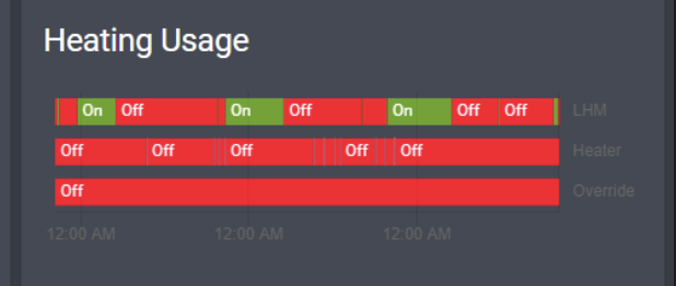
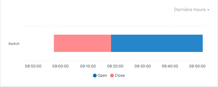
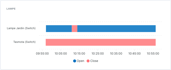
The graphics make a lot of sense and are very useful. However, for binary-type devices (on/off, presence, opening, etc.) they don’t make much sense.
The data types that will not be supported by the graphics are as follows:
Binary
Push
Camera
Color
A dedicated view, accessible on the dashboard (but why not a new section in the web interface as well), would be needed to consult the data history.
For the moment, I would like to be able to consult the history of openings of my front door.
I see several advantages to this:
In case of a break-in, I will have the exact time
When I slam my door and go for a walk with my dog in the residence, I can make sure no one has entered in my absence (#Lazybone)
And then later, do some usage statistics, including how many times per day we open the fridge and correlate it with the temperature drop / electricity consumption.
Yes, you’ve summed up the situation well. Even if it might be interesting to know how many times per day the door was opened over a period of 3 months, for example.
From my point of view we should be able to implement it in the current graphical view… But I imagine it will mess up the rendering itself.
Unless, as @spenceur suggested, if we choose « binary sensor » as the chart type then only binary sensors can be included to ensure a consistent rendering.