I have always checked unlimited retention, I wonder why it seems like I have no data. Maybe it takes time for the calculations to be done?
Regarding the display of axes, I realized that by activating them I had a graph. I thought it was mandatory for it to work. But I see in your screenshot that it is not the case and you are right it is prettier without.
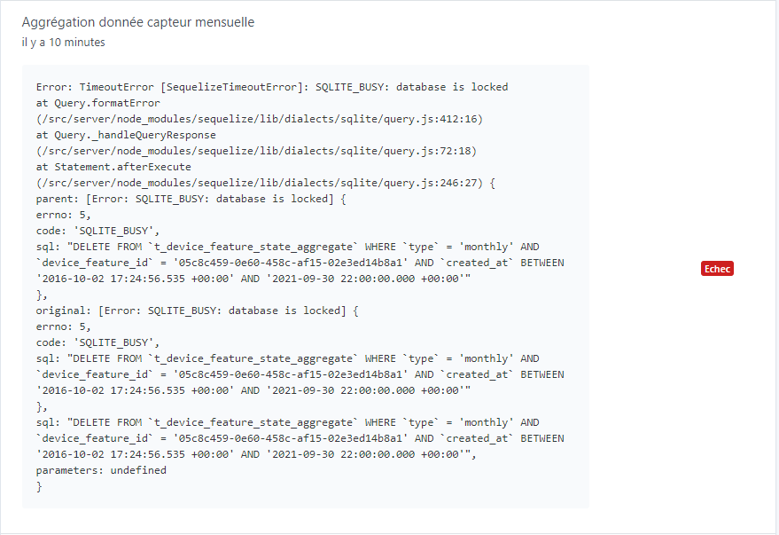
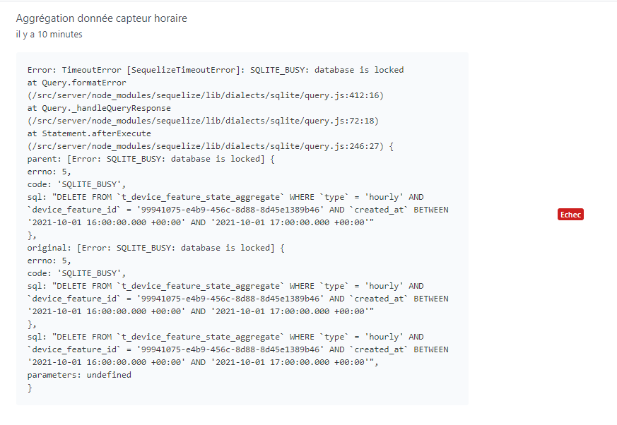
There is a bug in the current data retention, we never noticed it because it wasn’t used until now, see above:
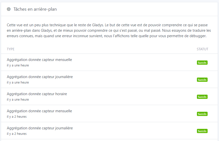
I don’t think that’s the case here, but if you want to check, there is a new view « Background Tasks » that allows you to check the current status of background calculations:
Could you check if there are any errors in your browser’s console?
Normally if you have no data, you have a message « no data for this period », but you have nothing, so it’s weird
Thanks for the clarification, I read the message without making the connection! Everything is clear now, fortunately, you noticed it now (rather than in a few years ).
I’ll take a look tonight to answer your questions!
I would have liked to provide feedback on the PR regarding the issues with the values not being saved, but I can’t. However, the interface for choosing this value is good. However, a validation such as « save » or something else is missing to apply the choice. Right now, it feels like nothing happens.
Is this really useful? I’m not necessarily in favor of all-options, it makes the product more complex! If it’s really useful, why not, but I’m really trying not to overload the UI.
ah! I added you to the GitHub organization. But it’s weird, I thought it was open to everyone…
I hope that in the long run there will be no limit on the types of data that can be displayed. Currently I cannot select an opening or motion sensor for example.
Is it feasible to offer to display multiple devices at the same time (of the same type)? For example, 2 temperature sensors from 2 different rooms in the same graph with two colors?
Sorry for the response time !!
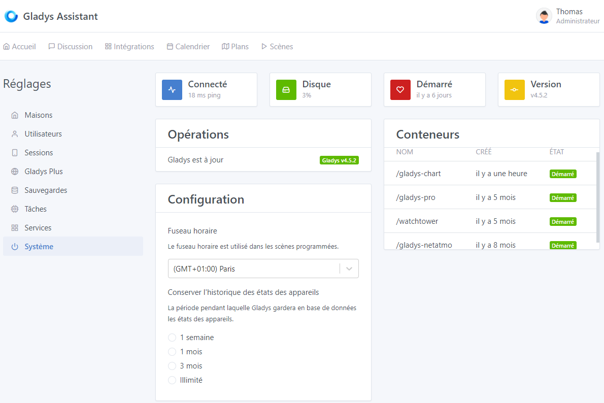
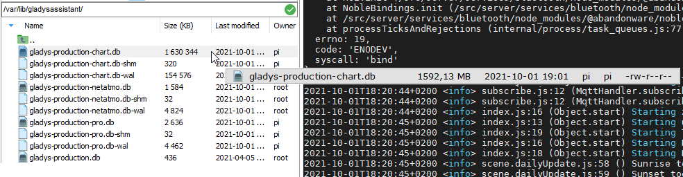
No on the production database, I don’t think I made any changes. And yet, in fact, my raw database currently weighs 925 MB and is still growing. So I think it works …
I’m finally installing the docker image with the DB. We’ll see what happens ^^
My DB seems to have worked fine since I get a time of 26 minutes for the first aggregation (« hourly »).
Edit 2: However, strangely, nothing is selected for the history in the Settings/System view
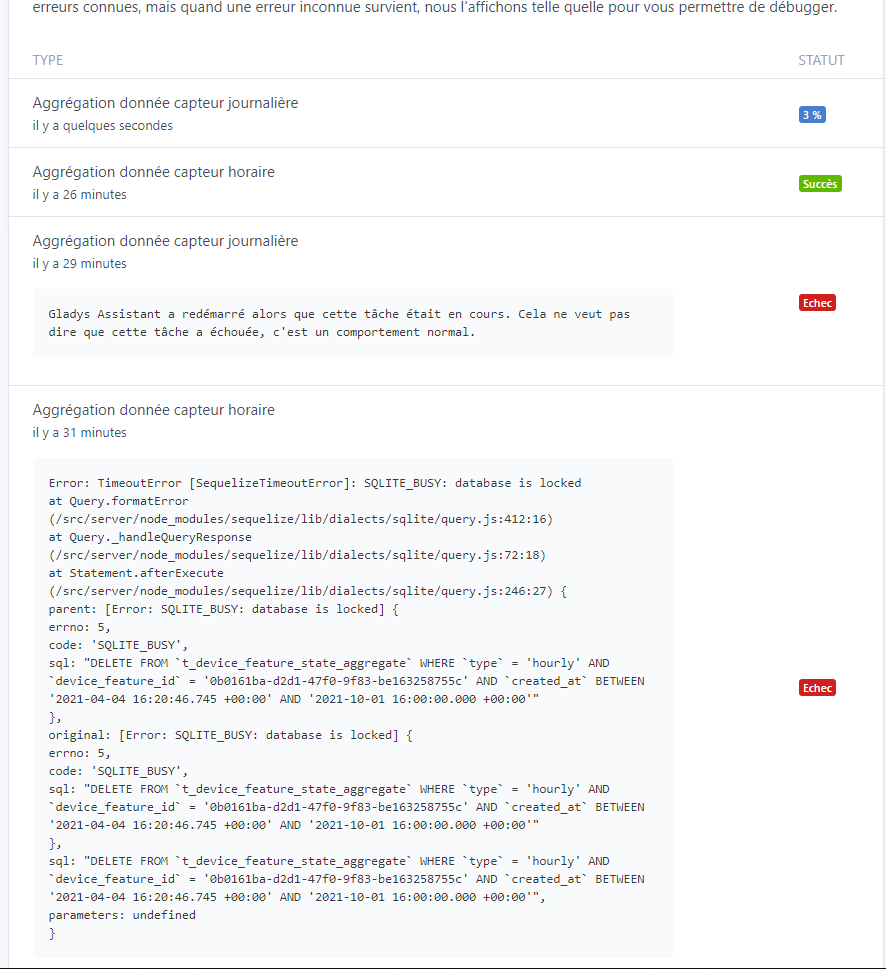
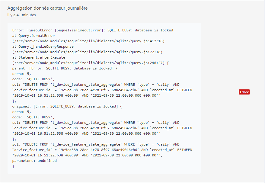
On the first startup, this same aggregation had crashed on « database is locked » I suppose. But the daily aggregation had started. I then restarted Gladys for the « hourly » aggregation to work.
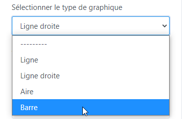
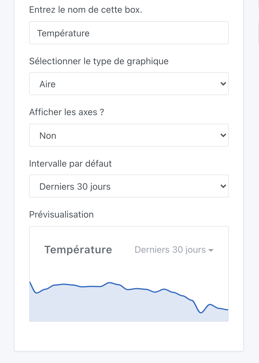
Is the box name correct? Would « Graphic » alone be more appropriate? Or perhaps « Graphic - Sensors » if you plan to separate them from other graphics (Binary, etc.)?
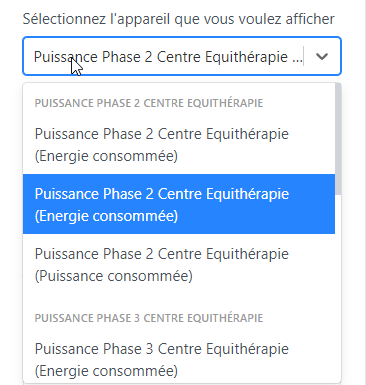
For device selection, it’s still bothersome not to have the feature name instead of the device name, especially when you have multiple features of the same category (here, hourly consumed energy and total consumed energy):
For the rest in editing, it’s perfect, everything is clear and simple to configure. As already mentioned by @VonOx and @lmilcent, it would be very interesting to be able to select multiple sensors and especially in different rooms if possible… it does increase the complexity for the programming.
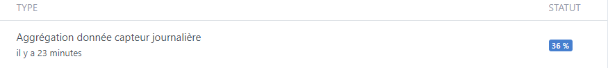
I’m waiting for the various aggregations to finish for feedback on the dashboard (I think tomorrow ^^)
Edit:
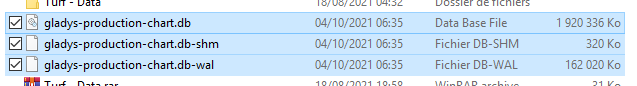
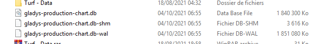
After 2 hours, all previous tasks ran smoothly, and the new aggregation cycle went very well (new cycles take about 50 seconds to 1 minute for each aggregation). The DB grew to 1.9GB, which is 1GB more with the aggregation - Note that the big difference is on the *.db-wal file, which went from 4MB to 162MB
Is it planned to have a history for the year, 5 years, and 10 years? (Nothing urgent for 5 and 10 Interest: solar, pro cons, etc. (Linked to unlimited history - which would be interesting to be able to define for each feature in the future)
Average display time for 12 curves = 5s with progressive display!! It’s good ^^
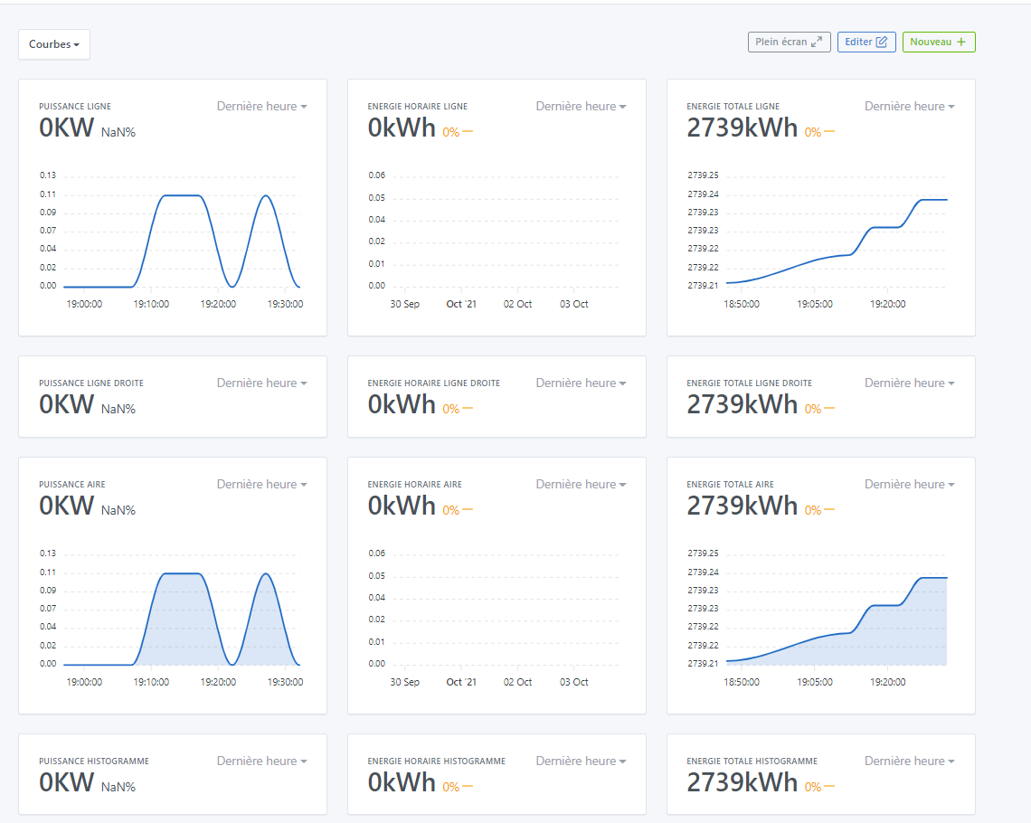
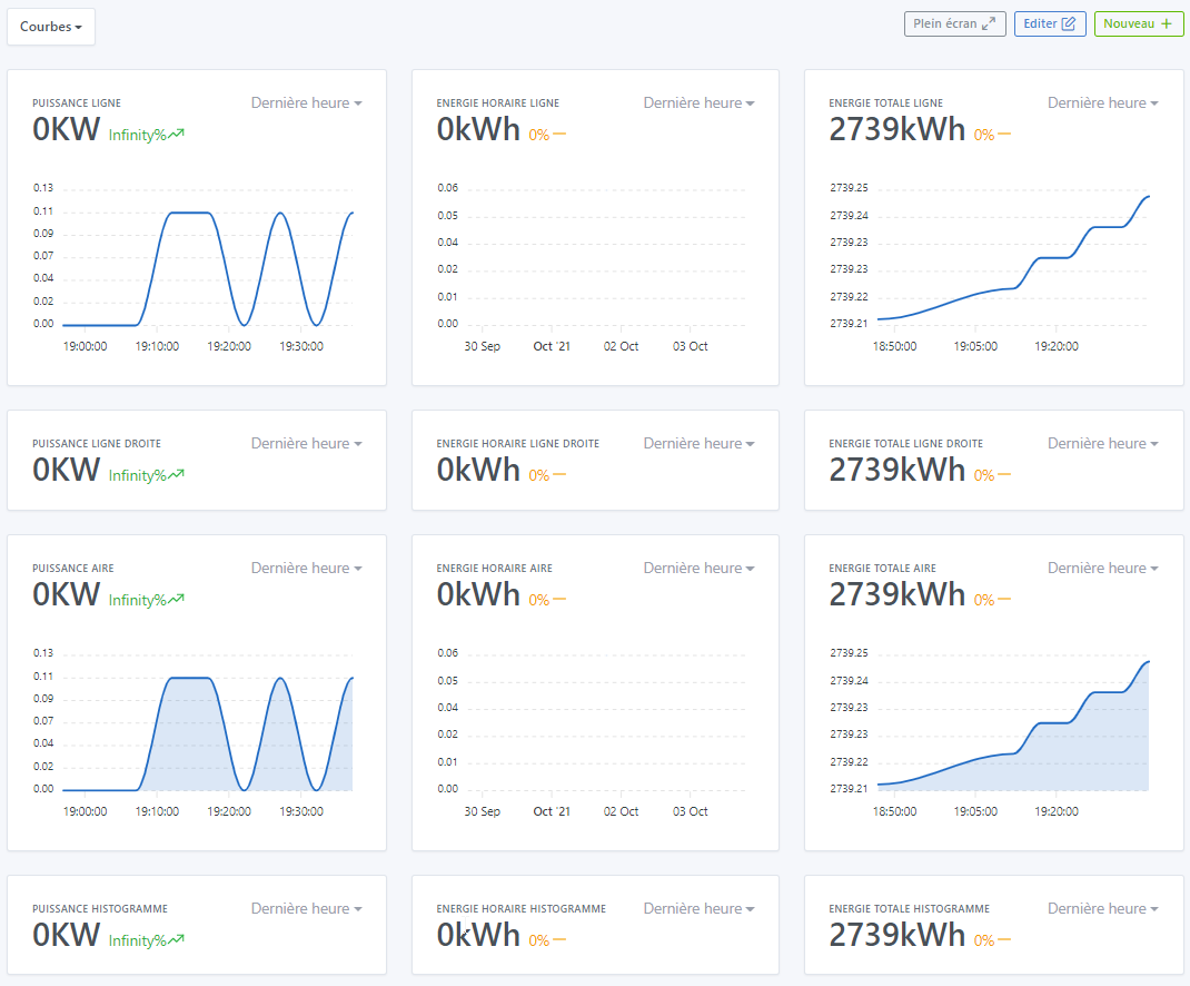
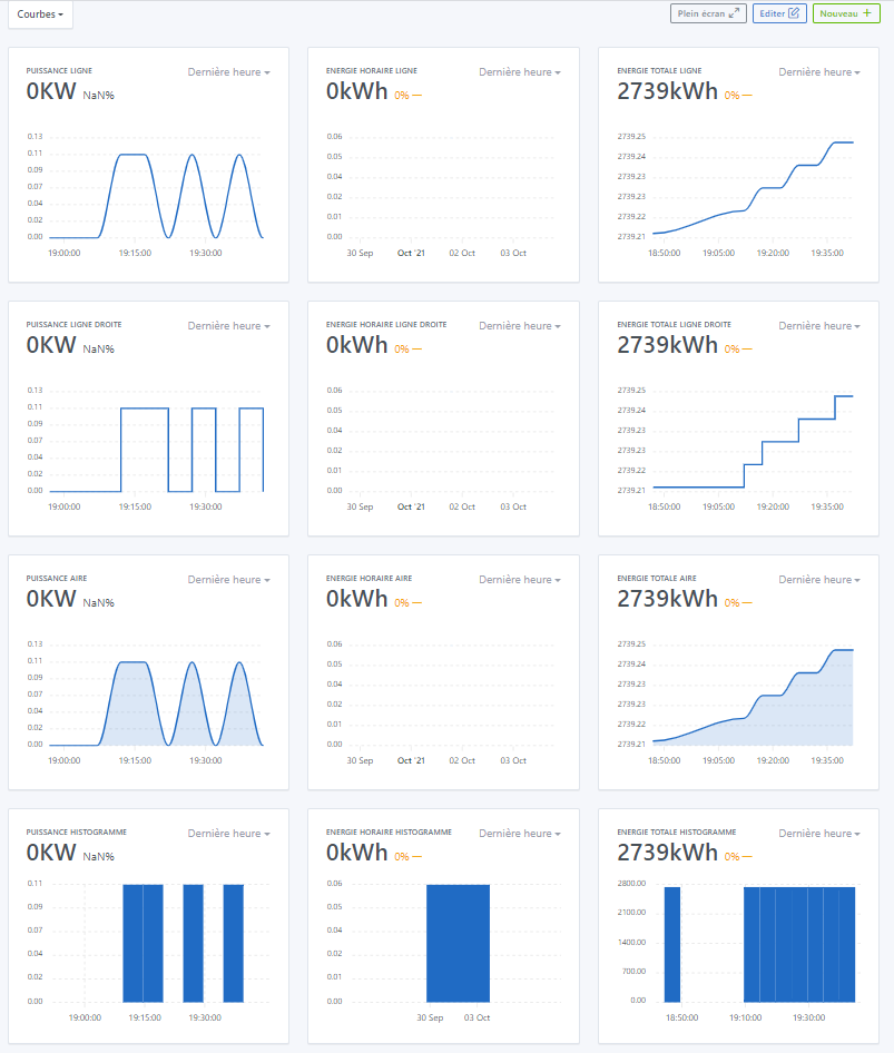
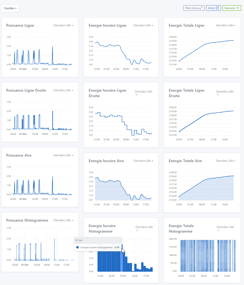
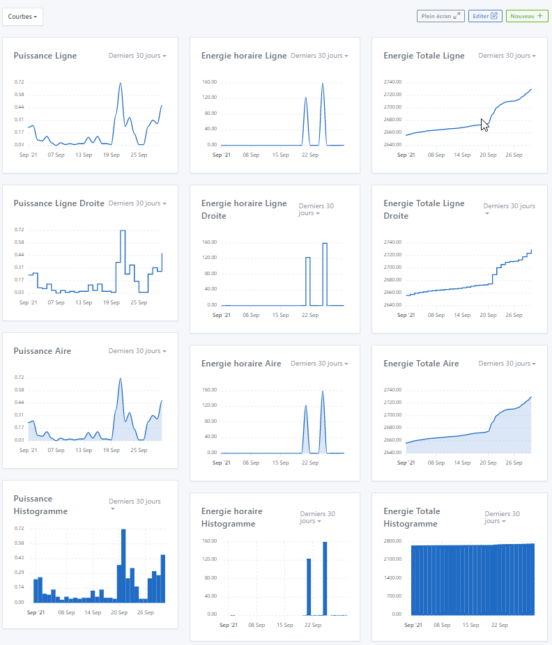
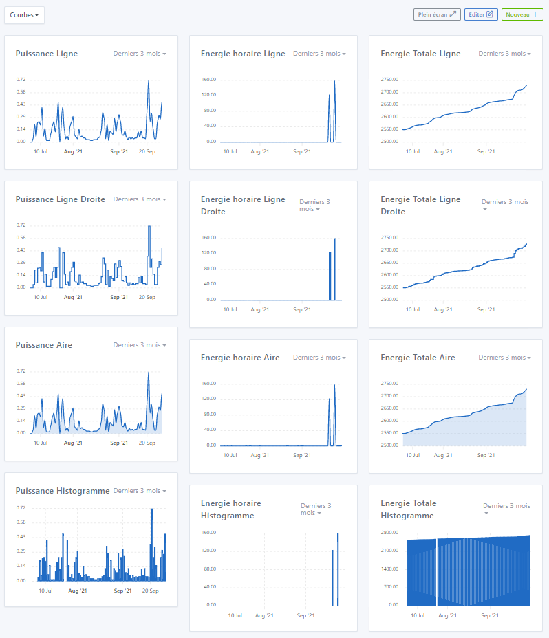
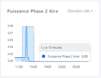
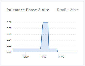
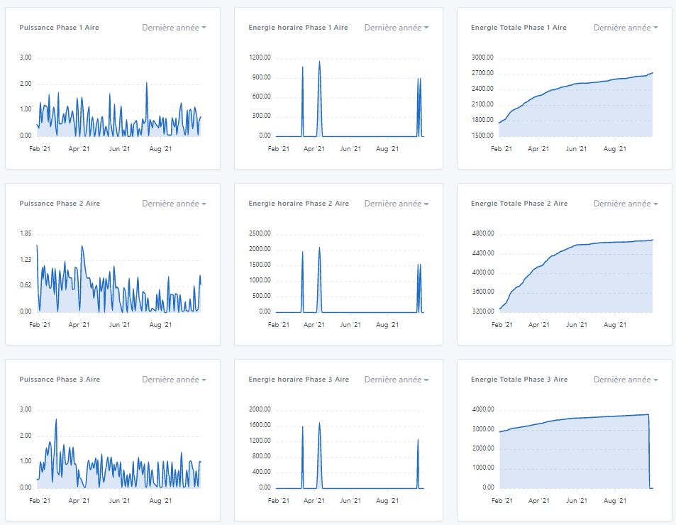
For my first try on the Dashboard, I created 4 Lines with 3 features in each column (Power, Hourly Energy, and Total Energy of Phase 1), for each Line a different type of representation, and for Lines 1 and 3 the axis representation is set to « Yes » while for Lines 2 and 4 they are set to « No » - I don’t have the same thing depending on the type, and especially values in « NaN » and then after some time these values go to « Infinity » (language issue here) - I therefore redefined all axes to « Yes » - see the 3 images below
The hours don’t seem to be correct either because it’s 21:46 and on the axis you can see that the times range from 19:00 to 20:00 (French time not handled?)
On the Histograms (« Bars »), the time on the pointer is not correct unlike other types of curves, it indicates the day and month instead of the elapsed time - I take this opportunity to point out the same opinion as @lmilcent, it would be more interesting to have the date and time of the point rather than the elapsed time
Same as before, the histogram does not show the same thing as the other types, however, in my humble opinion, it is more interesting to have the same thing as the histogram everywhere, i.e., the date of the day and month.
The dimensions of the boxes are not the same in height. In my humble opinion, a curve should always be of the same dimensions (visual comparison) at least in height (if one day we can resize the boxes over multiple columns, that’s another thing ^^)
I will test other things on Sunday!! In the meantime, all my congratulations @pierre-gilles, it’s magnificent, and you can’t know how much this is going to help me, for my personal/professional use (I’m still waiting for the annual curve which is one of those that interests me the most )!! I was looking forward to this, you have been « redoutable » efficient ^^ !! Bravo!! And looking forward to multiple curves ^^
Ok but I think you didn’t select anything! All the better if it works.
Tell me, you did duplicate your database, you’re not running this instead of your live prod?
Ok I see the problem for the « database is locked ». Thanks for the feedback, I tried something but I wasn’t sure if it would work on instances that are very busy like yours, I’ll fix it.
This is quite normal, in short the historical data is duplicated 3 times: Hourly aggregation, daily aggregation, and monthly. So it takes up more space on disk, because in short we have « pre-calculated » what will be displayed in the UI, it’s like a cache.
On the other hand, if I understand correctly, I will have to increase the limits on the Gladys Plus backup sizes But well, it’s normal, it doesn’t shock me to have a 1.6 GB DB, especially when you have such a usage like yours!
Why not just graph indeed.
Mmm indeed here we should put the feature!
YES!! I also want the preview, otherwise it’s too annoying, you have to validate and go back each time.
You’re probably right, I admit I just translated the English, I didn’t know the word in French
I agree I’ll add it.
I’m not shocked!
Small experiment, could you copy your DB separately (on your laptop), and open it with an application like TablePlus, and run the SQL command:
VACUUM;
Then you look at the size of the DB after the VACUUM (it’s an SQLite command to clean up dead lines)
Just to see if you have « dead » lines that haven’t been cleaned up by SQLite, or if it’s just real data (after, 2GB, I’m not shocked at all)
We can add longer durations yes, no problem.
5s how is it? Could you make a video? It seems a lot to me!
Probably the lib that doesn’t handle timezones by default, I’ll look into it.
Ok, noted I’ll fix it.
Apparently a problem of box title too long that makes the title overflow and wrap! I’ll see what I can do, but there’s not much magic:
Either limit the length of the box titles
Or move the « Last 24h » under the title..
To be seen
Thanks!! It was a lot of work this summer, and there’s still a bit left to fix all the little bugs you found In any case, thank you for your very very complete feedback, it’s exactly what I was expecting It’s better that you do this kind of feedback now, rather than release it to everyone when there are bugs all over the place.
Ok, @Terdious says the same thing so we’ll switch to a time/minute display
Ah, I’ll remove the limit.
This is quite possible, I haven’t been able to develop it yet because it’s a bit of work
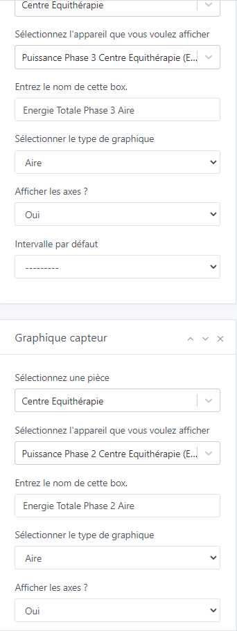
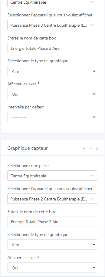
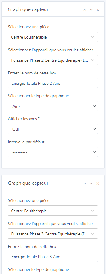
A small bug occurs on the Dashboard Edit page. I fill in the selection of a first device (« Puissance Phase 3 Centre Equithérapie ») and the name of the box (« Energie Totale Phase 3 Aire »). I add a new box in the same column with a device (« Puissance Phase 2 Centre Equithérapie ») and the name of the box (« Energie Totale Phase 2 Aire »). I made a mistake with the order, so I click on the up arrow to move the box of the phase above the phase 3. The box is, I assume, correctly reversed because the name of the box has been reversed, but the name of the device remains written in the same box and thus becomes reversed (no consistency). When saving and returning to the edit, the names of the devices are correctly back in the affiliated boxes. This is therefore just a display bug
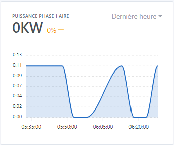
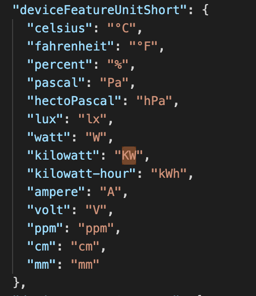
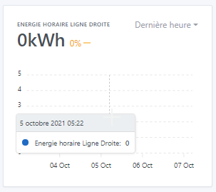
Another thing, my Power data is sent in kW but with a precision in Watts. Below I have a regular consumption of 110 Watts that I am interested in observing. However, the display at the top left is displayed in kW, whereas it would be preferable below 1000 Watts to write them in W rather than in kW (by the way, the units kW and kWh are not written with the same capital letters… - for information, the rules of use want that the units take a capital letter when these are derived from a proper noun - here kilo and hour are not proper nouns so they must be written « k. » and « h. » - Watt is a proper noun so W. - which gives kW and kW.h - an exception for the liter which can be written l. or L. to avoid confusion with the lowercase letter with the number 1 in some writing formats - I stop the digression ). Is it possible to perform an automatic conversion in your opinion for the curves? Which could even be taken up later for the values of the dashboard…
I just discovered the zoom feature!! It’s great and really practical. I was looking for a previous consumption. However, in the last hour, you can’t see far enough, you see too wide. I don’t know if it’s possible, but the best would be that when zooming, you could recover the precision of the lower rank…
I also did the tests on mobile, the full-screen landscape mode is really excellent. The same bugs as on the PC are found in editing in particular. No zoom possible with the two fingers. The display times are the same and it is very nice to be able to see the curves update instantly and to know it thanks to the loading (independent for each curve). A small axis of improvement that could really be useful on mobile is 2 small transparent buttons at the bottom right (or elsewhere ^^) to be able to go up to the top or down to the bottom of the page instantly because with all three columns combined into one… it’s long ^^ of course this applies to Gladys as a whole ^^
Are your data sent in Watts or in Kilowatts? I don’t get it
Whoa, uh that’s case by case, I don’t know what could be done (except if one day we make a « energy management » box clearly separated)
Because here, the box doesn’t really know what it displays.
I’m 100% agree that we should have a nice energy consumption management in Gladys, but I don’t know if it’s possible to do something as custom in this generic box… I’ll think about it but I can’t guarantee anything in the current development
Surprising but you are certainly right ^^ For the record I probably did well I thought the selection was mandatory.
Of course!! ^^ Renamed and running on another pi!! However I had forgotten Gladys more than I had to turn it off in time because it didn’t have time to make a backup ^^
Yes yes, it doesn’t shock me at all either ^^ It was only for information ^^ By the way, a question, for those who wouldn’t find the usefulness (of the curves) and who don’t have much space, would it be possible not to activate this feature to save space? (Really a question for those who would be concerned and who would read the exchanges of this post ^^
Yes on SSD 500Go on a PI4, my vital constants are at the top ^^ knowing that there are 3 instances of Gladys running on it (one modified for the Pro side, one with all the Netatmo devices therefore very solicited, and therefore the Gladys Chart ^^)
Ah yes indeed so it at least doubles the data. However my backups are currently 300Mo … we still have a little bit of margin with what you raised last time ^^
Before the SQL command:
After the VACCUM; request
And when closing TablePlus the db-wal file disappears so we gain almost 80Mo.
Sorry I don’t see how to be more precise ^^ My arduinos send the data in kilowatts for the power (because Gladys did not manage the unit of Watts at least at the time) but with a precision to the watt. So for « 1 W » it sends « 0.001 kW ».
Extract from the server/constant/utils … file from that time.
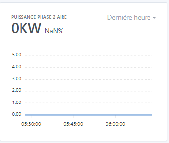
Or we can see here that the data is currently at 110 W or 0.110 kW but that the value displayed at the top is 0 kW, it does not display the commas. And to this day it is impossible to modify the unit in the integration. So impossible to go back to Watts even if the unit was existing.
For my part, I misexpressed myself, of course it is not at all a question of slowing down this PR with this and mixing everything. I should have opened a new subject. It’s more of a request for addition in the future. Just to clarify the thought, I had made a small PR on my side to work on this in 2019 and created a conversion table for that. It’s very simple, nothing complicated and obviously it’s case by case. But not being a base programmer, once again the code was dirty. I stop this new digression and will open a subject (if there is one ^^).
New question maybe off topic (but nothing ventured nothing gained ^^) : Possible to have the possibility to export the points of a curve in .csv format? Or would you see that rather in a dedicated integration?
The X-axis (time) is now displayed in local time, no longer in UTC. @Terdious I would like confirmation that it’s fixed for you
The tooltip now displays the hour/minute and no longer the relative time.
The bug you both had is fixed (display without axes that bug when the first value is equal to 0)
The title is now smaller to allow a longer title. I will probably add a limit on the title size later
Added a « Last year » interval. For 2 years - 5 years, I think we will make a separate view in the future @Terdious, in a filterable mode to do analysis. The goal of this dashboard box is really more to have a quick and instant display.
I still have a few bugs to fix, and some features to develop (notably the selection of multiple features on the same chart), I will keep you updated when I progress on them!
In the meantime, I would like confirmation that these bugs are fixed!
Thank you both for your feedback!
I don’t think so, we’re really talking about a very small space, at your place where you have a huge installation your DB is only 2 GB, which is quite ridiculous in size in 2021
Leaving the choice would complicate the use (what happens if in the end he wants to use it while he has deactivated it?) I think it’s better to leave the aggregation for everyone!
It works!
Ok it changes almost nothing, good to know it was just to make sure it’s real data
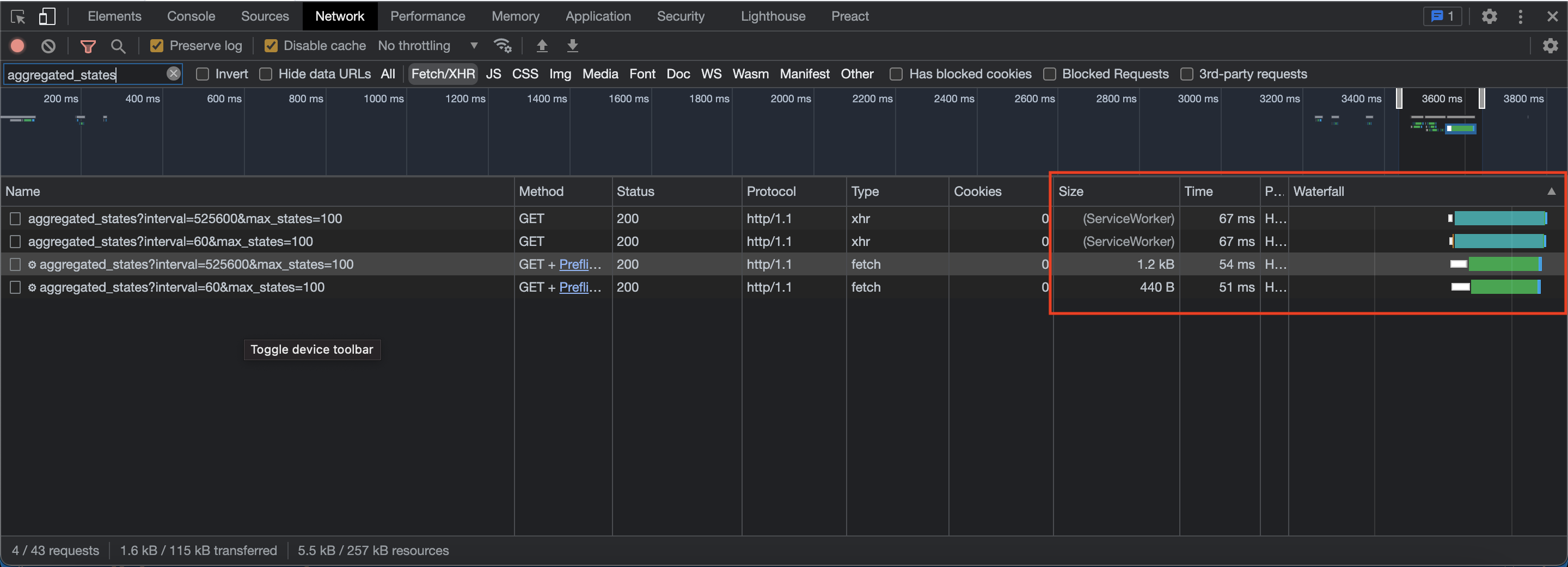
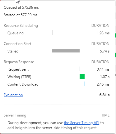
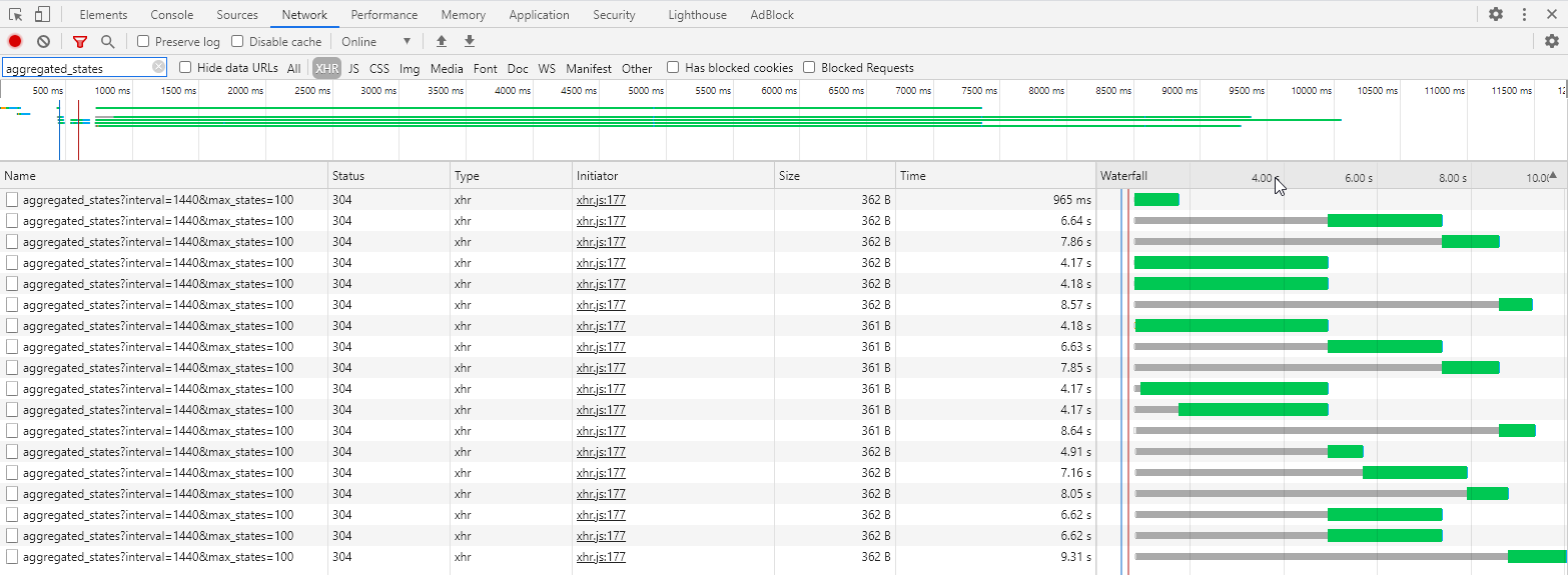
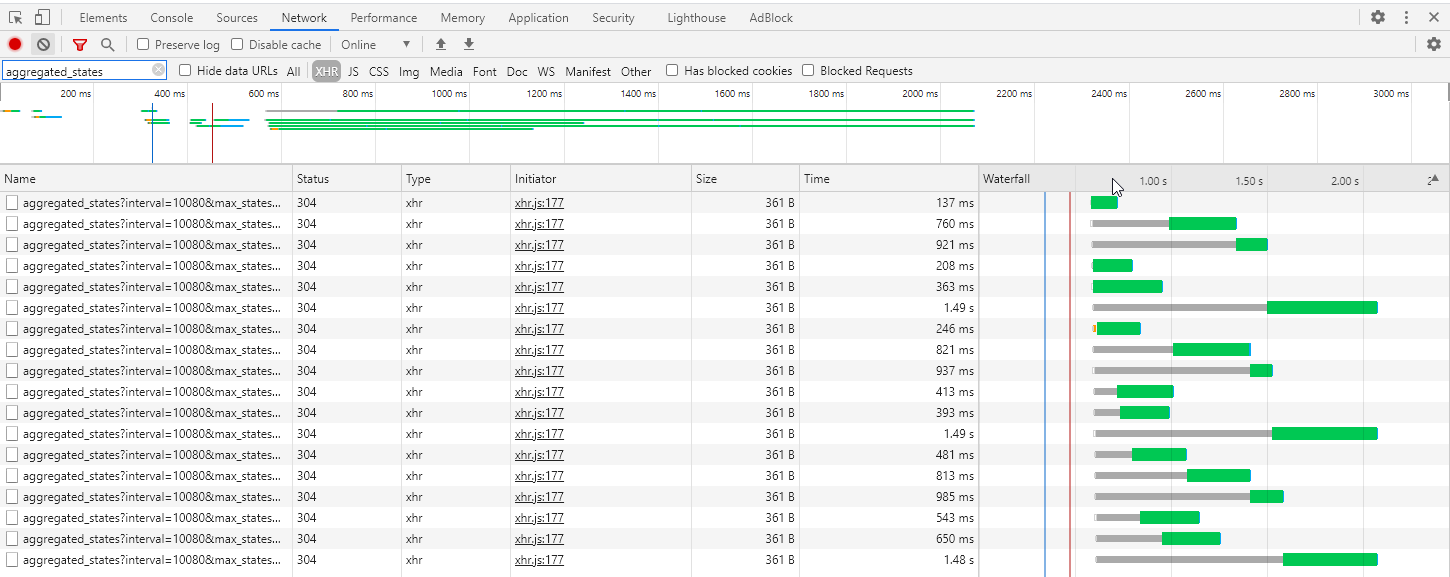
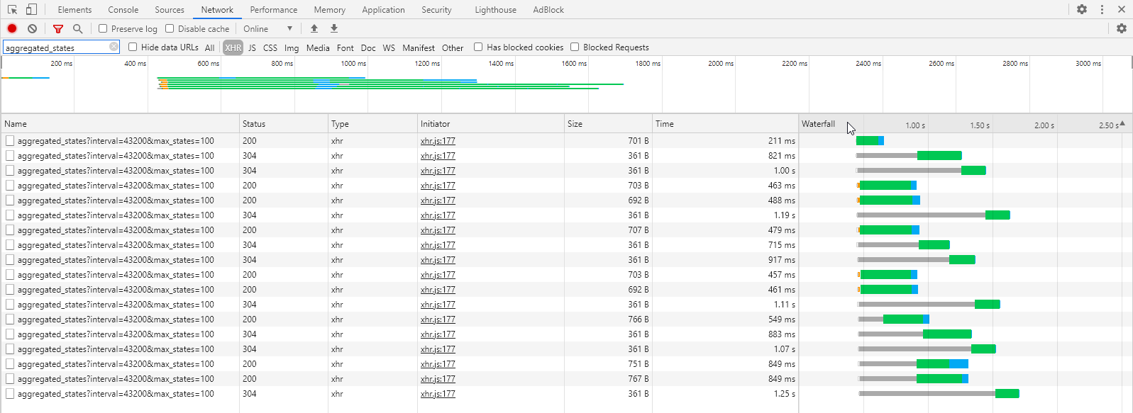
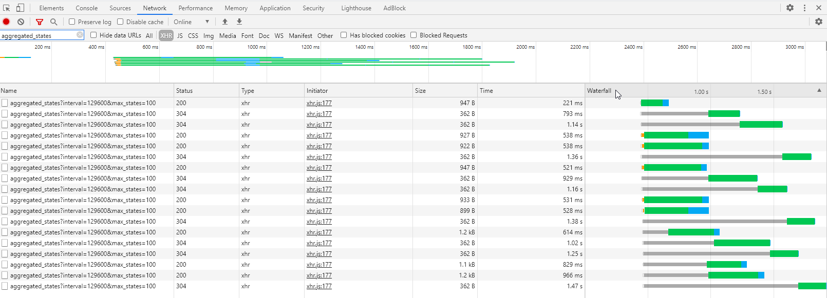
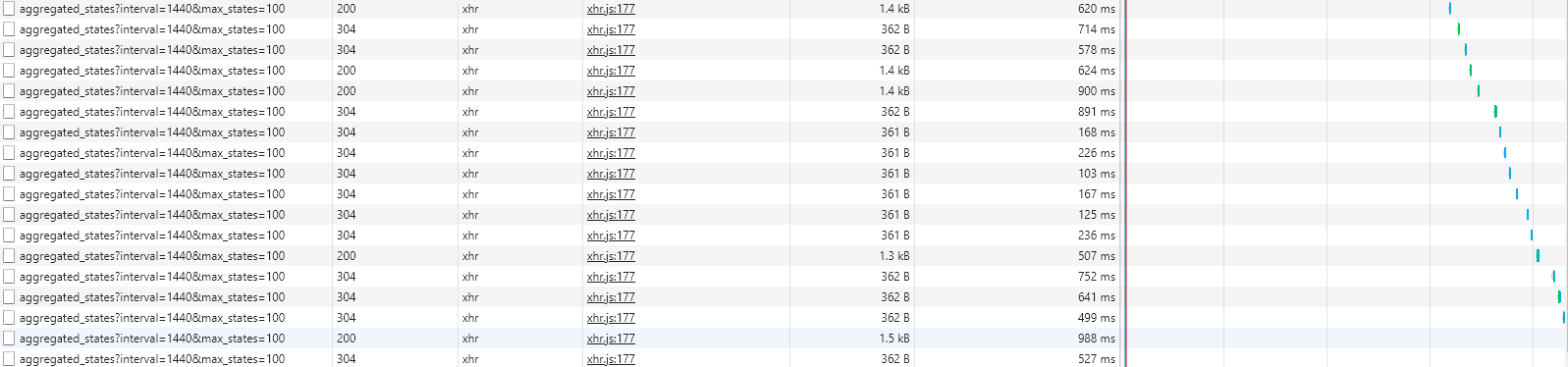
Ok, could you open this page displaying the inspector tab « network » of your browser?
You filter by « XHR/Fetch », and you filter by displaying only the request « aggregated_states », what I’m interested in is the size of the responses, the response time, and the waterfall.
I changed, I displayed the last two decimals if there are any, but to switch units, we’ll see if we don’t do that in another development specific to energy management.
Now it will display 0.11 kW! That’s already something!
Would you see a CSV export of just what is displayed on the curve? Or a total export of all sensor values?
Thanks @Terdious for your more in-depth feedback than mine, it’s interesting And given what you say, I can’t even imagine everything you’ve set up, it sounds amazing!
Hey @pierre-gilles I have another small suggestion: is it possible to have the number and the trend as well when selecting 7 days for example (currently limited to the 24-hour view)?
For my fridge consumption, I would like to know, for example, if the consumption over 7 days is totally deviating or within the norm
@Terdious already mentioned it, but I’ll say it again, it’s really awesome! It opens up a new field of possibilities for analyzing the data collected, such as detecting electrical consumption problems, recurring humidity, or even correlating certain events with values on graphs.
I’ll tell you again tomorrow, I had about one every 2 hours during the day. Edit: for now after 3 hours, no more failure.
It’s okay for me
Well in this case it’s perfect However, is it possible to only display this preview when you modify something in the box, or even a button to display the preview without preloading. Because in this case we end up with the same display delay as in edit. If it’s too complicated, forget it we will adapt, it’s better to have a preview than not I think.
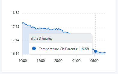
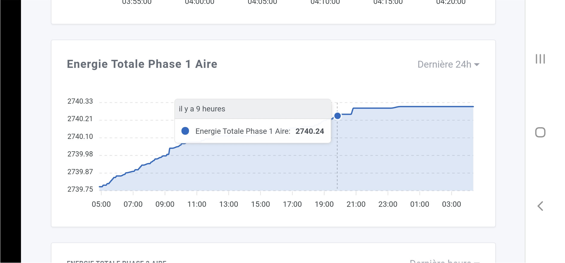
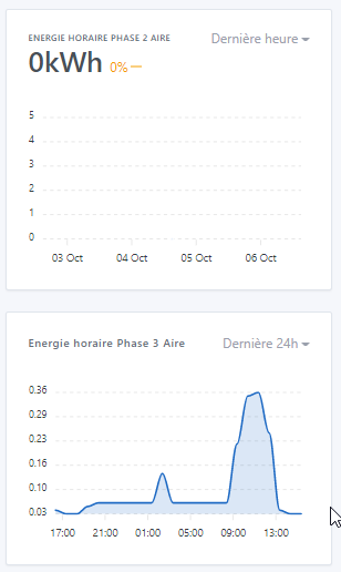
It’s okay for me, the time is correct However, I have a problem when a value is sent only once per hour. In the end, nothing is displayed. Example below with hourly energy which, in the « Last hour » aggregation, displays the days on the axis making it seem that there have been no values since at least before October 3rd and shows future days while in the « Last 24 hours » aggregation we do find values (it’s the same for the 3 phases.
Okay for me However, the title displayed on the « Last hour » aggregation is translated in all caps while that of the other views is written in the same format as we write it in Edit (see image above). Just a correlation issue.
Okay for me
I completely agree for a dedicated view in the future, which also removes my previous request regarding the zoom possibilities already present which is sufficient for this view. Perfect.
Very sincerely, it was to make a detailed report of the use but for the display of 18 graphs, it seems really not bad to me!! If I do the same in Excel, I’m not sure I would take less than 10 seconds ^^
Okay for me Possible to take advantage of this to change the unit « KW » to « kW » however, I’m sorry for my picky side on this one but it’s really shocking to see Is it also possible to be able to have the variation on all available aggregations. It’s the ideal view for that, and it can be very useful for all scales: for power, a tank level, an outside temperature, etc., the variation over 24h in instant view would be really great. For total energy consumed, solar production for example, the variation over 30 days / 3 months / 1 year would also be very interesting. In this case, the space on these views is practically the same, we could only display the variation without necessarily putting the instantaneous value if you don’t want to clutter the display too much. Edit: Oops, I didn’t notice, but @lmilcent already mentioned it, so I stand behind him to confirm that it would be great ^^.
As for the unit switch subject, yes it’s a whole other debate, we can open another topic and it is part of another development yes, sorry for bringing up the debate here
Okay for me It’s very good like this for the moment thank you!!
The first goal was that one yes!! But with the reflection you bring on a dedicated view for medium or long term, it no longer makes sense as a request, it will be much better in this view!! The goal of the Dashboard view being, as you say:
Thanks for everything and I’m ready to try any other update on this feature… especially ^^
Ah, that’s not normal, normally there should be a box displaying « no value on this interval ». I will check.
That’s normal, it’s just a design issue, it’s not the same design for the two types of display
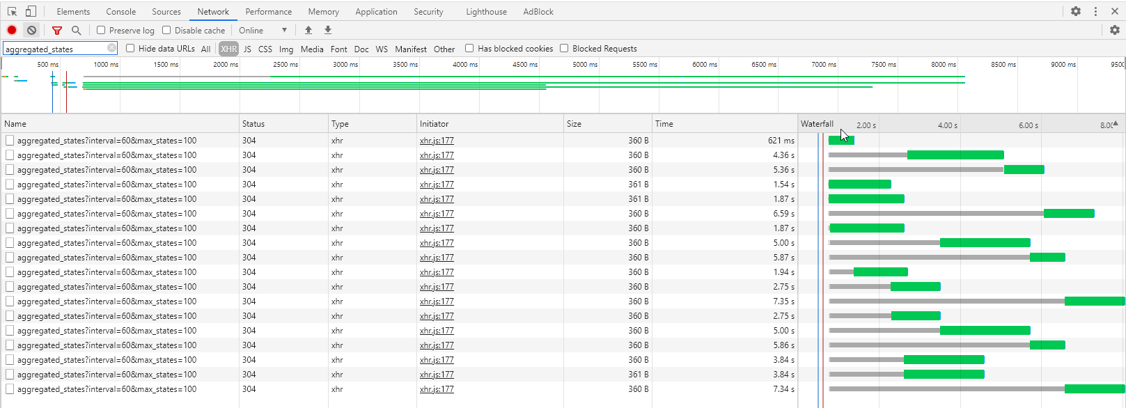
Some requests are still long (988ms for the longest one!)
I would be curious to see what happens. I will add logs in the next build and we will look together to see what takes time
Otherwise, the browser only allowing 5 requests per host in parallel, it’s quite normal to have such a waterfall, there are necessarily requests waiting!
Well, in the end it’s not related to this PR, it’s everywhere in Gladys like that (I don’t know who developed that)
Do you confirm that it’s okay to change it everywhere?
So, yes, there is a value sent. And unlike a motion detection which would mean « No motion detected », here I receive « 0 Wh » which allows me to know that there was no consumption during the last hour. So everything seems fine with the display. The only issue is with the date axis which switches from displaying hours to displaying days.