Displaying sensor curves on the dashboard

@Terdious Ok, super interesting, thanks!

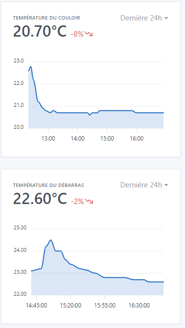
As we can see, the slowest calls are as follows:

Summary
getDeviceFeaturesAggregates.gettingRowsFromLiveDb(energie-totale-phase-1-centre-equitherapie): 1.154s
getDeviceFeaturesAggregates.gettingRowsFromLiveDb(puissance-phase-1-centre-equitherapie): 1.155s
getDeviceFeaturesAggregates.gettingRowsFromLiveDb(energie-phase-1-centre-equitherapie): 1.157s
getDeviceFeaturesAggregates.gettingRowsFromLiveDb(puissance-phase-1-centre-equitherapie): 1.162s
getDeviceFeaturesAggregates.gettingRowsFromLiveDb(puissance-phase-1-centre-equitherapie): 1.724s
getDeviceFeaturesAggregates.gettingRowsFromLiveDb(energie-totale-phase-1-centre-equitherapie): 1.159s
getDeviceFeaturesAggregates.gettingRowsFromLiveDb(energie-phase-1-centre-equitherapie): 1.156s

getDeviceFeaturesAggregates.gettingRowsFromAggregatedDb(energie-totale-phase-1-centre-equitherapie): 1.733s
getDeviceFeaturesAggregates.gettingRowsFromAggregatedDb(energie-totale-phase-2-centre-equitherapie): 1.742s

These are mainly DB calls on « live » data, meaning the data from the last hour.

Out of curiosity, how many states per minute do you record for these sensors?

Also, as there are many requests, the browser queues the requests to avoid DDOSing the server, so it’s more or less normal, no need to worry :slight_smile:

Also, are you running this backend on the same SSD disk as your Gladys production installation? It’s possible that the two are competing for disk access, so you might have better performance in production when you only have one instance :slight_smile:

I understand the idea.. Maybe these features are just not well distinguishable in the UI (same icon, etc.. we could add something to make it more readable?)

For the distinction between « energy consumed » and « total energy consumed », is this something common in devices found in commerce or is it something you do here @Terdious?

Why wouldn’t « total » be calculated by Gladys?

This is the solution we are heading towards, as mentioned in the other topic :slight_smile:

In any case, after conducting this survey, it’s really the device.name that is important and will be highlighted in Gladys, not the deviceFeature.name.

I will change this view as well, we stay on the device.name

New build available on the chart tag with the latest fixes:

  • Display of the device name instead of deviceFeature.name (following the discussions on the other topic)
  • Purely code correction related to the feedback from @AlexTrovato

I still have the NaN bug from @lmilcent to investigate, but I can’t reproduce it for the moment.

Do you have any other feedback?

Does the feature make sense for everyone now? :slight_smile:

Hello everyone!

I’ve been working hard on the PR today, and for me, I’ve reached the end of development:

  • I’ve fixed the last things to fix
  • Removed the logs added during development for debugging in some cases
  • Added data to the demo file for the demo site

I’ve done a final build on the :chart tag as usual.

I’m open to any last feedback, and if everyone is good with it, I’ll merge it into production! :pray:

Thanks to everyone who has tested so far, I hope the feature will be useful to many people! :partying_face:

For information, I just merged this development, which will be available in Gladys v4.6.0 (currently being built)

I will close this topic when the release / release post is live!

Thanks to everyone who provided feedback :folded_hands:

Of course, if there are any new feedbacks, I am still open to them (in fact, there will certainly be some with the production release)!!

I think that’s great!
I just have a question about the following behavior:
I configured 2 temperature charts (the values from the 2 sensors are sent back to me by the same script via mqtt), and I have one decimal displayed in one case, two in the other. Same for the hours: I have hh:mm on the first graph and hh:mm:ss on the second. Did I misconfigure something?

Moreover, if we take the first graph where the temperatures are displayed with one decimal, shouldn’t the most recent value displayed in bold follow the same format?

PPS: It should be « LastS 24h » :slight_smile:
Similarly, if I try to display a duration of 7 days, I get the message « No values in this interval » (intervalLE would be better :slight_smile: ); it’s a shame that we can’t display the graph at all on the pretext that we don’t have data for the entire period, I find.

That’s just the library we use that adapts the display based on the amount of data, I’m not surprised at all though :slight_smile:

Ah! Thanks for the feedback!

Thanks too!

It’s not the entire period, basically when you display intervals greater than 24h, we use the « aggregated » data, because the live data is too heavy to be displayed in such a small graph. The aggregation is calculated only every hour, so it should take a little hour for you to have data :slight_smile:

Perhaps a clearer message that specifies this point would be interesting, I think it’s not clear currently

ok, impeccable, I’ll wait until tomorrow :slight_smile:

Indeed, I hadn’t noticed the difference in scale between the two graphs, thanks for the feedback.

Hello,
Small question about aggregated data, I made a Node-RED flow that retrieves Coinbase data for Shiba. The values are around 0.0005 currently, so the chart on an hour displays well (except for the variation which does not display enough decimal places in my opinion :stuck_out_tongue: ) but on the 24h, what seems to be aggregated always appears at 0 (I have however apparently activated the keep_history).
Is this normal?

You need to be patient, aggregated data is calculated every hour :slight_smile: It will come!

I need to clarify this in the UI, you are not the first to ask about this.

This view was rather designed for home automation display, not so much for such small stock values :smiley:

Exactly, it’s been several days (about ten) since my nodered flow has been connected to Gladys, and still no data in « Last 24h »…

Ah ah yes I can understand :smiley:

Ah, I think I understand now! :smiley: There are indeed values, just that they are at 0 (you can see the line at the bottom of your graph), because for the aggregated values we take an average… I admit that I did not design this screen at all for stock values ^^

I don’t know what the solution would be, maybe suggest different aggregates other than the average?

The feature has been available since version 4.7, so I’m closing this topic to free up credits! :slight_smile: