I just
Try selecting “Binary" in the chart type.
@Lokkye Why not just show the binary devices in the list? That’s confusing, isn’t it?
I should swap the type selection and the device selection because when you select « Binary », I only show binary devices, and when you select something else, I only show non-binary devices.
What do you think?
It’s weird having to make this choice — why not just put all the devices in the list, and then you just deduce the displayed chart from the type of device selected?
When the user selects a « binaire » device, you remove all the other non-binary devices from the list, and you hide the options that don’t make sense
What do you think?
That can work too, but for example, a user puts about ten devices in the list and accidentally selects a binary device as the 11th, so they lose the entire list of the previous 10 devices.
No, because you should do the same in the opposite direction: if you select a non-binary device first, it should remove the binaries from the list!
I would find that behavior very appropriate indeed. We’ll inevitably start by choosing our sensor before the type of chart.
I just made the change. Tell me what you think.
I’m encountering the same problem, nothing is shown in the select ![]()
Maybe it’s my fake MQTT device that’s causing the problem?
@Lokkye,
Did you update your docker image? Because we still have to select the chart type before the binary sensor.
And I confirm that it’s annoying not to have the sensor in the list until the type is selected.
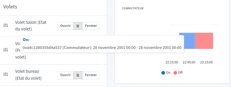
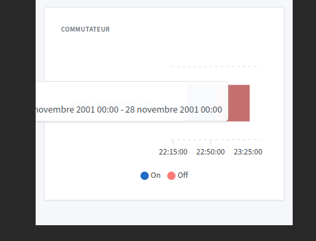
Could you do something about the display of the details when hovering over the chart with the mouse? The window goes outside the frame and when switching to mobile format half of it is cut off.
Why did you remove the choice of the time interval?
I think it’s because of the name but on my chart it doesn’t look as good as yours.
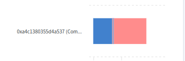
Ok I left the default name of my sensor but as a result it takes up half the frame.
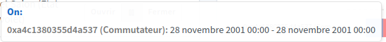
What happens to the legend if you add several binary sensors but with different text? For example if you add an open/close sensor (Open/Close) and a switch with On/Off. Does the legend display On/Off, Open/Close, or both?
I think the times aren’t working
No, I hadn’t released a new Docker image, it’s being created
Uh.. yes I’ll take a look
Because if you set more than a 1h interval, the chart becomes unreadable
For the moment, the only text displayed is open/clode
Weird
Ok, so in that case you need to disable it in the chart’s edit settings.
But then, if we only have the last hour available, is there really any point in having a graph? It should be at least over 24h or a week.
I mostly agree with that remark; maybe we should revise the graph so that only the impulses appear, or vice versa?
Hello! Quick follow-up on this PR — how is development coming along? ![]()
Hello @Lokkye ![]()
I saw your PR on GitHub, I was wondering what the status was?
With all due
Hi @guim31,
I took the liberty of picking it up in the other PR (mainly to see how it would look) — there wasn’t much missing (there’s one detail left to fix in the detail window when hovering over the curve).
If it needs to be split out separately I can take care of it if @Lokkye is not available at the moment.
That’s what I was wondering… I didn’t know if the whole thing could fit into the work you had done… it’s great! ![]()
Awesome if you can take over the dev, I’d be happy with a separate PR, yes! ![]()
Lokkye hasn’t been active on the forum for a while so we probably won’t get a response from him, I think