Affichage des graphiques pour les capteurs binaires

Great, I’ll pick up what I did, it should be quick.

@pierre-gilles
In this kind of case, should I open a new PR (actually I think there’s not much choice because I wouldn’t be able to work from his branch?)

I just need to finalize the tooltip => hard to find info on this kind of data!! But I think I found the right source ^^ https://codepen.io/andrussuitsu/pen/qBKEqzr?editors=1111

Would this be okay like this :

3 Likes

Yes, definitely a new PR!

PR : https://github.com/GladysAssistant/Gladys/pull/2094

However they’re really tiny when displaying names:

In itself the zoomed display on the dashboard is a relatively simple PR without implementing the whole history and the date-to-date feature!! Maybe it’s worth making a small PR about that, @pierre-gilles, no? And we could then graft the ‹ Graph improvements › topic onto it later?

1 Like

Are there any other ways to display the titles?

Yes 100%, I’m in favor of small PRs, that’s what’s best for debugging, and for getting features to the end user as quickly as possible.

1 Like

Could the name be just below the graph line?

I’m looking for everything that can be done in the docs ^^ Not easy, but we’ll find it ^^

2 Likes

@pierre-gilles, would this work:


Their thing is pretty hacky to properly intervene on all my searches; despite an option yaxis.labels.style.cssClass (Options (Reference) > yaxis – ApexCharts.js) you have to intervene directly on the SVG. So I broke the ‹ device › part of the ‹ feature › part to force a line break.

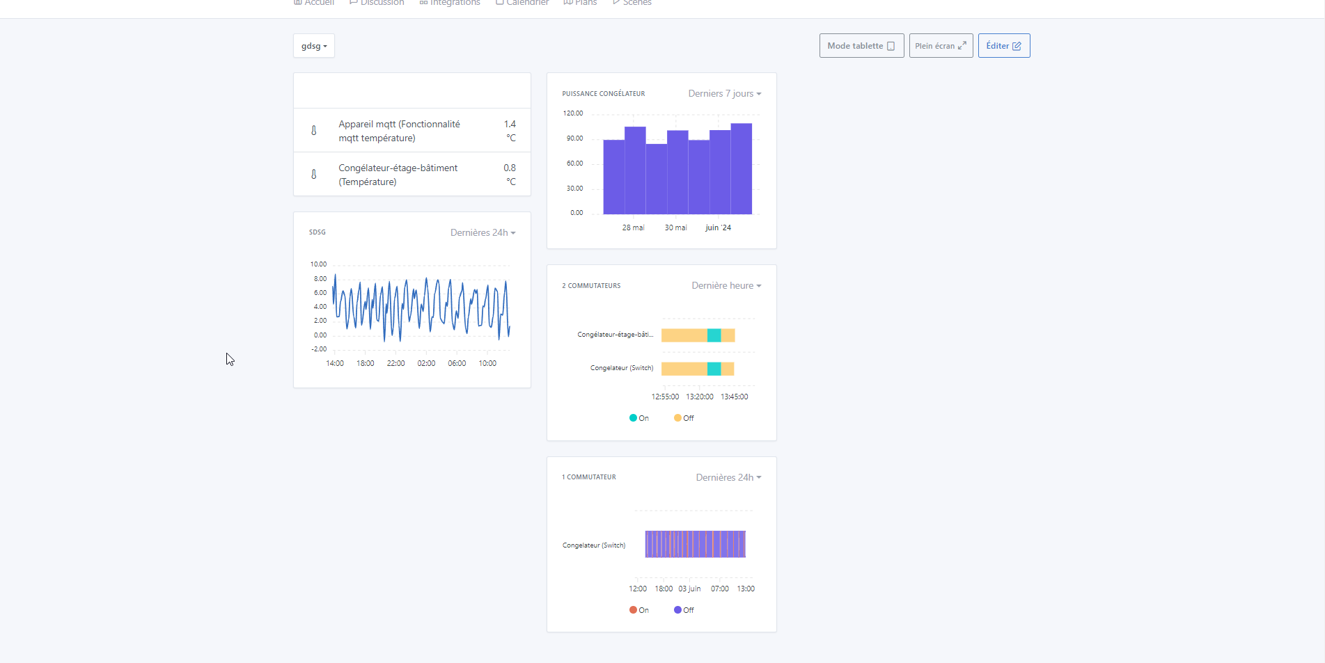
I wanted to reduce the font when there are more than two binaries in the chart, what do you think? In the image, the names on the graph on the right look all cramped, don’t they?

2 Likes

Honestly, it already looks pretty good :slight_smile:

1 Like

I think it’s really great! Great job! Is all of that in the PR? :slight_smile:

1 Like

I think the line break looks good, I’m not bothered by the graph on the right personally.
Anyway, it’s impossible to fit a device name + a feature in full under any circumstances, in my opinion!

1 Like

Not yet ^^ I was waiting for validation ^^ I’ll try tonight!!

But the writing style bothers me, doesn’t it?

EDIT: It’s been pushed. @pierre-gilles do you think you can review this one quickly for me?

I just did a review for you, for now only functional, unfortunately the test wasn’t very conclusive ^^

The UI completely freezes on my end, I can’t get the feature to work :stuck_out_tongue:

Details of my test :

Thank you very much, I’m resuming the tests with little value.

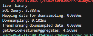
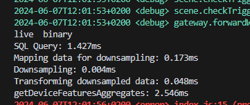
I can reproduce it… But what I don’t understand is that it doesn’t have a direct link with the PR (pull request). It’s the request, according to the console.log I put just after, that takes a long time for the binary only when there aren’t enough values (< 3 or 5 values) … yet we didn’t touch anything on that side ..

I’ll look on the server side to see if there’s any particular reason.

EDIT :
When empty :


and when loading the data :

So it’s the front-end rendering :

I’ll continue

1 Like

Hi @pierre-gilles,

So, it was a rendering bug — the chart generation was spinning, I guess because it can’t build the rangeBar chart when the data are below the base min/max scale (which must have been 5 min). Once it had more than 3-4 minutes of data, it was unable to render the dates in the correct format and didn’t display the data despite the curve appearing. And this persisted up to 10 minutes of data.
From all my tests (the time I spent on it :man_facepalming: ^^) adding the following to the options:

      min: Math.min(...series.flatMap(s => s.data.map(d => d.y[0]))),
      max: Math.max(...series.flatMap(s => s.data.map(d => d.y[1]))),

That should work. I’ll let it run through the day to be sure.

EDIT: Changes are pushed

1 Like

@Terdious Thanks for the investigation and the changes !

I just pulled, I tested your PR but it doesn’t display anything even though the API does return values :

Hi @pierre-gilles,

My mistake — I hadn’t changed back the minimum value for « value » to display the curve (>1) after my tests. It’s done. Sorry for the inconvenience.

Should I add a specific message for the binary to warn that at least 2 values are required (otherwise it displays an empty curve)?

@pierre-gilles,

I would like to add a ‹ heightAdditional › for displaying binaries when there are more than 3 selected. The idea looks like this :

Otherwise, we end up with something like this :

What do you think?
(Do not take into account the icon in the top right — I noticed it during my tests on the PR for the extended chart view.)

1 Like

Ah yes

It’s a rangeBar, so it