It’s a manual action. Afterwards, if you want to share Cloudflare links more easily, you can configure Cloudflare on your Gladys repo and it will create the links automatically ![]()
Okay everything’s done, I only have the reordering left… a pain and the tidy-up.
I looked a bit into Cloudflare, created an account and a Page linked to my fork… but it doesn’t give much ^^
Edit: Reordering of the binary charts (order of display on the dashboard) done. Now all that’s left is to retest. @pierre-gilles if you can restart Cloudflare, or if you have time, guide me so I can do it ^^
I’m at work today and tomorrow so not possible, but I’m surprised you can’t do a Cloudflare Pages build — it’s normally done in a few clicks.
Did you push a commit after configuring the builds?
Maybe try searching for a Cloudflare Pages tutorial on Google ![]()
Thanks for your reply ^^
I’ll look into it a bit more … ^^ for now my test was to go to the « Workers and Pages » tab
My configuration:
Build configurations
Build command: cd front && npm run build
Build output directory: /front/build
Root directory: /
Build comments on pull requests: Enabled
Environment variables:
| Variable name | Value |
|---|---|
CYPRESS_INSTALL_BINARY |
0 |
GATEWAY_MODE |
true |
NODE_VERSION |
18 |
SERVER_URL |
https://api.gladysgateway.com |
A big thank you to you, it works perfectly!!
@guim31 and those interested, the Gladys Plus link to test Gladys Assistant
:


Display without modification with default order:
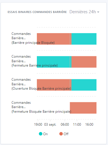
After renaming and reordering:

It’s done!!
I just tried it and when there’s a lot of data it’s not really usable.
At the same time it’s hard to do better; maybe try showing the curve in 1 column

Otherwise it’s OK
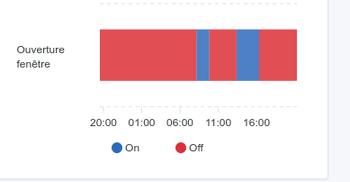
One other small detail — well, I find it odd. When you hover over a curve on a chart with multiple curves, it highlights all the curves.
Hi @_Will_71,
Thanks for your test, the advantage of front-end PRs is being able to test quickly and easily, it’s great ^^
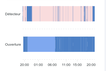
Indeed, for sensors like detection that jump to 1 in a matter of seconds, the results aren’t visually clear over 24h. Have you tried zooming (currently possible only on desktop I think)? It works fine for me.
As you say, hard to do better. For this kind of case. The PR on the expand should help too.
I’m making a new test build with the two PRs combined if you want to test: Binary + Colonnes dashboard
I can’t separate the row highlighting because it highlights the value « on » or « off » which is the same for all the graphs. But I can remove the highlighting if needed!
So in 2 columns it looks like:
And if we zoom on a part with fleeting appearances:
So it works quite well when zooming. The problem mainly occurs on mobile as long as you can’t zoom.
And in 1 column (which won’t change anything on mobile, maybe just on tablet):


Anyway, over 24h the goal is only to roughly spot where the detection zones are. Then zooming (thanks to the real values) allows quickly identifying the trigger times.
[quote=« Terdious, post:88, topic:6599 »]
I’m making a new test image with the 2 PRs merged if you want to test: Binary + Columns dashboard
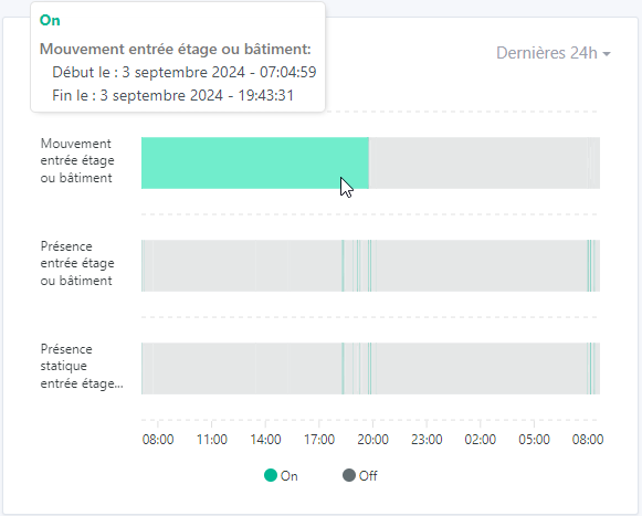
You can test again if you want @_Will_71, I’ve revised the highlighting. I’ve also adjusted the display heights of the timelines so it’s more consistent when one or more binaries are displayed. You can directly
With one column the display is a bit better; as for the zoom, I love it
Great work!

The change you made with the highlighting I find more natural — the highlight is only under the mouse and only on the curve under the mouse. However, if you place yourself below on the On for example, then it selects the On in all curves. Personally I prefer it that way.
I do have a few remarks:
I have the date appearing on the same line as the time

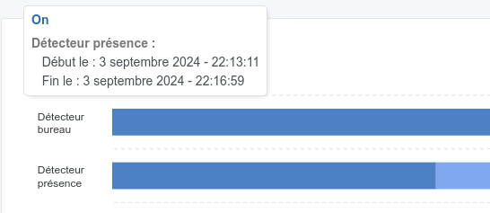
I have white lines appearing everywhere. The On area is cut into several pieces

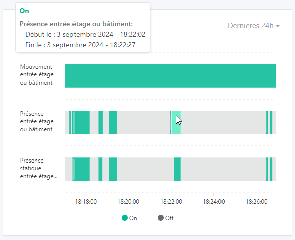
If I zoom in, you can see that the first On ends at 22:13:11.

And the second On starts at 22:13:11. There is no Off area between the two so why this segmentation?
When zooming it would be good to have the scale at the bottom. There is indeed a value at the bottom left but it should be converted.

Can’t wait for this to be merged!
Yes, it’s like that for all the graphs when the display overlaps multiple days ^^. Example on my prod instance:

Indeed I can reproduce it, I’m looking into it. I don’t yet understand the reason. Do you know if during that interval there should have been an Off area, or if there really were no changes?
Lol you zoomed in really far ^^ You reached a display order in milliseconds, so I wasn’t handling it ^^
I struggled but apparently it’s fine: I limited the zoom to a scale of 1s (I think we all agree there’s little point going below that?) So we display a minimum of 10s. If you try to zoom again, it just shifts.
Zoom max :
Damn I found it … ^^ It’s nonsense ^^
This happens for binary sensors that send more than 100 data points in 1h (or in 24h depending on what’s displayed). They return an aggregate. So if we only have 1s and a single « 0 » appears, it averages to « 0.5 » so we do have a different value, but it doesn’t know how to represent it…
Maxstate = 100 zoomed:

Maxstate = 1000 zoomed:

So @pierre-gilles, I don’t really know what to do in this case… for a 1h display, I was planning to set 1000 states, but it will probably be the same if the device sends a value every 5s for example, because « Last hour » already returns 3h currently on all the charts… (I suppose it uses UTC time - haven’t looked at the server-side code).
Well in my case 1000 states max fixes the issue for « Last hour », but I still have the case for 24h.
Otherwise I can set 10000 states… but …
In 24h, 1000 states:

In 24h, 10000 states max => 1600 actually (you can clearly see that this is not at all reality compared to the one above, between 10:06 and 10:08 we had a short On and then a long Off before going back to On):

EDIT: 3000 states max … that makes one value every 30s. That would roughly match reality. And for the rest we’ll see in one of the next PRs with recalculation on zoom??
I’ll let you test again on https://terdious-binary-and-columns-dashboard.pages.dev/ (not before 10 minutes) but I’d say it’s not too bad!

Yes that’s it!!
Ah ok, surprising. If you can try again (I’ve updated), because for me it brought up Off zones (consistent with
Doesn’t that impact performance too much with 3000 states?
And if there are only 10 states, we agree it won’t add fake states to reach 3000?
I tested with 3 features on the same graph, I didn’t see any difference. But I can test with 10 graphs of 5 features to be sure.
I confirm, it’s indeed state_max. I haven’t touched the system
Okay, I just ran tests again. It’s nowhere near as responsive as my previous tests. I don’t know what changed in a few days.
The problem is that if we don’t have all the values, as mentioned earlier for binaries everything is averaged, which skews everything because we get states ‹ 0.333 ›, ‹ 0.5 ›, ‹ 0.66667 › and others that can appear when switching to 0 or to 1. And which, moreover, are not time-accurate.
Visual differences in my use case with a presence sensor:
- For 2000 or 3000 states - display takes more than 5s (with 4 other curves) :
- For 1000 states display in 3–5s (with 4 other curves) :
- For 500 states display in 1s (with 4 other curves) :


My issue lies in processing the averaged states to give them a coherent value.

Taking 3000 states, I know that the first state is ‹ 1 › in this case. But how do you ensure that’s always the case? And if we take the example of a blinking signal, how does the averaging behave… only 0.5? How do we interpret that?


I can’t see the point of displaying so many points.
The user won’t even see the tiny marks; they’ll be smaller than a screen pixel… It’s unusable!
Why not restrict the display duration? 1h for example?
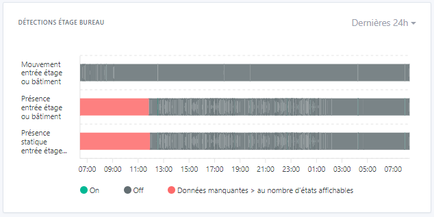
That’s exactly the issue… We’ve already restricted the display to 24h; beyond that it doesn’t make sense. But there are 2 points to consider :
- Sensors that send every x seconds
- Sensors that send on state change, for example a switch (which will remain on longer).
- It would be a shame to penalize the view of the second, which is largely readable:
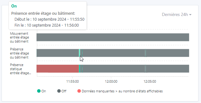
- The interest for the first is that it’s useful to be able to consult a full day and to zoom in to see more clearly — for example here you can clearly see that between 11:00 and 13:00 yesterday there was a presence detection:
=> if I zoom in on 11:50–12:10 yesterday it becomes perfectly readable and I see that I had a presence of 10s at 11:50. So fully exploitable.
The idea will then be to be able to recalculate on zoom. (For example have all exploitable data and be able to zoom on the red area to retrieve data not visible on the initial view)

If you have a bit of time during the week for a video call with visuals, I’m very interested. Because I’ve revised my implementation; however it’s no longer testable from Gladys Plus unfortunately, I’m « forced » to make server-side changes.
I added a specific query for ‹ binary › features and limited the number of results to 300.
The only thing that bothers me is that it worked so well last time at 3000 states that I’m really surprised by the radical change today. I’m afraid my PC is kind of on its last legs (but I can’t restart it. I’d need to set up a new machine for dev. But no time or resources.
That said, I think the method is better because we organize the data directly in the query.
We’ll then need to add the recalculation of values on zoom.