Display the time on the dashboard

@Lokkye, @VonOx’s design is much better for digital display.

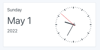
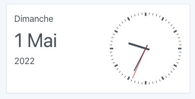
For analog display, why not, we’ll see how it looks once you’ve styled it, it needs to blend well with the rest of the dashboard. I’m thinking for example about the colors, here black and red are very strong (it’s probably a #000000), you’ll need to integrate the theme colors so that it blends well with the theme.

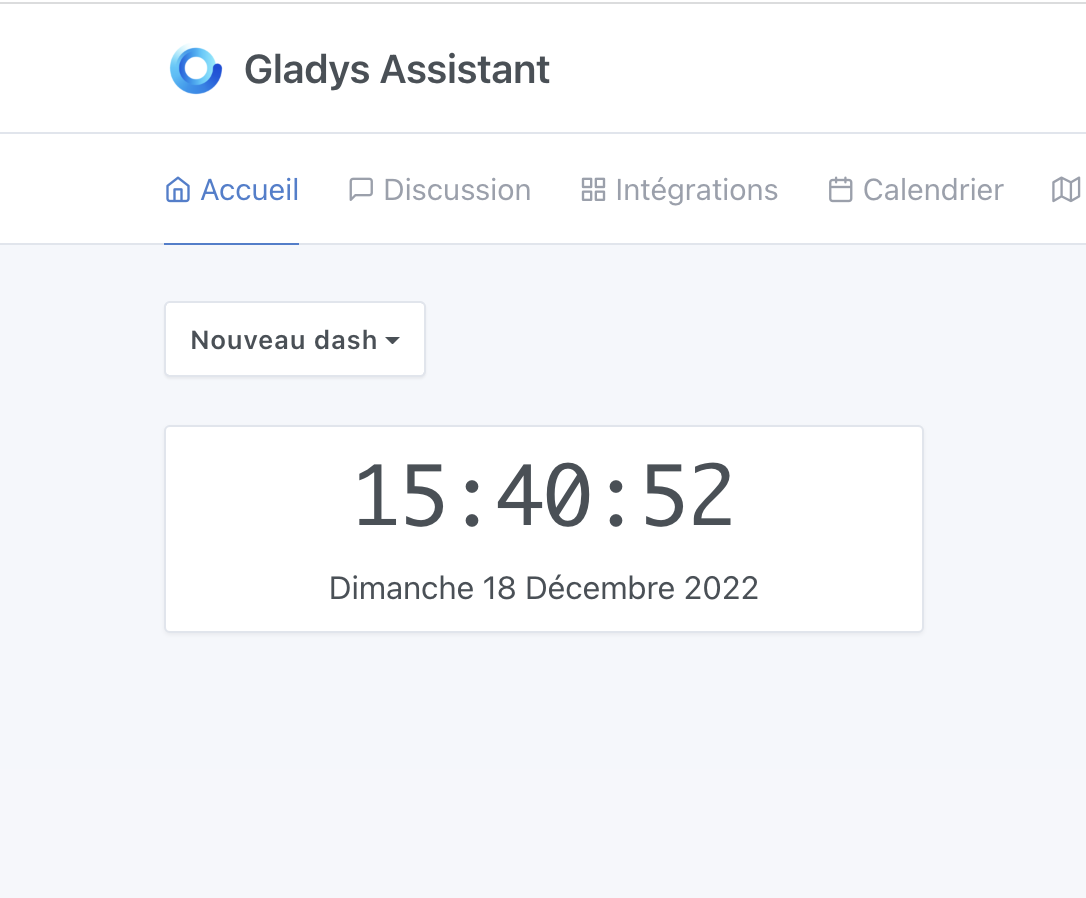
Also to consider so that the box isn’t too empty, the date can be used to fill the left side, example:

(I’m just talking about placement, not the color :p)

I like it myself

Here’s what it looks like with the correct colors and the date :


What do you think ?

Nice, I like it

Nice !! It’s clean.

I confirm — if we could have this in the next updates, that would be great!

[quote="Lokkye, post:

Don’t hesitate to give feedback, I know I’m not very good at design and graphics :slight_smile:

The clock comes from the library: https://www.npmjs.com/package/react-clock
It only weighs 67 kB :slight_smile:

Very nice!! I like it

Good evening
That works for me too, great, thanks

Hi @Lokkye!

I saw that you updated your PR — do you need a new review? :slight_smile:

I was just about to ask if we could have the time on the dashboard.
So I’m looking forward to seeing how it’s going to turn out. :slight_smile:

Yes, I’m still up for a review :slight_smile:

Review done, the PR is really good for me apart from just one design feedback :slight_smile:

The PR was developed in May when the month was a short month name, but now we’re in December,

Thank you very much for the review :+1:

I’ve reduced the date text size because I hadn’t planned for the « large » dates.

I also made the changes for the unnecessary constants in the backend.

Great!

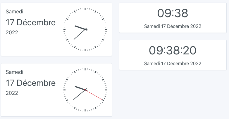
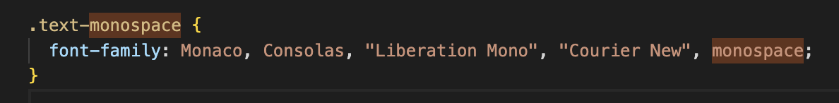
Everything’s good for me on the code side, but I noticed something when the digital clock is displayed with seconds: there’s a kind of « glitch » every second because the font being used isn’t monospace (each character doesn’t have a fixed width)

It’s really a small thing but I think it will drive some people crazy aha:

It would be cool to find a monospace font so that this shifting doesn’t happen :slightly_smiling_face:

I’ll check the theme to see if there’s one…

I find this in the theme:

--font-family-monospace: Monaco, Consolas, "Liberation Mono", "Courier New",
    monospace;

I’ll do some tests :slight_smile:

If we add the « .text-monospace » class, the theme gives us:

(And the glitch is indeed absent)

See:

What do you think?

I like it :slight_smile:

It’s simple and effective. It’s just what we need.
I’d put it in place.
I like the vintage feel of the typography.

Personally I love this kind of font, so I approve :slight_smile: