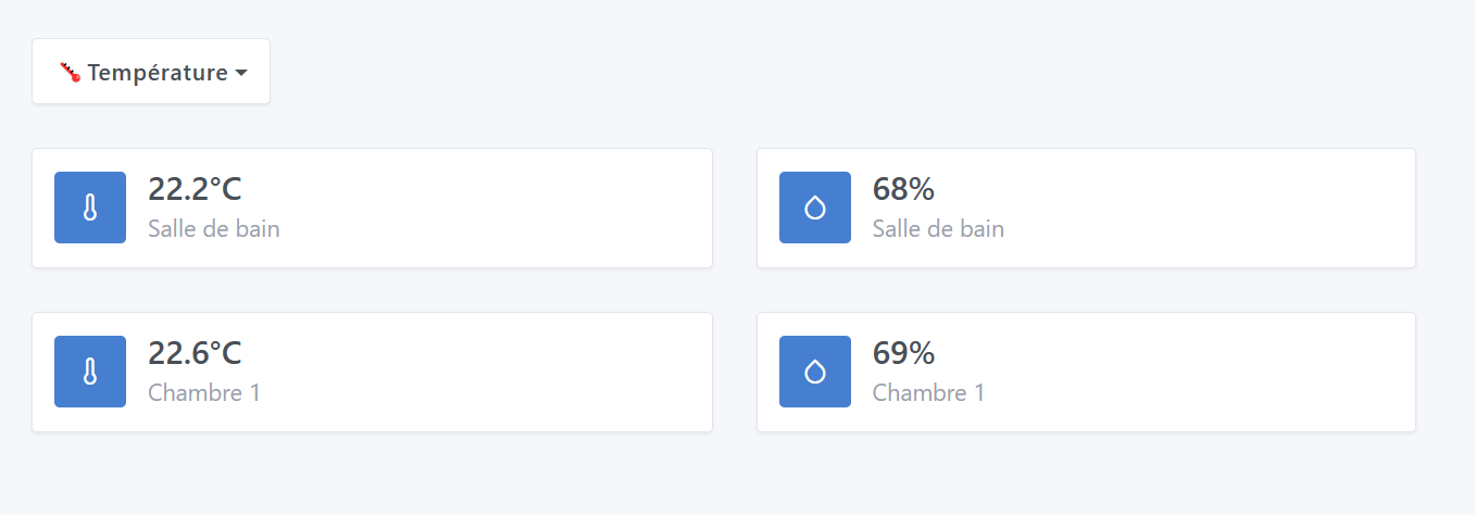
A temperature or humidity value can vary depending on the room:
Humidity will be higher in the bathroom than in a bedroom, etc
So it would be interesting to allow defining low/normal/high type thresholds on the room Temperature and Humidity widgets to have reliable color information on these dashboards via these widgets.
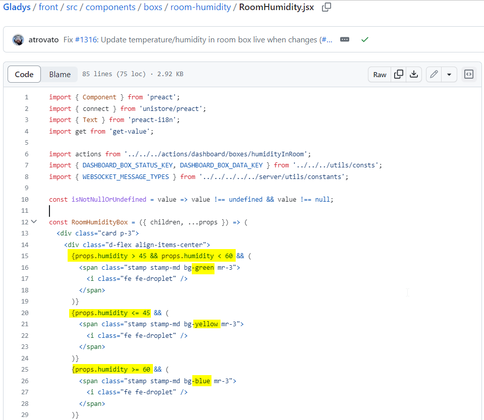
It seems there are only generic thresholds for the Humidity widget (logo color).
It seems the room Temperature widget doesn’t have a notion of thresholds by default today and the icon always remains blue. You might say that I can manage my temperature and humidity alerts via scenes and you are right, but I also think it’s good to have that visually at the widget level on the dashboard. It would also make the colors used for each threshold clearer; I think that today few people know the color/threshold correspondences of this widget and therefore don’t give much importance to these colors.
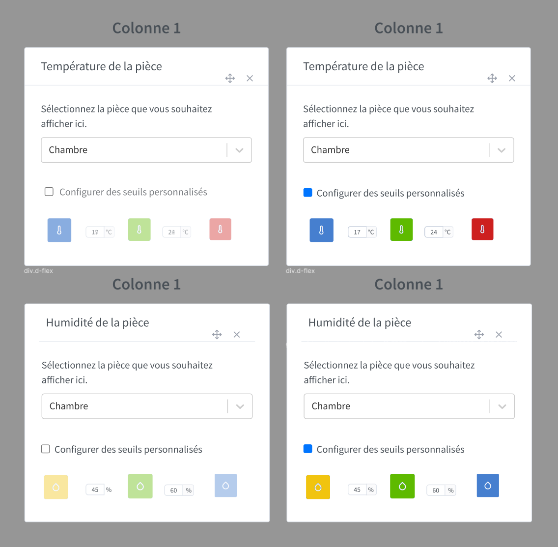
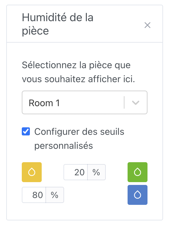
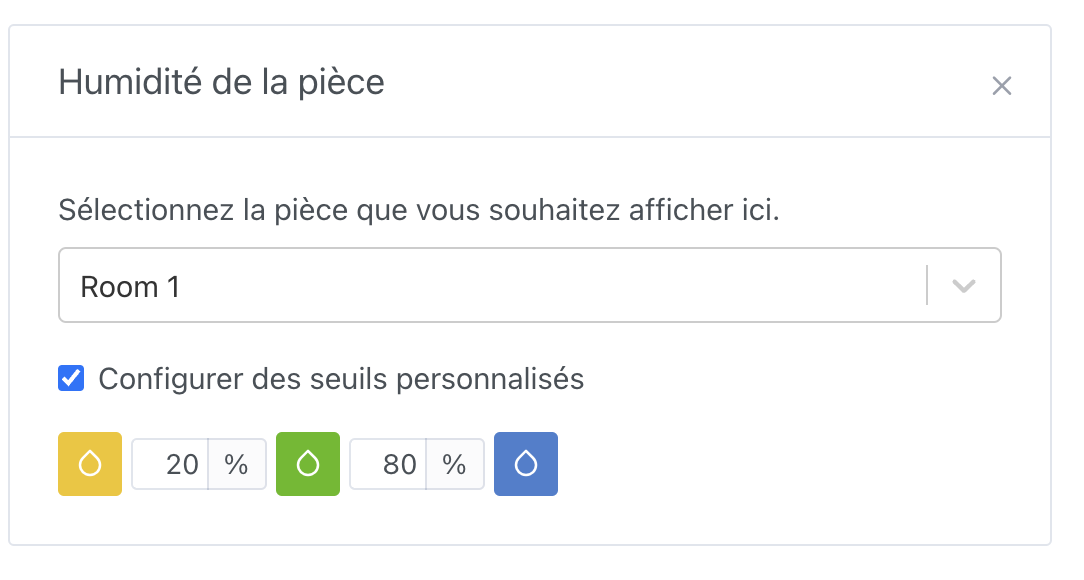
I can easily imagine the ability to configure these thresholds but as optional (so as not to complicate the widget’s use if people don’t need custom thresholds):
Either set generic default thresholds (like what we have today with the room Humidity widget)
Or set no thresholds (like what we have today with the room Temperature widget)
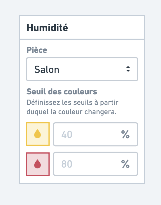
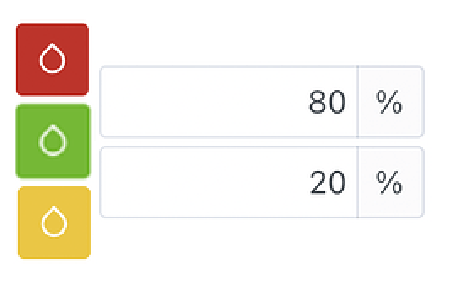
Visual example (I’m far from a graphic designer but this can give an idea, on the right thresholds enabled and on the left no threshold):
Maybe also review the color code (add it to the docs and/or in the widget editor) or perhaps allow customizing the color associated with each threshold.
What I can hardly do (If someone wants to take it on):
Develop the enhancement to be able to define (or not) these thresholds on the box
What I can do:
Start the documentation for the humidity box (it doesn’t exist, only the room Temperature widget is documented)
Complete the docs for the temperature and humidity boxes (thresholds/colors and widget behavior in the docs…)
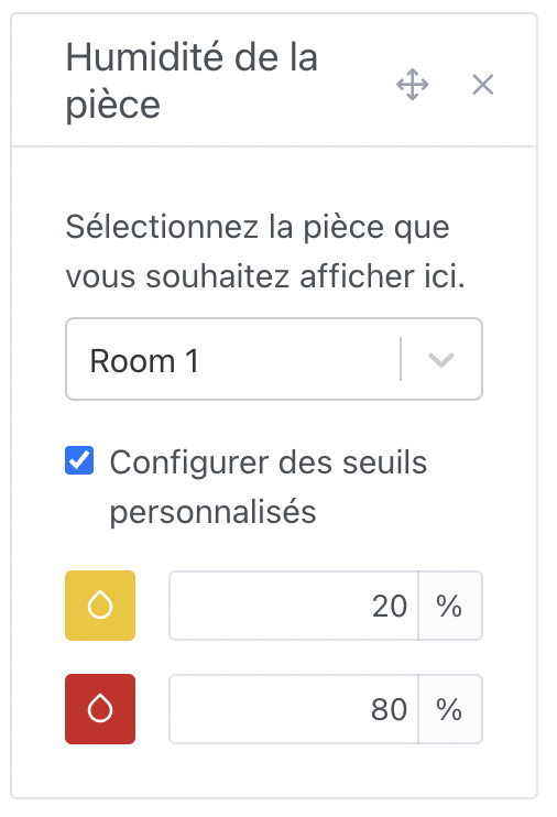
@qleg :
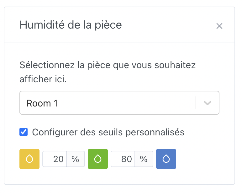
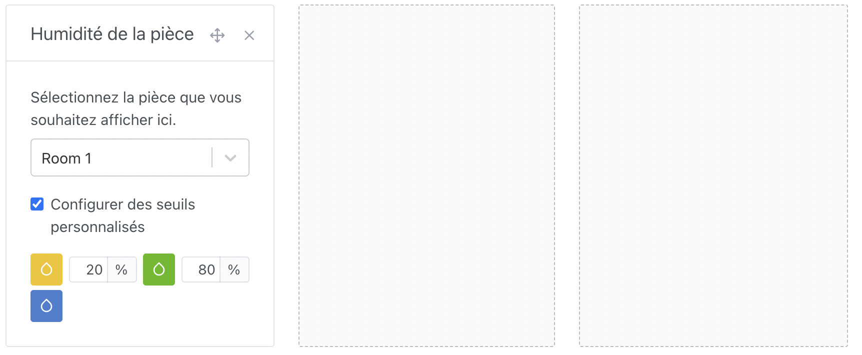
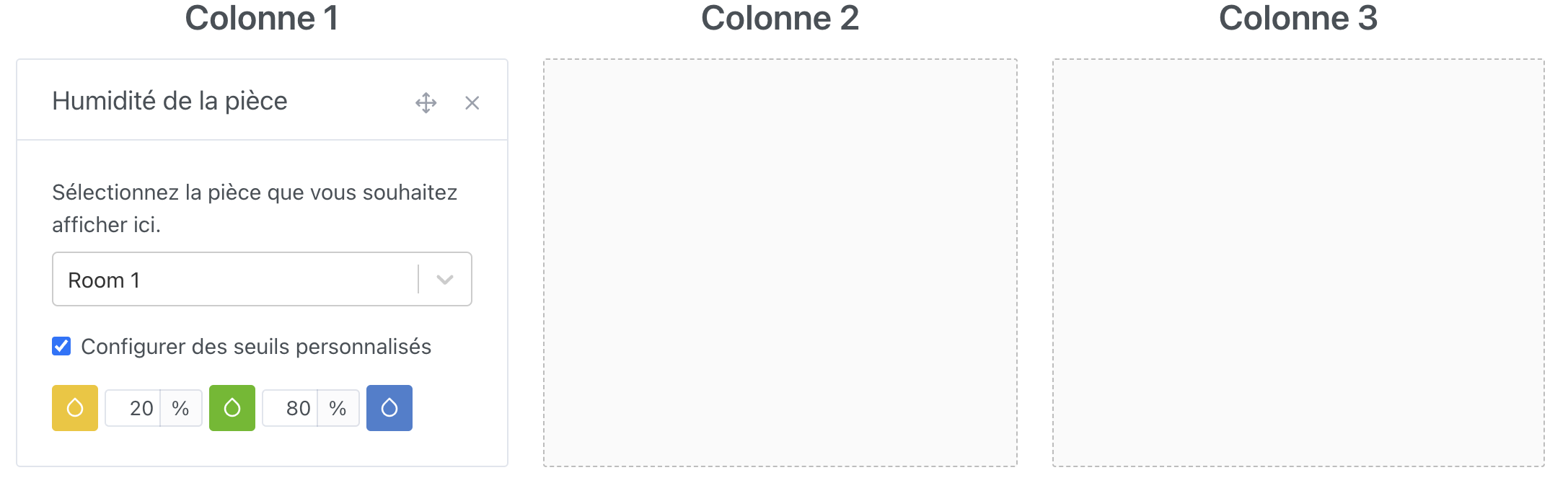
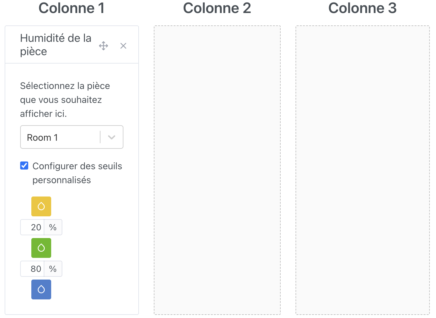
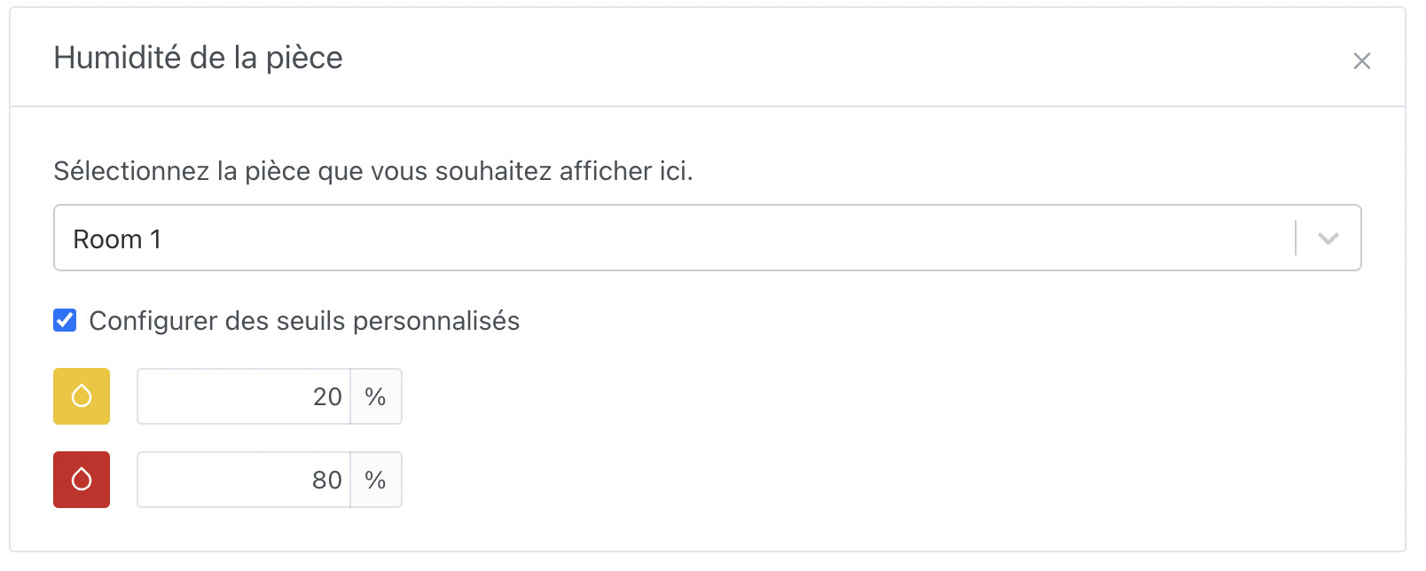
I tried to implement the « design » that you made but I have an issue with the width because it doesn’t fit all screen sizes. I did try to compress everything as much as possible. (Don’t pay attention to the text and the colors, I’m in development )

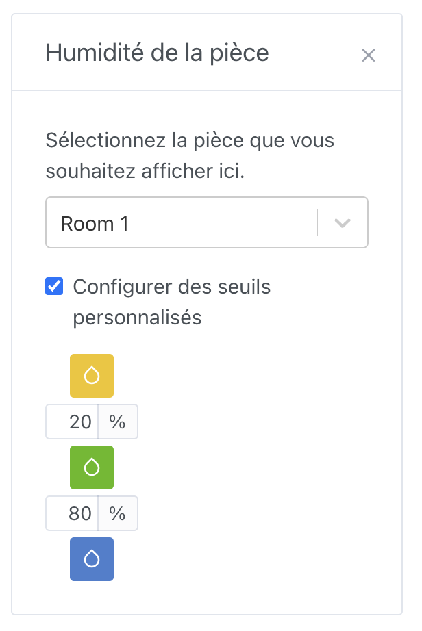
Do we need the checkbox? We can display the default thresholds if they’re not configured, right? Right now that adds one more state to manage; might as well just put the text and the inputs, no?
Otherwise I like it
As for the red color, I don’t want to impose it either — if I’m alone against everyone, blue works too!