Faced with the fact that chart colors were not customizable, I worked on a feature to allow some customization. I’m creating this post to open a discussion on the subject before opening a PR.
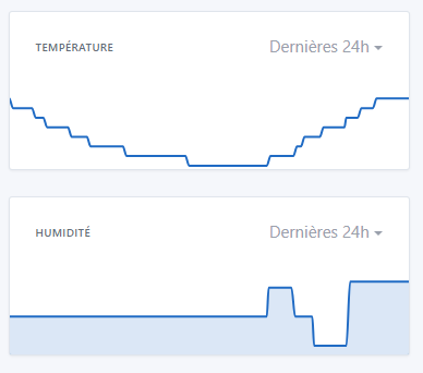
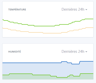
The first thing that bothered me was that all the charts were blue, imposed. In the example below, I would have liked to have my humidity in blue and my temperature in yellow, to « correlate » the colors with the data and therefore differentiate them:
So I wanted to try making the chart colors customizable.
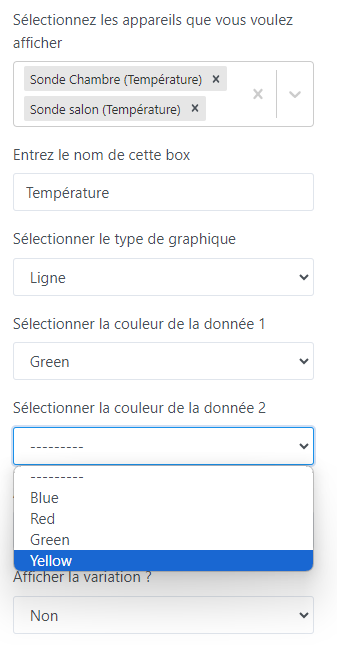
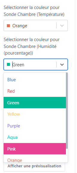
In this first iteration, the goal is just to be able to choose among the 4 colors yourself. (I took the opportunity to replace the second « yellow » with a green).
This feature addresses need #1, but doesn’t change #2 for the moment.
But it would be easy, if desired, to add more colors. (The ultimate solution would be to offer a color picker, but I think it’s counterproductive — choosing a color from a palette can be frustrating for some.)
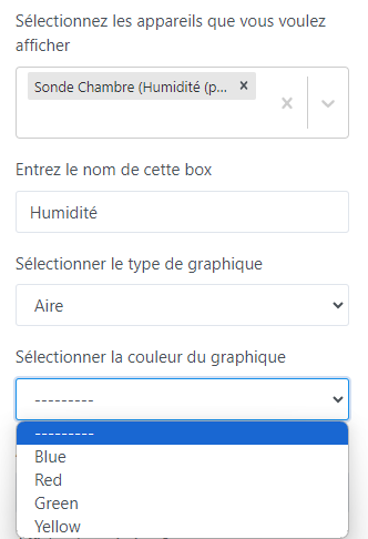
Here’s a quick demonstration of the feature:
When displaying only one data series, you can choose a color (or not, in which case the default colors will apply)
I tried to find out why this option wasn’t available until now, but I didn’t find any justification, only this sentence:
In this post:
So I hope this feature doesn’t harm the project’s philosophy (I understand that the idea behind Gladys is to remain extremely simple to use).
Discussion is open — I’d be curious to hear what each of you thinks.
I like what you propose, and I have some feedback:
Instead of putting « Data 1/Data 2 », you should put the name of the displayed feature
By default, select a different color per feature so the user only has to change it if they want to
In addition to showing the color name, include a small square with the color as a preview — I think if you go through React-Select (which we use everywhere in Gladys) it’s possible (React-Select).
Not very keen on a color-picker; for me we should offer a fairly exhaustive list of pre-chosen colors that are coherent with each other.
There are color palette sites that exist:
We should choose a single palette, and then offer about twenty colors max, for example
Glad to see the feature might be well received — I’ll rework it to finish it and take the feedback into account, after which I’ll open a PR.
Regarding the feedback:
Yes, to be honest I had started wanting to do that, but I found that the « label » became too long with some devices. But I agree that it would be clearer than numbering. I’ll implement it with the name, and we’ll discuss it again.
Yes, by default I hadn’t put anything so that it would fall back to the default colors. But indeed, it might be clearer and more easily editable with your solution.
Totally agree, thanks for indicating which component to use.
We’re aligned on that
I think twenty is too many. First, it’s hard to find 20 well-distinct colors. Also, I’m not sure the need is there. If a chart displays 20 different data series, it will have readability issues that go beyond the color problem in my opinion.
What do you think if we start with 10?
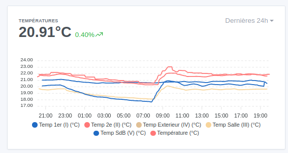
Huge fan of this feature — since I often look at my temperature chart (which has 6 or 7 sensors) I regularly get confused and click around to tell them apart.