Hello everyone!
It’s Monday, back to work ![]()
I’m finishing all the modifications we discussed here:
- Correction KW → kW
- Display of the variation for all types of intervals
- Display of multiple features on the same curve (this is the most complex point)
This last point is the most complex!
Here’s where I am for now:
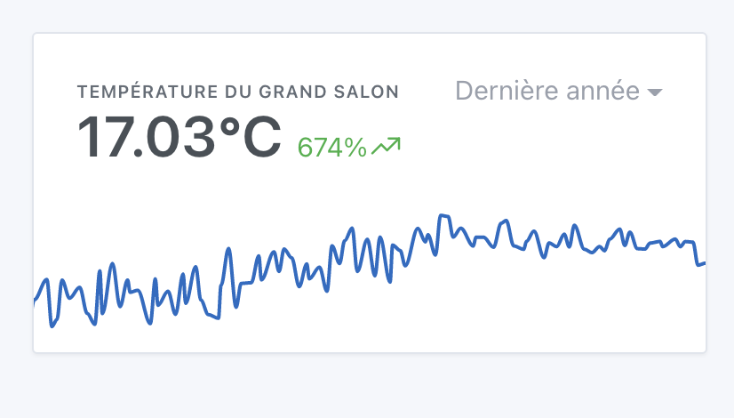
Display of a feature
Basic state, display of a single feature:
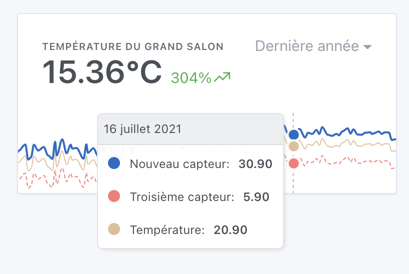
Selection of multiple features
I removed the selection of the room, now it’s in all of Gladys that we search with a multiple selector:
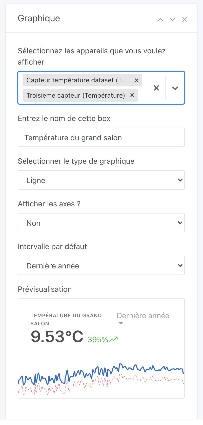
The colors
This is the big debate: what colors to offer?
What do you think if I propose a list of colors that is assigned to the different sensors? (No possibility to choose)
Or is it really crucial to be able to manually select a color for each device?
For now, it looks like this:
I found a slightly pastel color palette on https://colorhunt.co/
If anyone has better taste than me, I’m open to any feedback to find better color sets, knowing that the constraint is that we need colors that are a good balance between eye-catching and too subdued.
Calculation of the variation and the displayed value in bold
For now, the value displayed in bold is the average of all the last values of each series.
The variation is the average variation of all the series.
What do you think?