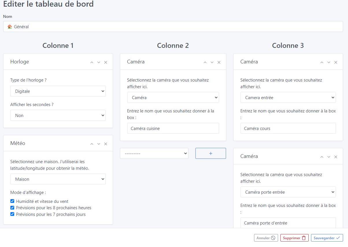
While editing dashboards, there is a fixed bar at the bottom of the screen so you can cancel, delete or save dashboard changes.
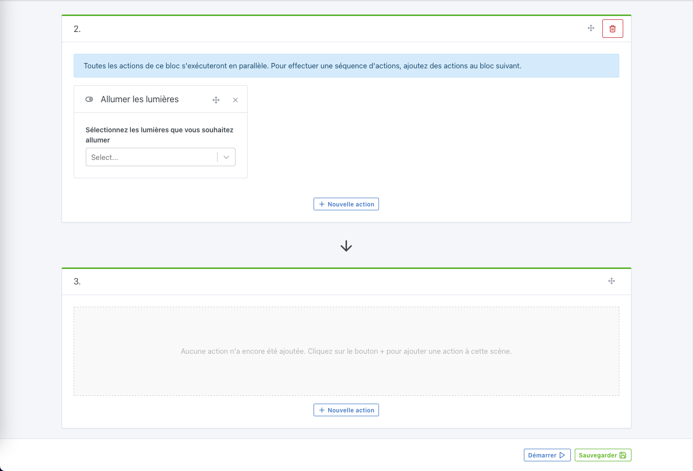
The idea is to have the same thing for scenes — this will avoid having to scroll back up to the top of the page when your scene has a lot of action.
It’s true that it would be more convenient.
@pierre-gilles In the series of small UX improvements, I’m bringing this one up, a bit old…
Hello, I worked quickly on this one and I have several questions :
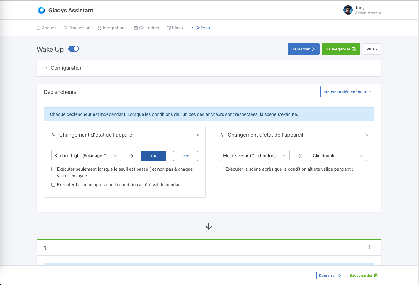
Do the Start and Save buttons suffice (I think so)?
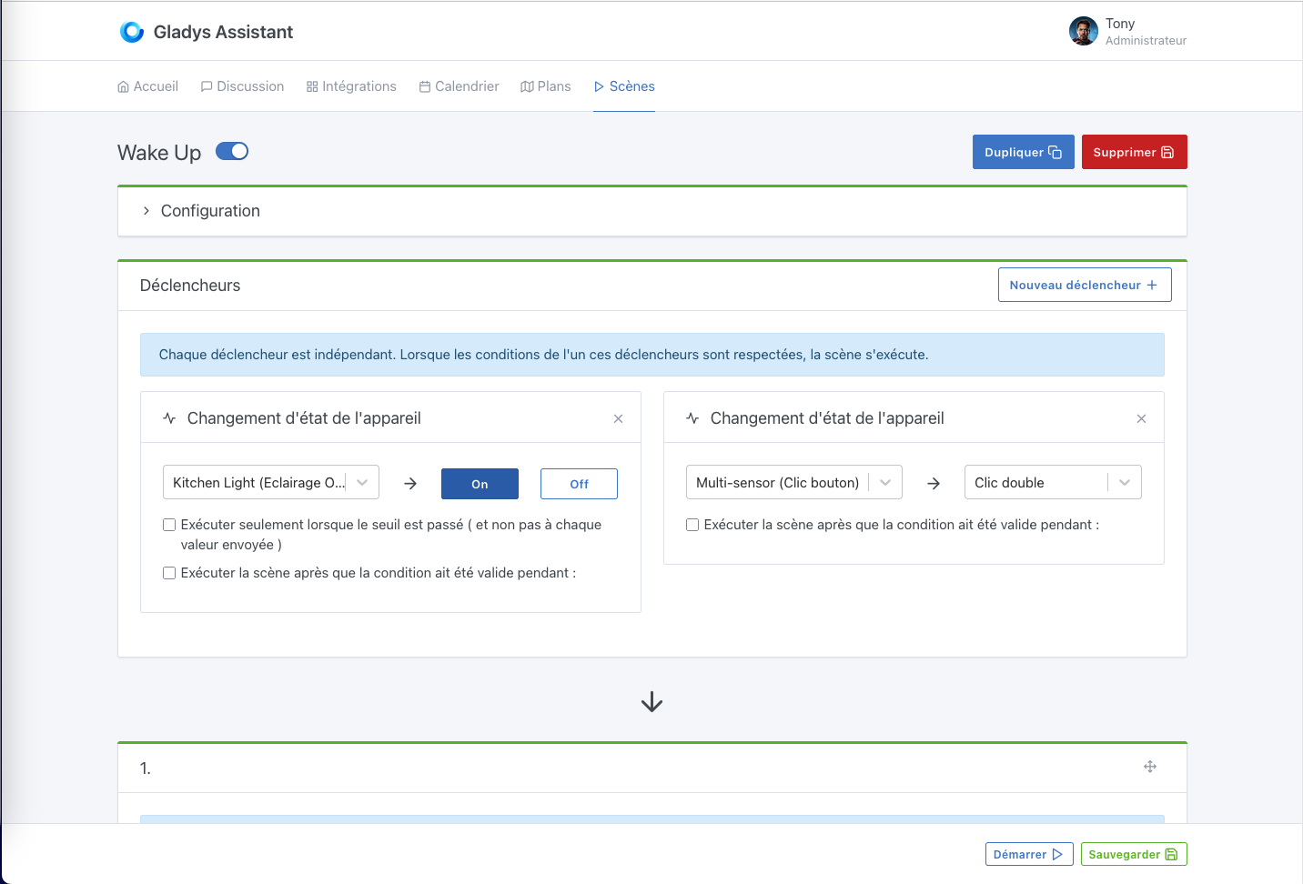
Should we replace the top buttons with these ones all the time, reintroducing the Duplicate / Delete buttons?
Or should the bottom bar only appear when scrolling?
So cool!
I really like this suggestion, it removes the dropdown that wasn’t great
master ← cicoub13:feat-scene-actions-button
ouvert 02:55PM - 21 Mar 25 UTC
### Pull Request check-list
To ensure your Pull Request can be accepted as fa… st as possible, make sure to review and check all of these items:
- [X] Are tests passing? (`npm test` on both front/server)
- [X] Is the linter passing? (`npm run eslint` on both front/server)
- [X] Did you run prettier? (`npm run prettier` on both front/server)
- [X] If you are adding a new features/services, did you run integration comparator? (`npm run compare-translations` on front)
- [x] Did you test this pull request in real life? With real devices? If this development is a big feature or a new service, we recommend that you provide a Docker image to the community ([french forum](https://community.gladysassistant.com/)/[english forum](https://en-community.gladysassistant.com/)) for testing before merging.
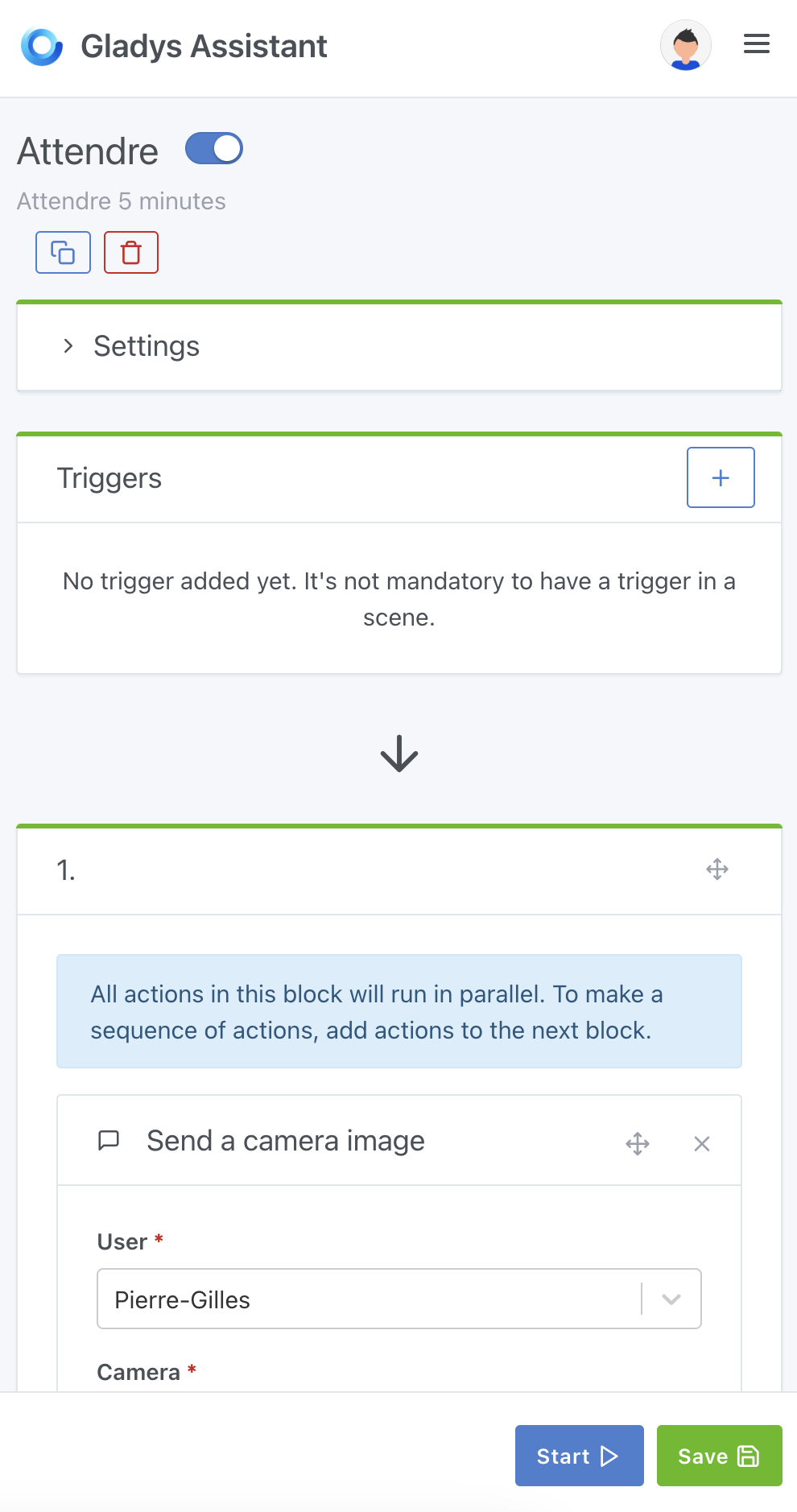
### Scene action buttons sticked at bottom
Improve scene action buttons UI by:
- putting in a bottom sticky footer the Run / Save buttons
- removeing dropdown and adding buttons for Duplicate / Delete buttons
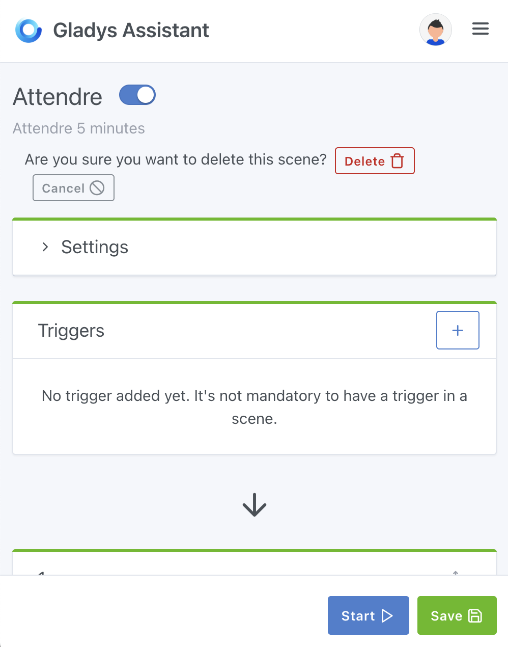
- adding a confirmation when user clicks on Delete


Can you deploy a Gladys Plus page so users can test it over the weekend?
Thanks for the PR, it’s really cool
I have some issues with the responsive layout; the « duplicate » and « delete » buttons should be on the right and bigger, I think:
The placement of the delete confirmation could be improved on mobile:
Jluc
March 21, 2025, 4:25pm
8
Hello,
Hi @Jluc , I think that’s a separate development — let’s keep each development concise
Jluc
March 21, 2025, 4:31pm
10
Yes, of course, I’ll look for the appropriate section.
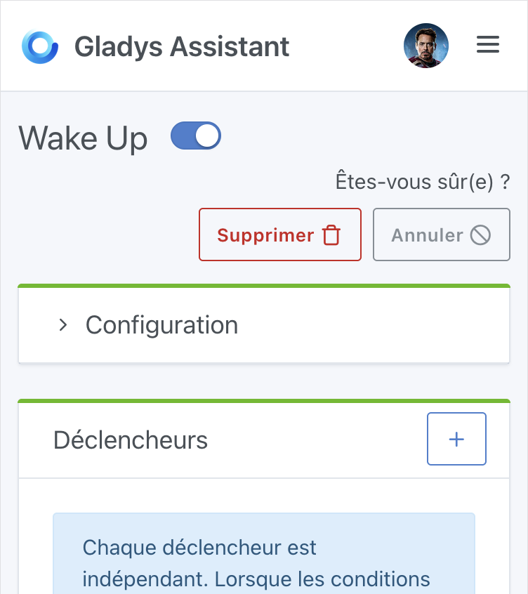
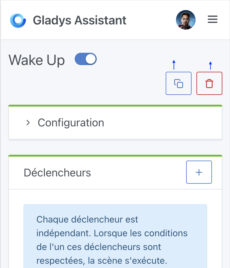
They were already on the left but it’s more natural on the right indeed (and I restored the original size):
Is it better like this?
It’s better, but in your proposal there are gaps above the buttons and below the « Wake Up »; it would be neater to align everything at the same level so as not to waste space on mobile
cicoub13:
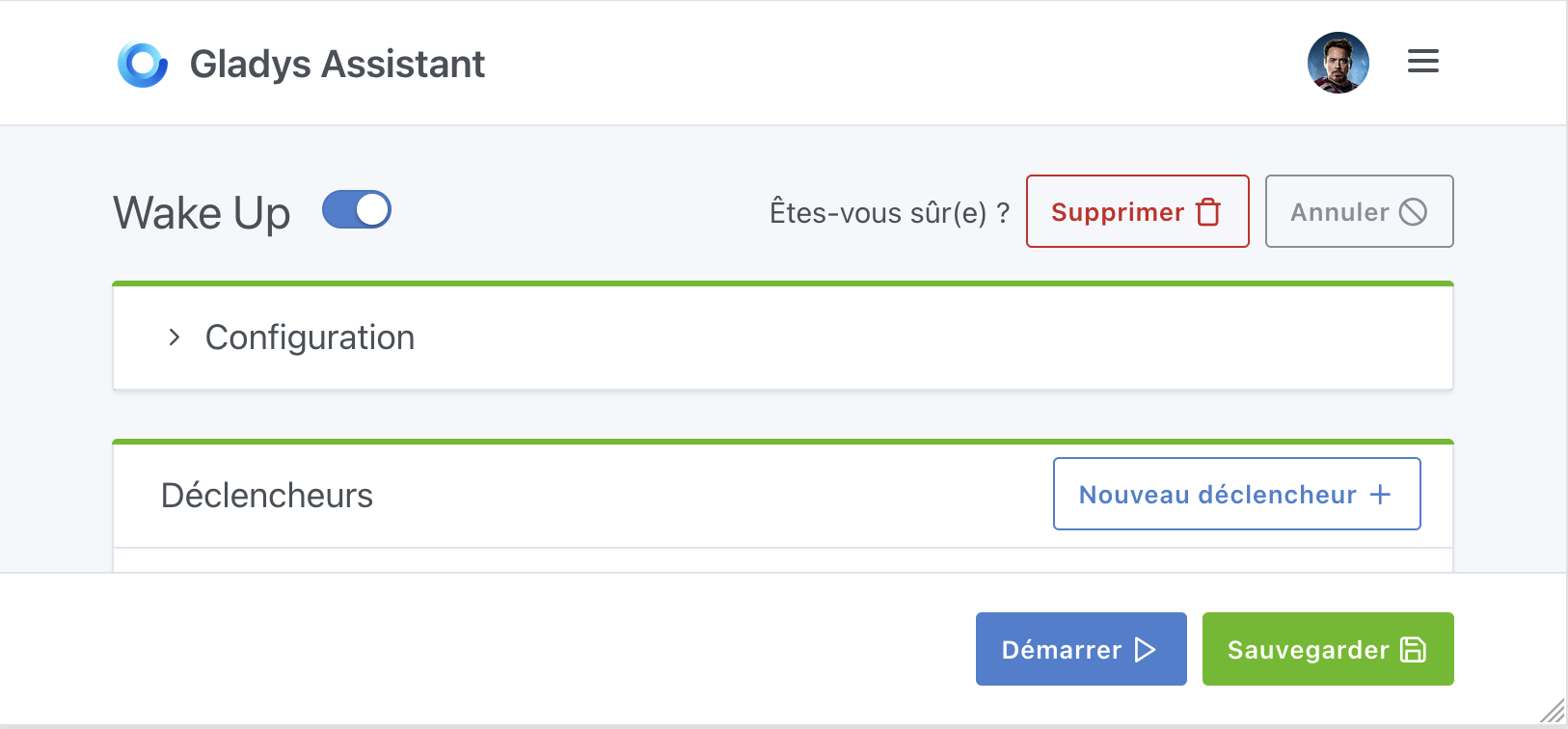
Is it better like this?
Better, but I think we can still do better — we’re losing quite a bit of space on mobile here!
It’s complicated to gain as much space as possible and at the same time to allow for longer stage names.
Tested in all languages
Here is the latest rendering:
I find this version very \‹ clean ›
Thanks for the improvements @cicoub13 , that’s very kind!
However, on mobile it’s still tricky
Current display in production:
Display on your PR:
I think it’s a shame that the « description » text is confined to half the screen
I know I was the one who asked you to move the buttons up to the side, but in your example there was no scene description — in an example like this with a description I find it arguably cleaner with the buttons underneath as it originally was
Jluc
April 18, 2025, 7:34am
16
The button to launch the scene is also very handy.
@Jluc it is indeed still present, just at the bottom of the screen, that’s precisely the objective of this development
Hi @cicoub13 , I don’t know if you saw my previous message
Yes, I’ll let you take a look at the latest version.