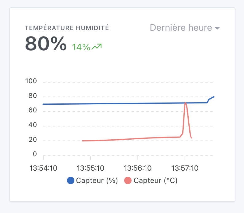
I have just created a chart for a Xiaomi temperature sensor, which gives the temperature and humidity. I display both curves on the same graph and it works very well, but would it be possible to modify the legend of the curves? Because currently the legend of the curves takes the name of the sensor, it would be preferable to take the name of the function. Because on my graph, both curves, temperature and humidity, have the same name « sensor name ». I take this opportunity to thank the developers for the « possibility to choose for the Sonoff between light and outlet » feature and also thank you for the progress of this colossal project
@Psoy It’s the eternal debate, we talked a lot about it during development! ^^
Displaying the function does not solve the problem, because for other people the problem will be reversed. In general, we are not going to encourage filling in the name of the feature because this name is not displayed on voice assistants for example (Google Home/Alexa)
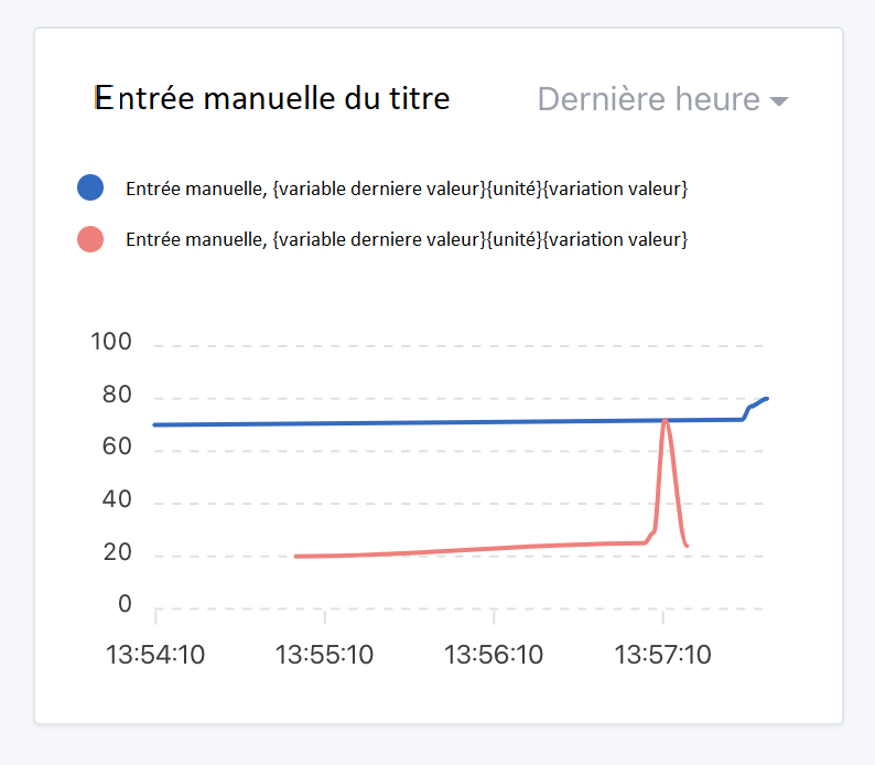
Eventually, we could add an option to manually fill in the legend in the dashboard configuration, I think that’s the only option! ^^
You can thank @AlexTrovato for his great PR on the subject!
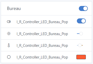
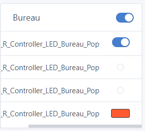
Hello, small bug on my dashboard regarding the brightness/temperature selector. I just tested the dev branch for Z2M integration with auto device detection, no issues on that side. However, for the brightness/temperature selector, when the page is between 975px and 1265px, the selector turns into a dot and is no longer usable (this is probably due to the length of my device name just before, but it’s still annoying):
Do you also have this problem when your device name has spaces? Because here, not only is the device name long, but it’s a single word that’s impossible to « cut »
In any case, I don’t know if I’ll have a magic solution, maybe I can cut the device names that are too long on these small screens…
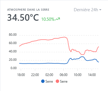
What does the temperature of 34.50°C correspond to? Is it an average, or is it the instantaneous temperature of the sensor? My sensor gives me 13.4°C currently.
It’s an average of the last 2 values, the issue is that you’re displaying 2 curves that don’t have the same units, so it doesn’t make sense ^^ (I imagine it’s temperature and humidity?)
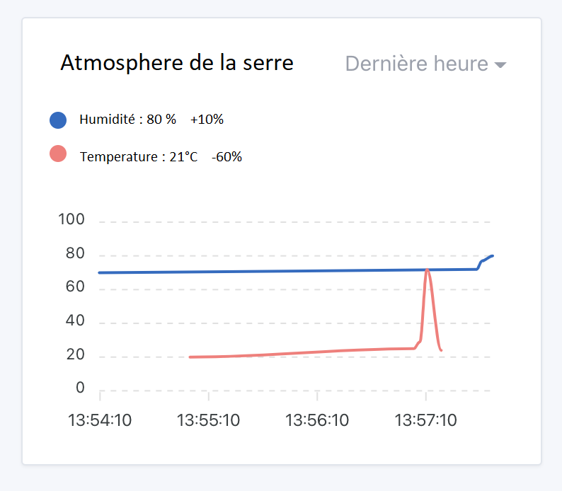
Yes, that’s it, I display the temperature and humidity of my greenhouse, indeed I find the temperature value when I remove the humidity. « Call to devs », Would it be possible to display a kind of variable that would correspond to the last value of each curve, (necessarily reducing the font size), and limiting it to 2 or 3 graphs per window, to avoid overloading it?
And once again, thank you for your quick responses.
Unfortunately, I’m not very familiar with GitHub to create an issue, but if you can guide me, I’ll do it well. I started looking a bit, but I’m getting lost.
Thanks in advance
I’m not sure if this is something we want, it’s going to look very cluttered afterwards
I see two possibilities:
Either you disable the display of this average which does not make sense (and you just use the view « Devices in the room » / « Room temperature » / « Room humidity »)
Or we add a case in this graph view, when the two selected curves do not have the same unit, we display (arbitrarily) only the first one.
For graphs displaying multiple sensors with different units, I have several proposals:
Display only the first sensor in the displayed value, and not the average of the two (which doesn’t make sense when the two sensors have two different units)
In case there are two different units, could you display the second unit on the secondary y-axis?
This would allow for a precise view of both curves on the same display.
I don’t realize the work to manage manual inputs and retrieve the latest curve values to display in the box.
So we could enter a comment in the box, then we could manually enter the names of the curves, retrieve the latest values of the curves, then we could specify the unit when creating the graph for curve 1 and then curve 2 and then we would display the measurement variation. Easy to say
That’s it, thanks for asking for our opinions
I’m not sure that makes sense, because this legend is the chart legend (it’s the lib we use, ApexChart, that displays it), and this legend is also displayed when you hover over a point on the curve. It doesn’t make much sense that when you hover over the curve, the chart title, we display the last value in addition to the current value…
I think that might be possible with this:
After that, you’re talking about only two values, what do we do if the user displays 3, 4, 5 values?
Personally, if I have to put many values on a chart, it will be with the same unit to compare quickly. And if you implement the secondary axis, I can see the same chart displaying temperature and humidity for example.
However, if I want to display many different units, I will split them into several charts otherwise for me it’s unreadable and not exploitable. After all, I understand that it’s not everyone’s point of view. But at least it allows displaying four different units on two charts. It’s already a space saver for those with limited display while keeping good readability.
Hello Pierre-Gilles,
Happy New Year to everyone.
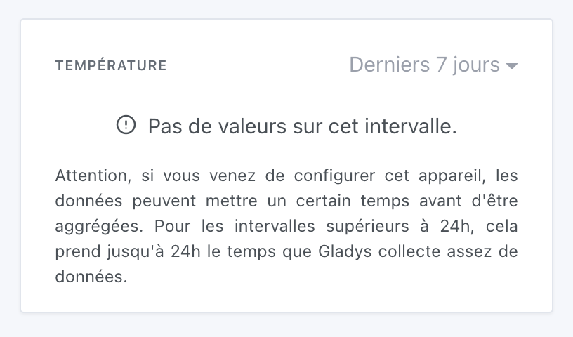
After installing my Xiaomi with Node Red, I am having a display problem in the dashboard graph. I retrieve the temperature from a sensor that I display in a graph on my dashboard, and it displays correctly but only within a 1-hour interval. After 24 hours have passed, when I switch the interval to 24 hours, the display tells me there are no values. There is likely a problem with storing this value. It was working correctly with the Xiaomi integration. I tried converting the value sent to gladys (via MQTT) to a string or a number, but it doesn’t change anything. Could you help me store a value coming from NodeRed via Mqtt?
Thanks in advance
Good evening



 You can create a GitHub issue. If someone wants to develop, it can be a fairly simple feature.