Hello,
When creating a chart with legends, the visual part of the chart shrinks depending on the number of legends. As a result, beyond a certain number of legends we end up with a chart that is practically unreadable.
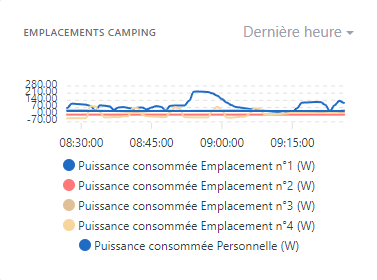
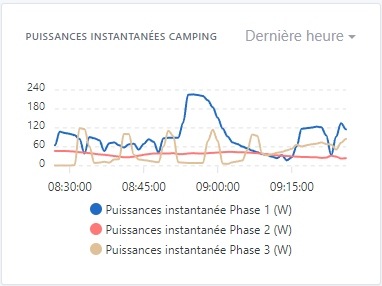
Example with 3 legends:
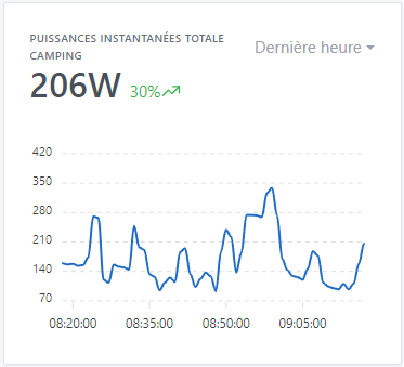
Without legend:
Could we fix the area without the legend, and enlarge the box according to the number of legends, or at least set a minimum chart height that allows reading (the minimum being the one with 3 legends; from 4 it becomes less readable).
GitHub issue:
ouvert 07:41AM - 24 Sep 23 UTC
fermé 08:37PM - 01 Dec 23 UTC
enhancement
effort:low
stale
First, are you sure that you found a Gladys bug?
If you are not sure, you can… come discuss with us on our community, in [french](http://community.gladysassistant.com/) or [english](https://en-community.gladysassistant.com/) 🙂
**Describe the bug**
When you create a chart with legends, the visual part of the chart reduces depending on the number of legends. As a result, we find ourselves from a certain number of legends with a practically illegible graph.
**To Reproduce**
Steps to reproduce the behavior:
- On the dashboard, add a “graphics” box
- Add more than 3 features
- Record and observe
**Expected behavior**
Could we fix the part without legend, and enlarge the box according to the number of legends, or at least set a minimum value of graph height allowing reading (the minimum being that with 3 legends. From 4 this becomes perhaps legible.
**Screenshots**
Example with 5 captions:

Example with 3 legends:

Without caption:

**Your Gladys installation (please complete the following information):**
- Raspberry Pi 4 Modèle B - SSD 512Go
**Desktop (please complete the following information):**
- OS: Microsoft Windows 10 Professionnel x64
- Chrome
- Version 116.0.5845.188 (Build officiel) (64 bits)
Thanks for creating the issue!
I’ve updated the title