In the charts, it might be interesting to browse them by time scales in the spirit of this mockup
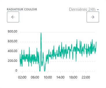
Left and right buttons to navigate through the data.
This could also solve access to data covering more than one year as mentioned here :
I really like this idea. It’s the most « logical » in my situation where I use charts to track my electricity consumption. It would make it easy to go from one day to the previous/next (especially on mobile).
I don’t have any more votes but I support it!
Nice! Totally ![]()
However, the design needs to be reworked ^^
I like what HelloWatt does :
However we don’t have exactly the same use case so it needs to be adapted, but it could work like that
Quick
@pierre-gilles I have a bit of time starting tomorrow, and I’d like to explore this feature request to refine the requirement. I have two questions before I dive in:
Great ![]()
We need to think about all the interactions ![]() Example: There on my quick mockup, we show « last 24 hours ». And if I want to switch to « last month », how do I do that?
Example: There on my quick mockup, we show « last 24 hours ». And if I want to switch to « last month », how do I do that?
In fact there should be no doubt, the only difference between the mockup and the final development is that the final development is in Gladys ![]()
You should explore ApexCharts’ documentation and only make feasible suggestions ![]()
Hello!
So I’ve thought about this feature request. I’m making a graphical proposal below to show how the new elements allowing navigation through time will be placed. And I will add, especially in a second message, a list of rules to implement so that navigation is as ‹ logical › as possible.
New additions:
The checkbox is a proposal, because I believe that navigation, for example in the ‹ 7 days › period, should offer two possible behaviors:
=> And I therefore propose adding the ability to switch from one mode to the other.
Note 1: All elements are placed above the chart, so I think it’s independent of what ApexCharts can or cannot do…
Note 2: For returning to now and for the ‹ regular/sliding › toggle, I didn’t make a visual choice: button, clickable text, icon, checkbox, dropdown,… I think the developer will make the right choice depending on available space…
Visually, it could look like this:
The rules (in bold below) are fairly few, I think, so the code to implement shouldn’t be overly complex. But I give quite a few details and examples so that everyone can get an idea and spot behaviors that would not be appropriate. I’m open to your feedback to refine!
====== Navigation with the arrows : ======
Note: Two successive actions left arrow then right arrow (or the reverse) are ‹ symmetric ›; this returns the x-axis exactly to the same period
Special case: If the end date is >= now, the right navigation arrow becomes inactive (to avoid exploring the future which has no data yet)
====== Change of mode ‘regular/sliding’ : ======
In regular mode, periods are defined as follows:
When switching to ‹ regular › mode: the new period includes the previous end date (so we shift a bit into the future)
When switching to ‹ sliding › mode: the new period « aligns » with the current day and hour (so we shift a bit into the past)
Note: the new end date will be the most recent possible, without exceeding the previous end date
note: aligning on the current day and hour allows falling back on ‹ now › when navigating with the right arrow…
The alignment of the period end is done as follows, according to the type of period (taking as an example that the current date is Thursday April 3 18:25):
Examples:
====== Change of period type : ======
When changing the period to enlarge it:
Note: generally the new larger period completely includes the previous period, except sometimes when starting from a ‹ 7 days › period
When changing the period to reduce it:
Special case: if this change places the new period entirely in the future, then the new period will actually be the one that includes ‹ now ›.
Note: generally the new smaller period is completely included in the previous period, except sometimes when going to a ‹ 7 days › period
A small flaw with ‹ zigzag › navigation in at least two cases:
Hi @StephaneB ![]() Thanks for taking a look at this!
Thanks for taking a look at this!
There are good ideas in your proposal, but I think the UI/UX still needs a bit of work to be more intuitive.
Some feedback:
For this kind of interface, which already exists in many apps, I think we can really draw inspiration from what’s done elsewhere. No need to reinvent the wheel ![]() Did you base this on any concrete existing examples?
Did you base this on any concrete existing examples?
Thanks for taking this on — my remarks are frank but nothing personal aha!
No worries, that works for me ![]()
I’d like it ![]() But that’s not enough to make it a community need, for sure. I’d be interested in everyone’s opinions, particularly those who voted for this topic…
But that’s not enough to make it a community need, for sure. I’d be interested in everyone’s opinions, particularly those who voted for this topic…
I understand… So I’m not a graphic designer, but I just tried to create icons to make this more intuitive. If there are graphic designers in the community, feel free to suggest something else ![]()
To clarify the impact of the regular/sliding toggle, it could be this:
 et
et 
And for the return to ‹ now ›, it could be an icon like this :
![]()
Integrated into a graphic, it would look like this:
What do you think?
Well yes, but no… ![]()
The example of Stripe’s Dashboard doesn’t seem relevant to me: it works with a kind of configuration bar that opens various large panels to set the observed period and the period to compare with, and what is configured then applies to all the charts on the page. That’s not at all Gladys’ logic, and making \‹ clean › the configuration method of Stripe in each of the charts of a Gladys dashboard doesn’t seem relevant to me at all.
And furthermore Stripe doesn’t offer a simple way to navigate past/future: there isn’t a previous/next arrow to move through time, whereas that’s the objective of this request in @Tolkyen’s initial mockup and then in yours as well…
In short, Stripe’s interface doesn’t inspire me at all for evolving Gladys…
Do you have other ideas of existing interfaces? Because I don’t have any ideas on my side, and I don’t have time to explore ‹ at random ›… If you give me other leads, I’ll gladly take a look ![]()
All the options presented work for me, thank you @StephaneB for all the work
I also just looked at the interface offered in HelloWatt, which you had already mentioned. It’s clean and intuitive, but much simpler compared to what we want to do in Gladys. With them:
So it’s difficult to keep their simple interface while offering the richer functionality of Gladys.
I’m available to look into other existing interfaces that implement this kind of time-based navigation on charts, to try to draw inspiration from them… Any ideas?
Hi @StephaneB
I don’t necessarily have any visual ideas right now, but couldn’t we already implement some of the functions available in ApexCharts?
I’m not really sure how to answer you, @mutmut — maybe it’s more for @pierre-gilles to react based on what he knows about ApexCharts? Not being a developer, I haven’t dug into the ApexCharts docs to know what was already possible.
And it’s a bit deliberate too: I think that to do a good job on software, you should, a priori, separate the thinking about the need (which I tried to do) from that about the implementation (which I leave to the developers). And of course if the described need is not reasonably feasible technically, we should discuss to find the right compromise ![]()
So on this topic, I’m available to explore other interfaces if you have ideas and to draw inspiration from them to revisit the requirement I sketched, or to discuss with the developer(s) if some points I proposed are too complex to implement.
The goal isn’t to copy exactly what Stripe, HelloWatt or other products do, but rather to draw inspiration from certain proven UI mechanics that work well.
With Stripe, for example, I really like their interval selector: it combines fixed ranges with sliding intervals:
I find their approach clearer than your proposal.
But I agree that the Stripe selector doesn’t make sense for Gladys, it’s just an example.
I can spend time on this spec, but that helps me less ![]()
On my side, I’m putting all my energy into Matter right now.
Totally agree! ![]()
Implementation is a detail. The hardest part is writing the spec.
Thanks @pierre-gilles for these clarifications
Ok, I understand. But does that mean you’re ok if I make a mockup that dares to integrate behaviors quite different from how it currently works? Because for now I was making proposals intended to be functional but without having to change the interface too much (both to limit visual development work, and to avoid introducing too much ‹ disruption › in users’ habits)…
No, that wasn’t the idea, I’m happy to keep working on it. I was just asking for leads to explore, but not only from you ![]() I’ll explore a bit myself, but I’m still open to ideas from everyone for sites showing ‹ navigable › charts that could inspire me…
I’ll explore a bit myself, but I’m still open to ideas from everyone for sites showing ‹ navigable › charts that could inspire me…
Propose whatever you want ![]()
I know it’s a bit constraining, but that’s precisely the whole point of the specification work ![]() I’m not joking when I say it’s the most complex stage!
I’m not joking when I say it’s the most complex stage!
You need to do research: dig through Google, draw inspiration from everyday products, ask the AI questions if needed, or explore sites that gather UX patterns or inspiring design examples.
Well, I have to admit, this is a use case where AI really saves time: I described what I wanted to do, and I asked it for examples of sites and components… and it really helped me!
I take away several things:
So it’s enough to place:
And for smooth and logical navigation, there must be automatic synchronization between the chart and the selector. That is to say:
I’ve done quite a few configuration tests with a component that I find nice, and which the AI tells me should be compatible with Gladys: DateRangePicker. But compatibility should of course be confirmed by @pierre-gilles or other developers ![]()
With this DateRangePicker component, I chose the following options to create the mockup below:
And I predefined the rolling periods that currently exist in Gladys, followed by the equivalent calendar periods
- last 60 minutes / this hour
- last 12 hours / this half-day
- last 24 hours / this day
- last 3 days / (no calendar equivalent)
- last 7 days / this week
- last 30 days / this month
- last 90 days / this quarter
- last 365 days / this year
(If needed, I can provide the configuration code of the DateRangePicker that I used)


