I tried to redesign this screen today; I made some mockups.
On large screens
In normal view, we only show the list of dashboards + fullscreen + Edit:
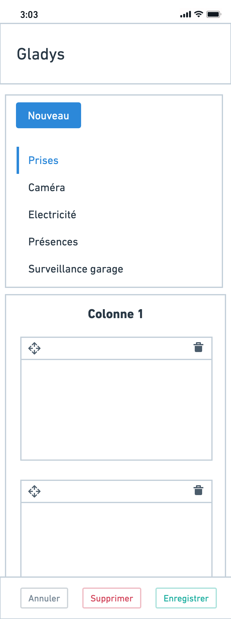
When you click « Edit » you’re taken to this screen:
The idea is that you arrive at a « settings » screen for dashboards in general, not just for the currently displayed dashboard:

On the left sidebar, you can navigate through the different dashboards and reorder the list via drag and drop.
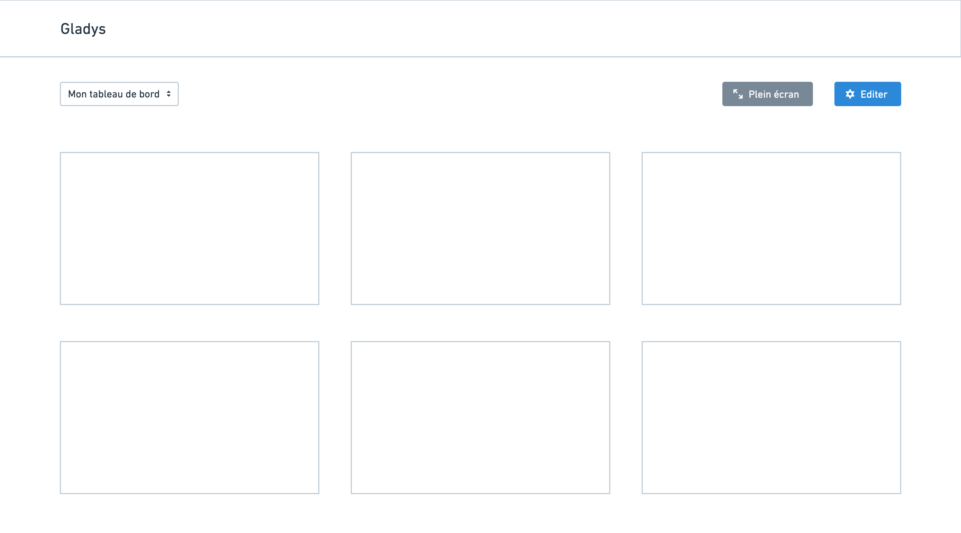
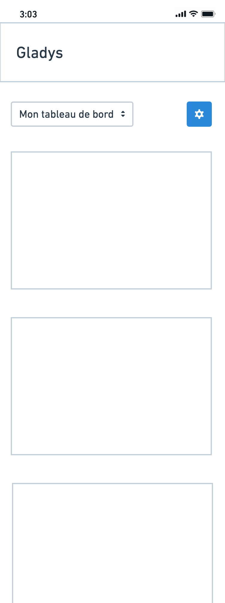
On smartphone
In normal view, only a gear icon is displayed (no fullscreen + new):
In edit mode, there’s a vertical view with the list of dashboards (reorderable by touch):
This diverges a bit from the current paradigm; it requires some work but it seems cleaner to me ![]()