The list of my dashboards is starting to get long, and it would be great to be able to sort them so the most-used dashboards rise to the top of the list!
I completely agree. But I’m out of votes ![]()
1 Like
Same here… Out of votes. Two or three times I’ve wanted to vote on a topic but I’ve already hit my limit.
All that’s left is to prioritize your votes then ![]()
If this one is a higher priority than another, remove your vote for this one
And once this one is done you’ll vote again for the other..
4 Likes
You’re absolutely right… But I don’t want to take my vote away from somewhere else in the end ^^ capricious as I am!
1 Like
It’s not easy to do; easier said than done xD
1 Like
I’ve made up my mind and I voted! ![]()
1 Like
I imagine that when a request has been completed, the related votes are redistributed to the voters?
1 Like
Yes indeed, the votes have been released.
Hi everyone, as I mentioned I planned to tackle a few UX topics this month, and I’m starting with this one because it’s the most requested ![]()
I have a first proposal!
I’m happy with how it looks, but not very happy with where I placed this sortable list — I find it odd to do that on a dashboard list… At the same time, for now I don’t really have any other ideas ^^
Great…
But indeed, it might be a bit odd in practice to have to:
-
Edit a dashboard
-
Edit the list of dashboards
Suggestions:
- Have an edit option for the list within the list itself (at the end of the dropdown menu)?
- A small button (icon=pencil) just to the right of the dropdown menu?
I’ve thought about it, but I’m a bit bothered by overloading the always-visible bar, especially since on mobile in responsive mode we already don’t have much space:

Indeed, it quickly becomes cramped!
And the second one?
Personally I think @b3n.0’s suggestion is good: a button / a link, basically a \u003coption\u003e at the end of the select that allows ordering the list.
It doesn’t overload anything, it respects the overall design, and it avoids having to go into the dashboard edit first.
Personally, I would have placed that more in the settings, but like the « New » button as well… these are not recurring operations (unlike editing).
A menu in the settings like the « Houses » and « Rooms » menu would make more sense. And you can directly integrate the reordering there. A « New » button where you give the name of the new dashboard that you can directly reposition. And the ability to edit the name directly.
When you return to your dashboard you have the new one that appears empty and that you can edit.
That frees up the space of the « New » button which is important on mobile, as @_Will_71 mentions, with longer names it’s already suboptimal for display
And actually for later, it could even be useful for other « options » useful.
4 Likes
That’s not wrong!
1 Like
Not a big fan of that option, I find it odd to mix content and action.
Why not, but I’m afraid it would be too hidden and nobody would find it. We could put a message during editing, but then why not just keep the behavior during editing? ![]()
I agree, but I’m afraid that during a new user’s onboarding it’ll get stuck. We’re going to get lots of messages from new users who don’t understand how to create a dashboard.
Yes, I agree with that, we need to rework the mobile look.
Especially since you’re right, « New » and « Full screen » have little use on mobile, right?
Like with houses/rooms ^^ The first time I looked because I thought I’d find a tab in the main view, but I found it quickly and I guess it’s the same for others. And in the end it was the right solution: we’re not cluttered, it’s still settings, I went back two or three times to add two or three houses and to reorganize or fix the rooms. But never again after that. One day I might go back to add a new room but that’s it.
The first dashboard will be present (as before the multi-dashboard), so if, as you suggest, you put a message in its edit saying that to create new ones you have to go to the settings — or even provide a direct shortcut — that will remove 99% of the forum questions. With this solution, there’s zero clutter for a settings page used very rarely after the initial creations. The message being present in the dashboard editor (or only the main dashboard if you can).
Well, this is a point of view not necessarily shared ^^ In any case it’s going to be very handy. Thanks for the dev.
Yep, well for fullscreen on tablets I think it’s essential for wall-mounted screens. But in my opinion for « New » yes, it’s just a setting ^^
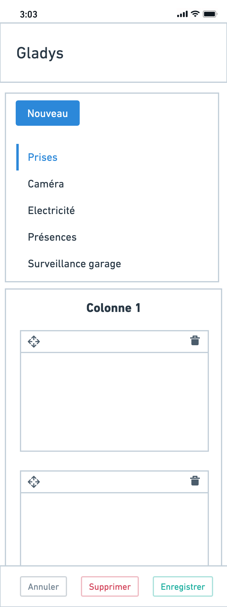
I tried to redesign this screen today; I made some mockups.
On large screens
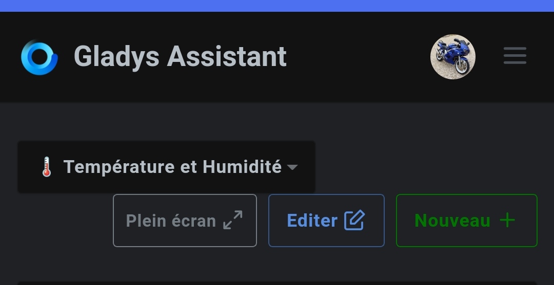
In normal view, we only show the list of dashboards + fullscreen + Edit:
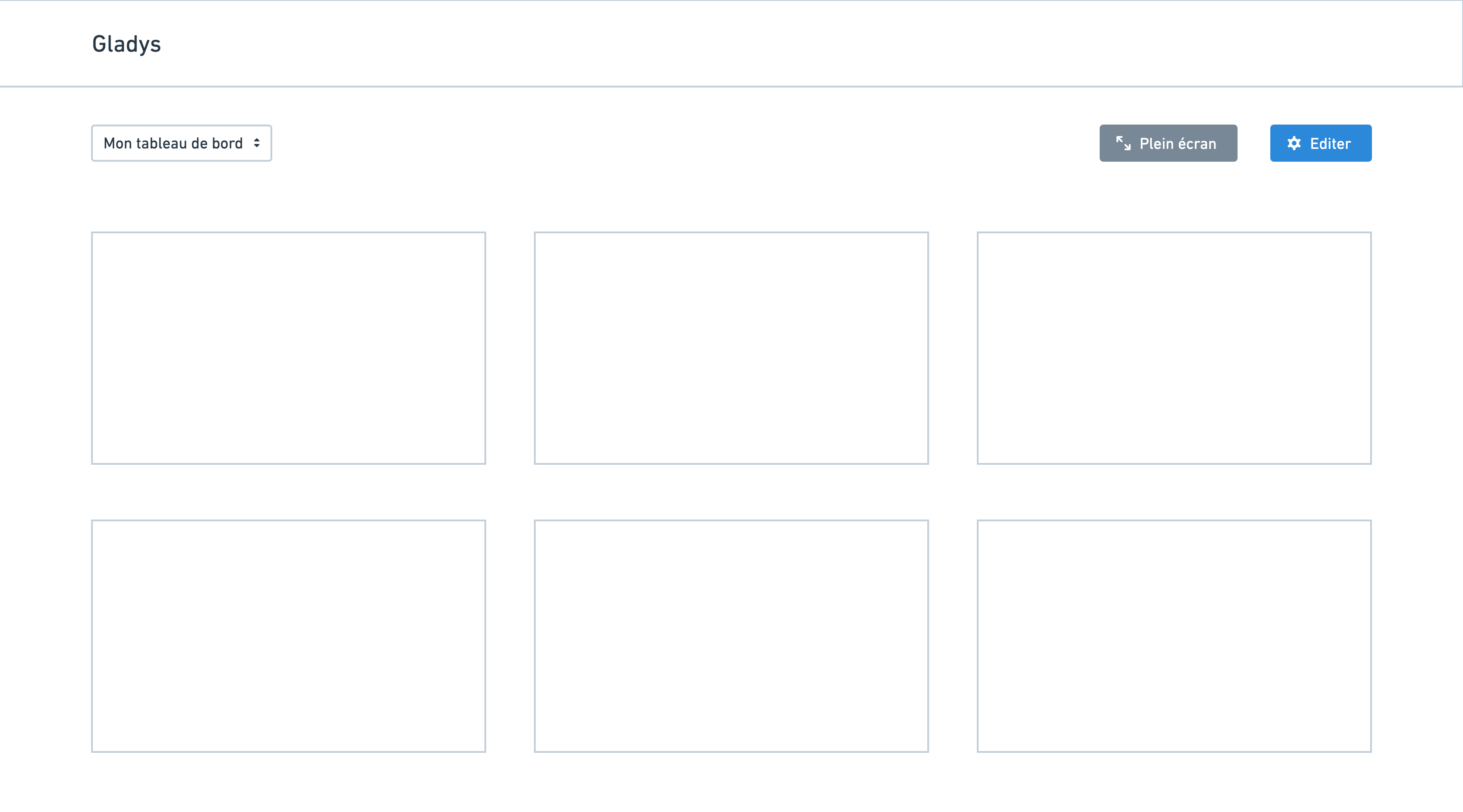
When you click « Edit » you’re taken to this screen:
The idea is that you arrive at a « settings » screen for dashboards in general, not just for the currently displayed dashboard:

On the left sidebar, you can navigate through the different dashboards and reorder the list via drag and drop.
On smartphone
In normal view, only a gear icon is displayed (no fullscreen + new):
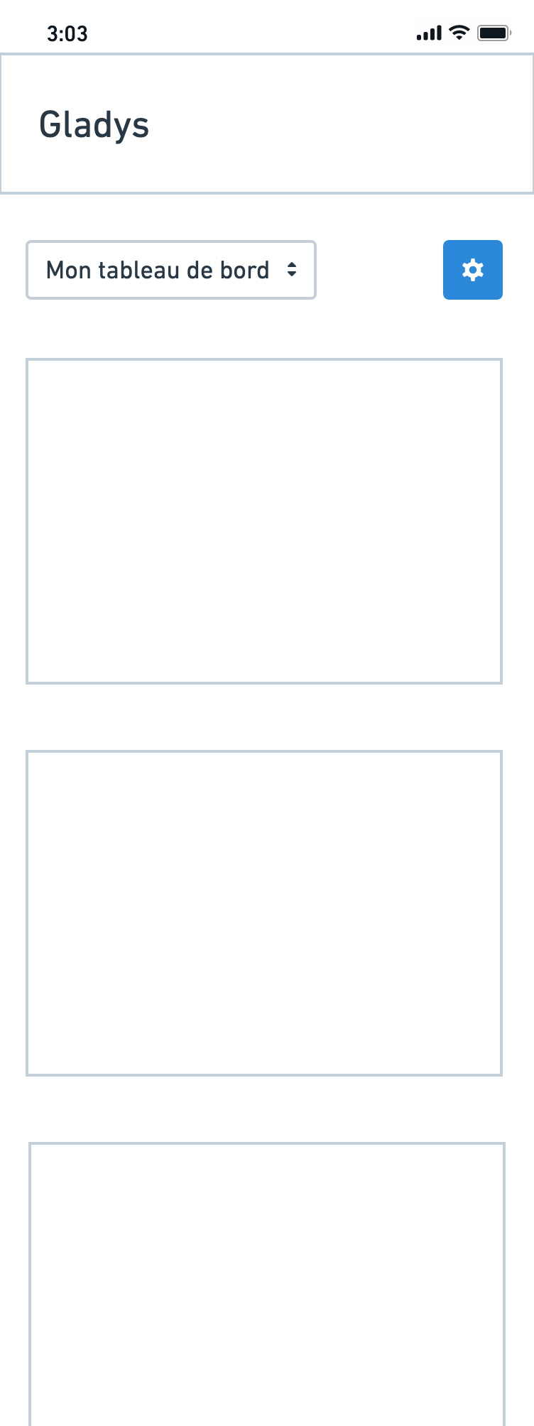
In edit mode, there’s a vertical view with the list of dashboards (reorderable by touch):
This diverges a bit from the current paradigm; it requires some work but it seems cleaner to me ![]()
8 Likes