Hmm we’ll see, interfaces where you have to scroll to add something are often annoying.
For now, on the left side I’d go with this:
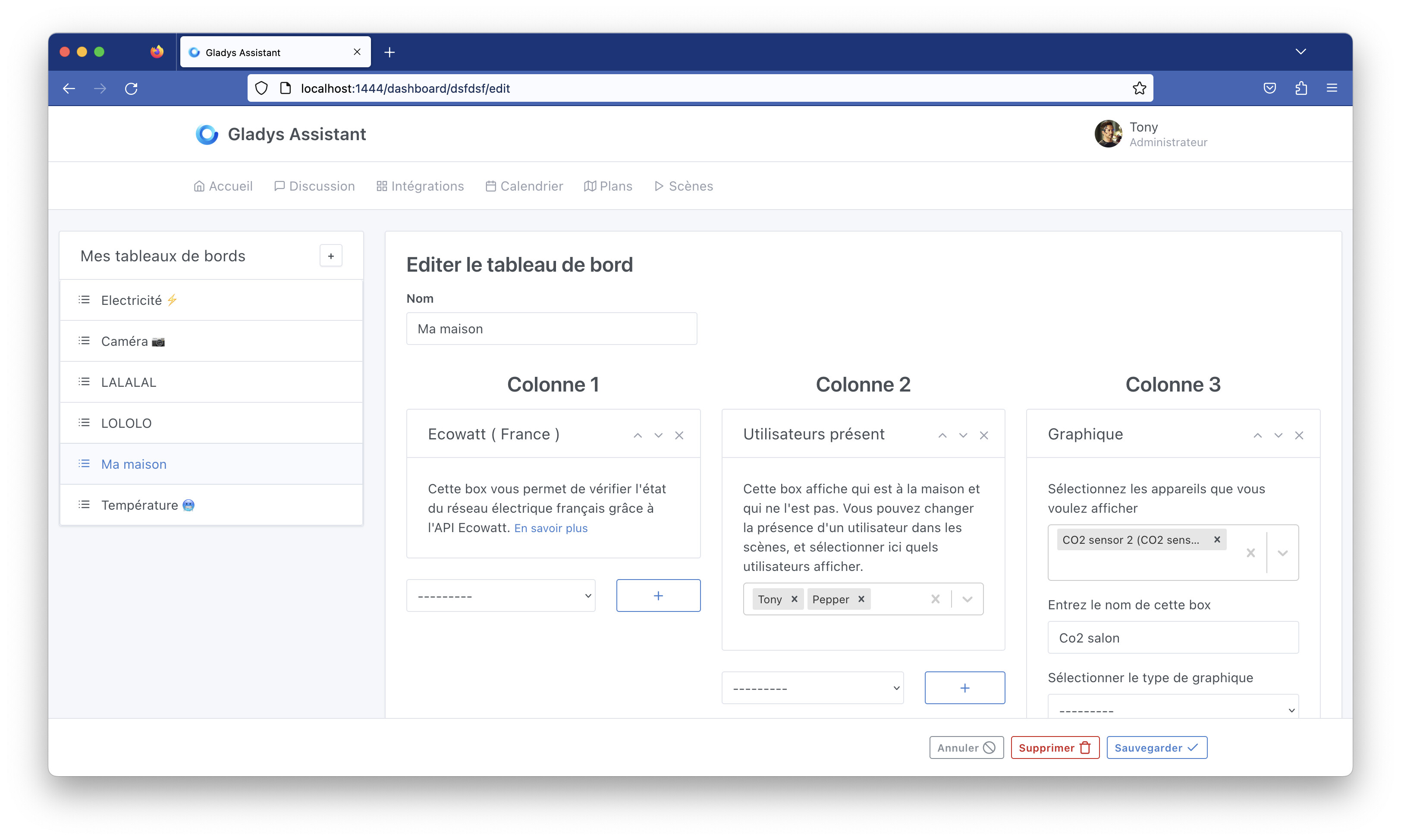
The right side will evolve with drag-and-drop, which will allow removing the three « + » icons and the select box, since we’ll be able to reorder them as we please.