The red line is dashed, which prevents it from being selected when positioned between two dashes (see the cursor below - which is unfortunately light gray on the screenshot)
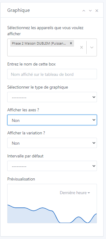
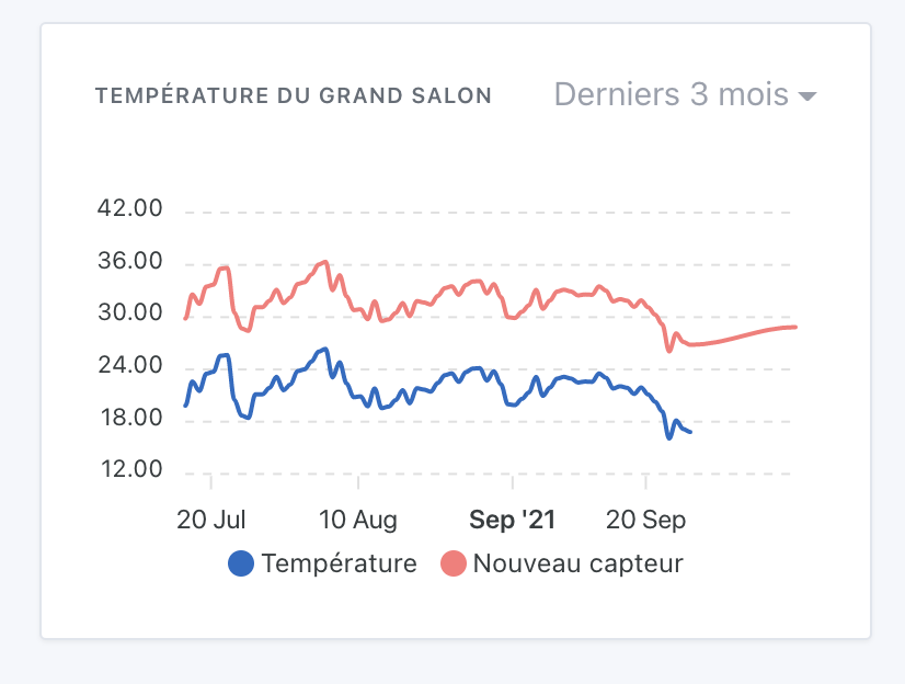
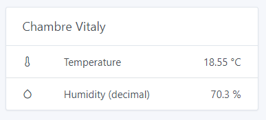
Other feedback: I display the humidity + temperature of each room here. The variation corresponds to nothing, neither the temperature (around 20°C) nor the humidity (around 60%).
Some solutions for me:
Display two variation indicators, but this makes the display heavier
Specify which is the main value that will be used (or take the first one, here humidity)
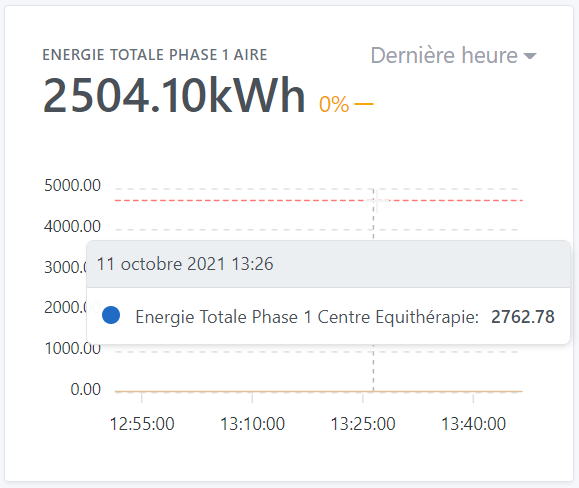
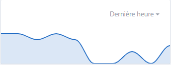
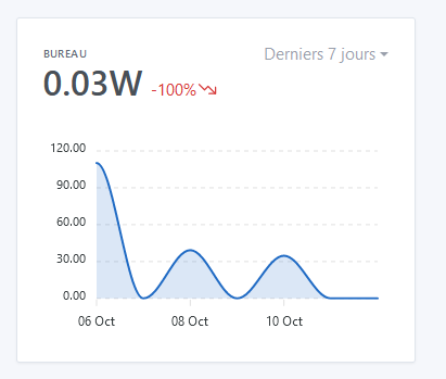
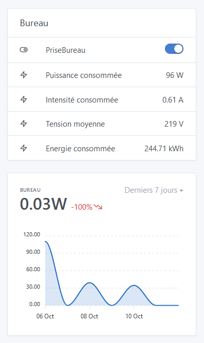
When the variation is displayed over more than 24 hours, it is a calculated value that is displayed. At the time, I found it strange that my computer + 2 screens only consumed 0.03W.
This is not a bug, but I would have liked to be able to display the current consumption in large, and the variation in red over the period.
For example: 80W current, -100% over the 7-day period.
For the « Tasks » section, it’s still bugged on « NaN ». I think the bug occurs during a task.
Once this is done, the displayed values will probably be correct (bet).
Well, at the same time that doesn’t make sense, right? Initially, I thought about completely blocking the selection of different devices that don’t have the same type.
You can disable the display of the variation if it doesn’t make sense:
In fact, when you select a curve other than the last hour, I base it on the aggregated data which is not « live »
And so, the last bit of data that hasn’t been aggregated is always missing.
If you select the last 7 days, in reality it’s the last 8 days up to yesterday (the live data of the current day is not displayed)
But I agree, it’s not crazy, so I thought at first « Ok but it’s simple, I’ll stick the live data to the aggregated data », the idea was to make a mix of aggregation / live to have everything.
But it doesn’t work at all, in fact it gives a weird rendering, since the live data is not yet aggregated, so you end up with a curve that is aggregated and « quite general » over 80% of the curve, and the last 20% is hyper precise data, and it looks ugly
But I agree with you, in the idea you should have everything up to now.
However, this is only on the view with the axes. The view without axes, I don’t know why but Apexchart completely messes up when displaying the legend (the legend ends up mixed with the graph). I’ve tried techniques without success.
For my part, this won’t bother me. The view without axes I will only use for specific cases and anyway if you want to have the value you will have to put the cursor (or your finger) on the curve, so you will have the legend. It’s perfect for me on this side.
Great idea the button, I love it
I still haven’t managed to observe the thing ^^ I always end up after the fact ^^
Indeed for me in this case mixing categories doesn’t make sense and the user should themselves leave the variation deactivated. As we said it should remain a simplified view. However, I think it is very important to be able to leave the choice to mix different categories. In the example of @lmilcent it is very interesting to be able to display in the same curve the temperature and humidity of a room but the variation does not make sense in this box and would further complicate the editing of the view. However, in a dedicated view later on…
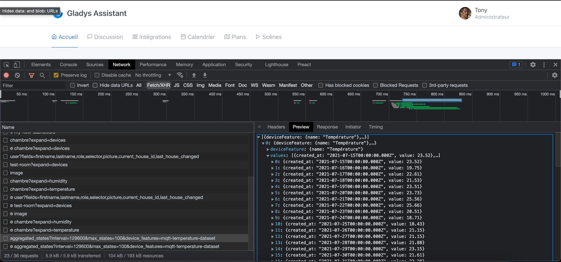
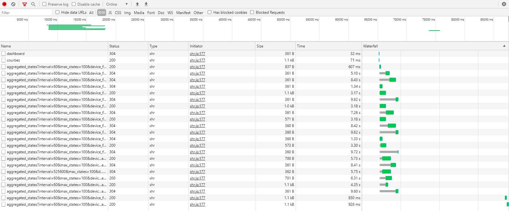
Nice one @Terdious, I’ve worked on optimizing the performance of the GET route for aggregated values for most of the morning, so the display should be faster for you!
I started with what you gave me (the stats you extracted), I formatted it in a spreadsheet and sorted it by execution time:
As you can see, what’s slow is the queries on the DB.
While investigating, I realized that at the beginning of the route, I was making a getDeviceFeatureBySelector query that could just be replaced with a call to the RAM cache.
I removed the query, and already that halves the number of queries!
Then, I realized that the call to the « Last 24h » view did not go through the aggregated data, but through the live data
In fact, this case was missing in the queries, and instead of calculating from the aggregated data, we were going through the live data (which is much slower)
By using the aggregated data, I manage to ensure that at most, the query returns 288 states, which is super small (I don’t know how often data is inserted? In 24h, how many states are written?)
I’m finalizing all this, and I’ll let you know when a new image is ready for testing!
What bothers me is related to the « debate » between Device name or feature name.
We can see that if I want a correct legend (which helps me, right!), I need to rename the features.
My first graph displays the room temperatures
Blue => my son
Red => my daughter
Yellow => my room
For me, it doesn’t make sense to rename the feature with the first names, for example.
Actually, the problem is that each case is unique. In your case, it makes sense, but in the case of @Terdious, it doesn’t make sense at all. So there will inevitably be someone frustrated (fight it out :p)
On my side, I notice a significant increase in the loading speed of graphics. What could take up to 5 seconds now takes less than 1 to 2! Bravo for the optimization!
If all developers were like you in this regard, the web wouldn’t require so much computing power
Aha thanks Performance is my job, I’m a backend engineer on the side and it’s my life to build solid infrastructure, fast backends, optimization, I love it
Donc résultat : Seul une vue dédiée Dashboard est longue à afficher. J’ai 18 courbes « Test » dessus. Mais ça ne me choque pas pour le coup, et ne me dérange pas. Cette vue sera affichée soit rarement, soit sur une vue sur une tablette dédiée à l’avenir.
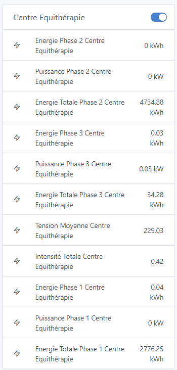
Si je reprend le même exemple que @VonOx, ici si je ne prend pas le nom des features je me retrouverais avec 3x3 fois le même nom de device ce qui ne fait plus sens. C’est déjà compliqué car on ne peut pas modifier l’ordre d’affichage. Chaque « Energie » et « Energie Totale » serait donc indiscernable :
Il y a de nombreuse solutions pour ne pas faire de « frustré ». Mais si pas possible alors tant pis, je n’ai pas l’envie que quelqu’un soit « puni » à cause de mes demandes ou propositions. J’abandonne le sujet ^^ Le seul sujet c’est que pour le moment plusieurs personnes font la remarque qu’il est impossible de distinguer certains appareils dans les sélections. Comment résoudre cela sans que l’utilisateur soit obliger de créer des appareils fictifs plus scènes pour les gérer (Tasmota multi prises, etc.). A lépoque (il y a plus d’un an) j’avais soumis l’idée de séparer les devices (Type Dual ou CH4 de Sonoff) comptant plusieurs commutateur en plusieurs devices.