![]()
![]() Feeling motivated ^^ and it’s nice to get back to
Feeling motivated ^^ and it’s nice to get back to
Hi @Terdious ![]()
Very cool all these investigations, it’s true that it would be great to be able to explore the data already present in Gladys more!
However I’m not necessarily in favor of a separate tab (which is, in the end, exactly the same thing as the dashboard); we should rather integrate what you did there into the existing dashboard ![]()
I prefer that you keep the other feature which is a specific feature.
I think I’ll convert this topic into a discussion in « Development », and close the feature request « improve the graphs » because the initial request from @Hizo has actually already been developed (having custom colors in the charts)
I plan to switch to DuckDB as soon as it reaches 1.0 (normally planned for the end of H1 2024), I mentioned it in another topic I don’t know if you saw.
That will drastically improve query performance even when querying raw data.
We’ll see whether this development needs to be done beforehand or not. Indeed in the meantime we can fetch the aggregated data as soon as the selected duration exceeds a certain period.
I don’t want to break your flow in the heat of development, but remember to break down what you’re doing well so you don’t fall back into your old ways: huge PRs ![]()
I think that if you want this development to land in Gladys, we need to rethink the basic operation: proper integration with Gladys (what need it addresses, and where to put it in Gladys), and for now don’t go off in all directions so we can have a clean PR ![]()
Afterwards we can iterate without issue like we did for Netatmo!
Hi @pierre-gilles,
First of all, thanks for tidying up the topic. You’re right. Sorry for the clutter.
Is your opinion final on this matter or is it possible to get the community’s input?
Honestly, on my side I see this as something added; the dashboard is more of a command access + quick view of states, I already have a ton of them:

For me it’s more about analysis and is separate from the dashboard; I will create/delete them regularly. And honestly, having 10 extra chart views in the middle of my dashboards would bother me considerably, even though of course I would still use them that way.
However we might be able to find other solutions ^^ if I create a PR now, could you make proposals.
And the single-column layout is essential for this development.
Yes, we discussed it in person and I have it in mind. That’s why I proposed this solution, whether it’s temporary or not, because I have no idea when you’ll switch to DuckDb and whether year-long tests will be conclusive afterwards. Can’t wait ^^
No chance ^^ I understood that well, don’t worry. For this part:
- I still need to have a broader view even if my PR is then split!!
- almost no server part touched/impacted (about 10 lines)
- main changes on the front-end… and so for the moment waiting for your decision on a new tab or not ^^
When you say that, are you talking about the feature selection part which is different from the current one or for example the export part? Because the latter is really not heavy!
It’s totally open for discussion ![]()
We need to see what the final use of the feature is, and whether it makes more sense to have it in the dashboard, for example via a button that would « expand » the graphical view of a sensor, like we do for cameras (with the « open in full screen » button), or if we really want a tab specifically dedicated to analysis.
If we want a tab linked to analysis, why not, but then we need to do something really different from the dashboard!
Yes, I also have no idea when it will be ready on their side; better not to wait, and adapt later when we switch to DuckDB
Up to you to judge by feel, but as always we should stay concise and focus on one main feature, without touching too many things so it’s easier to review, and it doesn’t create instabilities elsewhere ![]()
Victory !! ^^ Finally maybe, if people like it for multi-curve export:


I’m in the process of cleaning up the code to reduce it to the bare minimum, I created the PR: Add charts-history feature and related components and styles. As soon as it’s ready I’ll make an image. If there are testers who can copy/paste their production database and test it in use to provide feedback, especially on the point mentioned by @pierre-gilles, to give an opinion on:
- using the current charts on the dashboard with a way to open them to obtain this kind of view
- or a dedicated page where it’s possible to create custom historical views.
I’ll keep you posted
4 Likes
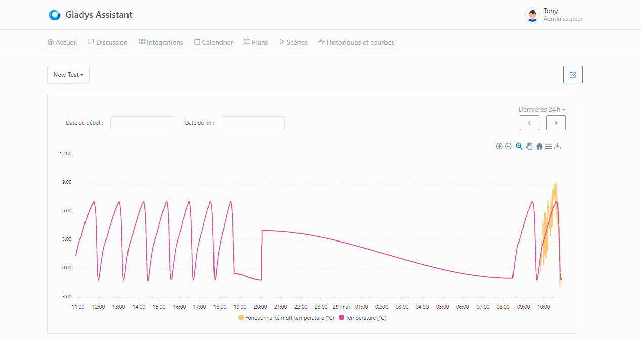
And finally the precise zoom :
And of course the export works with the displayed curve. All I have left is to finish the left/right chevrons to add the step according to the display and not the interval, and then we’re good for testing — I think three quarters of the original features (listed in the various threads) are there:
- Detailed full-size history view (still to determine whether to use existing dashboard charts or a dedicated view for browsing)
- Downloading reports as .csv / .xlsx
- Precision of data displayed when zoomed
- Ability to select from date to date
For me, a VERY useful development since I monitor my electricity consumption / production at home !!
Thanks again @Terdious, and even though I imagine there will first be debates, then coding, then testing… I can’t wait for it to be integrated into Gladys ![]() !!
!!
Image currently being built docker pull terdious/gladys:add-view-charts. I’ll test it tomorrow to let you know if it works ^^
In any case, I hope this gets the discussion started ^^ And yes, as you say, possibly debates ^^ For now it’s just the vision I have of it ^^
I tried building a test image but whether on the PR or on the image build side in GitHub Actions it fails on the linux/amd64 version in « Docker magic ! ». I can’t see why. @pierre-gilles would you have any idea?
I built an image for arm V8 (linux/arm64): docker pull terdious/gladys:add-view-charts (if someone can test I’m interested to know if the performance is better than v7 ^^)
And one for linux/arm/v7: docker pull terdious/gladys:add-view-charts-armv7
EDIT2: Works on armV7 for those who want to test.
My notes so far and a view:
History and chart: History and charts page empty: The "New" button has no text, just a "+" to check.
Dashboard: Review the height for the charts on the Dashboard (restore to the original)
History and chart editing: Review the names of the services displayed in the editor (not all as title ??). See what's done elsewhere (list of services in the integrations menu).
History and chart editing: Slow to display (retrieving services/devices/features taking long?)
History and chart editing: If no chart type selected => Error when rendering the view because it crashes on 'lowerCase' in the Apex types.
	Handle the error and prevent saving (with error) the edited view
Export XLSX: Try adding structured table construction of the data (allows filtering more easily from the start)
Export XLSX: Format the 1st column as date and the second as time

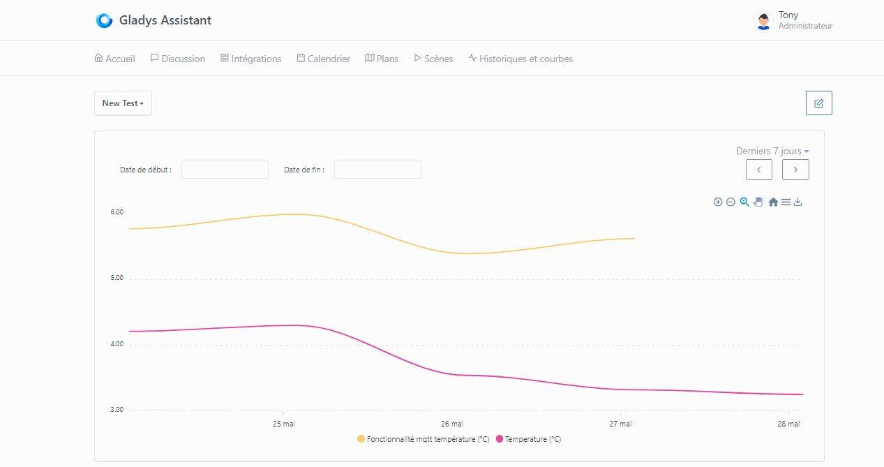
On arm/v7, responsiveness remains relatively good even if some lag to fetch 3900 states (6 days x 3 features):

EDIT: @pierre-gilles I assumed it was due to the installation of the new packages xlsx-js-style and sweetalert2 but apparently they are compatible with amd64. xlsx-js-style uses xlsx (SheetJs) which is already used apparently on the server side as a dependency of other packages.

And it runs on mobile (a few fixes to make ^^). Very responsive over 6 days. The zoom buttons are really handy, as are the left/right chevrons in this case (thanks @guim31 for thinking of it from the very start ^^)
I don’t know how to code but sometimes I have ideas ![]()
Yes there was an update to the Docker base image we use, and it broke the amd64 build
I made fixes in this PR: Google Cast integration by Pierre-Gilles · Pull Request #2088 · GladysAssistant/Gladys · GitHub (Not yet merged)
You can base yourself on it if you want it to build on your machine ![]()
Ah phew!! That’s exactly what I thought when looking at the build history ^^ You put me at ease ^^
Unless a beta tester needs the image in amd64 (let me know ^^) I’ll leave it like this until your merge. I can also run the test on arm64.
FYI, I’ll make a side branch adding your idea with the option of a large view directly on the dashboard … because in any case one doesn’t prevent the other, and it will be easy to pick up the work if in the end we decide only on that second option.
That will allow us to directly test both possibilities
Hello @pierre-gilles,
I’ve basically finished the proposal for fullscreen display by selecting directly from a dashboard curve… but I’m so deep in trouble with the CSS design… I’ve been floundering for hours and hours, and no matter how much I read the docs, I can’t get it to work (and the AI isn’t any better unfortunately ^^).
Example: I’m trying to adjust the close icon … disaster ^^
Functionally it’s working — we can review the design later. If you want/can test (so the two versions that will be present on the same image) that would be really great. For anyone who wants to test and give feedback, the image will be available tomorrow morning…
If I have time I’ll do a test over the weekend.
Image ready: docker pull terdious/gladys:add-view-charts
EDIT: New image currently being built (same link) available in about 1 hour, a bit cleaner
I managed to do roughly what I wanted :

If I want to test, do I need to retrieve my current database (from production) and copy it into my test container?
Let’s say that if you want to test in a real environment, yes it’s better to have data (notably to test performance over a long period, it may be necessary to split into other time granularities… particularly for armv6/v7 architectures)
FYI the new image has been built.
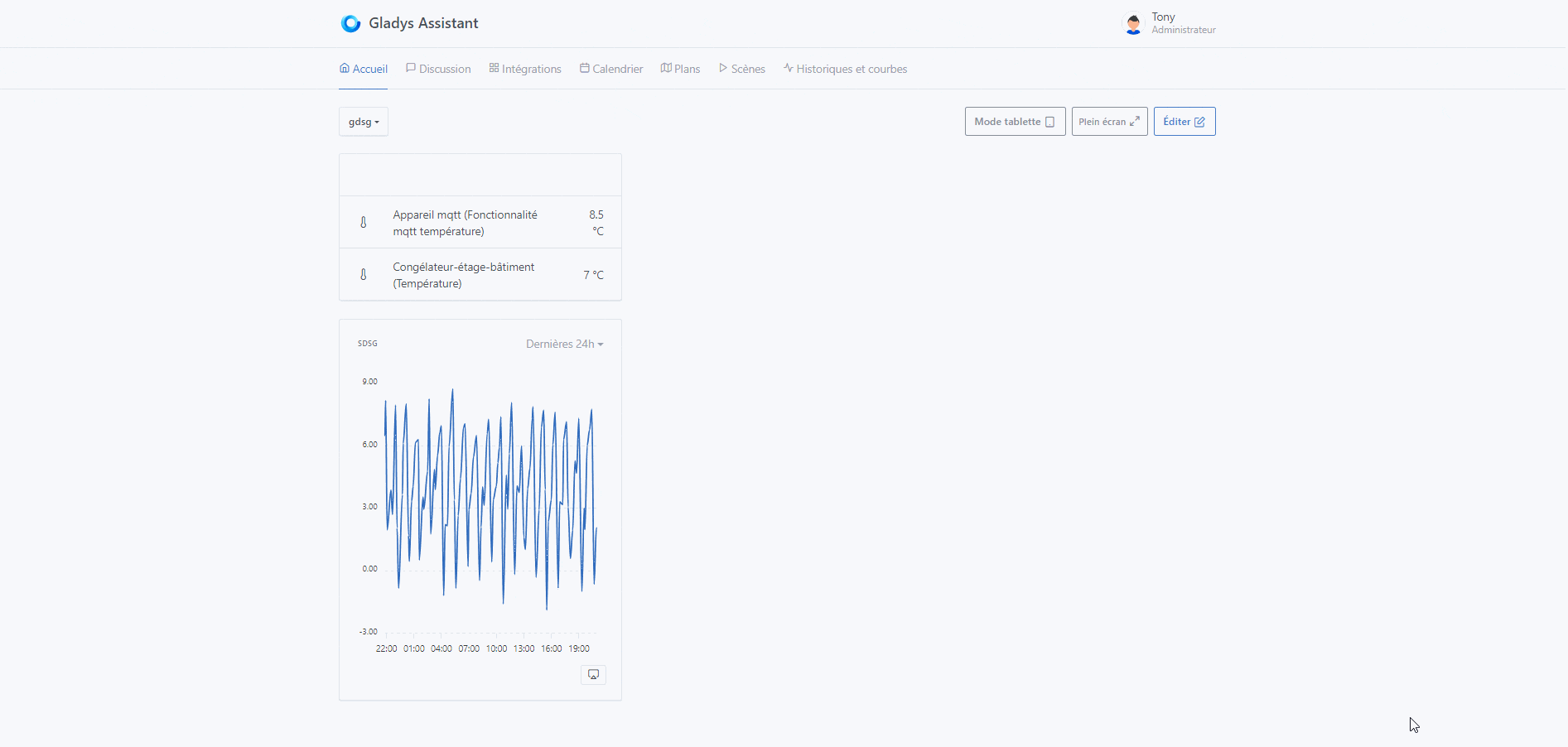
I love it!! Being able to view at least 2 phases simultaneously over 7 days, with the bonus of being able to export everything directly to Excel… It’s really great!!
And with the left/right arrows that allow keeping the same scale, you can quickly see the differences and it’s much easier, for me, to notice phase imbalances.
It would be nice to add an on-screen feature to visualize something temporarily directly (a refresh would remove it). In my case that would allow me to try to locate the devices that start at the same time (well, you could just put a binary curve below with the suspected devices, you’ll tell me ^^
Can’t wait.

You can see what’s consuming very quickly ^^
