I’ll take this opportunity to post this message here:
However, I think we should keep these topics separate; the DuckDB part is quite technical and it’s a long-term change that has impacts far beyond the graphical side. I think I’ll get started on it once I’ve finished my current developments
Regarding your development, it’s really cool!
On the other hand, I think there’s a real need to think about this outside of Gladys before even talking about development. I know it’s always more fun to dive headfirst into development, but first we need to know what we want
What exactly will this feature be used for and who will use it?
Example:
« I want to know my home’s consumption during the week of January 12 when I was on vacation to see my consumption when my house is empty ».
… ?
Then, you need to make mockups (I personally use whimsical), and ensure that the mockups answer our questions.
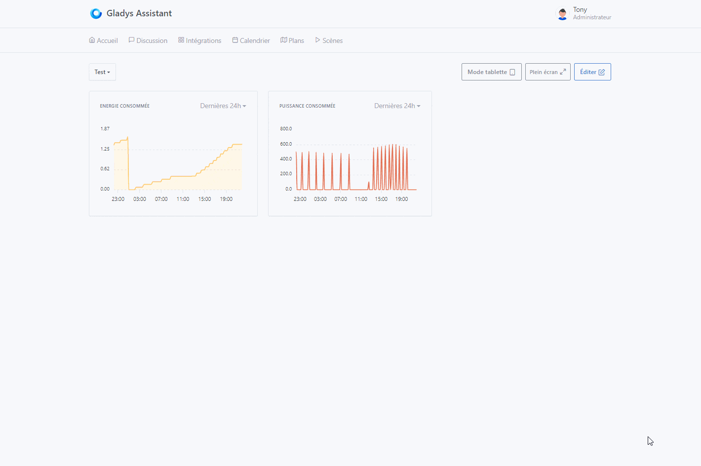
For now the « History » tab you just copy-pasted the dashboard tab, and so in my opinion it doesn’t really meet the need. I understand that you went as fast as possible to do tests, but in this case it would have been even faster to just make a mockup Because now you’re going to end up coding the feature six times, it’s a shame ^^
Do you want to have a call to formalize the development?
Honestly, I’m really not at all comfortable with Whimsical, which I’ve tried several times since you told me about it 2 years ago.
And it doesn’t bother me at all to code for no reason (especially front-end, to be honest ^^) because… it’s not for nothing… I don’t have formal training as a developer and it’s clearly really training me. In my head everything is roughly clear and what isn’t becomes clear when I code it. So frankly it’s win/win ^^
And yet regarding the copy/paste of the dashboard… that’s exactly what I had in mind. I was exactly trying to do that but yes, it’s a very personal vision. For me the chart part on the dashboard has little interest, notably because it’s not very visible on phone and tablet or because it’s too long to access by swiping to the correct box.
But I’ll develop it according to the need and the joint decision. Honestly. I find the zoom part a great addition.
Awesome ^^
I want to compare my production to my consumption
I want to identify which device(s) trigger recurring overconsumption
I want to visualize my weather station data over time with temperature, humidity and wind
I want to be able to easily calculate my electric car’s consumption
I’m on three-phase power and I want to be able to check my phase imbalances
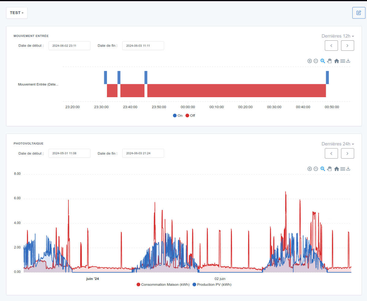
I want to see all window/door openings easily and be able to go back in time comparing them to my presence.
…
I’ll stop there for now but I have plenty of others that don’t come to mind right away.
I have many other improvement areas in mind, notably raised by other contributors who will make other PRs later (export xlsx/xlsm taking an xltm or xltx template file as input; adding an on-the-fly feature on a live chart; adding a checkbox in the editor to be able to use the min/max of the feature; adding multi-legend (for example temperatures + humidity or wind + temperatures + humidity) see https://codepen.io/apexcharts/pen/LBadXo)
But since I’m listening to you , I think I limited myself to the bare minimum.
Ok, I’d like to understand this point: why? What’s the difference compared to what you did?
Thanks for the examples! I’d welcome examples from other users who have more « classic » setups
For me the big question is: what proportion of questions are one-off versus recurring?
Having a « dashboard » workflow doesn’t make sense if the questions are mostly one-off, and in that case it would be better to have a simple screen that lets you answer questions « on the fly » without configuration.
For recurring questions, the dashboard approach makes sense.
We can probably wait a bit to get feedback from other users; for me we lack the data to decide.
Otherwise I’m available any day, Gladys, to discuss and formalize all of that!
I’m correcting my sentence which was missing words and therefore gave the opposite of what I meant ^^ :
« […] has little interest notably because it’s not very visible unlike on phone and tablet […] »
… the dimension ^^ on PC in 3 columns is way too small.
Then, as it stands, even if you zoom out you can’t easily see multiple curves / compare with binary …
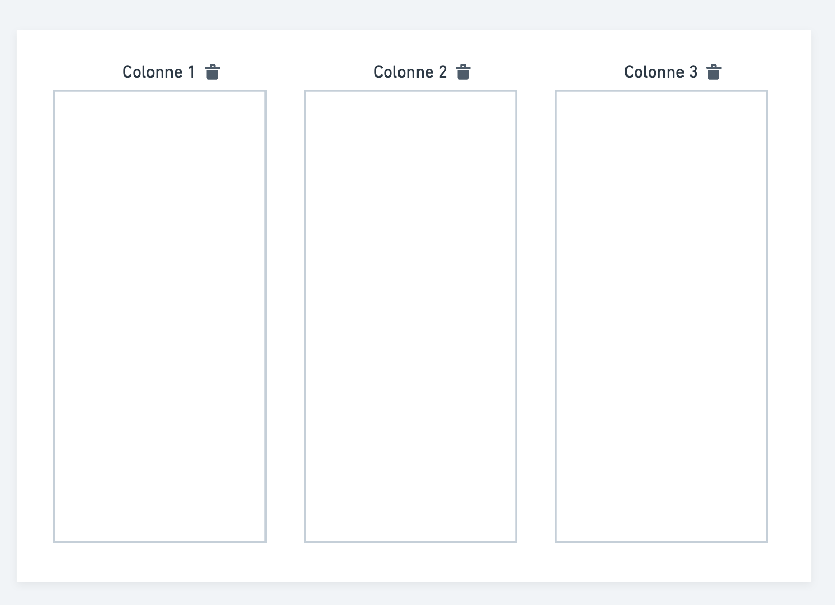
… but then … it makes me think … and what if, just as a starting point, I developed the possibility to select the number of columns (because I haven’t really touched much to develop the new menu part ^^)?
That’s exactly my point! If it’s just about column width, let’s go ahead and make the number of columns variable No need to create a new tab just for that
If you’re talking about being able to choose the number of columns, you have to consider that if I want 2 columns, then you must be able to choose the 2/3 1/3 split, or 1/3 2/3 … you see what I mean? ^^
That said, I also think that for visual things like charts or cameras, a larger display would be a big plus for Gladys, at least for use on a computer or a large tablet.
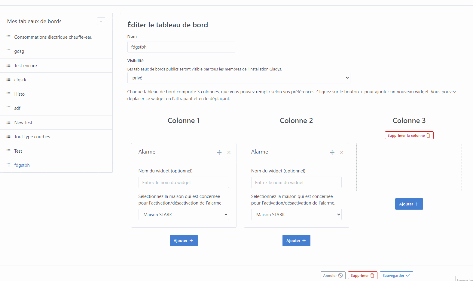
Either a new dashboard, you select 2 columns: the whole will simply be distributed across the total available screen (current size) into 2 columns.
Or you want to transform a current dashboard into 2 columns and in that case we need to put safeguards so that you can only delete an empty column (so you’ll have to move or delete the existing boxes beforehand).
I just got it ^^… let’s say that for the first dev we split it into 2? And then we can do an extra dev to give the option to choose 1/3-2/3;2/3-1/3;1/2-1/2?
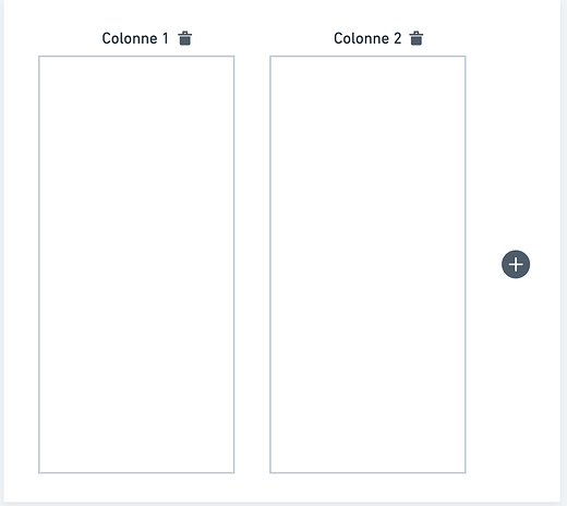
Would something like this work (well, knowing that alignments need to be reviewed in the edit with the addition of the button… but I’m fighting with the alignment of the boxes any advice will of course be welcome ^^) :
I really like it too, but we’d need to see how it looks mixed with other non-graphical boxes and how it renders on mobile when the box is 2/3 width or full width.
Well I think I found it … I was fighting in the wind, I was calling the wrong file for the styles.
This would look like this in web version (>992 pixels) :
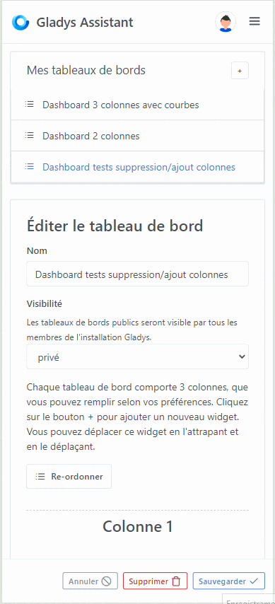
And this is what it would look like in mobile version or display < 992px :
So the case of columns on the same level has been handled, but I really like your design which is no-frills and lighter.
I’ll make the changes accordingly!! With the + on the right!
Thanks for your quick message!!
EDIT: @pierre-gilles I liked the placement of the ‹ + ›, but if there are boxes filled in the other columns… we can’t see it anymore and you have to scroll… maybe just display it on the same line as the columns but on the right, right?