Ultimately I like the very first image.
I find that the versions with frames are even clearer in terms of comprehension, but less pretty.
Ultimately I like the very first image.
I find that the versions with frames are even clearer in terms of comprehension, but less pretty.
The trash can without the button looks really clean, I think 
Centering the buttons vertically looks very nice, but as soon as the column becomes super long you’ll have to scroll to reach it, so I find it not very practical
What if you aligned the button relative to the top of the column’s drop zone (but not the title)?
Sorry, need context to be sure ^^
Are you talking about the trash icons and the +? For the trash icons, not a big deal since the column has to be empty to delete, that’s handled at the top of the page (the usefulness of a back-to-top button, by the way), right?
Here you’re only talking about the ‹ + › right? Like this then? Fixed or moving when scrolling, then? :
The +!
Yes the +!
Like this but I would have liked to try a rectangular button here for once, so that it makes a straight line aligned with the drop zone, so we understand that it’s the continuation and that if you click on it, the same thing appears!
Also, for me the columns should be left-aligned and not centered horizontally
I agree with that, and it makes it even more logical that if there’s an empty spot on the right we can fill it 
Hello hello !!^^
Would this be suitable? That is:
col-lg-12 / 3col-lg-10 / 2 and col-lg-2 for the ‹ + ›col-lg-10 and col-lg-2 for the ‹ + ›Tell me if I should remove the description (I think that would be a shame), if I should add scroll-follow behavior, and if I should remove the text on mobile.
EDIT: I adjusted the right margins that were incorrect. Everything is pushed.
Hello !
I’m chiming in (this is pretty rare now  )
)
Why not simply put a selector for the number of columns in the form just above?
It’s much simpler and more intuitive because it allows the user to immediately understand/see that they can change the number of columns of their dashboard and it doesn’t cause any design issues (unlike most of the proposals made so far, no offense intended)
Edit: I quickly put together the view to have an example =>
I also revised the form so that it’s more responsive and remains consistent.
<div class="row mb-3">
    <div class="col-md-4">
        <div class="form-group">
            <label class="form-label">Nom</label>
            <input type="text" class="form-control"placeholder="Nom" />
        </div>
    </div>
    <div class="col-md-4">
        <div class="form-group">
            <label class="form-label">Visibilité</label>
            <select class="form-control">
                <option value="private">privé</option>
                <option value="public">public</option>
            </select>
            <small>Les tableaux de bords publics seront visible par tous les membres de l'installation Gladys.</small>
        </div>
    </div>
    <div class="col-md-4">
        <div class="form-group">
            <label class="form-label">Nombre de colonnes</label>
            <select class="form-control">
                <option value="private">1</option>
                <option value="public">2</option>
                <option value="private">3</option>
            </select>
            <small>Les tableaux de bords peuvent contenir jusqu'à 3 colonnes.</small>
        </div>
    </div>
</div>
Hi @MathieuA,
Glad to be able to read you again, as you say you’ve been rare ^^
You’re right to share your opinion; sharing is only constructive, whether we agree with the proposals or not ^^
To tell you the truth, I had started with this option. And in the end, when modifying an existing dashboard or one under construction, I found it very restrictive. Because if we decide to switch back to 2 columns after having filled our 3 columns, what happens?
FYI I had chosen the second option. But I didn’t find that as smooth.
Finally, I think it’s still a viable option; I agree with you because I don’t think we change the number of columns on a dashboard all the time 
Edit : I’d add that the ratio of participants who gave their opinion is far from representing the majority of the community. So I think we’ll end up with a decision from @pierre-gilles, we can always revise it if there is feedback. So you did very well to launch this proposal to broaden the range!!
Ah no, but if you’re talking about the white space on the right, it’s because there’s the « + » to be able to add a 3rd column. Hence why I’d prefer it to stay visible when you scroll down ^^
Or maybe I didn’t understand, sorry ^^
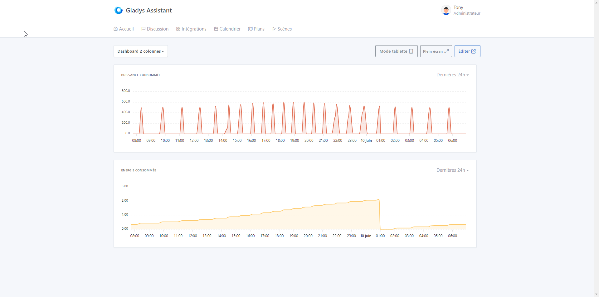
Ah but this is the view in edit mode.
I thought it was the dashboard view.
How does it look on the dashboard? Like before?
Yup ^^ that’s it ^^
Darn, I’ll show you tomorrow, the PC is in the other building ^^ I was hoping to have it on my phone by switching to the « Desktop version » but no ^^ it stays in mobile ^^
@Tlse-vins, it still looks like this
3 columns
2 columns
1 column
Thanks to @MathieuA and @Terdious for these suggestions
For the column number selector, I had thought of that too. It’s a simple solution that requires no design work, but to me it’s a very « developer » perspective.
In the same way that the user wants to be able to drag&drop widgets, they also want to be able to add/remove columns directly from the interface, and the behavior of a column selector would be impossible to understand (which columns will disappear if I remove columns?)
For me the « + » button / trash is the best option, but I agree with you @MathieuA, there is real design work to be done.
@Terdious For your last proposal, it’s better but I find that the « + » button might be too wide. I was thinking more of something like on GitHub Project, a smaller-sized button.
As for the hover, I’m not sure I find that very nice though.
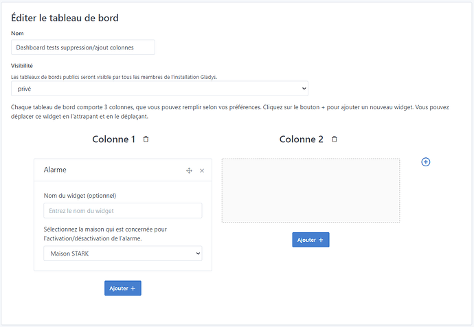
Are you talking about the ‹ title ›? We can do it differently if you want or remove it entirely, but to me it’s still useful information. You’re the one in charge. Tell me.
I’ll do that. And then are we good?
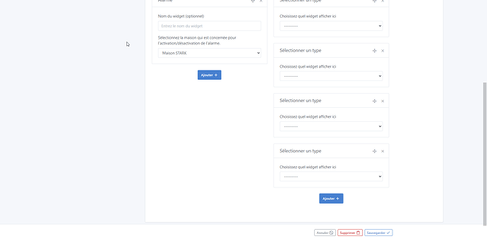
And regarding the button’s behavior when scrolling down, what should we do?
I was talking about the text "add a column
Oki so that’s it, the title (which is customized) of the button. Ok I’ll leave it so you can see it (I put it in a fixed position but we can place it differently, you tell me)
I always try to test every scenario, but some things can slip by ^^
For this, now I go through a GitHub review every time.
Okay, I’ll put it in the PR and you’ll test with and without.
Hi @pierre-gilles,
It’s done — it’s pushed!! You can take a look and run your tests. I added the drop-down button and the comment shown on mouse hover.
As a reminder the PR: https://github.com/GladysAssistant/Gladys/pull/2097
You can normally also review PR Add expand charts dashboard by Terdious · Pull Request #2096 · GladysAssistant/Gladys · GitHub. But since it’s based on the PR for binary curves, I suppose you’ll prefer to wait for the other one to be merged. Anyway, just for your information.
Thanks @Terdious for the PRs, I tested the PR for adding columns, and it’s much better — I find it very convenient and much cleaner than what you had proposed at the beginning.
Thanks for sticking with it!
On the technical side, I have some feedback that I left as comments:
For the PR about the chart « expand », I’m rather skeptical about using a modal; so far we’ve never used a modal in Gladys, and if we ever add one it would be more for deletion confirmation prompts, that kind of thing, rather than creating full screens.
Another option would be to display a new page.
So, is this PR still relevant following the PR about multi-column?
Too bad, I thought it looked really good (I don’t know if you tested it). I still recall that you had pointed me to this approach:
But I’m quite flexible, so okay for the new page—less functional I find—but the main thing is really to be able to exploit this data.
I think so after all our discussions. Because for one thing it allows us to still take advantage of 3-column displays and in an expand (or new page ^^) be able to do our date-by-date searches.