I made the changes to separate myself from the Overkill part, but I’m back to the same point — there’s a particular moment where I don’t understand why I get a bad result:
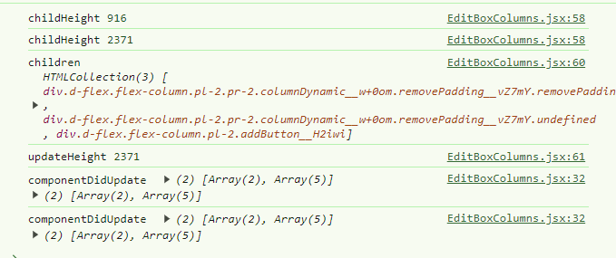
On some of my dashboards (I have the impression it’s when there are many items), the height retrieved is wrong when the page loads. Then componentDidUpdate takes over and the value becomes correct again. I therefore think it reads the height while the page is not completely loaded… But I can’t find the right feature. ‹ resizeObserver › and ‹ mutationObserver › worked, I was happy. And I saw on StackOverflow that it was recommended, but also that it was very fast.
For example here, the console.log gives me 2371 while the actual height is 3385. Once an update occurs, I get the correct value.
After testing, I have to admit I don’t really see the point of the sticky; when you’re at the bottom of the screen it’s actually quite confusing for the user:
You click, but nothing happens visually.
So in the end, I do question its usefulness a bit ^^
Hmmm ^^ You’re asking me a question here ^^ Actually it was to set the stage while being dynamic!! I was thinking that if one day you increased the display size (that would be awesome ^^) it would make it possible to switch to 4 or 5 columns easily ^^
But indeed, if we stick to three columns it works well!!
But otherwise, never mind, we can stick with ‹ col-lg-10 › / ‹ col-lg-2 › when there are 2 columns or fewer. The issue only comes up with 2 columns where I can’t do ‹ col-lg-(11/2) › ^^
You have a fixed column: the last column with the button
And 1, 2, or 3 columns that should have a dynamic size that’s just the remaining space divided by the number of columns (and it’s automatic, nothing to code, it’s CSS)
Let me add my two cents — I second the idea of being able to make 1 to N columns; it helps define a direction for how to manage columns, especially with increasingly higher-resolution screens. On large screens, three columns only occupy 50% of the page width.
From what I understand it’s built on Bootstrap, a small col-xl-N that depends on the number of columns is feasible, even if it means allowing 1 to 4 for example to keep a multiple of 12. But in my view 3 is still a tad too light on large screens. And the problem with going up to 5 is handling that multiple under Bootstrap — a lot of trouble for little gain. But 4 seems like a good compromise to me.
Another piece of feedback, not on the purely column side, but it would be interesting to have an expansion panel in the editing area for the cards inside the columns. For example, for large cards like charts, if you have 3 or 4 of them, it quickly becomes difficult to move cards. We could simply add a button to the left of the move button that would be ‹ Collapse ›. Just an idea
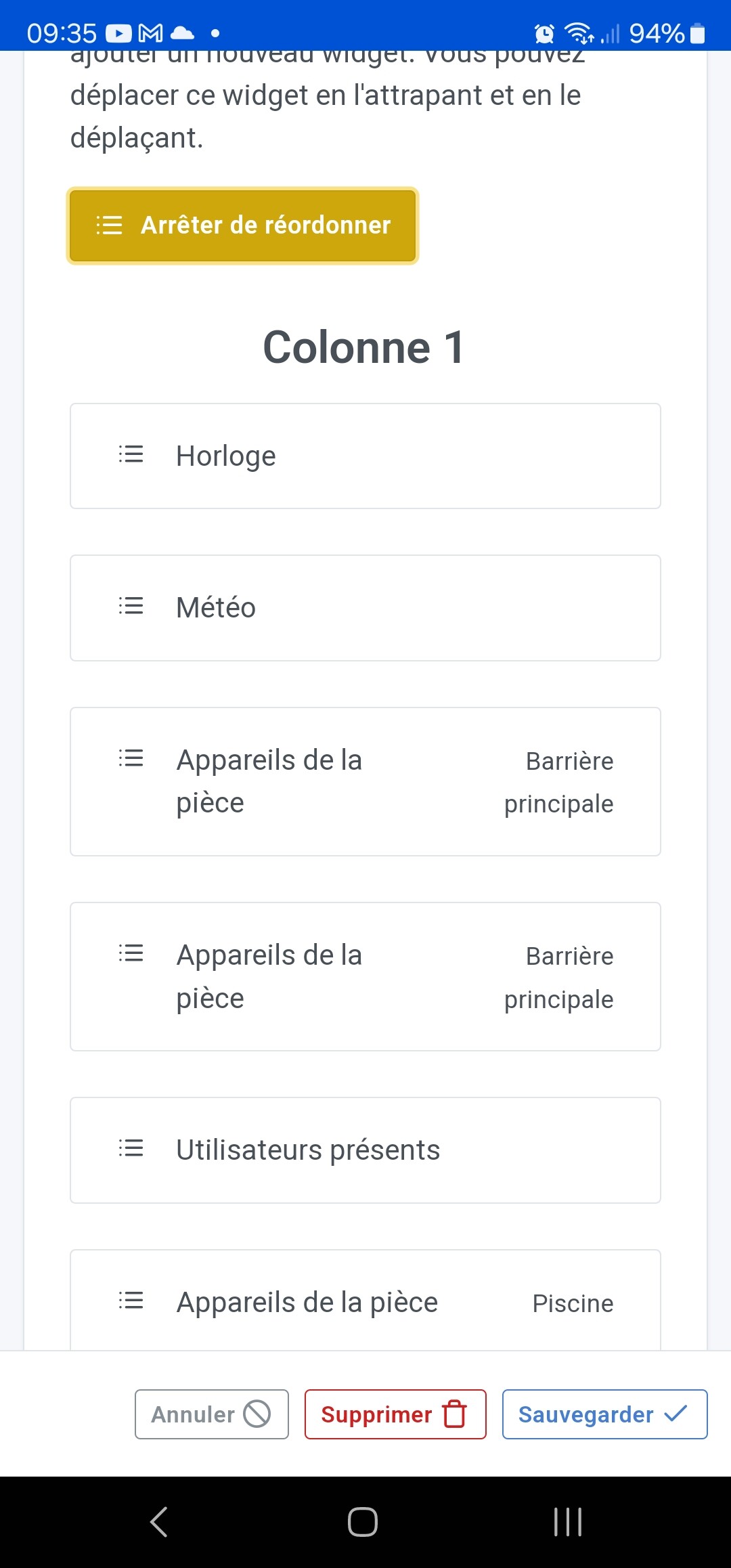
So in the end you’re proposing to keep the reorganization mode (« Re-order ») introduced for mobile devices (or small screens) that @pierre-gilles developed!!
Thanks for your help and sorry for the initial misunderstanding. The fixes are done, all in CSS and it works very well for me. I also picked up 4 ESLint warnings in the process.
I’ll let you check the PR (and see if it’s what you had in mind) and let me know.


 Less code = fewer bugs!