Actually I’m in the process of following up after v4.45 ^^.
I reopened the 1st PR 15 minutes ago (I’ll start with the binaries if that works for you), I’m catching up with DuckDB and seeing the new behavior and I’ll get back to you afterwards !!
As for this PR exactly … this minor thing actually took me an insane amount of time … I’ll be honest … I didn’t manage to … Note I’m not referring to your point specifically. To me the code around it doesn’t seem right. But I need to dive back into it and we’ll talk about it afterwards if that works for you.
Do you prefer that I prioritize this one or the binaries?
Oki !! (even if the binaries, I think there was nothing left except a display issue on mobile as far as I remember ^^) but that works for me ^^
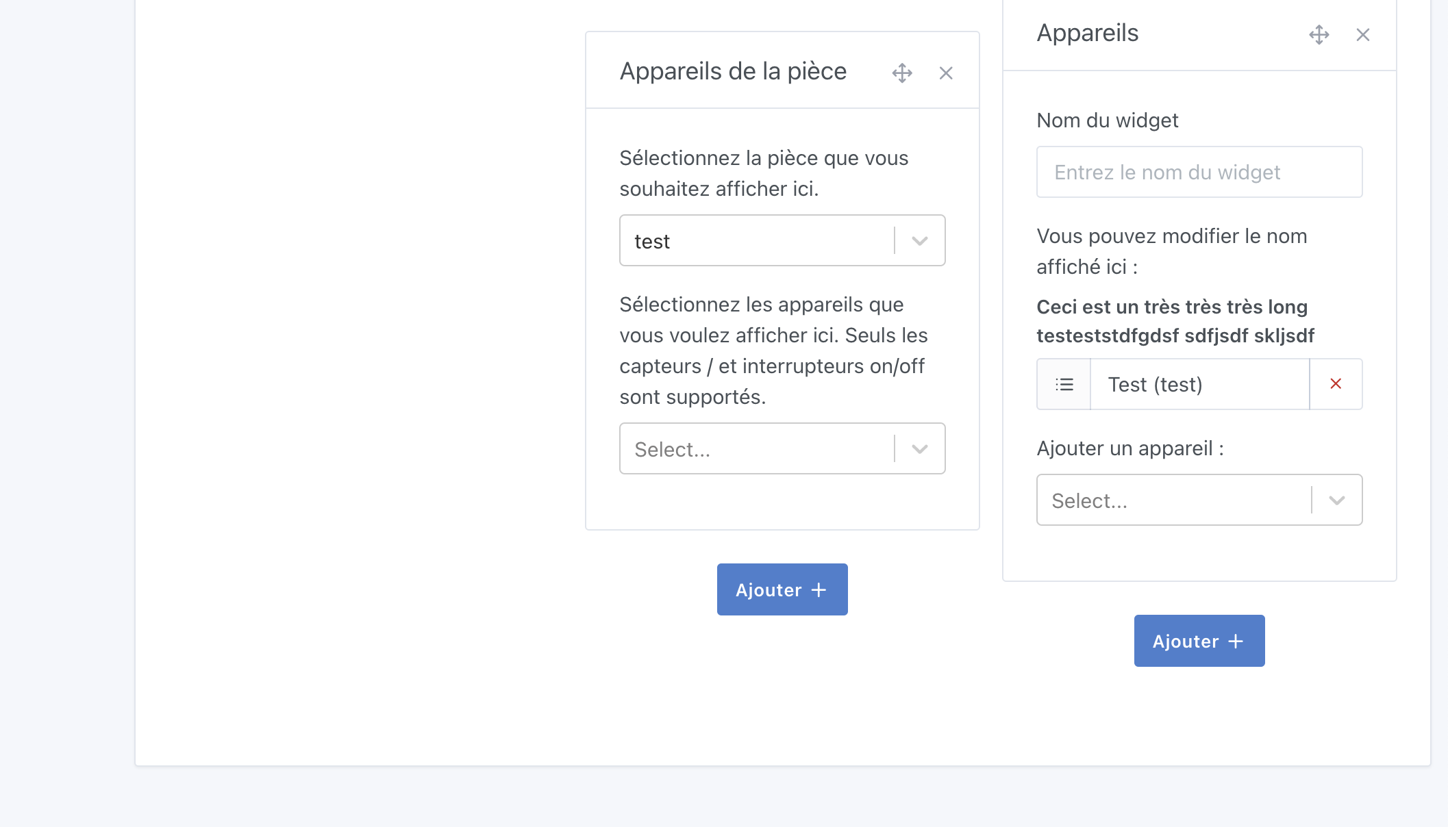
I’m checking it out ^^ But from what I remember it was about handling the display of dropdown menus appearing above/below in mobile mode due to the change in handling for dynamic columns… but I just ran the tests with my June changes and I don’t have the issue…
A positioning/overflow issue…
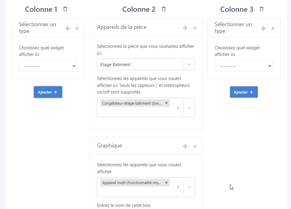
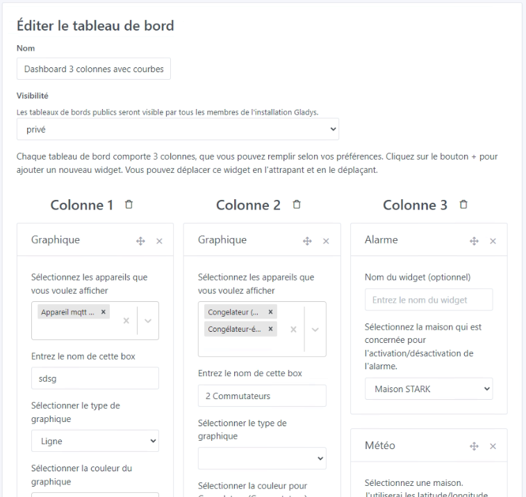
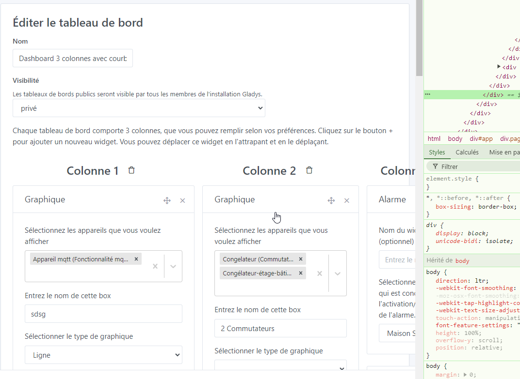
But when filling the columns, for example with a graph box that slightly increases the size of the column, you start to see that the 3rd column becomes smaller than the other 2:
When I put the CSS overflow:hidden (clearly an idea from ChatGPT since my searches yielded nothing), it does solve this problem, but creates the problem at the bottom of the page ^^
For this kind of issue, I find ChatGPT pretty dumb — it gives hacky, slapped-together solutions, whereas usually you just need to sit down and rethink the thing
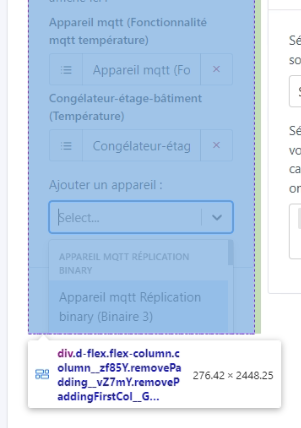
It really happens as soon as you put one of the 3 mentioned boxes in one column and not in another and you have devices selected. But if I remove them (just the selected features that I take out of the box, basically), it evens out…
It’s hard to reproduce, but I’ve done several reproductions here with different configurations!!


