Hello everyone,
I want to share here my feedback on my usage and the parts that I found could be improved. The idea is obviously to be constructive 
Context
I sometimes use Gladys from my work computer, but mainly from my mobile phone. I have therefore tested the two « versions » of the web interface.
Web Display Improvements
I find that the web interface is consistent and very easy to use, whether from a computer or a smartphone. But some parts lack mobile optimization.
-
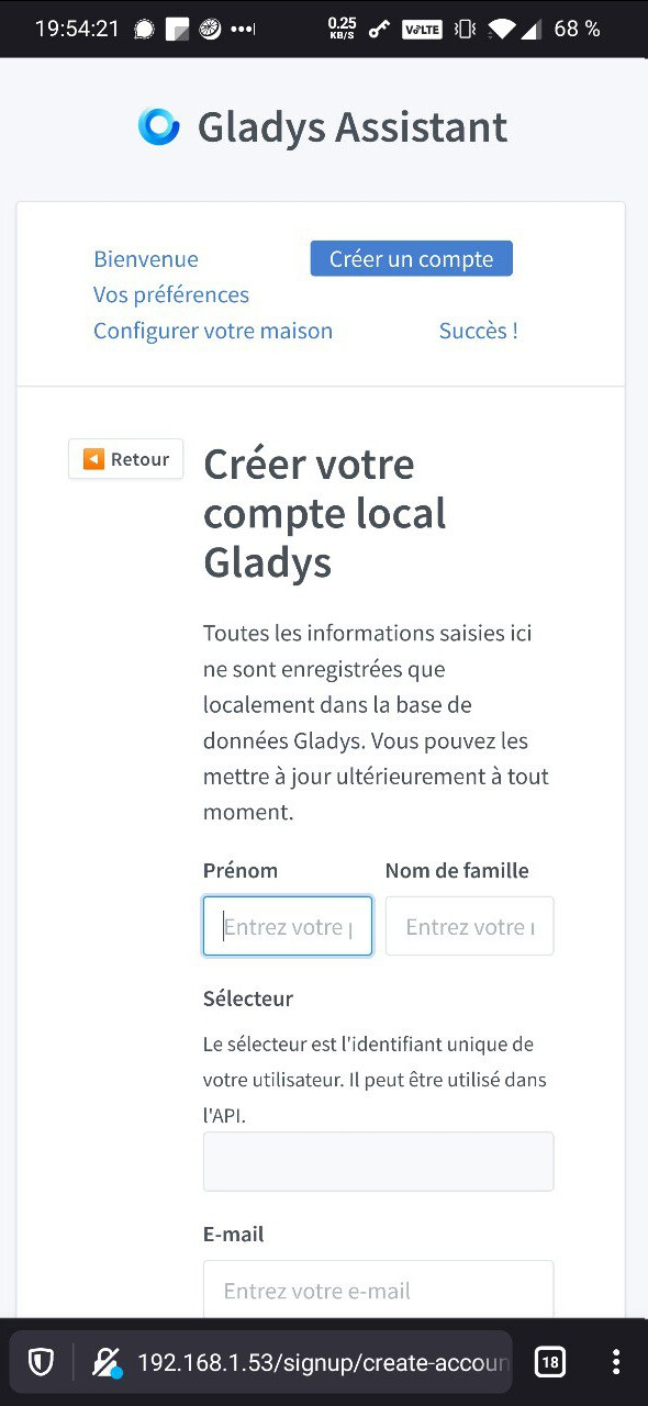
During the first installation of Gladys, this is important as it is the first real contact with the product for new users:
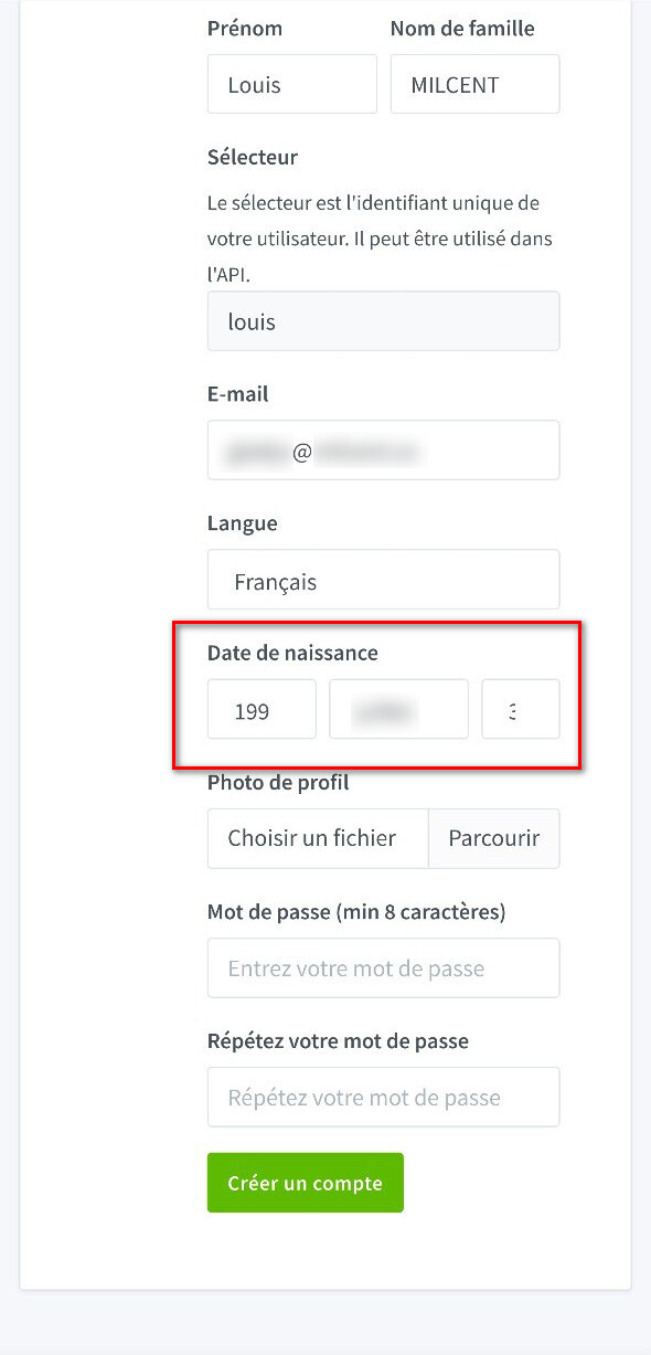
You can see that it is functional, but the « Back » button shifts all the « useful » content to the right, making the display less easy to use. For example, the date of birth is not displayed correctly (the day and the year are cut off, you can hardly see the 1st digit of the day).
-
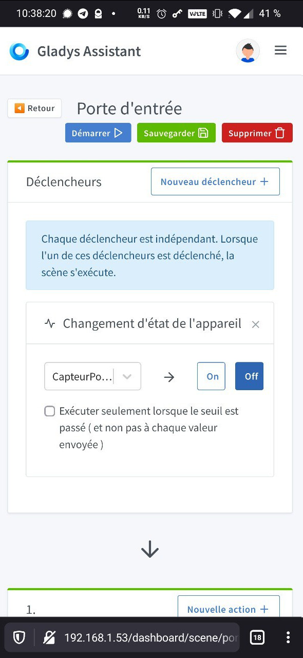
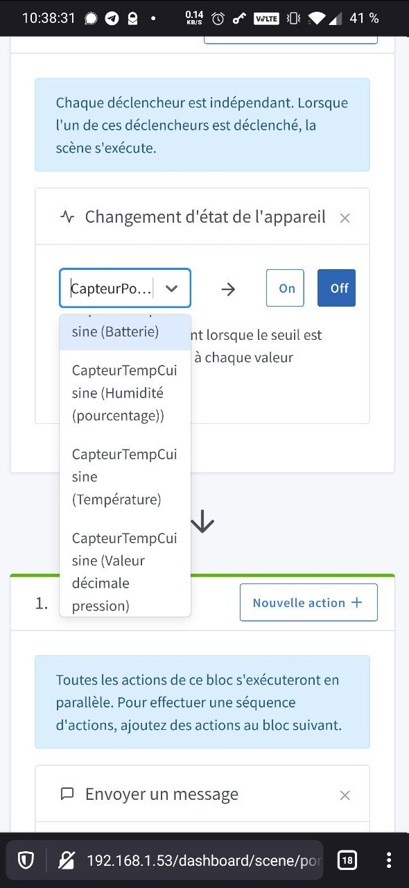
During scenes, when boxes are displayed next to an input field, the dropdown menu is then almost unreadable especially if there are many sensors.
On the other hand, when a box is on an entire line, it is again practical to use.
I will update this message if I see anything else!