Hi everyone 
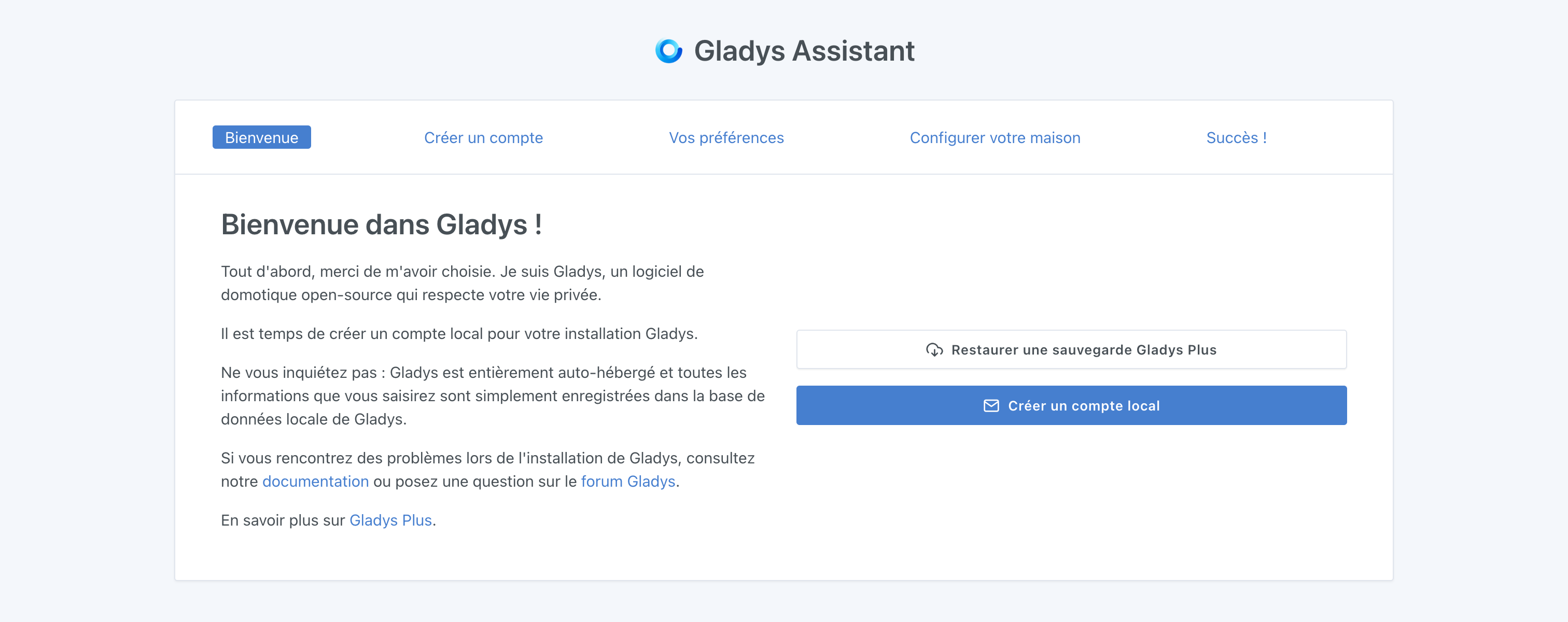
I worked today on the account creation process in Gladys to simplify Gladys’ first setup.
Open to any feedback on these improvements!
Desktop
I removed some emojis that looked good on macOS/iOS but not so great on Windows/Android ^^
Also simplified/updated the texts
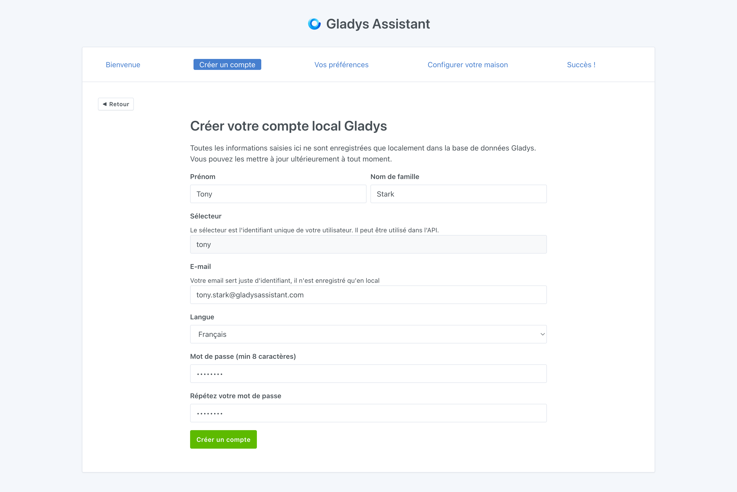
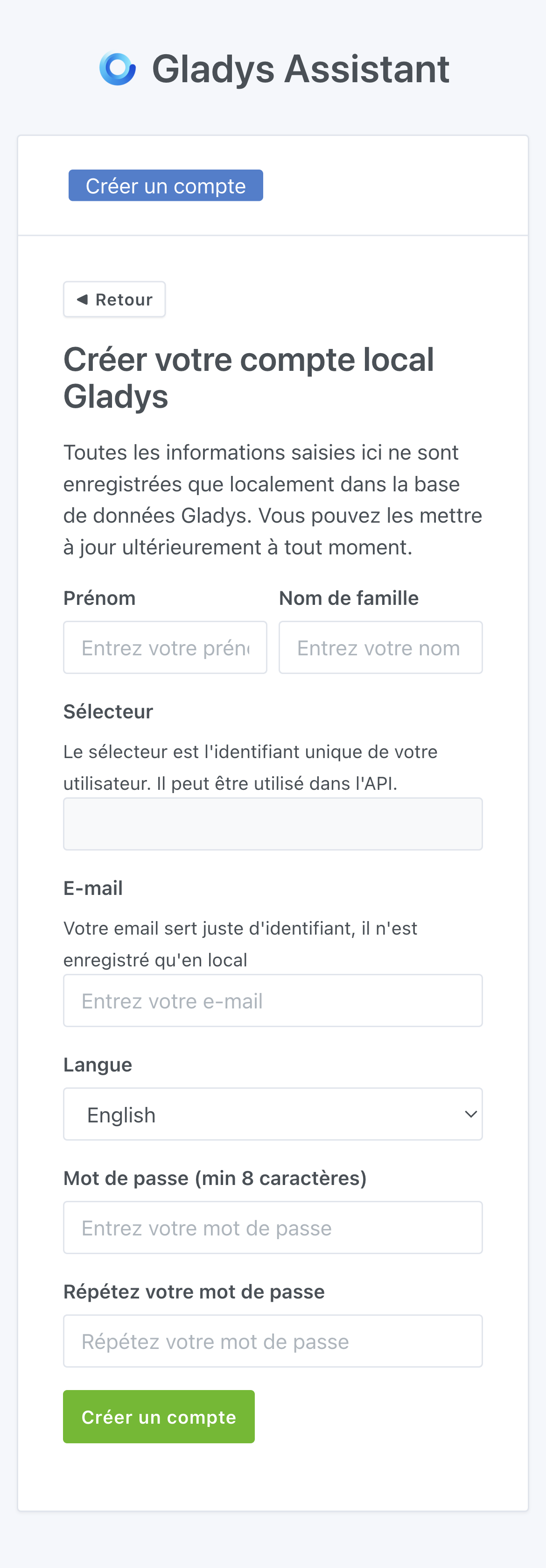
On the account creation page, I removed the « date of birth » field, which is completely useless.
Initially I had put it as a little easter egg so Gladys could wish you a happy birthday 
Several years later, I still haven’t coded that feature, and well, taking the user’s time for a useless field isn’t great.
The user’s « profile photo » field was also removed (it was optional, but that wasn’t clear), to let the user configure it later.
I added an explanation on the « email » field to explain that it’s a local identifier for login, and that it doesn’t leave the local database.
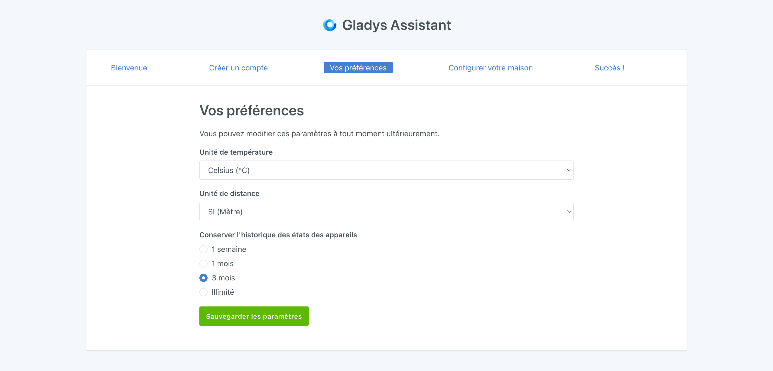
No changes on this screen or the one to configure your home:
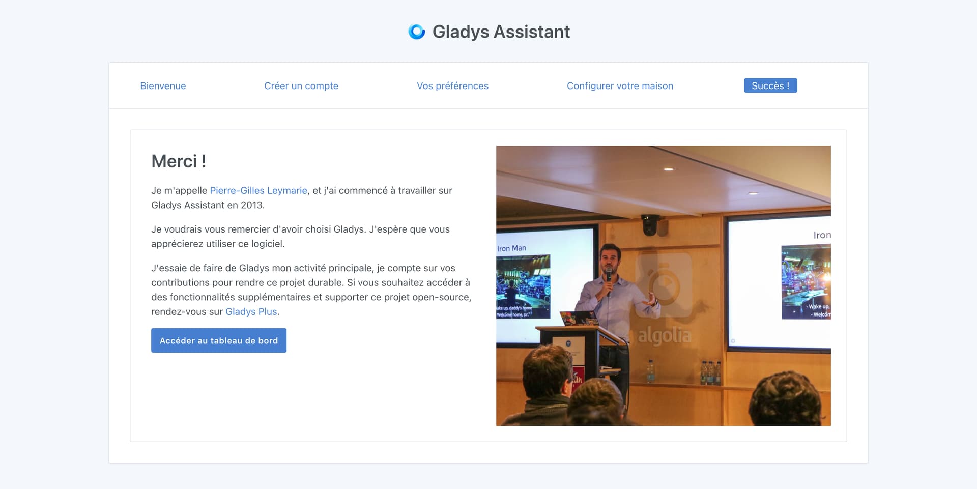
I changed the (not very professional) photo I had put during development that ended up staying all this time. This one fits the project better:
Mobile
I made quite a few changes on mobile to make it cleaner:
The PR =>
I like how it looks on mobile, it’s clean 
All these improvements are available in Gladys Assistant v4.23 
I’m closing this thread — if you have any questions/feedback, don’t hesitate to create a new thread!