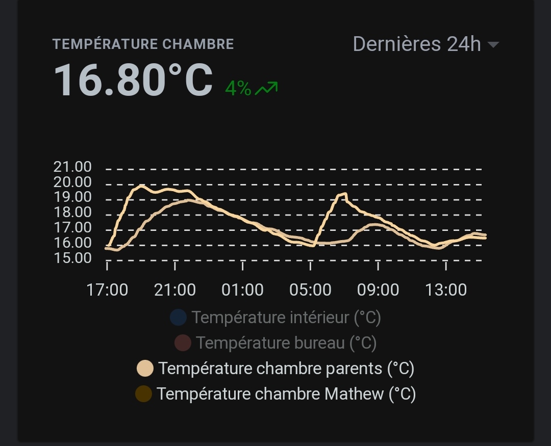
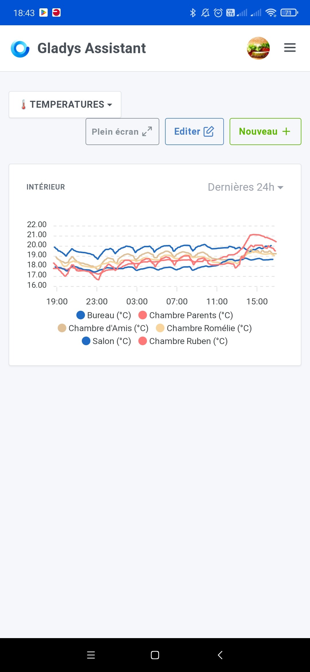
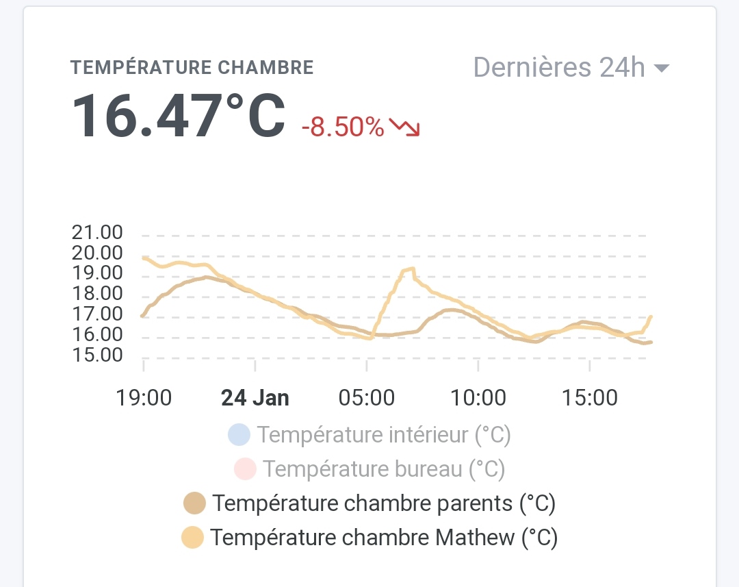
I use charts to display my home’s temperatures, but if a chart has 4 curves the last two are shown with the same color even though the colors in the legend are different.
guim31
January 24, 2023, 5:44pm
2
Oh, that’s strange… Maybe it’s related to the dark theme?
On my end I do have distinct colors… Still, my color palette is too limited ^^
Something needs to be done about the charts!
You’re right about the dark theme. In light mode it’s better, but the colors are still very similar anyway.
It’s true, they’re close!
I’m reposting the discussion thread where the colors were chosen:
Salut à tous!
C’est lundi, retour au boulot [Screenshot 2021-10-11 at …
I had tried to find a nice color palette that would work for colorblind users
But we can change them if these colors are a problem