Hi,
First of all, as I’m new here I hope I’m not posting in the wrong place.
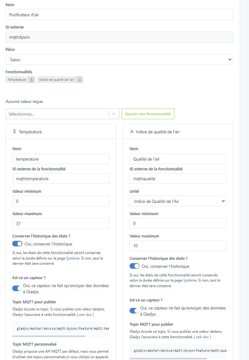
I’m getting started with Gladys but I dove straight into the deep end by integrating my Dyson air purifier with Node-RED and MQTT.
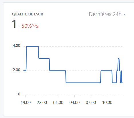
It appears correctly in Gladys and reports the data perfectly. So I put a small chart on the dashboard to track the evolution of air quality. Air quality is calculated from 1 (very good) to 10 (very bad); when you display the variation over 24 hours, for example, it shows +X% in green because it has worsened.
Is there a way to change the color to red, for example, or should I modify the incoming value by making it negative, for instance?
Edit 16/02: Hi @pierre-gilles, (sorry I don’t know how to reopen the discussion). It seems that it isn’t working properly even with the latest version: