By the way @Lokkye, is that still a development you’re considering?
@guim31: Yes and no — for now, I’m focused on the three other pull requests in progress. Also, the frontend is not my area of expertise. It helps me learn and practice, but it takes more time.
Okay, thanks for your reply. And there’s no need to justify anything — I already think it’s great that people like you take part in the project (and intensively, too!). I don’t do any coding; I’m grateful and I wouldn’t dare demand or complain about that!
Everything in its own time, I’ll wait patiently… and thanks for your work 
Here is the first draft
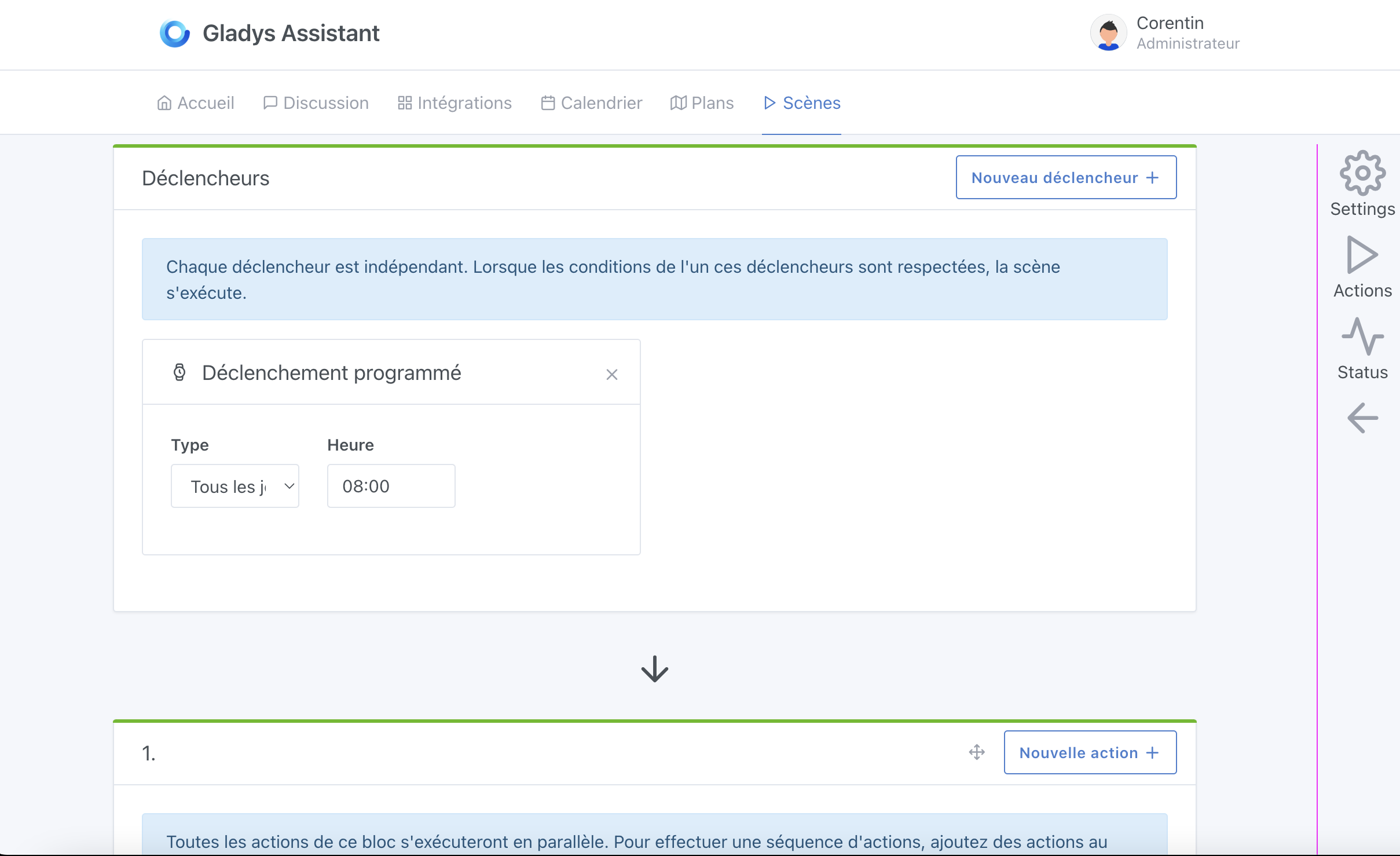
I love the idea of having a « bar » on the side but I feel it doesn’t fit into Gladys’s overall design. If I take Zapier as an example, the right-hand menu makes sense because the top bar stays visible at all times even when you scroll down. In Gladys, however, the top bar disappears on all screens when you scroll down (like a website). Whereas Zapier is more of a « web application ».
And in the GitHub example, there is no tab selection, which I feel doesn’t match our expectations.
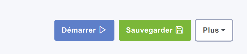
Is it conceivable, like Zapier, to change Gladys’s behavior when entering edit mode? That is to have its own top bar with:
- the name of the scene currently being edited (on the left)
- the save button (on the right)
- the enable/disable toggle for the scene (on the right)
- the scene start button (on the right)
Your thoughts, ready, go!!! 
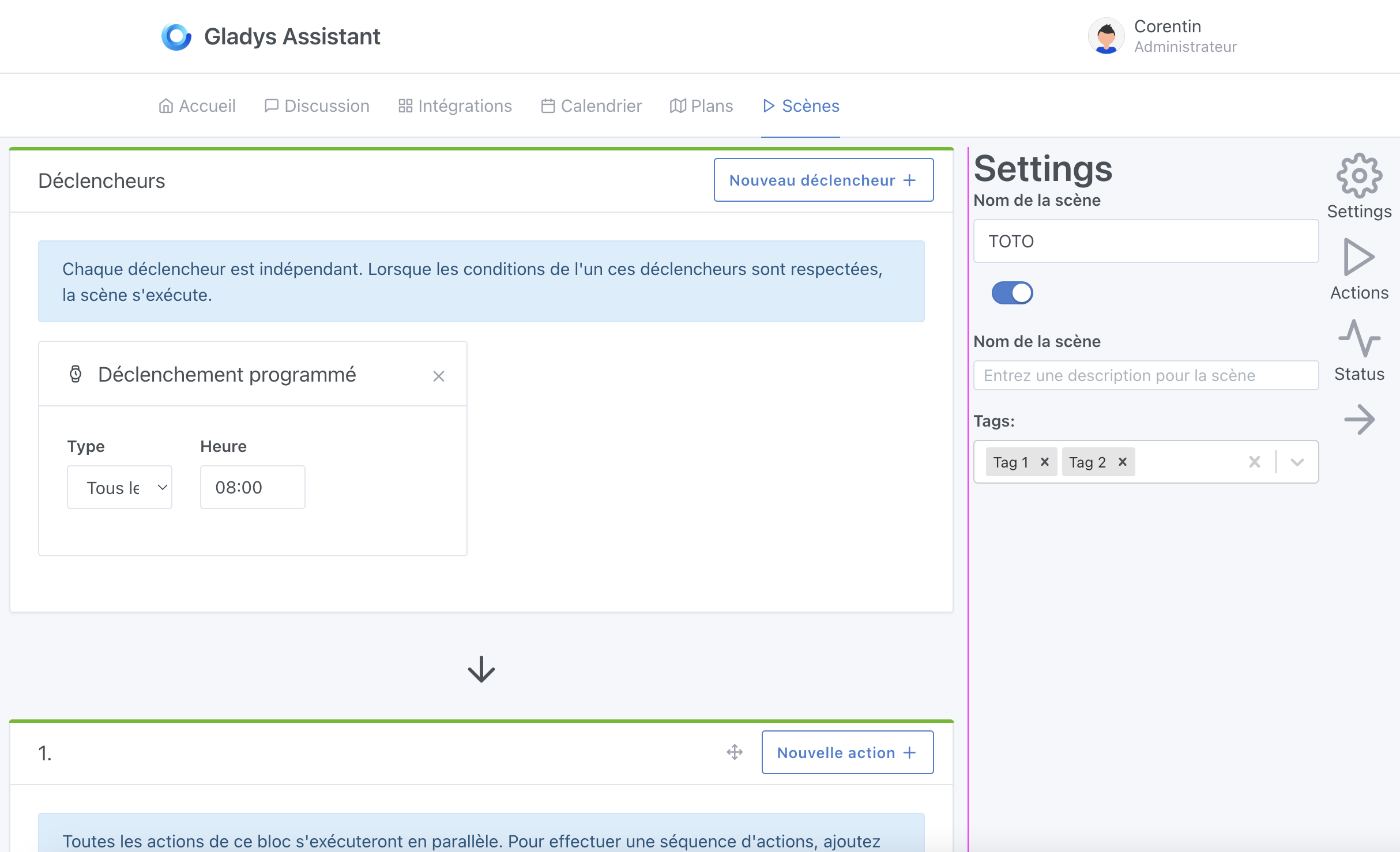
So on lots of sites / apps I like sidebars, but it’s true that with Gladys it doesn’t fit the overall design.
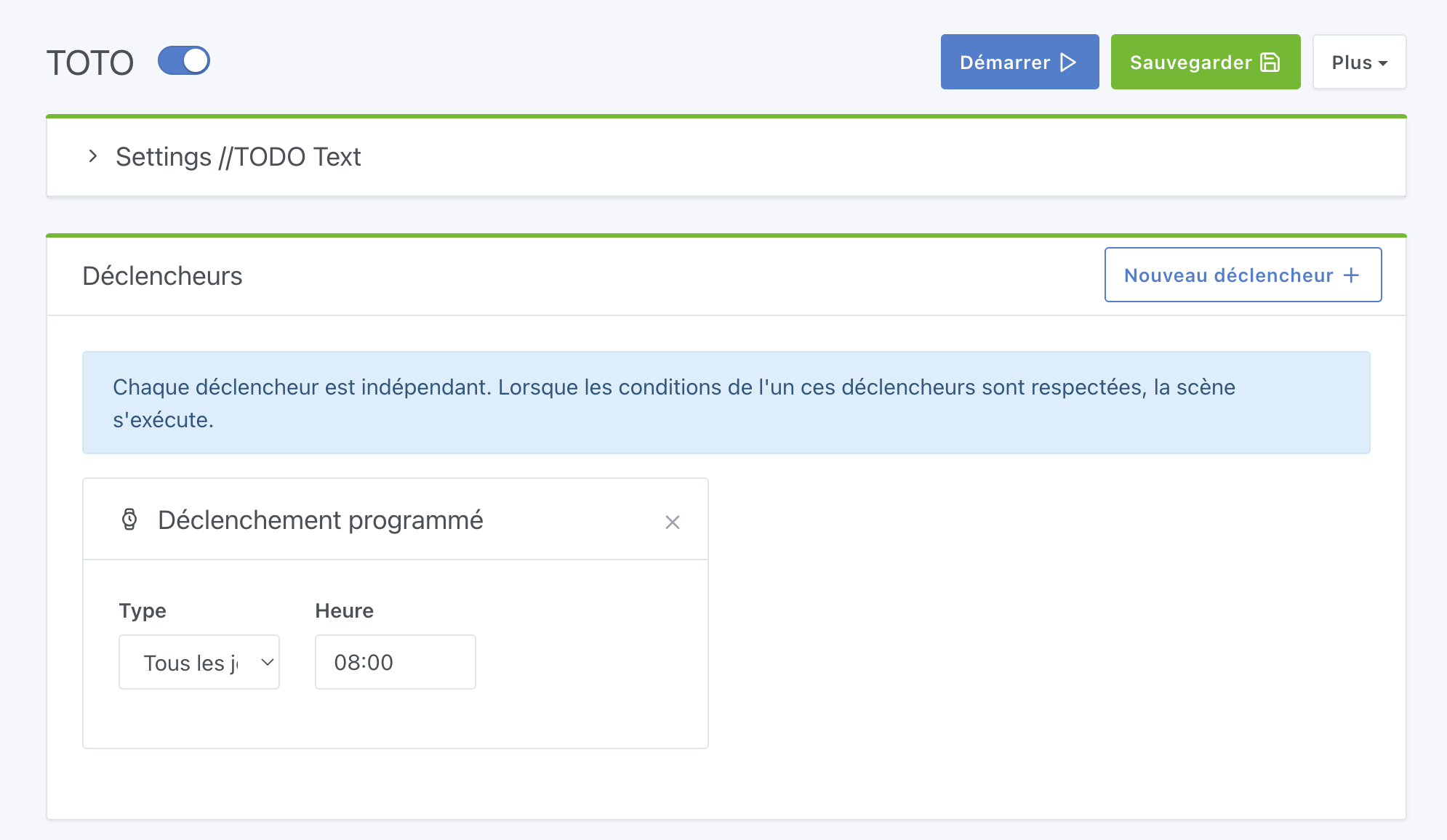
Suggestion: could these functions be added to a block at the very top that would adopt the design of the following frames (triggers / action).
The block could be called « configuration » and would group the ON/OFF state of the scene,
Thanks for taking the time @Lokkye! 
Indeed, as it stands the sidebar doesn’t really fit with Gladys’ overall design
I’m not sure we really want to move away from the current navigation architecture when entering scene mode; in my opinion it would hinder navigation more than help Especially since in Gladys, when you create a scene, you enter a scene/leave it to create another
Why not! That’s a good idea, worth testing
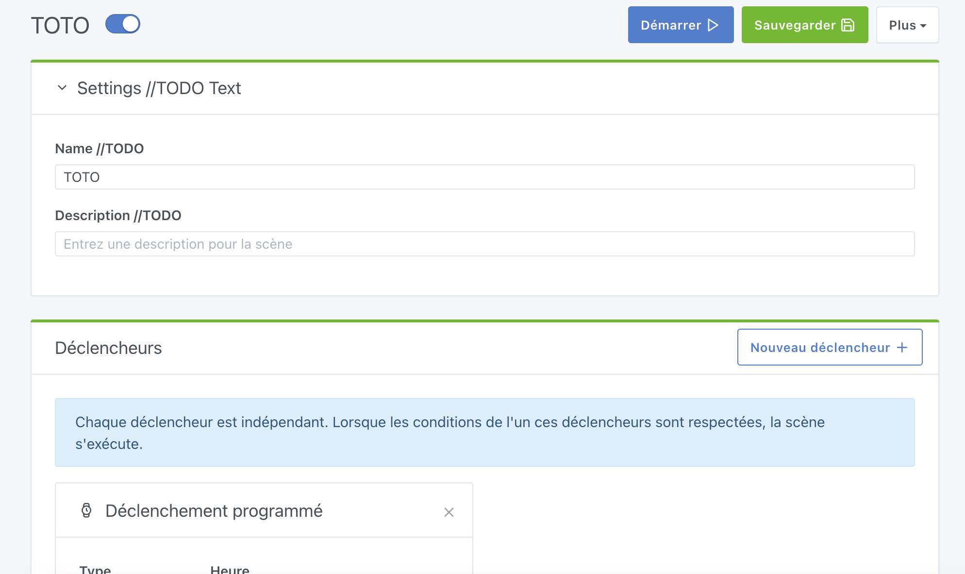
Could this block be « collapsed » by default and expandable to be edited?
Why not, but it depends on what we’d put in it. If we put the scene’s ON/OFF button in there, it might be a shame to collapse it, right?
Could the buttons be in the header (visible even when collapsed), for example? No idea, we’d have to run some tests — they’re just off-the-cuff ideas
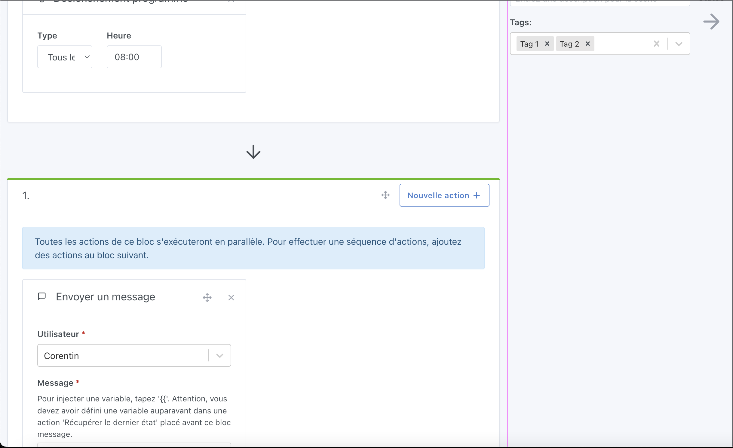
A few comments following your screenshot:
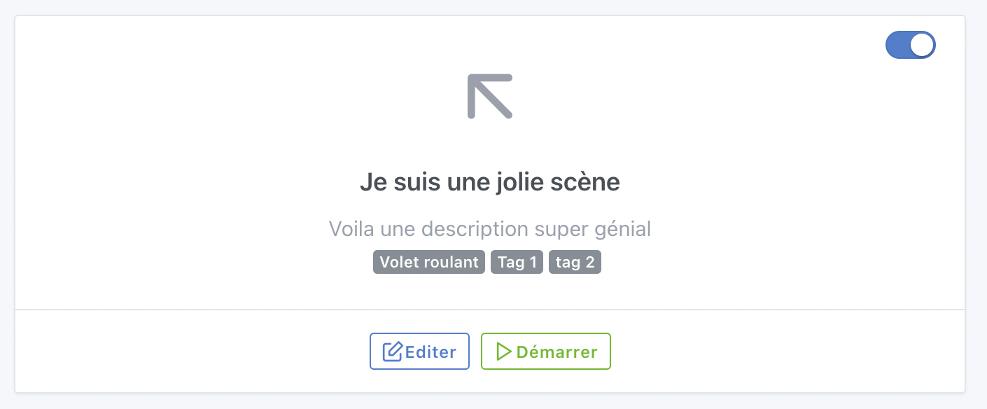
- Personally I’d remove the top part (Title and ON/OFF button) to integrate everything into the card header.
That would put the title on the left, the ON/OFF button just next to it, and these three buttons on the right of the header:
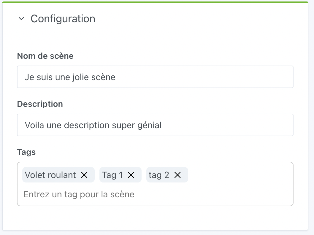
Clicking the PLUS button would open the card body and in that body we would find:
- editing the name
- editing the icon
- description
- editing the tags
What do you think?
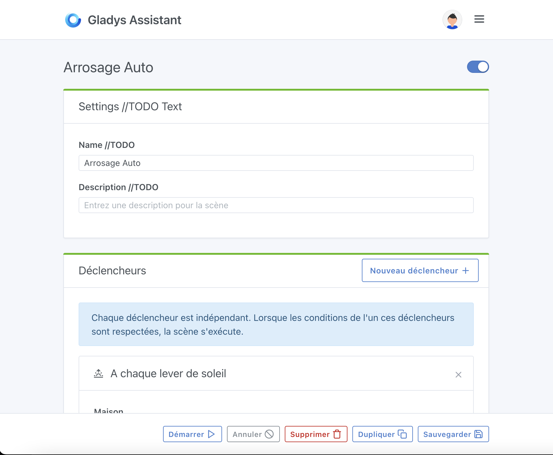
I like the idea of having the buttons at the bottom.
This would be identical to dashboard editing and accessible at all times.
I can see the same design as for scene editing actually

Just the « Delete with confirmation » button alone will probably break the responsive layout, I think
I’d rather keep the buttons as they are, and make the top « card » collapsed by default with a button to expand on the right of the card header.
I like it personally, even though I find a button more explicit than an arrow.
Besides, since the text is clickable, it’s very user-friendly too.
That’s really nice! Okay, now we need to work on the content, but I like how it works like this it doesn’t obstruct the screen too much, and it’s clean in terms of design
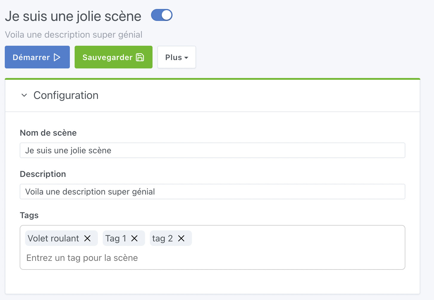
@Lokkye I think it’s great
Maybe harmonize the size of the inputs a bit — I find the « name » and « description » inputs very small?
Ok, let me know when you want a review!
@pierre-gilles : It should be ready