Scenes: Improve the "device state change" selection with filters and multi-select!

Feature description

Do you want to detect any movement in your home and trigger an action? It’s possible, but if you have 4 motion sensors, it currently takes 28 mouse clicks, which is a bit long and tedious.

What if we limited the dropdown list display to only what you want to select?
What if you could select all devices at once?
→ Well, that would be super convenient :slight_smile:

Explanations

Currently, selecting the 4 motion sensors to trigger a scene:

  • 4 clicks to add a new trigger of type « Device state change »
  • 2 clicks to select a first sensor of type ‹ Motion (Yes/No) ›
  • 1 click to set « On » (motion)

Total: 7 clicks for a single motion sensor, so 28 clicks for 4 sensors.

And I’ll stop there, because if you want to retrieve the last value of each sensor, test it and then perform an action, it’s even longer.

Proposal

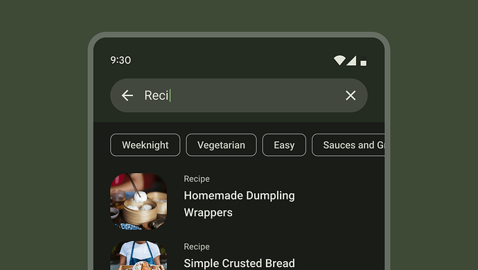
When choosing a device from the list, add filters at the top of this list to limit it to sensor types or rooms of the house.

As a user, I want the list to be as precise as possible for my needs and to allow me to select all the sensors to be used in a single action.

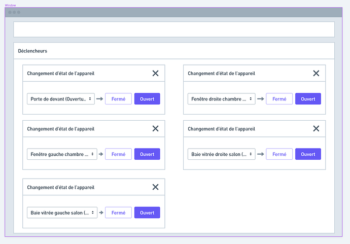
Example I really like (source) :


Versus currently

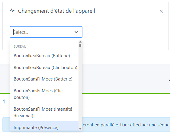
The list is veeeery long, even if I filter on « movement » for example, because each detector has a line for battery, signal strength, temperature, humidity, brightness and finally motion.

Example with an unfiltered selection:

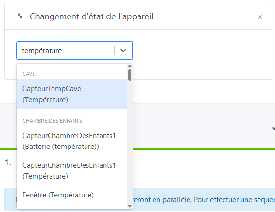
Another example with a selection filtered on « temperature »:
I share the desire to simplify finding those select elements in scenes, because as soon as you have quite a few devices, you’re really dealing with HYPER long lists.

3 Likes

@pierre-gilles I don’t know if this can be included in the UX improvement project, but it seems relevant to me.

Creating a scene that has to check that all the windows are properly closed is always a pain (I have 8 openings, because the windows are double: right and left).

From a usability perspective, it would be life-changing.

I agree!

How do you see that for the filters? I’m having trouble picturing it.

If you could make a quick mockup on https://whimsical.com/ :smiley:

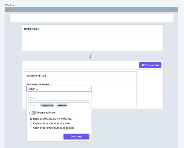
Here is my proposal: scenes-ameliorer-la-selection-du-choix-des-capteurs-avec-des-filtres-et-du-multi-select

Inspiration: Material Design 3
Chips – Material Design 3

Trigger

Here, Gladys allows us to list all devices, filter by room or type, and select one or more.

Three filter modes: via the usual input, via the room input (like Gmail, adds « chips » once the tag is confirmed by pressing Enter), and via type.
Filters should operate exclusively (type AND).

Validation can be direct (selecting everything validates at once) or indirect: you must select checkbox by checkbox then confirm (to be defined).

Once confirmed:

Retrieve the latest state (same idea)

Same principle, the example mixes the types this time and does not filter by room:

1 Like

I really like this proposal! Well done @lmilcent

1 Like

I understand that this would be applied to triggers and to the « get last state » actions. Would it also be feasible in a similar way for the « control a device » actions?

1 Like

In fact we’re moving toward a request for a global change to the selection of connected devices in Gladys.
I believe this is indeed a point of friction in some use cases that we encounter frequently, but that it’s not a « quick win » because the work behind it is more substantial than fixing a few UX bugs (I imagine).

@pierre-gilles what’s your view on the matter and the proposal?

Thanks for your proposal, it’s cool that you spent time on this :slight_smile:

Where is that on your mockup? I don’t see it

Why go with a checkbox system, instead of keeping the current react-select component?

The problem with checkboxes is that devices in Gladys number in the dozens/hundreds. Even with filters, the largest rooms easily have 20 devices. So to prevent it from overflowing, you’ll need to add scrolling inside. However, checkboxes inside a scrollable view are not great, because you can’t see the devices you’ve checked at the very bottom.

Otherwise, overall I like the proposal but I find it a bit heavy, don’t you think? And in terms of UI clarity, I’m not sure a newcomer who doesn’t know the product will understand that the room selector is a filter, same for the type.

I agree that this behavior could later be extended to other parts of Gladys, but I think that should be in a second phase, and in other feature requests.

My view is always the same: the smaller a feature request is in terms of scope, the better. Giant catch-all requests are projects that never get completed because the hurdle is too big!

We need to move forward in small iterations :slight_smile:

It may not be explicit enough, but the Select ... is an input field, to keep everyone’s habits.

Simply out of ignorance, I used the fields offered by Whimsical.

Good point, I hadn’t thought of that and indeed it’s a UX disaster :grimacing:

I wanted to give a general idea, a bit more concrete than words. But it’s not developed enough; like you, I find it looks very busy and almost intimidating for a newcomer.

Currently, when you look at the list and see the same sensor many times but with different types, I find it lacks simplicity.
For my part, I often pre-filter by typing the type first (ouverture), but then I can no longer filter by room. And doing the reverse shows me too many results.

My proposal tried to limit that aspect a bit. With some redesign work, we’ll end up with something :slight_smile:

1 Like

Cool! Keep me posted as soon as you have a new version :slight_smile:

I also think it’s good to be aware that this UI improvement would be relevant in three places (triggers, state-retrieval action, device-control action), but to first define, develop and test it on only one of the three.

So it would be on the state-retrieval action that was your initial point in this thread, @lmilcent? If that’s the case, maybe state that clearly in the title…

2 Likes

It’s done, I’ve changed the title.

2 Likes

Hi @lmilcent, I’m following up on this — have you had a chance to take a look?

I haven’t forgotten the topic; I just haven’t yet found the time or availability to get back to it.
In the meantime, if others have suggestions, I’m open to them too ^^

1 Like

Hi @lmilcent, just a quick follow-up in case you have time to take a look :slight_smile:

Oh dear, oh dear, oh dear, time flies. I use the forum’s « Remind » function to always keep the topic in mind.

For now I’m a bit stuck on the design to combine practicality of use and visual ergonomics, but I keep digging around for inspiration and to come up with a new proposal.

In the meantime, don’t hesitate to share new proposals with me (the community, not just you :wink: ).

1 Like