I created this topic for ideas to improve the interface … to be validated for each proposal!?
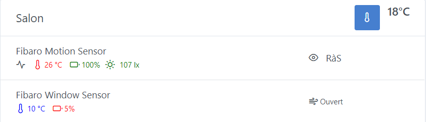
I’ve been a bit focused on user experience in recent years and I’ve created a small mockup of a proposal for displaying multi-sensor data from a device. (see attached images)
Here I propose to keep the Room Temperature and Room Devices cards separate but in my proposal we would have the possibility to combine the two and display the room temperature in the header of the Room Devices card (small + I don’t know if this is already the case, but we would have an average of the different temperature sensors to return the average temperature … here greatly exaggerated)
Moreover, to save space and readability, here is my proposal for the multi-sensor data of a device under the name of the latter and bonus to be able to choose which data is « Important » and would be alone on the right … Possibility of having none.
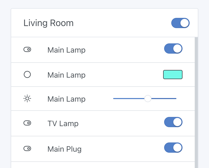
I’m not a huge fan, I admit.. plus this part of the header is already used when you have a room with lights to turn on all the lights in the room with one click:
For that, why not, I like the design you made, but removing the colors! ^^ To be seen how it looks on mobile (it must not be too overloaded)
Also to be seen how we identify which sensors should be displayed as one sensor per line VS one feature per line, because in my opinion this does not concern all sensors
Tastes and colors, I’m not particularly a bigger fan either. In fact, I just took the existing visual for the mockup and I realize there’s already better to propose. However, you raise the most important point: in the header, there are pieces of information/actions that concern the entire room… The average temperature would, in my opinion, be an option (in the Dashboard card configuration) that could be useful for those who want to « condense » the information.
I can make a mobile mockup if you wish…
For me, it would be important to offer the user the choice to configure this as they wish. Let me explain.
If you add a multi-sensor or a multi-action (in your case, the main lamp with 3 possible actions), you can choose a standard view or the « condensed » view and also enable or disable the colors (Today, you’re right, the trend of colors is fading, but colors, in my experience, remain an instant visual indication).
But once again, my goal is always to leave as much flexibility as possible to users through my modifications.
I can prepare mockups of all this so that people have a better idea of what this text says.
I think that if we have an option that is clearly better than the other, we might as well just propose it and forget the other one
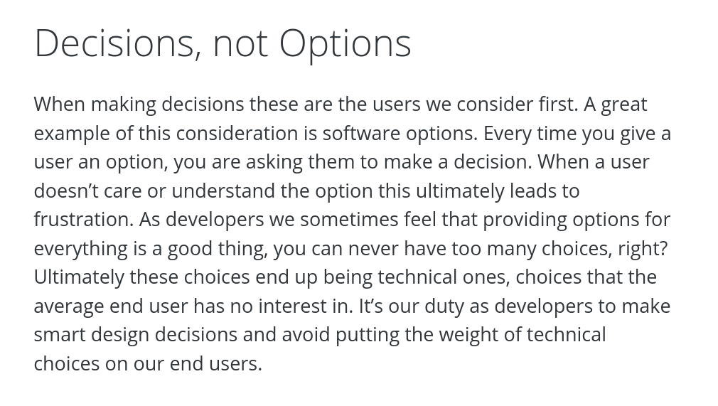
In general, in terms of product development philosophy, I am rather against the « all options » approach. It is up to us to make sensible choices and to develop what we consider the best option.
In the case of condensed boxes, if they are nice, I don’t see why we wouldn’t offer them to everyone for all devices where it makes sense
On the subject, a quote from the WordPress site that sums up this philosophy well:
It’s easier to manage and I agree for the development, but I didn’t want to « arrive » and propose UX/UI improvements and « impose » my choices as in your case you don’t like the color and I respect that.