Would it be useful to have in the documentation, accessible from the MQTT integration, a description and/or an image of what each feature will look like in the UI on the dashboard?
Because if I’m trying to display a slider, I currently have to guess that it’s called a variateur, or that it’s under lights, etc…
If I had a visual of the final rendering, it would help me choose the right feature.
I’m willing to look into what you want, but I don’t know how to use GitHub (except for writing Issues) and I don’t know how to use a development environment.
For me, it would REALLY be a better option to integrate this doc into the MQTT integration. The average user (of which I am one) very rarely clicks on a Documentation link on a web page.
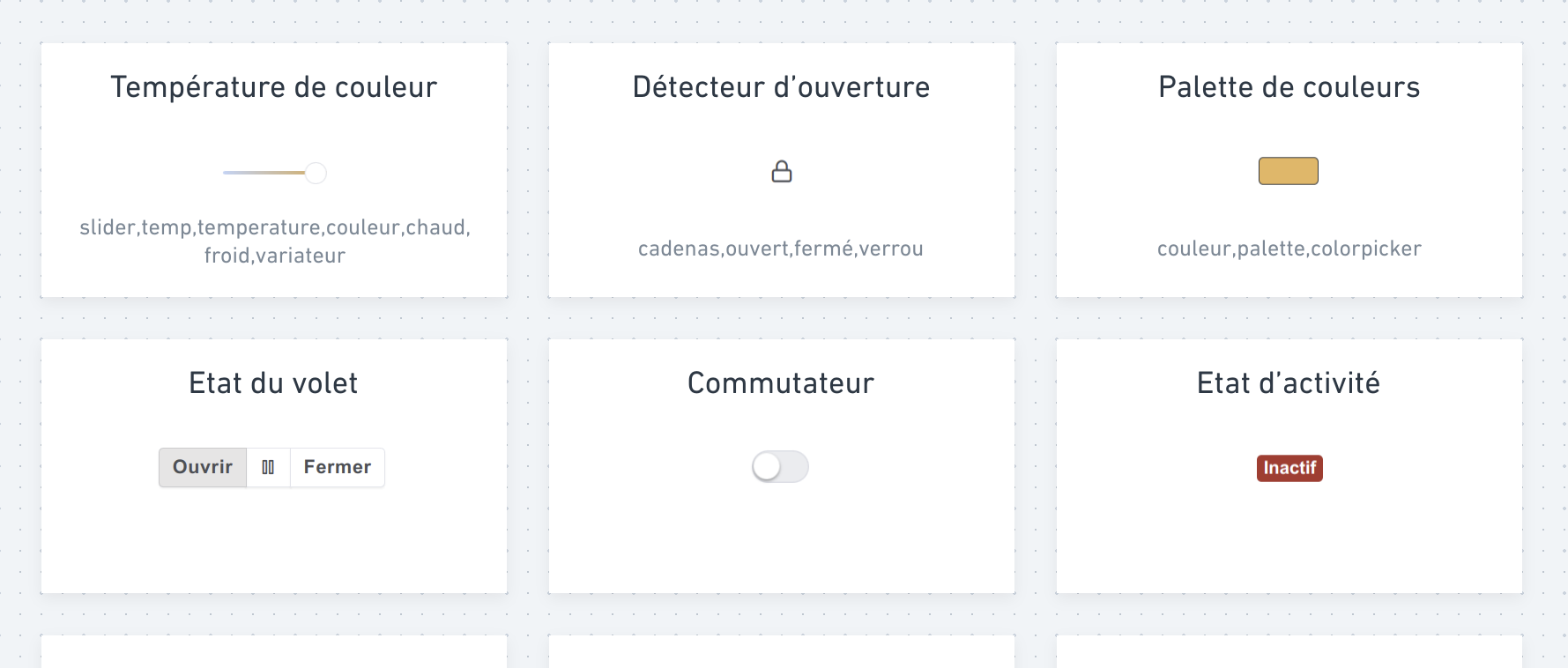
When you click the button, a panel would then appear under the button / in a modal / other to be defined, topped with the famous search field, as well as the « catalog » of features, which could be presented like this:
I wasn’t super exhaustive, I admit ^^ but the idea is to see the feature’s « generic » name, how it is rendered on the dashboard, and also the keywords it’s associated with (to decide if it’s really relevant to display them or not).
So someone who starts typing temp will create a filter of all features containing that string, as in the current behavior, but will very quickly see what they’re looking for: a temperature sensor? A dimmer? A color temperature dimmer? a storm detector?!
So what I’d find interesting — assuming it fits within Gladys’ UI guidelines — would be a collapsible system so that this catalog opens below the button you just clicked. I think that would nicely guide the user through their device creation process.
Not bad! I like the idea, but how would the « search/selection » part of the feature look?
Because that part will already have features already created. Also, in terms of possible features in Gladys, we’re talking about dozens of possibilities, so that part could end up being huge.
I’m not sure I understand your question.
In my head it’s a div that would appear under the button once you’ve clicked it, let’s say arbitrarily 300px high, which would therefore be scrollable (and even if I’m totally wrong I’d call it « lazy loading »? that’s what they call things that load progressively as you scroll, right?).
Basically I imagine the height of this frame should allow at least one and a half rows of features to be visible, so people understand they can scroll.
It mainly prevents having 85 tiles that would make the page overflow infinitely.
I don’t see a more efficient way to have everything at a glance while keeping it searchable so you can go directly where you want.
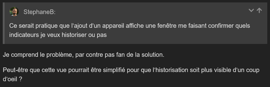
Could there be info on the virtual device view that shows all the features (maybe in the form of icons) indicating whether the feature is logged or not, and whether it’s a sensor or not?
I think that would be a good answer to:
The goal is then to iterate, and once we all agree, we’ll need to do the mobile design, then the list of all device types (for step 3), and write all the copy.
Finally, we can move on to development, but it’s only frontend, nothing too complicated; the hardest part is really agreeing and creating all the content.
I love it
Having a visual of the render is really great and the sorting by rooms too.
Be careful with the min/max and units which can be hidden by default but I’ll make them accessible if needed with a drop-down (if that’s what it’s called in the jargon).
Quick question: what do your 96% and 14% correspond to in your first screenshot?
If that corresponds to the sensors’ batteries (or battery-powered switches) then it indicates that it’s not a « virtual device » but a physical device (at least for me).
On the other hand, are physical devices only those coming from z2m or am I mistaken?
I could see just the feature icons if that doesn’t make it visually too heavy (with just a lightning bolt for two reported power values or more, for example).
First quick feedback: I really like it . I’ll take another, more detailed look tonight…
Just one initial point: I often have devices in which I configure several features of the same type. For example a device « heating setpoints » for which I have a feature « min setpoint », another « max setpoint », another « temperature variation over 15 minutes »,… So I think that on screen 2 the name of each feature should also be shown.
Maybe the term « virtual device » isn’t very clear. It’s just a device that you declared manually in Gladys and that is managed outside Gladys via Node-RED or a homemade script. But it can very well be a real physical device
Yes, you’re wrong, we have lots of integrations in Gladys, not just Zigbee2mqtt.


 . I’ll take another, more detailed look tonight…