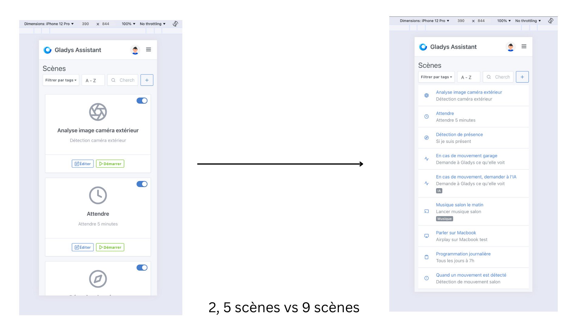
Great initiative!! Indeed, it was way too big on mobile.
However, since you’re asking, I find that removing the actions is a regression. For my part I quite regularly use the activation/deactivation of certain scenes, notably in case of breakdowns, work or maintenance, and winterizing.
I agree that the « start » function could be a small « Play » button on the right, I’ll try!
You can still enter the scene, but we won’t be able to put everything back into that view, that’s precisely the goal of this simplification ^^
I think that in any case you come out ahead — if your scene is the 10th one, you’ll be faster clicking on your scene and then « disable », rather than having to scroll through 5 pages and then click the current disable button
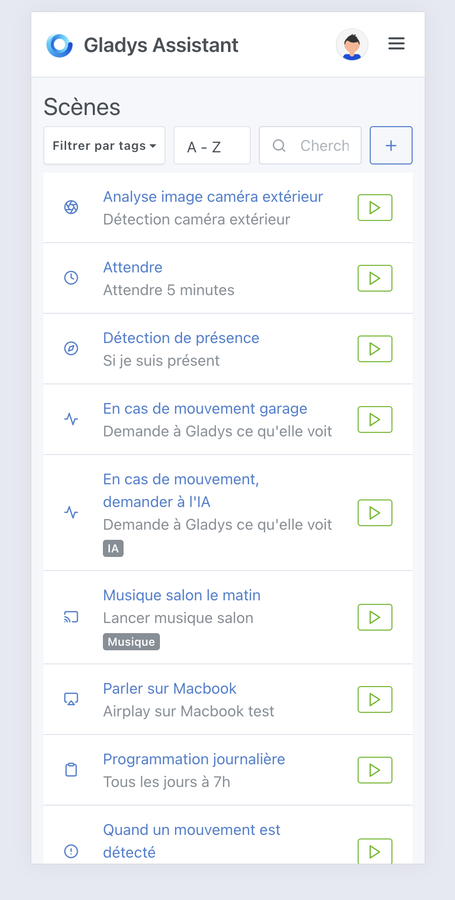
Do you think it would be possible to grey out the titles of disabled scenes? That would make it possible to tell whether they’re enabled or disabled without having to enter the scene.
It’s great honestly, much cleaner on small screens.
Indeed, for activation/deactivation on small screens, it’s not restrictive, especially since you added tag persistence!
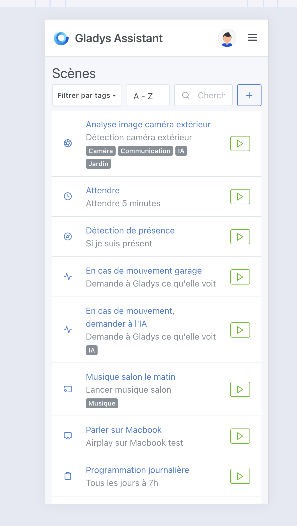
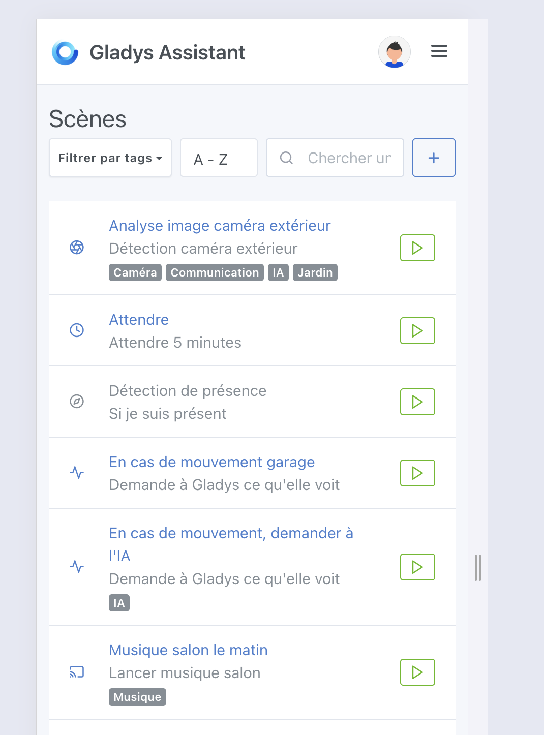
I’m 90% in agreement with @_Will_71, too many tags can be less visually pleasant, but most of the time working with 1, 2 or 3 tags, it would still be nice to have the first line of tags and put something like « … » if there are more tags than one line?