I just found a very interesting bug
If you add a box on the dashboard where you only specify the room name without adding devices, it displays all the devices in the house.
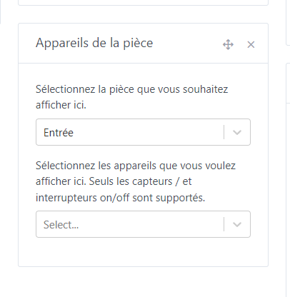
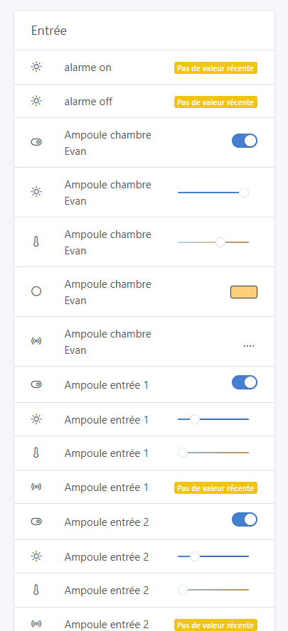
Wow! A bug that could almost be useful! Well spotted ![]()
Yes, but at my place it’s super long and I don’t even want to imagine how it is at yours!
I have another one that’s very strange:
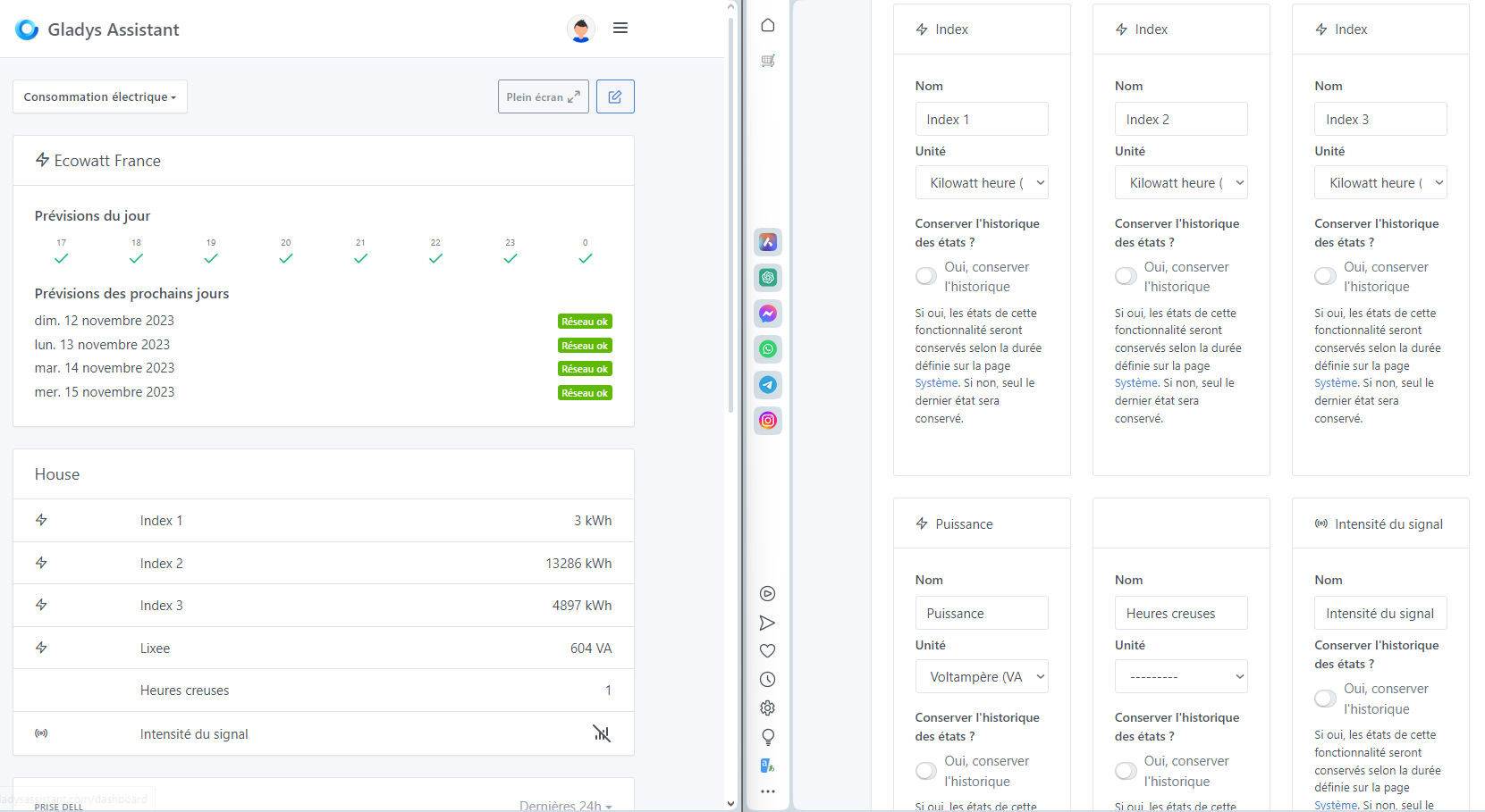
I put my Lixee back since the Enedis API is no longer working.
I wanted to change the names of the different features.
For the « index » features I had no problem. However, for the « puissance » and the « relais heures creuse » it gets tricky.
If I put 5 features the names are not correct.
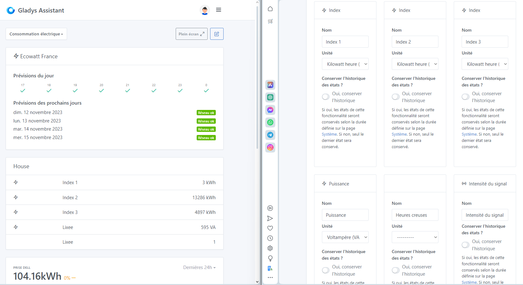
If I add « signal strength » it’s better but I still don’t have the name of the « power »
Can anyone reproduce this behavior?
And I’m missing information (features).
edit: after some research, I need to update the lixee.
I don’t think that will fix everything.
This widget is deprecated and I plan to remove it in a future update (in favor of « Devices ») so I don’t think there will be a fix for it ![]()
(Don’t panic, existing widgets will be migrated)
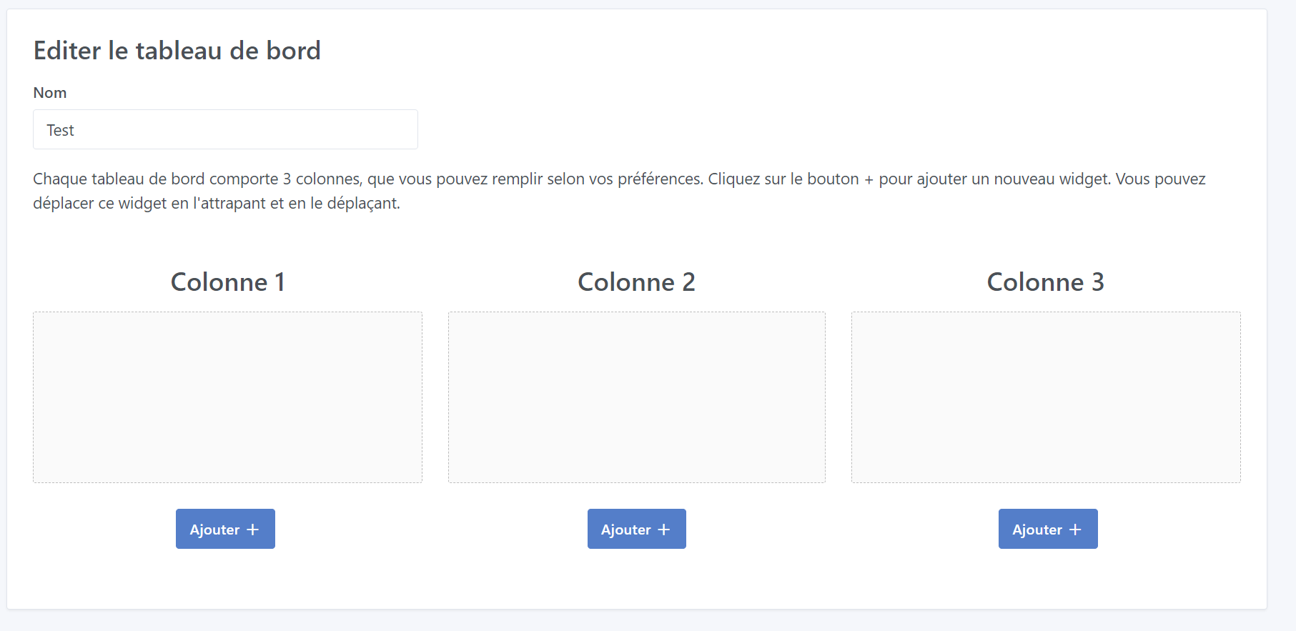
Here’s another one related to the boxes:
On a smartphone, when you want to add a box it gets added at the end of column 1, except if, like me, the three columns are full — you don’t see the added box and you click, click again and again… and you end up with 10 boxes.
The box should be added just above the « Add + » button
I often encounter this problem. I’m not sure that making it appear above the button would be a satisfactory solution, because that would mean it would end up at the end of the third column.
To me it’s no more logical to put it there than anywhere else… ![]()
I’d rather have it stay where it is, but when the add button is clicked there should be an automatic scroll to bring the view back up to the box.
Mobile is clearly not suited for adding boxes. However, considering this case, the most suitable option on mobile would be to be able to:
- either provide a column for adding (drawback: if you want the box higher in the column with the current system, if it moves up too quickly, you quickly end up in the 2nd or 1st column — or vice versa)
- or have 3 pages with arrows (1 per column) to add to one of the columns
- or have a select box at the top of the page to choose the column to view and have the add button act on the selected column (my preference)
… other suggestions?
The 3 buttons will surely be the clearest and the easiest to set up
Yes I agree, we should add 3 buttons, it annoys me all the time on mobile too ^^
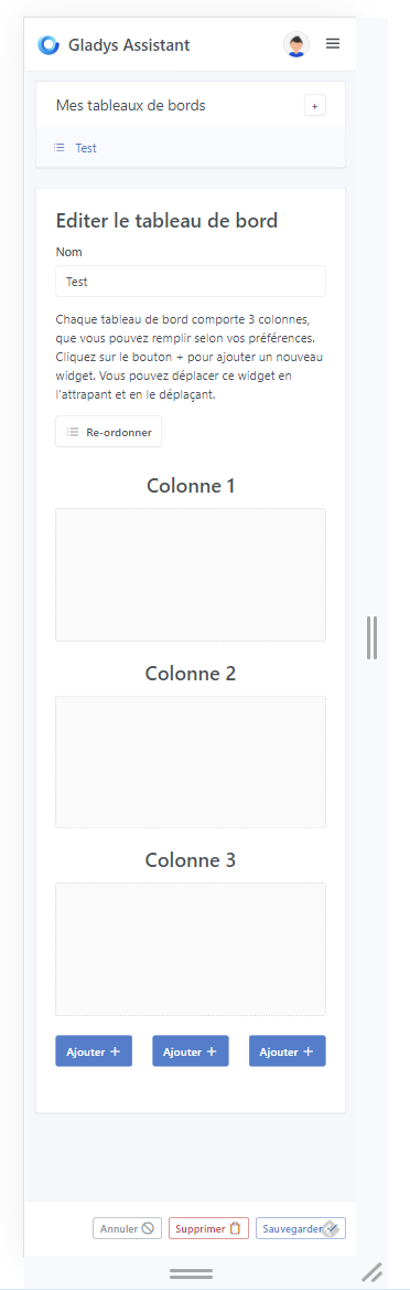
The first option is clearer.
The first choice for me too
Option 1 yes! Thanks for taking that on, it’s cool to have a new contributor! ![]()
Option 1 in the PR.
You’re welcome, it’s normal to help ![]()
EDIT: link to the PR
Great PR @Brisou, I think this fix will make a lot of people happy!!
It’s tested and approved on my side, it’ll be included in the next Gladys release!
This feature is available in the latest version of Gladys!