Je viens de penser à quelque chose, en effet quand tu arrives sur le service xiaomi ou autre tu sais pas forcément comment il fonctionne. Il serait bien de prévoir des tutorials (soit sur la page soit sur un site internet). Le tutorial permet à l’utilisateur de comprendre comment mettre en place le service et surtout pour Xiaomi le mode développeur sur la gateway par exemple.
Il faudrait ptet prévoir cette possibilité sur le front mais je sias pas encore comment.
C’est crowdsourcé, tu as un spreadsheet modifiable par tous, je fais confiance à la communauté
Pour moi c’est dans le service. Un bon produit doit avoir un onboarding solide, pas besoin d’envoyer l’utilisateur vers des tutos. Le Xiaomi c’est tellement simple comme service, tout peut être dans l’onboarding.
On explique step by step: 1) passer votre Xiaomi gateway en mode développeur, 2) Etc…
Je ne souhaite pas l’envoyer sur des tutos qui viennent d’autres source ou d’auter page mais d’avoir par exemple un petit modal qui permette de suivre les étapes globales pour initialiser le gateway par exemple. Ce qui permet d’avoir quelque chose de généraliser à tous les autres services. C’est un truc intégré dedans.
Yes c’est ce que j’entend par « onboarding » Pas dans une modal par contre, juste dans une page (tu noteras qu’il n’y a pas de modal dans Gladys 4 pour l’instant)
N’ayant aucuns périphériques Xiaomi, ni autres d’ailleurs,
(juste des periph http de ma composition)
je ne connais pas toutes les actions possibles.
Je ne vois pas comment visuellement les représenter (l’action elle même)
la boite s’agrandit pour afficher la commande… pas convaincu
oui je suis d’accord
Pourquoi pas style dimmer mais je ne vois pas comment visuellement les représenter (l’action elle même)
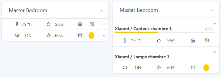
Est-ce que tu penses qu’il faudrait donc une box pour les yeelight, une autre pour les hue et une autre pour les milight ? J’imaginais qu’une box lumière pourrait gérer n’importe quelle techno mais c’est peut-être pas possible.
Hue, saturation, brighness ca ferait 3 barres . Est-ce que quand on clic sur le bouton de réglage de ta box, ca pourrait pas afficher 3 progress bar afin de régler la couleur ? Après il y a aussi la couleur en kelvin qui peut varier sur certaine ampoule je crois ^^
@luke, @Jacky pourquoi avez-vous besoin d’afficher le niveau de batterie sur le dashboard principal ?
Qu’il soit disponible dans la vue « Xiaomi » ou qu’on ai une notification quand la batterie est faible je comprend, c’est très utile, mais sur la box du dashboard j’ai du mal à comprendre le besoin. Quel est votre cas d’usage?
N’ayant pas de periph, je propose une vue suivant les commentaires.
pour @VonOx le niveau de batterie est important
je pense que l’indiquer seulement quand le niveau est faible est suffisant
Pour un visuel ou il y a seulement le titre de la pièce + une lampe (donc visuel petit), j’ai du mal a voir ou mettre, comment les faire apparaître les 2 ou 3 barres (un doigt prend de la place)
modal : non
la boite qui s’agrandit ?
J’aime bien ce qu’Apple a fait sur HomeKit, ça ouvre une sorte de contrôle full screen (pour le coup c’est un peu une modal), et ça te permet un contrôle plus complet
Je pense aussi que c’est peu utile. La batterie, c’est utile de savoir quand il faut la changer, le reste du temps quel intérêt tu as à savoir que tu es passé de 97% à 96% ? Du moment qu’il y a une alerte quand la batterie est faible, sinon c’est pas forcément utile.
Je pense aussi qu’on y gagnes à faire une box générique. Sauf dans certains cas particuliers, l’intérêt de Gladys c’est de regrouper les usages et d’avoir une expérience unifiée.
Au niveau du rendu, j’aime toujours l’idée du regroupement mais je suis pas fan des placements, il faut que cela reste léger et clean.
Oui je pense aussi que ça fait beaucoup. C’est pour ça que je proposais un autre panneau pour la configuration.
Euh… Ne le prend pas mal… J’essaie juste de comprendre votre besoin. Je croyais que c’était luke qui en avait besoin aussi c’est pour ça que je demandait à vous deux.